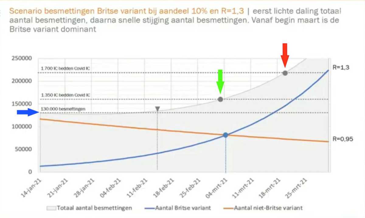
There is a much-discussed doom graph, known from Prof. dr. Ernst Kuipers. Maurice de Hond has already written a lot about it. There was another small thing that struck me, which saves a nice 400 ICU beds.
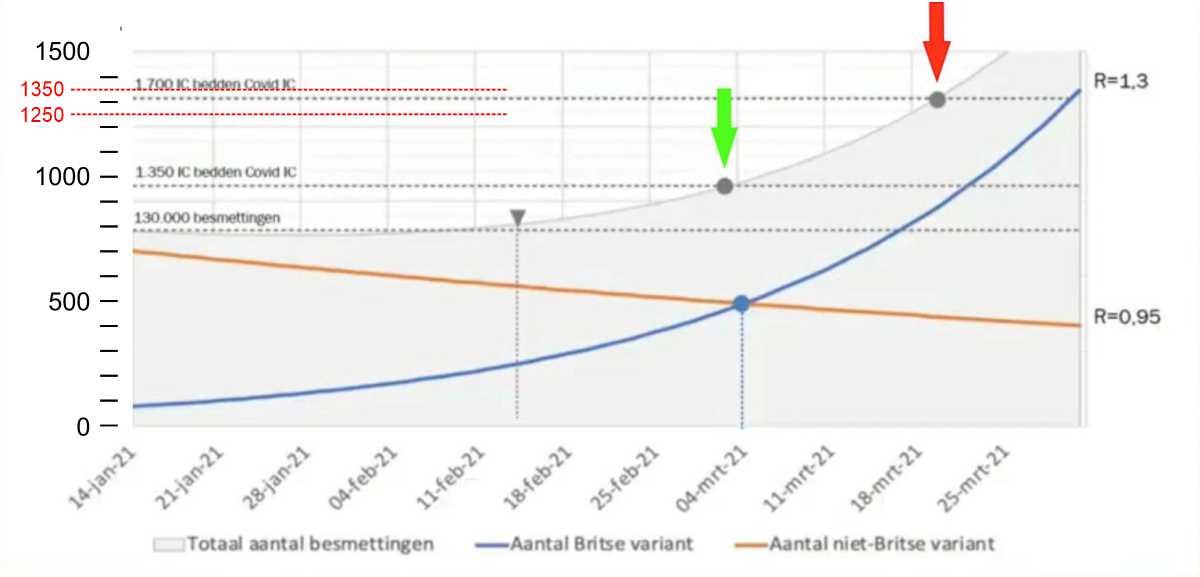
Kuipers' graph, without scale on the Y-axis for ICU beds (quite important). The numbers are written on dotted lines in the graph: 1,350 and 1,700 beds Covid ICU. The Y-axis shows the scale for the infection rates.
(click on the graphs to enlarge)
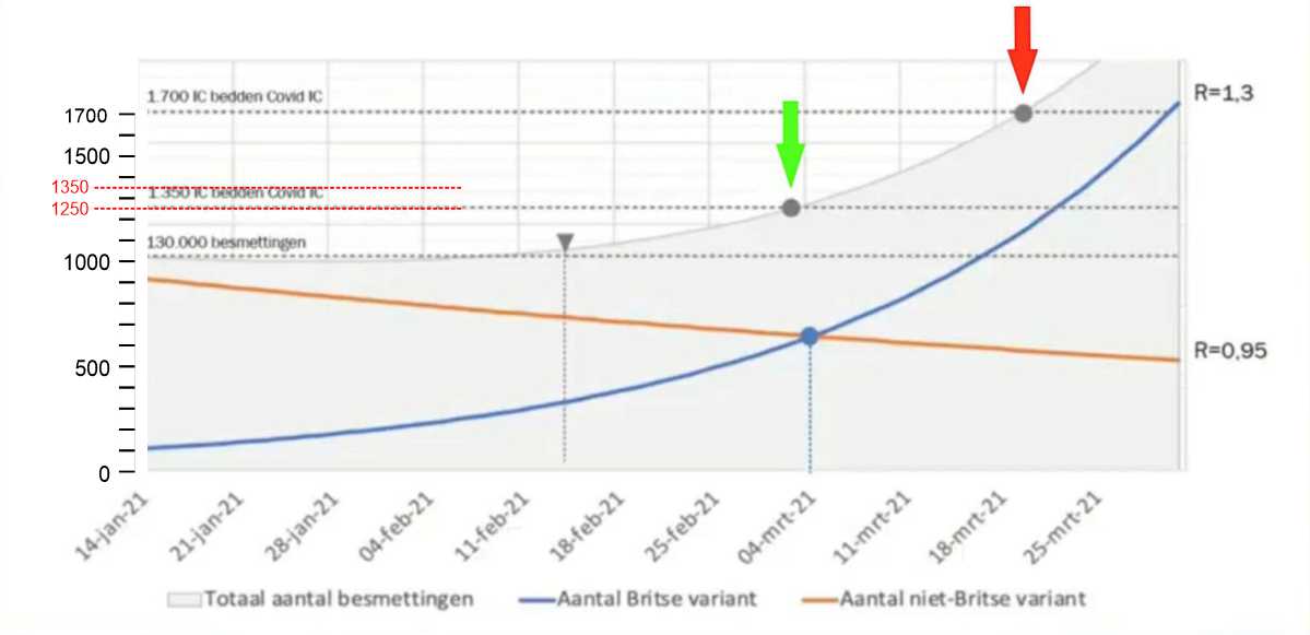
I have replaced the scale for the Y-axis with the scale associated with the Covid IC values: from 0 to 1,700. The caption "1,350 beds Covid ICU" appears to fall on 1,250 in the graph. How is that possible... Maybe 1,250 didn't sound serious enough for Kuipers? I can't imagine that they just make up 100 ICU cases.
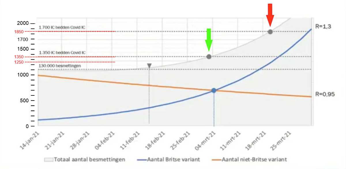
It won't be that manipulative anyway so another attempt: we make sure that the 1350 matches the scale instead of the 1700. Oops: the line of 1,700 actually indicates the value of 1,850!
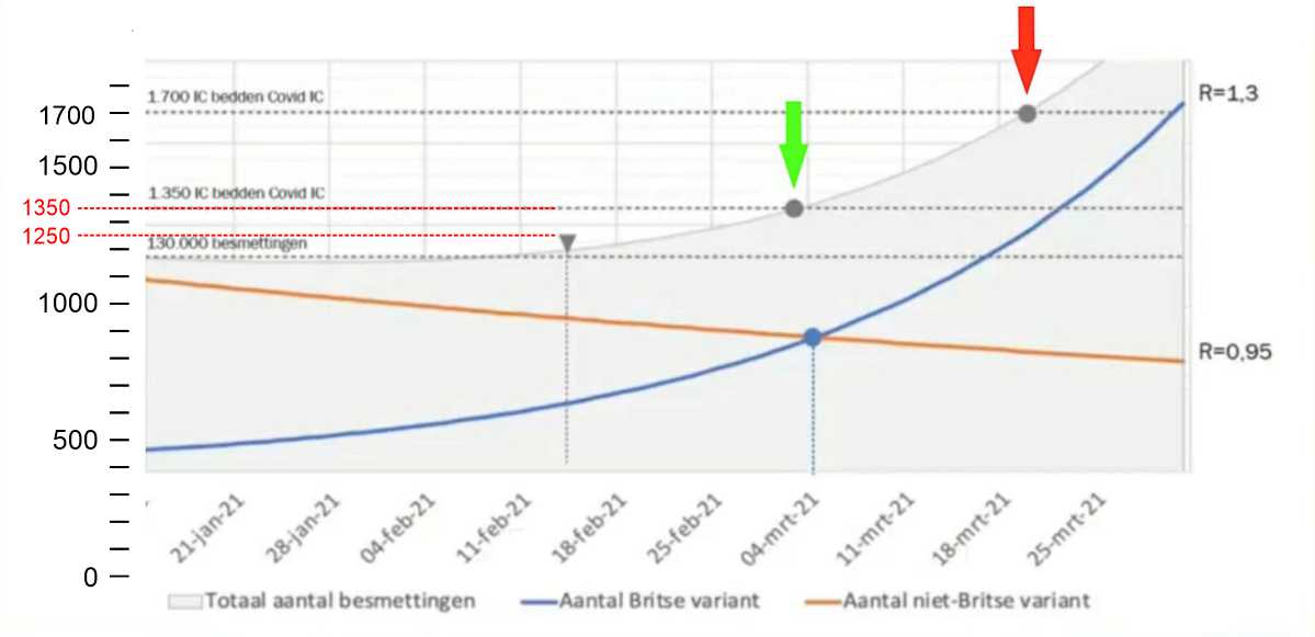
Then there is no other option than to put both 1350 and 1700 in place. Then the Y scale does not start at 0 but at about 400 unexplained beds Covid ICU. Of course, that's not fair. In this way you can compare trends but not numbers.
If we move the scale upwards, so that the zero point is the same as the other zero points, then 400 beds are deducted from each value. The 1,350 ICU beds actually turn out to be 950, at the red arrow we are at 1,300 instead of 1,700.
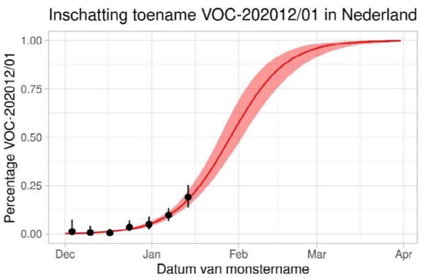
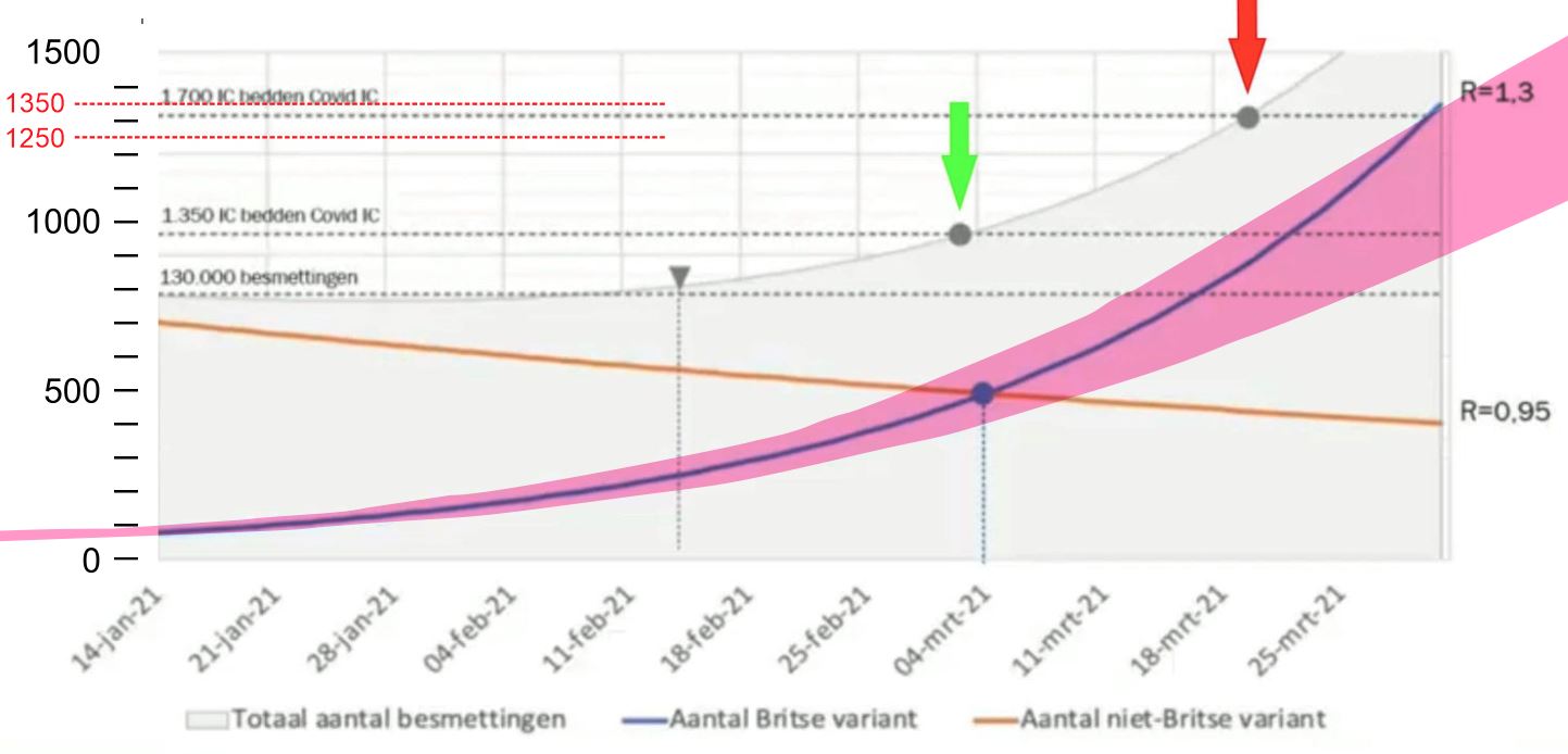
Not something to look forward to, 1,300 ICU beds, but shouldn't the ICU capacity be able to handle that by now? Or have they still done nothing about it, despite the fact that they claim all the time that it is getting worse? You could say that it doubles much further after that. If you look at another RIVM model, that is not correct.
In another graph, they also draw a curve of the British variant, which flattens out again after an exponential rise.
It seems as if there are several competing models circulating at the RIVM. Perhaps that is why the various statements in the media are not easy to reconcile.
