Followers of this blog have seen how we enthusiastically dived into the UK data to compare All-Cause-Mortality between vaccinated and unvaccinated people. The data from UK were detailed enough to gain new insights, also useful for understanding the Dutch situation. Epidemiologist Jaime Bojas alerted us to errors in the articles. Fortunately, this was not so bad methodologically, but we still have to be very cautious, simply because it turns out that the data is impure. Unless England still starts counting noses.
Al eerder gingen er op social media klachten rond over de onbetrouwbaarheid van de ONS-data. Zij rapporteren absolute aantallen overlijdens en leeftijdsgestratificeerde data. Statistici willen graag met leeftijdsgroepen kunnen rekenen om bijvoorbeeld tot een gemiddeld sterftecijfer te kunnen komen, om leeftijdsgroepen te kunnen vergelijken of om vergelijkingen te kunnen maken met landen met een andere leeftijdsopbouw. De sterfte in een land met een zeer oude bevolking en de sterfte in een land met een jonge bevolking, krijgen zo met elkaar vergelijkbare mortaliteitscijfers, gecorrigeerd voor het leeftijdseffect. De landen worden vergeleken alsof de leeftijdsopbouw hetzelfde was geweest. Dat is weliswaar een eerlijke vergelijking - maar er wordt zo ook informatie minder zichtbaar die van belang kan zijn, zeker bij een leeftijdsdiscriminerende ziekte. De kritiek betrof met name de resultaten van die statistische omrekeningen.
Die statistische omrekeningen (correcties, standaardisaties) leken te omzeilen door de leeftijdsgroepen strikt gescheiden te houden van elkaar (compartimenteren). Dan moet je meer grafieken maken; je kunt niks samenvatten of middelen - maar dat wilde ik ook niet want juist het verschil per leeftijdsgroep is interessant. En als je werkt met een geïsoleerd leeftijdscohort hoef je verder niets om te rekenen of te "leeftijdsstandaardiseren".
Within a 10-year cohort, there is a risk that the youngest five-year cohort has a different profile than the older one. Because the vaccination coverage is almost the same between the elderly and the young within the 10-year cohorts, no significant difference can arise within the scope of the vax/unvax comparison.
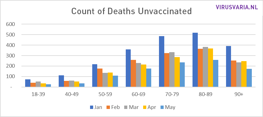
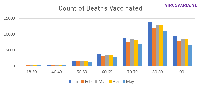
For each age group, it is known how many people have died in recent years and, moreover, what their vaccination status was. This is accurately recorded per day per age group. So you only have to compare those deaths in terms of vaccination coverage with the relevant age group (and you know exactly per group whether the mortality rate is higher or lower in percentage.
Het gaat dan ook niet fout in de methode of in de berekening maar bij het vaccinatiepercentage zoals dat in de heatmap onderaan de pagina van "Source 2" wordt gecommuniceerd. Deze officiële overheidsstatistiek klopt jammer genoeg niet omdat het aantal vaccinaties wel zeer nauwgezet wordt bijgehouden maar men geen goed beeld heeft van het aantal ongevaccineerden. Men spreekt dan over foute 'noemers' of 'denominators'.
Een 'noemer' of 'denominator' is onderdeel van een breuk. De belangrijkste fout wordt echter al gemaakt bij het bepalen van de tellers, voordat er überhaupt wordt gedeeld.
The number of unvaccinated people is calculated by subtracting the number of vaccinated people from the population. However, there are large differences of opinion about the size of the population in England.
The number of unvaccinated people is simply calculated by subtracting the number of vaccinated people from the population.
O = P - V (Number of Unvaccinated People = Population Size minus Number of Vaccinated People). However, there is a big difference of opinion about the size of the population in England. This has a huge impact on the number of unvaccinated people.
In this document van de National Health Service wordt beschreven wat de verschillen veroorzaakt. Zie ook het kopje "In het kort".
Short
NIMS (National Immunisation Management Service), which registers vaccination figures, is based on population figures that they update weekly. You would say that that must be good. Nevertheless, everyone agrees that these figures are a aboutschatting zijn. Deze overschatting wordt toegeschreven aan een aantal oorzaken die mij kwantificeerbaar voorkomen en waarvoor ook redelijk te corrigeren zou kunnen zijn - maar dat konijnenhol ga ik niet in... Het is vast complexer dan het lijkt.
ONS (Office for National Statistics), which keeps track of mortality, on the other hand, works with England population mid-year estimate. The most recent version is from June 2021. These figures are overall very likely - and for some cohorts demonstrably - a underestimate.
Result:
NIMS has 60 million English people while ONS comes in at 53 million.
The problem of this becomes clear when calculating the number of unvaccinated people. That results in differences. The number of vaccinated people is carefully recorded. However, the number of unvaccinated people is calculated by subtracting the number of vaccinated people from the population. This results in dramatically different graphs for different population sizes:
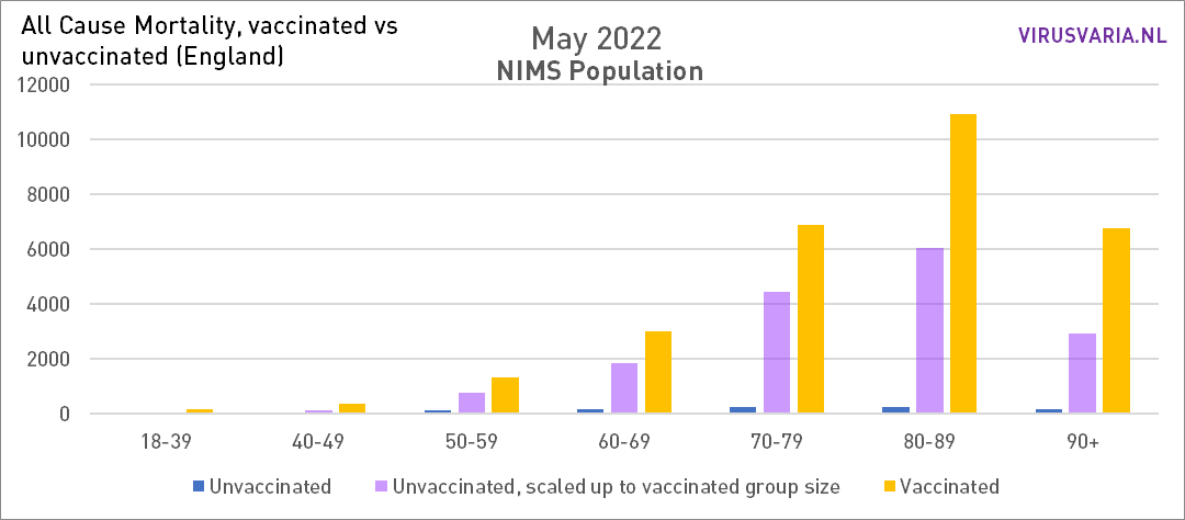
The population is too large. After deducting the vaccinated, too many unvaccinated people remain. As a result, the mortality rate in that group decreases. After all, there are just as many deaths in a larger group.

The population is too small. After deducting the vaccinated, too few unvaccinated people remain. As a result, the mortality rate in that group is rising. After all, there are just as many deaths in a smaller group.
In the left graph, mortality among unvaccinated people is shown too favourably. The purple bars should be higher, but we don't know how much higher.
In de rechter grafiek gebeurt iets heel vreemds. Dat komt omdat er in sommige groepen meer gevaccineerden zijn geregistreerd dan er mensen zijn(!). ONS werkt dan ook met de aanduiding 100%*, waarbij het sterretje aangeeft dat de vaccinatiegraad boven de 100% ligt. Dat kan natuurlijk niet en heeft tot gevolg dat er, na aftrek van de gevaccineerden, een negatief aantal ongevaccineerden overblijft. Vandaar die hangende staven. Die data vallen daarmee door de mand - waarmee niet meteen is gezegd dat de NIMS data wel bruikbaar zijn.
What now?
Het verschil dat de grafieken uit eerdere posts over Engeland weergeven is in elk geval te nadelig voor de vaccins. Misschien is er iets op te vinden om dit enigszins te normaliseren (wordt over nagedacht) - maar heel precies zal het niet worden... Wat overigens ook geldt voor de ONS-benadering, waar de vaccins te positief uit naar voren komen.
Prof. Norman Fenton also paid attention to this, see the tweets below from last week. Also read the additions by O.S. who point to more major inaccuracies in the ONS report. He makes a case for the use of the NIMS data:
How policymakers, population and health statisticians have done their work there in recent years is puzzling. Before you know it, you will leave the EU on the basis of wrong figures! If anyone knows why the Population Register does not work in England (incl. migration data)
The following text will be placed above the existing posts:
In the graphs below, the population data of NIMS are used. As a result, mortality rates among unvaccinated people, at least in some age groups, are displayed as lower than they actually are.
Because England works with impure population estimates, we don't know how many unvaccinated there are. The population size used has a direct effect on reporting on unvaccinated people. The deviation also differs per age group. It is not yet clear whether and if so, how this can be adjusted; the UKSHA (UK Health Security Agency) is working on this. The ONS says about this:
"We hopen dat het werk dat UKHSA doet om de NIMS-gegevens te verbeteren (inclusief het verwijderen van duplicaten), samen met het werk dat ONS doet aan bevolkingsschattingen en de volkstelling van 2021, ons inzicht zal verbeteren. Het is echt positief dat ONS en UKHSA samenwerken om te proberen een oplossing te vinden voor dit probleem, dat zo belangrijk is voor zo veel statistieken. Gezien deze onzekerheid kan kennis van de implicaties van de verschillende keuzes gebruikers helpen de gepresenteerde gegevens met de nodige voorzichtigheid te interpreteren."
Uitgebreidere verantwoording in de post "UK professor: 'Data on mortality by vaxx status are junk' "
In the graphs below, the population data of NIMS are used. As a result, mortality rates among unvaccinated people, at least in some age groups, are displayed as lower than they actually are.
Fortunately, we still have the figures.
The only hard numbers are the rough counts. If you organize them you will also see something, just look. More about this in a next blog.