
RIVM assumes that something happened in 2021 that increased the mortality chances in the Netherlands, also for 2024. This can be seen from the figures for the increased mortality expectation (baseline), which also foresees higher exceedances. The cause is not named or explained.
De grafiek "Nationwide mortality" werd in de coronaperiode tijdelijk door het CBS verzorgd wegens onenigheid met het RIVM met betrekking tot doel en inhoud. Daaruit valt op te maken dat het een belangrijk communicatiemiddel is. Bij de grafiek, zoals die tegenwoordig weer door het RIVM wordt gepresenteerd, staat een (vernieuwde?) publieksuitleg. Enige aanvullende achtergrondkennis is wel vereist om goed te kunnen begrijpen wat men wil zeggen maar vooral: wat er daadwerkelijk staat. En wat er niet staat.
Just to be sure, I immortalized the text in a screenshot. You don't have to read it, I'll quote the relevant bits in the text.
View the screenshot
footnote:
The baseline is gone
The first thing you notice is that the RIVM graph no longer shows a baseline. It seems like a detail, but such a line is not accidentally lost, it is really thought about. The baseline is the expectation of the exact average for that week. Designed away.
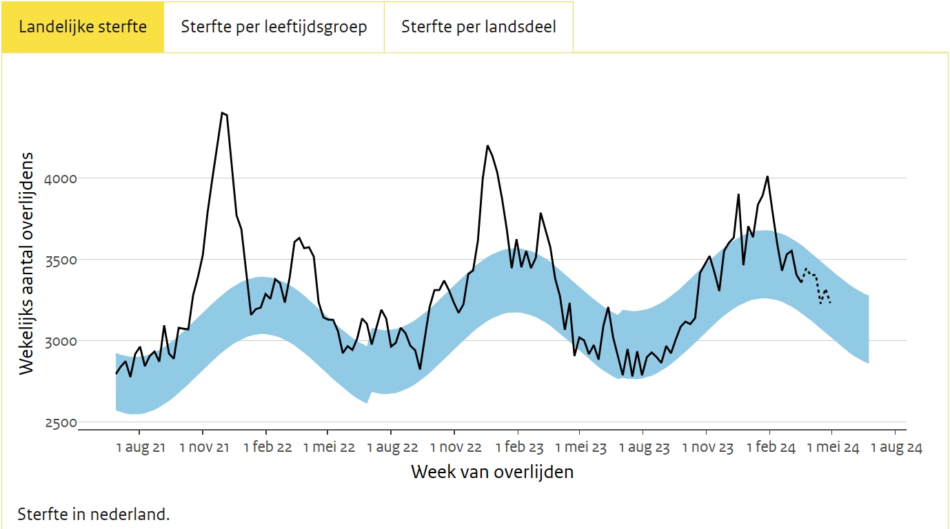
With a baseline as a reference, you can immediately see whether the actual mortality is above or below the expectation for a particular week. If the actual mortality remains above baseline for six months or a year, it will no longer be possible to see it properly without a helpline.
As a reminder, an image of the old-style RIVM graphs: with baseline, the blue line in the middle of the bandwidth. I will now show you the picture of when the bandwidth was fiddled with. Completely accidental, of course, a conversion error that optically eliminated the excess mortality. (At the time, here signalled). That bandwidth is now being tampered with again.
Bandwidth utility: signal value
The new RIVM baseline with bandwidth is based on the past five years (excl. 2020), years in which a lot of unexplained mortality occurred. High mortality has been modeled with these figures. Perhaps because a mortality prediction based on recent years is part of life, while no one seems to know yet what such an estimate was actually for. Or they know something that we don't know yet: excess mortality will remain for a while, just get used to it.
The bandwidth always indicated the norm within which the mortality rates of a healthy population should move. Any excess of that bandwidth serves as an alarm signal. It indicates that there is unusually high mortality that week. A cause is then sought: usually a heat wave or a flu wave. A severe flu wave can last up to 10 weeks. By monitoring this properly, you keep an eye on public health and you can take appropriate action if necessary and also see when it goes away.
However, if a flu wave passes by and mortality nevertheless remains neatly within the bandwidth, then your prediction is of no use at all, then your band was too wide to use as a signal value. You only show that you have fulfilled your obligations: neatly predicted, even the flu wave falls within it.
- You don't install worn-out solar panels on your roof if you want to be environmentally conscious.
- You don't hang up fake smoke detectors to meet the fire safety requirements.
- You don't calculate a public health reference based on disastrous years.
Unless you know it's wrong, but you don't want to cause panic, for example, just to name a consideration. Then you start looking for ways to raise the standards so that the signal values are tapped less often. It seems so.
Bandwidth is King - but which one?
The RIVM explains what the bandwidth represents. The expected mortality is only mentioned as a tool to calculate the margin. That expected mortality is based on the past five years - with the exception of 2020 because we know that there was a corona peak, so that does not count, is the reasoning. But why not actually? They do include the excess mortality years 2021 and 2022 (and soon also 2023) and the excess mortality in those years was even higher than in 2020, looking at the seasonal years. Or take the past 10 years as a reference period, which would also dampen the effect of those crazy last years of excess mortality.
The statisticians at CBS think otherwise. They also take 2021 and 2022 not in the prognosis, because these are clearly different years. According to them because of Covid, but then again, those are not medics.

There are therefore reasons for the agency of the Ministry of Health, the RIVM, to accept and 'normalize' that higher mortality level, as we did with the winter season. If they wanted to mask excess mortality, they could not have done it better.
Below is the RIVM explanation of the bandwidth.
The band represents the expected mortality between an upper and a lower limit. The upper limit is the expected mortality plus two standard deviations from the expected mortality. The lower limit is the expected mortality minus two standard deviations from the expected mortality.
https://www.rivm.nl/monitoring-sterftecijfers-nederland
There does not seem to be any policy behind this. Dry statistics. Let's calculate that using this week's RIVM download file.
This file also does not contain any expected mortality, only the actual weekly mortality and the upper and lower limit values for each week. The value that lies exactly in between is normally the expected value and that is for the last reported week: 3230.
"Twee standaarddeviaties van de verwachte sterfte". With a single value we speak of the 'uncertainty' and that is 2 times the square root of 3230, which is: 114.
The upper limit would have to be something like: 3230 + 114 = 3344. But the upper limit specified by RIVM is no less than 95 higher: 3439, which is also consistent with the graph. The signal value is therefore much less sensitive with this upper limit, from 114 to 209.
So now 95 more deaths must occur in one week (85% more!) to achieve 'increased mortality' than the uncertainty of the weekly value itself. There may well be a reason for this, but what do we want now: set a signal value to identify deviations from expectations or do we want to normalize the excess mortality years by including that increased mortality in the expectation?
It seems that the RIVM mainly wants to predict well.
The excess mortality is expected and thus disappears from the signalling.
Nu zal de "publieksuitleg" op de RIVM-website ongetwijfeld een simplificatie zijn van de werkelijke rekenmethode waarin meer onzekerheden op een of andere manier worden meegenomen, waardoor de band wat wordt verbreed. Ook in statistiek moeten keuzes worden gemaakt, en zelfs "standaarddeviatie" is een kneedbaar begrip: welke periode neem je, welke pieken neem je wel of niet mee. En neem je een piek niet mee, top je die dan af op de bovenwaarde of zet je die op nul: de sterfte is immers 'verklaard' en kan worden weggeboekt uit de prognose, net als een hittegolf. Maar het valt op dat er consistent wordt toegewerkt naar een opgaande lijn.
We already knew that the baseline has been raised because the RIVM includes the years with unexplained excess mortality in the forecast, contrary to how CBS calculates. That in itself is worrying. You can expect the bandwidth to grow somewhat in absolute terms, as a percentage of the increased numbers. But that percentage itself doesn't increase from one year to the next, does it?
Well, it is. I'll show you, again using the same csv file. If we compare the first weeks of January, we see that the bandwidth (2x the standard deviation) increases compared to the expected mortality. The same goes for the first weeks of July.
| Upper limit as a percentage of expected mortality | ||
| Year | 1st week of January | 1st week of July |
| 2021 | 12.9% | |
| 2022 | 11.0% | 13.7% |
| 2023 | 11.8% | 14.1% |
| 2024 | 12.1% | |
Note: I do it percentage-wise, which is very lenient because the standard deviation becomes proportionally smaller with larger numbers. Carrot 4 = 2, which is 50%. Carrot 9 = 3, which is 33.3%. Carrot 16 = 4, which is 25%. The fact that the bandwidth, on the other hand, increases in percentage terms with higher numbers therefore requires some explanation.
Do you calculate it yourself?
The only thing that comes with it is addition, subtraction, division and multiplication. That's fun! 🙂
- First, calculate the baseline in a column (upper limit + lower limit divided by 2).
- In the column next to it, you do upper limit minus baseline. This in turn shows how many deaths still fall within the bandwidth of 1 week.
- If you divide that in the next column on the baseline, you have the percentage (you can see that it is not that difficult)
The upper limit in the 1st week of January 2022 was 11% higher than the expectation in that week. In 2024, the upper limit will have become 12.1%. From 11 to 12.1, that's a 10% increase in two years, on top of the already elevated baseline. Just by virtue of this seemingly minimal broadening of the band, any week 40 more people die without 'increased mortality' being reported.
In één jaar tijd zijn dat ook weer ongeveer 2.000 overlijdens extra. Terwijl de verhoging van de baseline al ca. 9.000 extra overlijdens toestond in 1 jaar, gerekend van juli 2023 t/m juni 2024. (Om dat te berekenen heb je ook traditionele "virusvaria-baseline" nodig die we op sterftemonitor.nl gebruiken, zie ook ResearchGate).
The total of additional 'unnoticed excess mortality' on an annual basis then amounts to approximately 11,000 more deaths than before. These are numbers that pale in comparison to a flu epidemic and are on the order of corona year 2020, with two corona waves in 1 calendar year. In the future, a lot of excess mortality will escape the attention of the media.
So:
- The expectation has been raised
- With a higher expectation, the bandwidth should not even grow in percentage terms
- However, the bandwidth is becoming an increasingly large percentage of the expectation. The signal value is further increased, so that even more excess mortality goes unnoticed.
Could the bandwidth have been increased because there were so many peaks, and so much persistent excess mortality? Peaks are not taken into account, says the RIVM. If they only mean the part above the upper margin, there is still a lot of excess mortality between baseline and upper margin. And if it's based on real numbers, shouldn't the bottom margin be much smaller because there were virtually no under-mortality weeks in the last five years? Or will it be statistically modelled again? As the bottom margin is presented now, the only function is to mirror the top margin. That aside.
How important is that bandwidth?
De baseline wordt niet meer gehanteerd, alles wordt opgehangen aan de bandbreedte. De lichtblauwe bandbreedte is het veilige gebied, overschrijding daarvan geeft "licht verhoogd" aan. In voetnoot 3 legt het RIVM uit hoe we dat gradueel moeten zien:
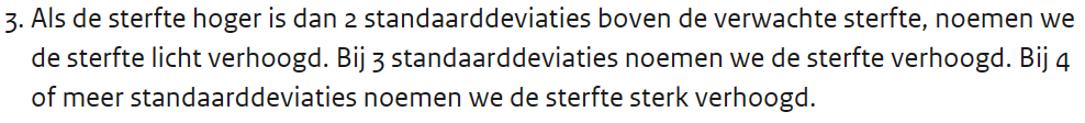
"Als de sterfte hoger is dan 2 standaarddeviaties boven de verwachte sterfte, noemen we de sterfte slightly elevated. At 3 standard deviations, we call mortality Increased. At 4 or more standard deviations, we call mortality greatly increased."
https://www.rivm.nl/monitoring-sterftecijfers-nederland
What it doesn't say is that this signal value only applies to the week. For science columnists and spin doctors at CBS, this is a rewarding anchor that can be thrown out 52 times a year, but for people who can do a bit of math, it's different. If you take longer periods, the bandwidth will be smaller (also think of the Carrot calculation). Yet, week after week, RIVM and CBS are once again looking exclusively at the last week only. Compare it to flipping a coin. Free to an earlier post Bandwidths for dummies:
If you toss the coin 28 times and you get, for example, 24 heads or 24 tails, then that is a signal that something is wrong with your coin (that chance is 0.0153%, you would have to throw approximately 700,000 to encounter such a series). Then you will either have to adjust your expectations regarding this coin or reject the coin and start investigating. If you still stubbornly insist "yes, but every time I threw it was really a one in two chance so there is nothing special to see" then you apply the wrong rule and close your eyes to the series you are making.
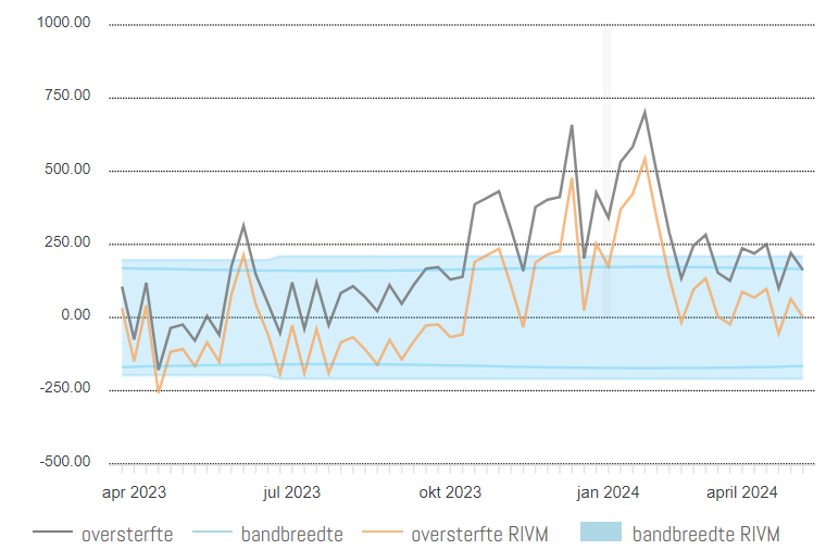
RIVM and CBS consider each week to be isolated, while, for example, since October 2023 until now (32 weeks), there was only a mortality rate in 4 weeks that was lower than the (increased) expectation, and higher in 28 weeks. That's the orange line. If we look at the excess mortality based on the traditional expectation (grey line in the graph), as calculated before 2024, the mortality has not fallen below baseline once since July 2023. An uninterrupted excess mortality series of approximately 40 weeks: significant excess mortality.
Wat het RIVM precies onder een "standaarddeviatie" verstaat, weten we dus niet precies genoeg om na te kunnen rekenen. Het is voor hen in elk geval iets wat groeit naarmate er meer mensen doodgaan, net als de onzichtbaar gemaakte baseline. Het is een mix tussen harde statistiek (de ondermarge die even groot is als de bovenmarge) terwijl er anderzijds naar de realiteit wordt toegerekend vanwege de verhoogde overschrijdingen aan de bovenkant. En dan gaat de onderkant weer mee natuurlijk want dat hoort zo met statistische onzekerheidsmarges...
Where are we now?
See the orange line for 2024. The X-axis of this graph (thanks to Herman Steigstra) goes from August to July. Seasonal years provide a clearer picture because the winter bumps are not intersected by the annual changes. In '22-'23 (green line) there was slightly less excess mortality than in '21-'22 and now we are slightly lower again. But still far above corona season '19-'20. And also above '20-'21, when everyone was vaccinated.
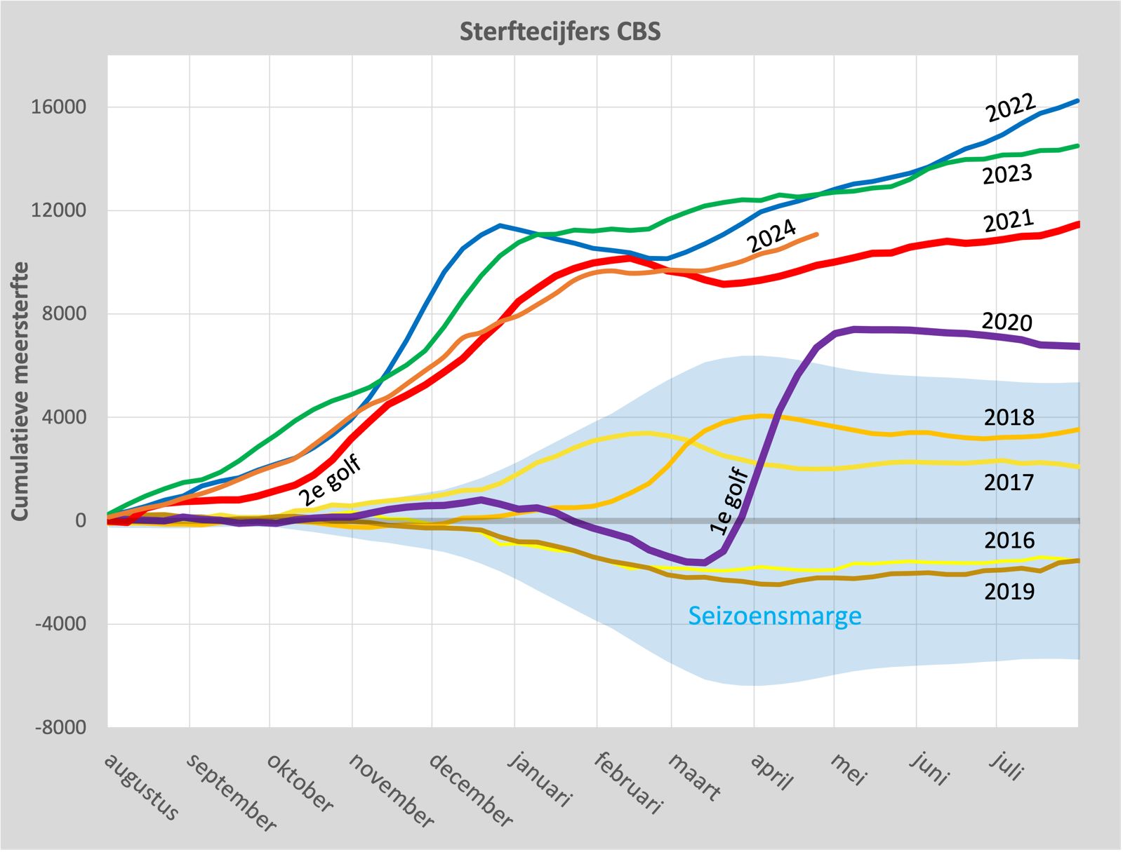
What I find particularly disgusting about this graph: Before 2021, for example in the summer after the 1st wave, the line decreases again (under-mortality) after the excess mortality period. You can also see that after the bumps in 2017 and 2018: a small decrease and then stabilization.
But then, in 2021, 2022 and 2023, it just continues to rise in the summer. That really doesn't sit well. The fact that no attention is paid to this means to me that there is nothing they can do about it. It is accepted, a fait accompli. And it's going to happen again. If that has anything to do with policy, then there is no other option than to insist that they have done the right thing and simply advise pregnant women to take the jab again. Otherwise, there will be a cognitive dissonance that cannot be managed.
Looking further ahead
If mortality slowly returns to normal levels in the coming years, the RIVM will report under-mortality until it becomes too extreme and they correct the baseline again because things are going so well. In any case, a lot of excess mortality fuss has been missed. Let's keep our fingers crossed that we don't have to wait years for this and that we will then be somewhat in line with pre-2020 levels. This graph does not yet offer much hope for such an improvement.
In the Previous article we saw that the average age of death in 2021 and 2022 was five years lower than before.
If we are to believe some doomsday scenarios (Vandenbossche, Dowd, Cole, McCullough, McKernan, Bonte, etc.) the mortality level could remain higher for decades. That will have to be seen. By raising the baseline, the RIVM has in any case already safely prepared for this. They don't do this for nothing: they actually already know it, as can be seen from the figures.
Questions about the techniques used to identify less excess mortality:
- Why does RIVM use different comparison years than CBS, resulting in a higher mortality expectation (baseline)?
- What is the justification for the expanded margin of uncertainty, which means that the signal value for excess mortality is further from the baseline?
- This margin is stretched a little further every year, more than what can be expected on the basis of the baseline. Why this step-by-step increase in tolerance, always in July?
- Weeks were not assessed by CBS as a series but as isolated events, which meant that long-term excess mortality was not detected. In the health sector, taking history into account is necessary for a diagnosis. Will RIVM continue to look exclusively at exceedances of the weekly margin?
- The National Institute for Public Health and the Environment (RIVM) does not show a baseline in the graph, which makes it difficult to visually identify excess mortality and excess mortality (especially over several weeks). Can RIVM bring that line back and if not, what is the consideration for this?
The National Institute for Public Health and the Environment, as an agency of the Ministry of Health, Welfare and Sport, will not comment on where the years of excess mortality came from, tens of thousands of people who died. The expectation was correct, will then be the observation.
If that isn't worth an honorary doctorate or scientific medal of exceptional merit, I don't know what is.

Would the RIVM keep shadow accounts? Because, of course, they will miss flu and heat waves (or only signal their peaks).
Until Dec. 2023, the RIVM stated this on the page https://www.rivm.nl/monitoring-sterftecijfers-nederland :
“Since the flu epidemic of 2009, RIVM has been monitoring the number of deceased people with data from Statistics Netherlands every week. The purpose of monitoring mortality rates is to portray the impact of an epidemic or an incident. In the past there are peaks in the total mortality in cold and heat waves and at brokerage waves, and at brokerage waves.
The excess estimates of Statistics Netherlands and RIVM can differ at weekly level.
⦁ Statistics Netherlands looks at the averages over recent years for the week in question, these include increased mortality in the flu season.
⦁ RIVM also wants to map over the flu every year. For that reason, the estimates of Statistics Netherlands and RIVM differ. "
Now she states:
"Since 2009, RIVM and Statistics Netherlands have been keeping the number of deceased people in the Netherlands every week. This allows the consequences of special circumstances to be portrayed on the number of deceased people. For example, in the event of a heat or cold wave, a flu wave or the outbreak of an infectious disease."
And a lot of thanks, Anton, for the signaling and the explanation. It is very bitter that this was not even noticed in the "normal media".
inmiddels meer onderzoek: oversterfte moet onderzocht want lijkt te komen door de prikken:
“Conclusions Excess mortality has remained high in the Western World for three consecutive years, despite the implementation of containment measures and COVID-19 vaccines. This raises serious concerns. Government leaders and policymakers need to thoroughly investigate underlying causes of persistent excess mortality.”
https://bmjpublichealth.bmj.com/content/2/1/e000282
Ja er komen er steeds meer. Ik zal binnenkort een aantal verzamelen en in een artikel op een rijtje zetten.
I only see this now, very interesting, thank you! But I am puzzled by the claim that "the 'uncertainty' [...] is 2 times the square root of 3230". I haven't seen anything like it before.
Usually, the standard uncertainty (SD) is based on the deviations of the mean – and not the square root of the mean. If the data is put into Excel or Openoffice, the standard deviation can easily be calculated. However, the use by RIVM is more vague, because they do not include (or take?) flu waves. For example, in the . CSV for May to September 2023 with =STDEV(B98:B119) a flu-free sample standard deviation of 103.6, so two SD is 207. The RIVM takes, if I understand correctly, (D141-C141)= 419 as the bandwidth for 2024, which is two times two SD so that 2*SD=209.5 and I don't think there's anything wrong with that.
In times with more fluctuation, the standard celebration is greater than before, by definition. But whether that should be considered "normal" is of course also a point that can be debated. I don't think so, with the same arguments as why the excess mortality that has now become "normal" should not be considered "normal".
'Whether that should be considered "normal" is of course also a point that can be debated.' That is indeed the most important point. See also the Broadening margins.
The forecast of RIVM, which is now visible up to and including wk 43 (end of October), shows a remarkably steeper curve from wk 35 onwards than in previous years. The expected "autumn bumps" will remain nicely in between, but the peaks of heat waves will still be visible.