
It was a turbulent week in the media. From Jinek to De Telegraaf: the framing and disinformation were impossible to keep up with. This afternoon I responded to an article on the Facebook page of the Telegraaf, which still calls itself 'the newspaper of awake Netherlands' despite the fact that the meaning of the word 'awake' has shifted from their identity. The headline (without photo, otherwise I'll get another copyright claim):

The corona numbers always bounce through the week. There are days that are always higher than the weekly average and we can read that in all the newspapers. Other days are always low and that has to do with the weekend, but you don't hear anything about that etc. etc. In short, you have to make a considerable correction to be able to interpret it. (if you are interested in this, I refer you to, for example, the site of Maurice de Hond). Furthermore, the tests are especially useful for frightening people, as they are now.
This time it was again about the rising number of 'corona cases'. Who knows, this time it might just be the start of a (slight) increase, but if someone says 'wolf!' too often calls, then there comes a moment when you think: 'I'll wait it out with that wolf'. Especially when the number of corona cases has been rising for a month because more and more tests are being done. Nothing new under the sun.
First, the good news
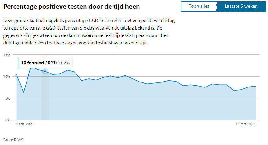
First the good news: of all those tests, an increasingly smaller proportion is positive: It is now around 8%. In the last three days, it has risen slightly (has been 7.6%). According to the National Institute for Public Health and the Environment (RIVM), this is an effect of the British variant. It's already at 90%, so if this is it, it's not too bad.
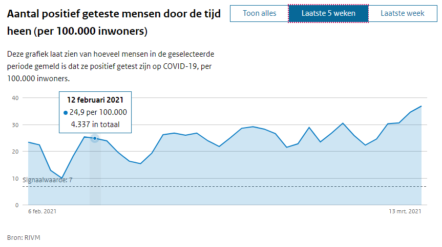
The fact that there are more positive tests is therefore mainly due to the increase in testing, see below:
Then: more good news!
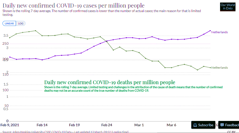
The Covidmortality on the other hand, has halved in the past month from about 70 to 35 per day. See below.

Well, mortality always lags behind the infections, but after a month it should look different. That's why I wanted to put the Telegraafkop in the right context.

Then the sensationally good news
I had also checked ourworldindata to see if that was in line with the rivm graphs and then I saw something else strange. First this graph, which confirmed the picture of rising 'cases' (= positive tests, as far as NL is concerned) and falling mortality, the green line.
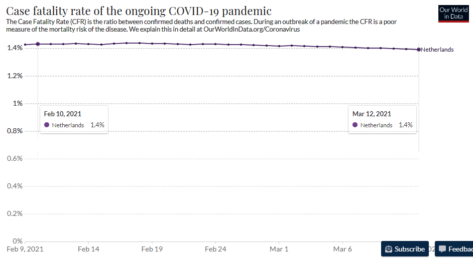
The Case Fatality Rate is the mortality rate among confirmed corona patients (i.e. not the people who, for example, get sick at home unreported or do not suffer from it).
Apart from the height of the numbers (I remember higher CFR numbers): it really is a halving. The numerator will be almost half smaller, the denominator will be almost half larger, so there is no other way.

Above are the corresponding numbers, with the ratio I calculated in the bottom line. Last month, 1.79% of 'Confirmed Cases' died. This month only 0.75%. A halving of the CFR!!! How sensational is that!?
That raises all kinds of questions: Are they secretly using Ivermectin? Or is the virus weakening? Or will the weather get better so that the viral load is less often fatal? Then the admissions would also have to drop and that is certainly not the case.
And then: the miracle
What is my surprise when I looked at the chart of the CFR: the CFR is unchanged at 1.4%??? With some goodwill at most, from 1.43% to 1.41%. I can justify that the calculation is a bit different, but where is the halving!? It's an unknown. On FB or something.
Hier is ook de live grafiek, kun je de waardes zelf checken. (Klik eventueel op "Customize chart" om te kiezen voor Cases, Deaths of CFR, as dat niet zichtbaar is). This is the link to the graph on the John Hopkins University website.
