
Not pretty statistics: a simple graph of the vaccination rate against Covid mortality rate for all countries in the world
Translation of a simple explanation by Dr. Norman Fenton.
With the help of the website "Our World in Data" we have made the latest snapshot of each country the total vaccinations per hundred people and the total 'Covid deaths' per million. The full data per country – in order of vaccinations – can be found at the bottom of this page (all numbers rounded to 0 decimal places).
We use quotation marks for 'covid deaths' because (as readers of this blog will know) this is a very vague statistic and we don't feel confident that it is collected accurately or consistently for every country in the world.
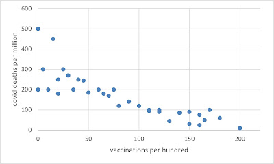
If the data were accurate, and if the vaccines worked as claimed, then we should see that when we plot the vaccinations against deaths. I.e. the more vaccinations in a country, the fewer deaths, approximately as in this example graph with an unmistakable downward trend:
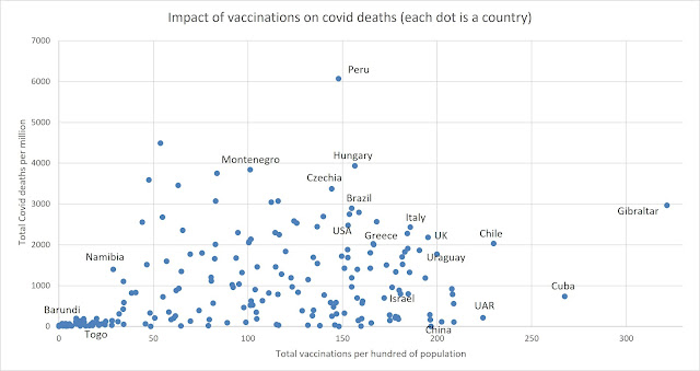
Clearly, there are multiple confounding factors (other than inconsistent reporting) that can impact the relationship (timing when covid first hit, average population age, population density, geographic location, access to healthcare, etc.) not to mention all the missing factors discussed earlier**. Ideally, deaths should also be limited to the post-vaccination rollout (difficult to do that using the Our World in Data spreadsheet). But it's still surprising that the following is the actual plot:
Editor's note
In the article there is a piece about Africa, I left that out because it doesn't add anything. As Fenton himself says, there are many more factors than just the low vaccination rate that can explain a lower Covid mortality. That is why Africa should perhaps not have been included in this plot. Africa is really a different world with huge differences compared to the rest of the world, especially the Western one. Climate, age structure, BMI, ivermectin use, resilient immune systems, registration methods, health care, Vitamin D etc. etc. I hope for similar plots but with excess mortality or better yet: excess mortality instead of Covid mortality and also without Africa, because that is really a completely different story. Continue with the article:
But what it really shows above all is how bad all the 'official' covid data is (look at the laughable China data) and, because of the universally bad data, how little evidence there is of the severity of Covid or the effectiveness of any covid interventions.
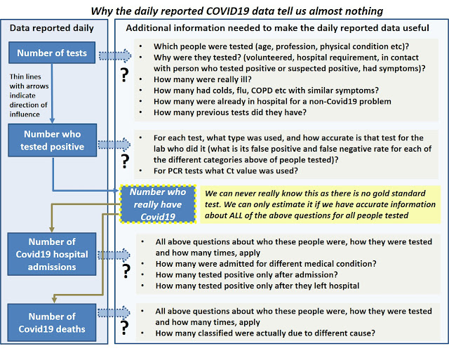
** As we have been saying since March 2020, all the 'official' Covid data are essentially useless because they do not provide us with the necessary information to take into account all the causal explanations for what is observed:
For those who value correlation coefficients for such relationships (we don't), there is a significant positive correlation of 0.31 between the number of vaccines and the number of deaths
Kijk voor de onderliggende data (en het kaartje van Afrika) in het originele artikel