
Not pretty statistics: a simple graph of the vaccination rate against Covid mortality rate for all countries in the world
Translation of a simple explanation by Dr. Norman Fenton.
With the help of the website "Our World in Data" we have made the latest snapshot of each country the total vaccinations per hundred people and the total 'covid-sterfgevallen' per miljoen. De volledige gegevens per land - in volgorde van vaccinaties - staan onderaan deze pagina (alle getallen afgerond op 0 decimalen).
We gebruiken aanhalingstekens voor 'covid-sterfgevallen' omdat (zoals lezers van deze blog zullen weten) dit een zeer vage statistiek is en we er geen vertrouwen in hebben dat deze nauwkeurig of consistent wordt verzameld voor elk land ter wereld.
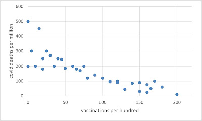
If the data were accurate, and if the vaccines worked as claimed, then we should see that when we plot the vaccinations against deaths. I.e. the more vaccinations in a country, the fewer deaths, approximately as in this example graph with an unmistakable downward trend:
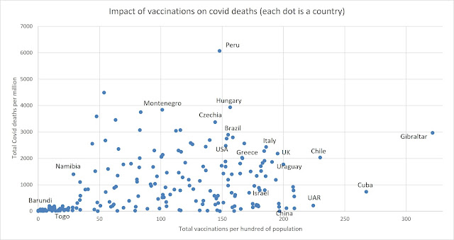
Clearly, there are multiple confounding factors (other than inconsistent reporting) that can impact the relationship (timing when covid first hit, average population age, population density, geographic location, access to healthcare, etc.) not to mention all the missing factors discussed earlier**. Ideally, deaths should also be limited to the post-vaccination rollout (difficult to do that using the Our World in Data spreadsheet). But it's still surprising that the following is the actual plot:
Editor's note
In the article there is a piece about Africa, I left that out because it doesn't add anything. As Fenton himself says, there are many more factors than just the low vaccination rate that can explain a lower Covid mortality. That is why Africa should perhaps not have been included in this plot. Africa is really a different world with huge differences compared to the rest of the world, especially the Western one. Climate, age structure, BMI, ivermectin use, resilient immune systems, registration methods, health care, Vitamin D etc. etc. I hope for similar plots but with excess mortality or better yet: excess mortality instead of Covid mortality and also without Africa, because that is really a completely different story. Continue with the article:
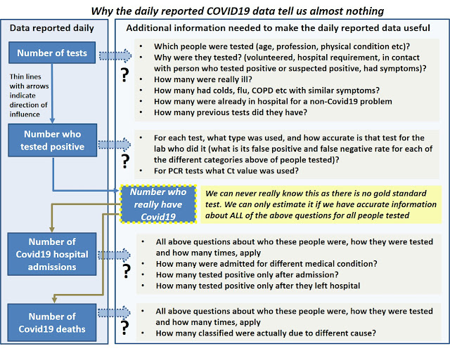
Maar wat het echt vooral laat zien, is hoe slecht alle 'officiële' covid-gegevens zijn (kijk naar de lachwekkende China-gegevens) en, vanwege de universeel slechte gegevens, hoe weinig bewijs er is van de ernst van Covid of de effectiviteit van eventuele covid-interventies.
** Zoals we al sinds maart 2020 zeggen, zijn alle 'officiële' Covid-gegevens in wezen nutteloos omdat ze ons niet de nodige informatie verschaffen om rekening te houden met alle causale verklaringen voor wat wordt waargenomen:
For those who value correlation coefficients for such relationships (we don't), there is a significant positive correlation of 0.31 between the number of vaccines and the number of deaths
Kijk voor de onderliggende data (en het kaartje van Afrika) in het originele artikel
