
The identified spectacular rise of sudden and unexpected German deaths in 2021 would result from errors in the data. At first glance, these were certainly incredibly sensational figures and at the same time: if something occurs as infrequently as 'sudden death', you quickly see doubling or more if anything moves in that area. In addition, the data came from an excellent government institute and the analyst involved Tom Lausen is very familiar with the subject. Several independent reviews broadly confirmed his findings.
Of course there was also a lot of sputtering: various fact checks did not get any further than that Tom Lausen's analysis was incorrect and that the figures were not intended for such an analysis. It is also claimed that the data was deliberately requested in a way that could only lead to this result. In short: panic among many fact checkers, exceptions apart from that.
But: there does seem to be something going on. Where did we fall for it? Have we really stepped into something? Then let's see for yourself.
What exactly has been requested?
Three data packages were requested. The first two data packages were only insured in 2021. This could therefore not include mortality figures from previous years, which would explain the lack of mortality codes until 2021. But the third package was really about all insured persons of 2016-2021.
You are responsible for sending a breakdown of the frequency of all ICD codes of all insured persons - excluding the insured persons from package 1 - for the period 2016 to 2021, if available also for 2022, by quarter. The data must be requested with V and G.
Confirmation data request
Package 3. You request the transmission of a list of the frequency of all ICD codes of all insured persons - excluding the number of insured persons from package 1 - for the period 2016 to 2021, if proportionately available also for 2022, by quarter. The data query should be done with V and G.

It is now claimed that package 3 was delivered incomplete: The insured persons who had already died before 2021 were not included, it would only contain persons who were still registered as insured persons in 2021. So they could not have mortality codes in 2016-2020... Hence the absurd differences with 2021. Willful intent or misunderstanding, we will leave that open.
Yet that is not true either
We assume for a moment that the data did indeed concern people who were still alive in 2021. Apparently, 1 January 2021 has been taken as the benchmark date. If December 31 had been chosen, no death would have been visible, at least according to this reasoning. After all, you can assume that someone, once deceased, is no longer considered an insured person. On 31 December, all deceased persons who died that year were deregistered as insured. Then you have nothing left to report on if you think straightforwardly enough.
If someone who had to collect the data has realized that, it is at least striking that they did not take 2016-2020 with them or else asked what the intention was.
With this in mind, the overall graph shows something strange:
Among the people who were still alive in 2021, one and a half times as many died in 2016-2020 as in 2021 itself.
Read that again.
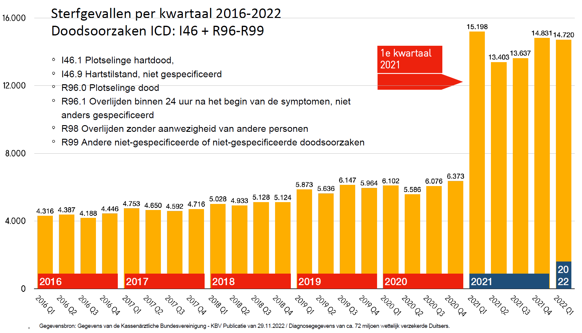
This is conveniently explained by experts as an 'input error'. We understand that; After all, it cannot be the vaccines. But this concerns an input error that has become increasingly easy to make, as evidenced by the slightly increasing trend from 2016 to 2019. We can assume that this trend will continue in 2021. Then approximately 40% of the 2021 data supplied by the Paul Ehrlich Institute is simply fake because there is no reason to assume that those input errors suddenly no longer occurred there...
And if data for the years before 2021 deaths are not included at all, where do those 'input errors' actually come from!?
40% 'input errors', isn't that a lot even for the medical industry?
If it is entered incorrectly at the source, it is not easy to find out. That source is the doctors: it concerns claims (cost reports) that doctors send to insurers. That is why we also think of fraud instead of errors. Doctors would have deliberately given up more actions than they actually performed. This also raises questions and objections:
- Het gaat hier niet om handelingen, het zijn overlijdensomstandigheden, zoals "overleden zonder andere aanwezigen"
- Do doctors get paid extra money if someone dies without other people present...?
- If you, as a doctor, want to increase something, do you do so with the sudden death of your own patients (your customer base, you are reducing your practice) or do you tick extra ingrown toenails, stitches or ear and eye infections? There are undoubtedly less drastic, more common, more time-consuming actions available than the observation of a sudden death that can no longer be done.
Is it sometimes with the health insurers or with the federal umbrella?
Another point of pollution can be the health insurers themselves. They are not allowed to make mega profits, so they could come up with costs to keep the premiums up to standard. Even then, deaths do not seem to be the appropriate cost item, at least if you do not want to make it stand out.
Back to the question: How does this enormous pollution get into the data? Is the fault perhaps with the research institute for vaccines and biomedicines, the Paul Ehrluch Institute, which collected all the data? Cardinal mistakes are also made at institutes, which we have seen repeatedly at our own institutes.
It is good to realize that the situation in Germany is different than in the Netherlands: A 'federal' institute collects the data from the federal states. Each federal state has its own health insurer or 'Kassenärtzlichen Vereinigung' (NRW has two). So there are 17 KVs, united in a Bundesvereinigung.
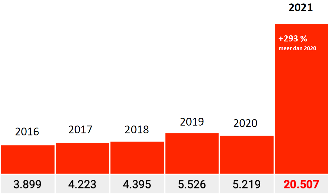
Factor 17
If the federal institute has incorrectly requested data from all but one of the institutes, that could explain this graph.
Then there is one institute that has also passed on 2016-2019, that's where that handful of data comes from. The remaining sixteen have only submitted 2021.

Indication
Can that ever be reconstructed? The institute may have passed on the question directly and only 1 of the seventeen understood the question as it was intended, the rest only on autopilot (after Package 1 and Package 2) also turned out Package three for 2021 only.
When merging the data, there is again no attention. A data-responsible government institute should see that datasets are not compiled consistently. Gene input control? No output control?
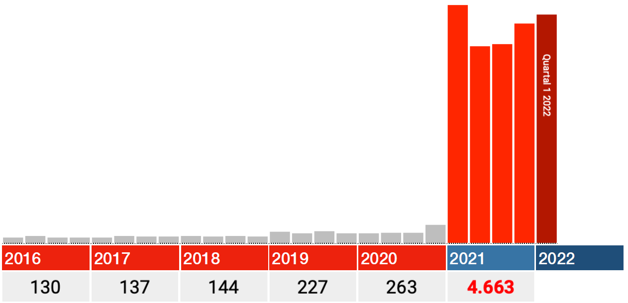
That factor of 17 should then more or less also apply to other Codes. We saw a factor of 16.7, which is in line with that. For the other codes, this should more or less be the case. With some margin, they should be on the order of between 15 and 20.
That is not the case. The factors there are approx. 10, 6 and 3 (only factor 3 graph shown, 293% to be exact). By no means a factor of 17 and the Bundesländer will not be that different, will they?
Factor 0.2
So much for the absurd differences. Let's just look at Code I46.1: Death due to sudden heart failure, then the difference is suddenly only about 20% compared to 2020. What system error or 'input error' could have been made again? Sudden heart failure is a real cause of death, the other Codes are circumstances, maybe that was treated differently? This code was also added later.
Would this be the only graph in which the years 2016-2020 are correctly included? In any case, an increase of 15-20% looks more credible than one of 1700%. The message does not get any less urgent: Investigate this! (and in the meantime stop that vaccination on nothing).
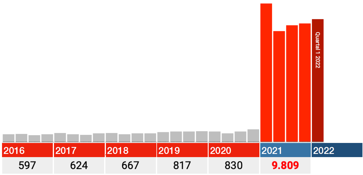
How do other I.46 codes work?
Cardiac positions with successful resuscitation (I46.0) are in line with the normal trend. Data really seems OK.
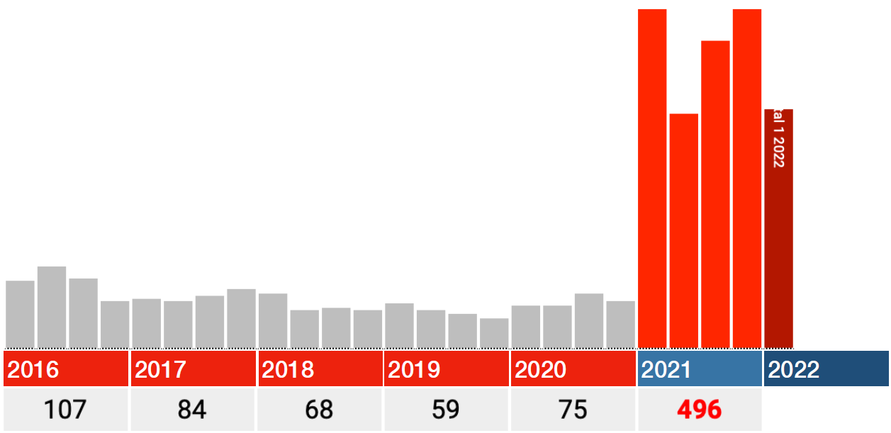
Daarnaast is er een categorie "Cardiac arrest, not specified." Daarin zien we bijna dezelfde jump als in Death due to sudden heart failure.

To what extent the various categories are duplications or overlap, I do not know, not every database design is equally conclusive.
These graphs are generated on https://corih.de/KBV-Daten/index.php?ohneuberhang=1&uberproz=0&mind=0&icd=I46
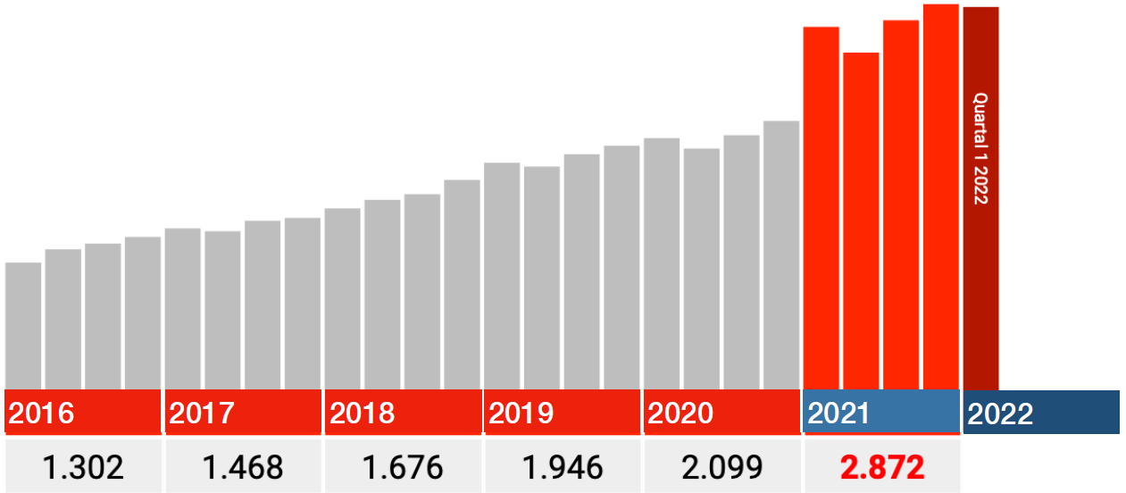
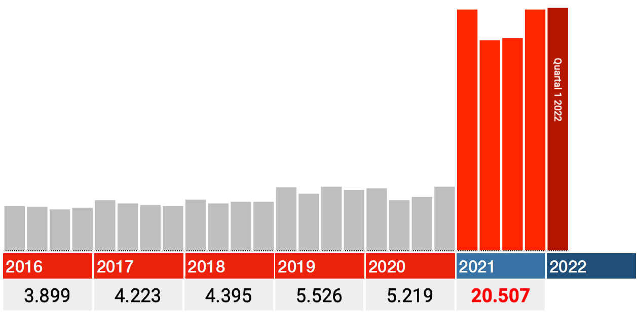
The quarters of 2021 are correct
The data for 2021 also seem to be correct. So only look at the red bars in the graphs below: each bar is a quarter 2021, the dark red one is Q1 2022.
In all categories, the biggest blow falls immediately in the first quarter of 2021, after which the numbers fall back in Q2 and from there rise again in Q3 and Q4.
If there are any ideas on how delayed care, lockdowns or long covid can cause this, I'd love to hear from you. With vaccinations, I can think of something: the most vulnerable were pricked first. Germany started this at the end of December 2020.
from other persons
How does this unfold?
I am very curious about the whole story with which all the above questions are answered:
- How does the pollution end up in the dataset?
- How can the susceptibility to error (degree of contamination) differ so much per code?
- How can some pollutants show a stable/descending trend and others an increasing trend?
- If the data were not complete, are the data from the I46.1 (sudden cardiac death) correct?
Before we start speculating further: first transparency and open data so that we can find out with targeted independent research whether the vaccinations have anything to do with this at all. There is sufficient circumstantial evidence.

"... the biggest blow immediately in the first quarter of 2021, after which the numbers drop back in Q2 and from there rise again in Q3 and Q4 .... If there are any ideas on how delayed care, lockdowns or long covid can cause this, I'd love to hear from you."
I think there are a lot of variables. The Alfa variant became dominant especially in Q1. Contagiousness rate increased rapidly to 50% and at the same time, especially B.1.1.7, turned out to be a lot more sickening than the previous variant.
After that Delta came as dominant but by that time you have possible influences of vaccinations and lockdown, built-up resistance and so on. For me, the rise in Q3 is more puzzling.
Another problem with Q1s are sometimes after-effects from the end of Q4 of the year before. People get sick more often in a Q1 precisely because a lot of resistance disappears in Q4, winter, food, sitting at home, etc.
Those are not really typical variables for heart failure or "Less than 24 hours after the onset of symptoms, not otherwise specified". Looking at previous Q1's, this one looks pretty bright.
I'm afraid that the data pollution/incorrect input is a plausible explanation.
You're dealing with government agencies. I also work for it and if there is a bad deal with data somewhere, it is with governments. Why don't they do anything about it? For 20 years I have been providing solutions for simple registrations that have been going wrong for 20 years due to wrong processes and none! data management, I'm right and people love it, but then they don't get a foot on the ground and they don't do anything.
Another problem may be that due to the spontaneous focus on data and figures, suddenly everyone has started to enter more serious figures. For example, I made up figures for CBS statistics for years because the requested was nowhere in our files. They demanded an answer and got one, for the source the data is worthless so sowhat. And there was never a fact check by CBS by, for example, requesting the figures elsewhere or otherwise.
And why does the government never do anything about this or even don't want to do anything about it? Firstly, it is very useful for the government not to have good data. (saves black ink for bars) You can then (apparently) continue to waste millions without any problems and no one does anything about it or understands anything about it. Secondly, this is the easiest way to cover up the truth. Suppose the vaccination causes only 5% more deaths, bad enough in itself to stop of course. But if the figures start to deviate as they do now, they become implausible and the "real" 5% disappears due to the collapse of, for example, the 17% when Tom Lausen's report can be undermined as far as that 17% is concerned. Then when the data problem becomes known, can be solved, he does not have to come back with the "real" 5%. Credibility has been lost.
The government also deliberately keeps itself stupid. In the land of the blind, one-eyed is king. For example, by appointing a management that knows nothing about the content and by systematically promoting the real content experts in dead-end positions. This has been happening structurally at IenM since 2004, hence one scandal after another or blunders and budget overruns of millions in a year. Also look at the nitrogen approach, misplaced sniffers and bad data and then a model that you can set exactly so that the farmers you want to get rid of are shown as peaks in the map. Fishing is also being pilloried again by wrong data, etc. etc. Data is a weapon against the population and they use it everywhere. And you just have to be stupid for it, the most important competence to be a civil servant alongside a university education in lacemaking.
You confirm my worst suspicions...
Typically, it is now claimed that these data are not suitable for drawing conclusions (in this case about trends in causes of death), while during the entire pandemic the number of positive corona tests was used without any criticism as if it were a representative sample of the population. If the data are complete (and if not, they simply need to be supplemented) it seems to me that the chance of bias in this case is many times smaller than in the case of corona tests.
By the way, I can well imagine that the data was not accidentally delivered incorrectly. By giving the data the appearance of an unrealistically strong increase, the whole story immediately becomes suspicious. Although in Germany alone the association with AfD actually ausreicht for that.
Kerryn Phelps top doctor and politician in Australia, seriously and permanently (?) ill after 2nd Pfizer vaccination. Revealed that doctors in her country are being censored under penalty of high fines and loss of registration.
https://www.smh.com.au/politics/federal/not-anti-vaxxers-dr-kerryn-phelps-says-she-suffered-covid-vaccine-injury-calls-for-more-research-20221220-p5c7ry.html
The 'top doctor' Kerryn Phelps is also a big proponent of lockdowns, vaccination and mouth mask requirements, also indoors. In September 2022, she called for all strict covid measures to be reintroduced!
With such hard-learned medics, no pity fits. Karma is...
Ik heb het artikel uit de Herald vertaald https://virusvaria.nl/oproep-van-australische-hardliner-met-vaccinschade-wij-zijn-geen-anti-vaxxers/
Was the reason for anonymizing Dutch excess mortality data perhaps to prevent the Dutch people from finding out through BSN numbers that only a small part of Dutch politicians have actually been injected with Spike protein mRNA, just as was noticed in Japan:
https://twitter.com/riseupandresist/status/1599160471046983680
In addition, we need to look beyond just (excess) mortality; Also increase in the disease itself (cardiovascular, pulmonary, neuro, etc.).