
Until the end of April, so for more than a month, ICU admission was almost a death sentence. This was evident from the figures of the NICE Foundation. 66% of the patients died despite/from the treatment. Even when that continued, it was never substantiated why the IC was important enough to shut down the country.
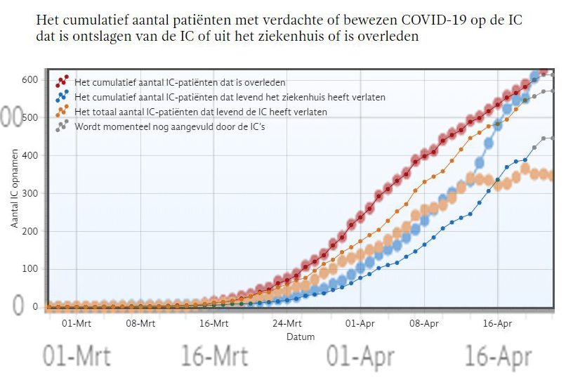
The first reflex to treat breathing problems with intubation is understandable. It soon became clear that this resulted in dramas. These were therefore widely reported in the media: "the disease is terrible". The treatment continued stubbornly, despite the almost live reports from the ICU about how inadequate that treatment was. Because that's what we were looking at, not a terrible killer disease. That situation continued for weeks and the country was shut down so that no one had to be denied that treatment.
If we only look at the deceased and those who left the hospital alive, the ratio is almost 2:1.
N.B.: The orange line also has an influence but we do not know what percentage of them survived. If we put that at 50/50, the number of deaths still remains almost 2/3 of the total.
Red line: deceased ICU patients: approx. 540.
Blue line: discharged from hospital: approx. 450.
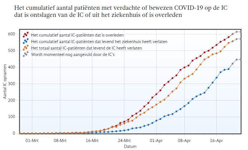
Fortunately, in retrospect it went much better then!
If you look at that graph again now, you will see that mid-April looks very different. It suddenly turns out to have gone a lot better. On April 17, the blue even crosses the red line.
The disease was still the same so it is guessing what happened there. Different treatment? Better triage? Didn't start with hopeless cases anymore? Or was there perhaps something wrong with the reporting?
Red line: deceased ICU patients: approx. 540.
Blue line: discharged from hospital: approx. 650.
Data changed retroactively
This positive trend is not yet visible on the graph dated 18 April. When comparing the two graphs, something else is also striking: on the graph of 18 April, the ratio of roughly two-thirds had died, one-third had left the hospital alive. If we look at the same graph now (on 3 July), we see a fifty-fifty ratio: according to this later graph, as many people had returned home on 17 April as had died after ICU treatment. So what has happened to those figures in the meantime?
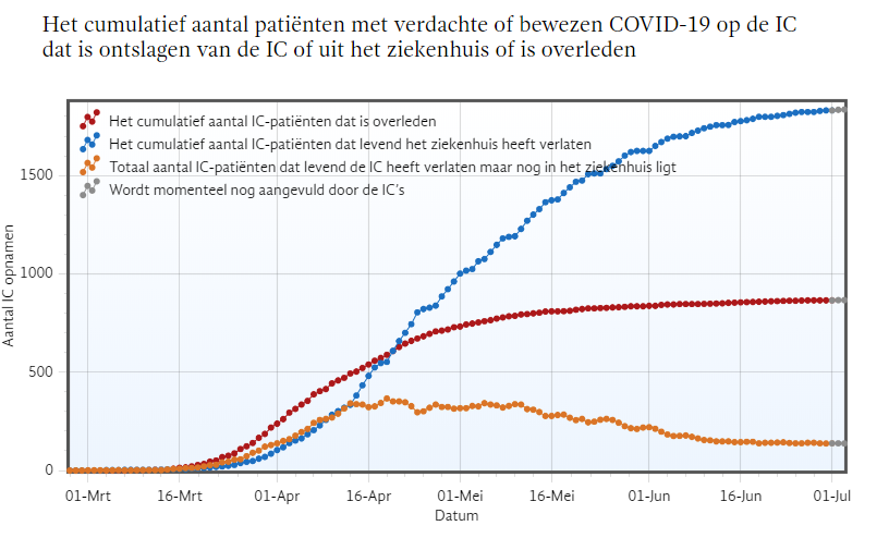
The Fat Dots: Report of July 3
The striking thing is that the mortality figures, represented by the red dots, are not touched. That is not possible just like that, they are attached to other databases. The number of patients who were still in hospital from the end of March, on the other hand, has been significantly reduced. At the same time, the number of patients who had left the hospital alive at that time increased significantly afterwards.
On April 20 (last dot on the right), 450 "discharged patients" were reported at the time. In the data now presented, that number has become 650. How can you be wrong by 200 patients? 10 patients are missing, I get that, but 200 if you count 450..?
The line starts to diverge as early as the end of March. You're not going to tell me that the "from the ICU discharges" reports take three weeks longer than the mortality rates, are you?
In any case, the data on which the steering was done at the time were not correct. Then I assume that they are now and have therefore been corrected afterwards. The country has been shut down on the basis of incorrect data.
The figures will now be able to counter future critical questions about the substantiation of steering in the ICU a little better than the original report could have done. RIVM will be able to use that well.
[EDIT: These numbers have never been paid attention to]
0 reactions