
A real 'blog' article: report of my LinkedIn trip last weekend to LinkedIn and back. A journey past IFR deniers, steaming sewage water, anti-CBS extremists and vaccine knights where there is nothing to fight. tl;dr? Despite ChatGPT's glowing review?
See then (also found in the new Calculators menu item) the shortened version.

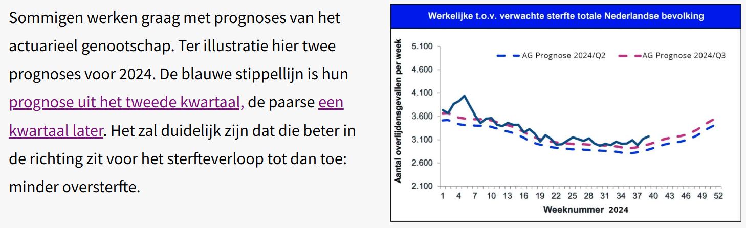
On LinkedIn I posted a summary of the last article about Norm Mortality1RIVM emphasizes the need for standard mortality model, met een link naar het artikel. In het verleden werd alles met "virusvaria" erin van LinkedIn verwijderd, ook als universiteitswetenschappers er iets van deelden. Ik was nieuwsgierig of dat nu nog steeds zo zou gaan. Nou, dat heb ik geweten. Het hele weekend bezig gehouden. Het was maar een handjevol LinkedInners, maar jeetjemina, wat een felheid. Maar ik heb mij kranig geweerd. De post staat here but you'll finish faster if you just read on. 150 comments...
As we know, the Standard Mortality Model is a way to calculate excess mortality. A few actuaries joined the discussion, but apart from a link to the latest report from the CAG (already known) and some sneering about vaccinations, I received no substantiated information or answers to questions. They had long had a standard mortality rate, they said. I have written before that the Royal Actuarial Society has been shifting their baseline considerably in recent years to keep in line with mortality.
The blue dashed line was their forecast AG2022. They were still using that in 2024/Q2. In 2024/Q3 they used a new one: AG2024. See the difference in a picture from the September 2024 article.
That is exactly not Standard Mortality, because it does not allow for that nervous chasing. So they hadn't read anything. Delayed care was also reported2previously covered: https://virusvaria.nl/uitgestelde-zorg-en-oversterfte/ and sewage water measurements as causes for excess mortality. No substantive comments about the Norm Mortality model.
The style of communication was also striking. Lots of sneering, lots of disdain. Only real professionals are allowed to deal with this matter. It's all way too complicated.
(Long) Covid
Een van de opmerkelijke mededelingen was dat er helemaal geen onverklaarde oversterfte is! Ik begreep het alleen niet omdat ik het niet wilde zien omdat ik alles op vaccinaties wilde gooien (dat weer...). Alle oversterfte zou, ook volgens sommige actuarissen, toe te schrijven zijn aan Covid of Long Covid. Biomedische onderbouwing voor dat standpunt ontbreekt weliswaar. Dat de ziekenhuis- of IC-opnames niet in de pas lopen zegt ook niks want "mensen kunnen ook thuis doodgaan". Anne Laning, die bekend is van de correlatie tussen Covid-sterfte en rioolmetingen, gaf tenminste nog wel een aantal studies die zouden aantonen dat Long Covid de oversterfte kan verklaren.
I looked through it with interest. Most of them boiled down to the following: "Mensen die vanwege een Covid-infectie in het ziekenhuis opgenomen zijn geweest, hebben een aanzienlijk hogere kans om binnen drie jaar te overlijden. 29% meer in het eerste jaar na Covid-infectie, aflopend naar 7% in het derde jaar. Conclusie: Covid zorgt voor extra sterfte op de langere termijn.
Then correlation suddenly becomes causation again.
Want je kunt natuurlijk ook zeggen: Covid is een typische "laatste zetje" ziekte. Dat zie je aan de overlijdensleeftijd van Covid-patiënten. Een flink deel van degenen die vanwege Covid naar het ziekenhuis moesten -en er weer levend uit kwamen- had succesvol uitstel bedongen bij de man met de zeis. Maar dat wil niet zeggen dat ze van zijn lijstje waren geschrapt. Bij de eerstvolgende gelegenheid waren ze alsnog aan de beurt, en anders in het seizoen daarna wel. En toen was hij weer bij.
(Anti)vax
Vaccination was mentioned repeatedly. This does not occur in the entire Norm Mortality story, but I got the impression that they wanted to prevent the vaccinations from coming into the picture when the excess mortality was examined more closely. Several times I emphatically requested that the subject be limited to the Norm Mortality Model, but that was difficult. If you say anything about 'unexplained' excess mortality, you will soon become an anti-vaxxer and FvD voter, while they themselves are the ones who immediately make the link between Standard Mortality and vaccinations.
The excess mortality could therefore be attributed almost entirely to Covid, it was argued. 'After-effect of Covid' was also mentioned, but that is more difficult, because it is now 5 years later. That 7% of those ever hospitalized (after three years) is of course only a fraction of the excess mortality that we saw in 2024, and moreover, it has already been 4 to 5 years since the large, more virulent waves came along that could cause the 'after-effects'. We also knew these after-contractions from other acute infectious diseases such as flu (they also have a name: PAIS). But this is solely about: 'mortality'. As if that's just a number. An abstraction, a Covid specter that haunts the sewers and causes people to die at home, because we do not see synchronous hospital or ICU admissions. So to what extent the supposed postponed Covid damage - and once delayed planned care - still contribute substantially to mortality, and above all: how, those are still question marks. And no one answered that. But it just was, if you wanted to see it.
Calculate
According to CBS, the excess mortality in 2024 will be between 12,000 and 14,000, although ChatGPT could not find a firm CBS statement on this (RIVM reports on this, not CBS). CBS also reported the Covid deaths in 2024: 1,225 to be precise. It was agreed on LinkedIn that this is of course a gross, very gross underestimate. There's nothing wrong with that. In that respect they are bigger wimps than we are (you, readers, maybe too, but I am talking about Herman Steigstra and myself here); At least we are still looking for a connection with the CBS source data, although we do not agree with their interpretations.
I do not know the age structure of these 1225, but if the average is around 84 or above, or with comorbidities, then they do not even contribute to the excess mortality.
Not to mention the WHO instructions to inflate the cause of death 'Covid-19', as can be read on the government site vzinfo.nl3Register COVID-19 as a cause of death where possible: vzinfo.nl.

back to 2024: at least 12,000 people died from Covid that year - how do we achieve that? It is even more than in 2020 when vaccinations had not even been done yet!4By the way, more than some years afterwards, in which vaccines did protect us - at least maybe not you directly and neither did Herman and me, but all those others did it for the other and that must have been us. I guess. That did work well.
I tried to calculate it, but in vain, people quickly jump back onto the other leg. It was explained to me that I did not want to understand that Covid deaths can indeed occur with an incomplete vaccination rate and a vaccine that is not 100% effective! It failed my logic. Whereupon there was some arguing about the height of the IFR or something else.
Once I got home, I set up the calculation below in a calculator. Think about it for a moment. I'll take some plausible easy example numbers, you can fill them in below.
Manual
The idea is that we should see how many people would have died from Covid in 2024 if we successively included:
- Vaccination coverage
- The vaccine effectiveness
- The spread of the virus
- The IFR (lethality as % of infections)
If vaccination rate Let's now take 80%. That's high but OK. Moreover, the elderly are more vaccinated, and that is where most deaths come from, so that's good. That leaves 20% unprotected (including many young people).
Then the vaccine effectiveness: go ahead, also 80%. We now know that that was wrong at the time and that it is no longer true in 2024, but the actuaries on LinkedIn do not know that, so I go along with their own assumptions. So 80% of those 80% vaccinated are: 64% really protected. The remaining 36% is susceptible to a symptomatic infection, 'immune-naive'. We also ignore the fact that almost everyone now has natural immunity, otherwise we will never reach that 12,000. And there will probably be new variants that will make you sick again every few years.
Then comes the distribution. If a virus infects 15% of the population in 1 year, that is a lot5Insightful research: https://www.rivm.nl/pienter-corona-onderzoek/resultaten. For example, at the end of 2020, only 5% were infected. In the Omicron wave it happened much faster, but fortunately the virulence was very low. Infected people were immunized but rarely sick; you would almost think of a chemtrail vaccine6This is to upset any LinkedInner who may be secretly reading along.
Even though there was no clear Covid wave in 2024, but according to sewer measurements there was, we assume no less than 20% spread, despite the built-up immunity. Of the remaining 36%, that is 5.4% of the population that is actually infected by the virus.
What percentage of that 5.4% would die? That's what the Infection Fatality Rate tells us. The IFR we only set it at 0.15% (so you can adjust), while here and there values of 0.05% and lower are also reported, thanks to immunity and the mutations that strive for higher contagiousness and the weaker, the more chances to infect. So that will be a very small part of that 5.4%, that is... 0.008%. Anyway. Look at the calculator below, the absolute numbers are given there. In the last lines you can see which number you are short of achieving that excess mortality of 12,000 with Covid alone.
Responding to the suggestions on LinkedIn, this shortage can be made up in two ways: if 'Still Covid' (where you see what the IFR of Covid should have been in 2024, thanks to the sewer ghost) and 'Vaccination after all', where you see how many people per 100 vaccinated people should have died.
Judge for yourself which option is the most likely of the two.
You can adjust the white text fields. Have fun!

Footnotes
- 1
- 2previously covered: https://virusvaria.nl/uitgestelde-zorg-en-oversterfte/
- 3Register COVID-19 as a cause of death where possible: vzinfo.nl
- 4By the way, more than some years afterwards, in which vaccines did protect us - at least maybe not you directly and neither did Herman and me, but all those others did it for the other and that must have been us. I guess. That did work well.
- 5Insightful research: https://www.rivm.nl/pienter-corona-onderzoek/resultaten
- 6This is to upset any LinkedInner who may be secretly reading along

Nicely done.
But unfortunately it won't convince the non-wappies.
Maybe in about 2 or 3 years?
Thank you Jan. Don't be so dejected! You would think that there must be some who can do math.
Let's invite them to fill in their parameters on the tl;dr version in the menu “Calculators / Covid Mortality Calculator”:
https://virusvaria.nl/de-covidsterfte-calculator/
Maybe it will give the silent wappie community something in their hands that they dare to share. After all, it is just a calculation, there is nothing conspiratorial or anti-scientific about it.
But yes, wappies are soloists. They don't like to parrot anyone, they mainly like to share what they have come up with themselves...
Have you perhaps already considered that the standard mortality that you calculate for the years 2010-2019 may not have been good standard years at all? You act as if there is only one way to calculate the correct standard. A (small) deviation in your standard years has a significant impact after 5 years and can easily cause a hole in the calculation(s) of 1,000 extra deaths.
You could calculate with deviations by, for example, stating that mortality can deviate by 1% or 2% per year, and also develop a trend with these deviating numbers. In my opinion, you seem more credible if you speak with, for example, expected mortality = 172,000 +/- 4000, instead of 171,892.
With such a margin of uncertainty you already explicitly indicate that mortality can fluctuate, and not every death has to be directly related to 'unexplained'.
In addition, I have also pointed out to you several times about weaknesses in your calculations. Nevertheless, you continue to irreverently repeat the same tune.
When others do that, people complain. Don't get me wrong, I really think you're concerned. But I don't think the soup needs to be eaten as hot as you serve it.
Also look at the trend before 2010. Then you will see that mortality can fluctuate and long-term trends can change. Perhaps a gradual increase was coming anyway, for example due to constant cuts in healthcare.
I also think that the standard mortality calculation is far too linear, without taking into account other phenomena such as aging and other macro effects.
Good point to indicate a margin.
Determining a “norm mortality” with models (even if it is “only” a linear regression line or, if necessary, a cubic spline) remains difficult.
But it is a bit nonsense to say that mortality went in all directions in the past.
You can clearly see from CBS data that there was a sharp decline until 2010. And then somewhat gradual.
And also that there are some bumps in flu years.
And finally, the point that Anton rightly makes, in my opinion, is that this will suddenly end in 2020. Or actually only in 2021, because 2020 was actually a fairly normal year with its Corona peak.
But 2021 and beyond will really be a trend break: you will see that the old mortality rate will not return, but will remain at the 2020 level. And that is (unexplained) excess mortality.
I am still in favor of not using a model and simply showing the mortality per year per age category of 10, 5 or, if necessary, 1 year, per 100,000.
Then you immediately see that things will go wrong in 2021. And that we are still not completely back to the old level.
The question then remains: is this long Covid, deferred care, psychological distress, vaccinations, or something else.... In my opinion, Anton has reasoned fairly well that it cannot be the 1st 3.
The whole sore point in that mortality per 100k is the absence of a flu wave in 2019. That is the last data point in your model / regression line / or whatever you want to call it, and this will depress mortality mainly among the 80+ in the following years.
It is unlikely that the following years will pass without flu.
In addition, the Netherlands has the largest aging population in all of Europe. And 80+ die much more often than 65-min. The absence of a flu wave immediately results in a significant correction.
Make this a nice mix, and you can claim anything based on statistics. This does not necessarily have to be the truth, but it can be statistically substantiated. And then you can create enormous excess deaths that then have to be explained. And yes, those statements make no sense. As far as I'm concerned there is no discussion about that.
About how to achieve a good standard mortality rate. But that cannot be compromised. Apparently there is only one good calculation for that.
Completely agree with your criticism of an excess mortality model.
But you are wrongly including the aging of the population.
Aging is a consequence of lower mortality at lower ages, so that you are left with relatively more elderly people.
But eventually everyone dies.
So the mortality per 100,000 of elderly people is higher.
Therefore: neatly map out the mortality per age category per 100,000. That is not a model with all its limitations and assumptions.
You immediately see that things will go wrong from 2021 onwards in almost all age categories.
Or not?
You think a little too easily. Flu waves almost only affect over 80 year olds.
Below 80 the fluctuations are so small that you can work well with regression lines.
Despite the high/low economic situation in the summer and winter months in various subgroups, an active flu virus can significantly increase mortality among people aged 80+.
Mortality per 100k therefore experiences considerable fluctuations.
I posted the following on X.
https://x.com/BonneKlok/status/1941258973111525834?t=pUtyhNoXoNRH-ImvU96YYA&s=19
Season 24/25 had an average mortality of 80+. Rather too low in the bandwidth than too high.
I wouldn't know how low the baseline would have to be to eliminate those 12k unexplained deaths.
The problem arises from data point 2019.
https://x.com/BonneKlok/status/1957136213803933904?t=QFUN0iBJRVDcpAoxjObjaA&s=19
This pulls down the expectation/regression line for 80+.
So if you blindly assume mortality per 100k, and you don't check whether your data points are stable enough to draw a regression line...
If your population also grows quickly, your expectations will quickly become very low and there will suddenly be thousands of unexplained deaths, while if, for example, you ignore data point 2019 (flu-free winter) and then draw a regression line, the current mortality numbers are not that crazy.
Call it a model, call it mortality per 100k. You cannot accept heavily fluctuating data points as truth using a 'statistically pure method'.
Oops, unfortunately my answer is in a separate post.
But if the IPCC presents some numbers very selectively, is it causal?
Persistence wins:-). But even your impeccable logic is no reason for these people to doubt. Or could there be a hint of doubt emerging? It's admirable that you keep this up.
It has become a religious 'debate'.
I just saw on RTL news that people are still getting their shots, the white coats are still warning about Corona... 2025. Pure propaganda and 100% nonsense. What does that say about the other news items?
You yourself give all the arguments for not using a model and/or regression line, but simply taking the mortality per 100,000 per age category.
1. The better that at 80 (or 65) flu has no effect. Then it is even more noticeable that mortality/100,000 has increased there (according to Herman Steigstra).
2. According to CBS, by 2025 (life expectancy) should be back to approximately the old level (2018). But the decline has been interrupted. So that is a certain degree of excess mortality.
3. “So if you blindly….” totally agree. let the graph per 100,000 speak for itself. But you should have a series of separate graphs per year or so per age category. I think it is already very confusing in your tweet with those dozens of lines...
4. “If your population also grows…” completely agree. Therefore I would like graphs/tables per 100,000.
The key question is therefore whether there are age categories in which it is evident that deaths/per year/100,000 have shown a "strange pattern" (increase) since 2021. Unfortunately I don't have those graphs here. I'd like to see another really decent set of those graphs or a table/age range/100,000. And then just per year, so not per season. Or if necessary from July to June per year.
Do you have that?
Herman calculated the Standard Mortality on the basis of those tables. After all, mortality per age per 100K is the same as mortality probability per age. Growth and aging are part of that and deviations from that trend are very small from year to year. After all, we know the mortality rates and population structure, so we also know quite reliably how many people there will be in each age group next year, and in two or three years too - but then there are fresh data for the age structure.
New mortality probabilities are also available, but if they have exploded unexplained (2021 trend break), we believe that you should not accept them as a reference.
To see what a “strange pattern” is, you will need some kind of forecast as a reference. That will always remain a modeled future expectation, no matter how simple you make your model.
It is precisely about a formalization of what you call “strange pattern”. Which reference are you going to test against, when does it deviate sufficiently? With a wet finger, because we are experts...?
Of course that's not possible.
We can plot a bandwidth of 2 σ, for example (see mortality monitor for the weekly band, also the seasonal graph for the annual band). But you will first have to agree on the choice for mortality per 100k (= observed mortality risk) per age group, added together proportionately for convenience.
We have also looked at how to extend that line using the long-term curve. It is a flattening, actually almost flattened curve. A linear trend hardly differs from a curve over a period of a few years. (If you take the average you are a little too high).
You can group/merge ages as desired depending on your personal preference. You can also raise awareness afterwards, such as removing/adding flu peaks for a more even picture, as Bonne emphasizes, or correcting something for the missing 2019 flu peak and then also include the associated under-mortality. But it seems to me that we first need to understand that basic concept.
I speak for myself, but I think Herman agrees with that.
I have tons of graphs.
But that annual mortality is also a confounder. Since mortality peaks in the winter, and therefore the peak of increased mortality sometimes counts in the previous year, and in the case of a late peak, in the following year.
Therefore it is better to divide (Northern Hemisphere) on July 1. Then you are always in a bad economic situation.
But you have not understood my argument, I notice from your answers.
Well Bonne, if someone has a certain view, that doesn't mean that he doesn't understand something, right? Then try to explain better what he would not understand.
I just note that my previous argument is not understood.
Even with the most 'simple' comparisons you unconsciously make assumptions. I'll explain that.
The assumption is that all mortality in the years 2010-2019 is comparable. And you can therefore continue them into the future. Another assumption is that January 1 provides a 'good' separation to start a new period.
It's great that that's someone's different view. But that does not automatically mean that it is the best approach to the 'truth'.
In addition, trends sometimes want to change. First picture in next post.
https://x.com/BonneKlok/status/1928774349412028694?t=VpOvASg_ltK9e8FldnJW5w&s=19
That's why most demographers look at the 5 previous years.
Now I understand that this is clouded by Corona.
But in my opinion, that makes it all the more important not to make too harsh statements about trends from more than 10 years ago.
And don't simply put a bandwidth of 2% around your predictions. But work is showing a trend line, with 2019 mortality being 2% higher. Or the mortality of 2010, 2% lower. And see how you end up in 2025.
In short, focus now is not just on one method, but broaden your view. If all those different methods all indicate the same thing, then you are probably close to the truth. However, if you create a wide pattern of expectations, I think you have to make a good argument as to why all those other methods are not good.
Totally agree with your cmt. over the wrong border on January 1. That causes distortion. The only question is whether there is enough data to set the limit at 1-7...
Do you have a link to those tons of graphs?
I also have difficulty with an indicator that is created with a "weighted addition" or "proportionally justified addition" of deaths. That is another model that can easily be challenged. I prefer to check the “bare figures”.
I also noted a few years ago that it is illogical to assume that mortality will continue to decline indefinitely. And that idea behind “the standard mortality” does cause significant extra excess mortality.
I would still prefer to have unedited graphs in which the mortality / 100,000 / age category is plotted per year from 1/7 - 30/6 (x-axis) (so a separate line for each age category). And where a downward trend comes to a halt on a plateau does not seem to be a problem to me. But where a downward trend starts to rise in 2020/2021 and does not quickly return to the old level, there is a serious problem. And not too many lines in one graph, so that it is really clear what happened. And where we stand now (6/30/2025).
If there is clearly something wrong with those types of graphs, I think you can convince everyone that there is indeed. something is wrong. Even RIVM people. But not with models and composites. That obscures things far too much.
I meant that you can't just add up mortality probabilities. The absolutes are simply added, nothing has been ASMRized or anything like that. You could therefore miss fluctuations among young people, for example. But that is not the problem at all. You can see this with a 0-65 year line, if necessary in 10 year cohorts. But if you prefer to make 100 graphs, that is also possible. Love, m/f, there are big differences there too.
If you have multi-year series of figures, you can choose from which date in the year you make selections for graphs. You will only miss the first year of your series because it is no longer complete, that's all. What do you mean by 'enough data'?
See the seasonal graph on mortalitymonitor.nl
If the excess mortality resulting from the bare aggregated figures has now become a problem, then we indeed have a problem. But those numbers are what they are, just totals. The discussion should be about how to implement them.
What seems to me to be a sensible experiment: to investigate how you do not remove or invent the flu peaks, but smooth them over the years. So, for example, you take everything above the baseline from all excess mortality weeks in reference years and redistribute it evenly over the same years. It will make a difference, but I don't expect miracles from it.
I am amazed that RIVM staff would be convinced by individual annual graphs. It seems strong to me. Make them, no shot is always wrong. But we know that in periods of excess mortality, each age group is taxed extra for approximately (don't quote me on it, it's a rule of thumb) the same percentage. That is not difficult to understand and I think it can be demonstrated without having to make 100 graphs. Maybe that will help if you distrust both the RIVM three-way division (0-65-80) and the absolute totals. To extend those totals, on the other hand, you use all 100 mortality probabilities per age and the population growth per age. You calculate this per age, extrapolate to an expectation per age and total it again for your forecast point in the graph.
I wouldn't put too much work into it; I don't imagine much of it. I can see if I can dig up that table. Min says Herman has it, maybe it's in the attachments on Researchgate. Do you perhaps have that, Bonne?
The problem with this beautiful, and apparently very convincing, graph is that it has a controversial model behind it. There is a controversial standard behind it. That's why it's not convincing.
By the way, we don't need tons of graphs at all. There are only 9.
This is what I think we need:
9 Graphs with the years from July (thanks for the tip about “July” instead of January to Bonne) 2000 or possibly. July 2010 – July 2025 on the x-axis, so 25 or possibly. 15 points. Not splitting it up per month, that distracts from what you want to make transparent: simply mortality per year per category per 1,000.0(0)(0).
And then on y-axis:
Deaths per 100,000 (or 1,000,000 or even 10,000?) of the categories:
0 – 20 years
20- 30 years
30 – 40 years
40 – 50 years
50 – 60 years
60 – 70 years
70 – 80 years
80 – 90 years
90+ years.
So those are 9 graphs, which you could best combine into 2 collective graphs with a scale of per 1,000,000 and per 100,000, I suspect (maybe even one per 10,000?; then you have 3 graphs with 3 lines in each).
Those graphs should decline and peak in 2018 and 2020. But we fear that from 2021 onwards they will continue to show far too high a figure.
Then you have the bare, naked truth at your fingertips and you can immediately see what the trends per category look like. No model, no manipulation. So irrefutable. I don't think I've ever seen those graphs before. But I suspect that they will be disconcerting and will convince all scientists, including from the RIVMCBS, if strange patterns can immediately be deduced from them. And perhaps RIVM/CBS have secretly made those graphs and are studiously NOT publishing them. Because then, in my opinion, the dolls are really dancing. Even with Maarten Keulemans... If it were different, CBS/RIVM would have published these graphs themselves a long time ago to squelch "all that nonsense about excess mortality". They really aren't stupid there...
So, what are we waiting for. I have not maintained any databases myself.
But for those who did, these 9 graphs should be able to be produced in a few hours.
I like to be surprised...
Totally agree. I have seen those types of graphs a year or so ago, and also made them myself (less refined age groups, trade-off between noise and precision). But those were absolute numbers from January 1, if I remember correctly, per 100,000 is of course better over a longer period of time and mid-year should cause less fluctuation.
Unfortunately, I am now on holiday without a computer. But it was certainly very clear, without the need for suggestive trend lines or “norm mortality”. Just the hard figures over the last few years in bar graphs.
Absolute numbers are of no use to you. It should be /100,000. Otherwise, immigration, growth, the shifting baby boom and the aging population will pollute the figures far too much.
With /100,000 graphs, this is all as good as filtered out.
Then you really see how many 100,000 of a certain category do/do not die. And that's what we need to know.
Yes, for the longer term – we already agreed on that.
I have a version in excel on 5-year bins.
I always split the data into summer (week 20-39) and winter (week 40-52-19). While winter tends to fluctuate, summer is actually always quite stable.
And that's where we see deviations.
Since corona/vaccinations, the baseline has shifted at 0-65 and 65-80.
https://x.com/BonneKlok/status/1919400748737024380?t=dRBc8n1CKtS_KbTZkqWTnA&s=19
Hardly any changes at 80+.
And we still observe that staggered baseline. Also in the summer months. At 0-65 it seems that we are returning to the old baseline.
65-80 remains elevated.
If you compare the 5-year groups, you will see this outlier less strongly.
The 65-80 group is also the group where the first boomers moved in in 2010. It may also be that those relatively healthy 65-year-olds pushed down the mortality per 100k in the 65-80 group for a few years. And therefore generated relatively low expectations.
On the other hand, it doesn't explain the jump. You would rather expect a curve.
All in all, I think that the figures at 65-80 show such abnormal behavior that this could well be seen as a form of vaccination damage. Summer 2020 (corona, no vaccine) shows a data point close to baseline. Summer 2021 (corona, but vaccinated) suddenly shows a much higher mortality.
At 0-65 kind of the same pattern. But a little less intense.
I suspect that if the causes of death are also examined, we can be certain that vaccine damage will emerge here.
VAT If you give me your email, I can send you the excel.
Despite the fact that there were no real measures, not even a mandatory face mask requirement, no vaccines, no high natural immunity level, there was virtually no corona at the end of spring and early summer of 2020 and mortality with and from corona was virtually zero. At the beginning of 2021, the natural immunity rate was approximately 33 percent and approximately 50 percent in the summer of 2021 when almost everyone had been vaccinated, people were wearing masks and there was much more corona in that summer than in 2020. The stuff did not work and was counterproductive because those vaccinated took more risks.
Natural immunity worked 15 times better according to Israeli research.
Very interesting.
Email = info@janvdzanden.nl
I'll start a new thread with a detailed answer...
“back to approximately the old level (2018)” is pure delusion from CBS.
What it's like: Our steady improvement in public health has been set back 7 years. The question is how long it will take us to catch up – if we ever succeed. Looking at the decreased life expectancy, quite a few person-years have been gambled away.
Although it is a solid piece as usual, there is still something missing.
ModRNA - vaccinated people were and are simply infected with variants of Covid, the immune response due to the vaccination is only based on the non-neutralizing IgG4, which allows the virus to 'normally' circulate in the body, multiply and therefore spread further through these vaccinated people.
That is why it seems to me that the sewer measurements are so high in various countries with a high percentage of vaccinated people.
In unvaccinated people, the immune response would neutralize IgG1 and IgG3, thus eliminating a virus, leaving the body with broad lasting protection against it.
This means that those vaccinated have a lot of spike protein circulating in the body, which can cause all kinds of problems, such as increased cardiovascular disease, etc.
Measuring is knowing, can't we even check what actually kills people? Some more autopsies perhaps?
Did you see Theo Schetters yesterday at Lighthouse TV? They knew that people were dying from those injections. An article was left on the shelf after research into nursing homes, but someone from the board of these nursing homes later became minister of care WITH that knowledge and called for many injections, especially the elderly, the weak and everyone around them. With sewer ghosts it is very clear that sting products are also excreted by people into the sewage water. I'm not making this up, but I know someone who works and researches in this field. Also in a very large city far away where almost 100% of the population had been injected because otherwise they would not be allowed to stay there, i.e. residents and visitors. When the findings in that city did not have the "desired" results, the project suddenly stopped... That person went there with rose-colored virus glasses but was suddenly at a party and splutteringly admitted that it had gone very strange and had been temporarily put on a "silly investigation" to have something to do. That frustration apparently led to taking off the rose-colored virus glasses. By this I mean that science is not cast in granite but has unfortunately been destroyed by “desired” results. Articles, test setups of new models, etc. and discussions that take up Anton's entire weekend (hats off) are extremely valuable to continue to give weight so that the tipping point is reached.
I believe that by the end of 2021, approximately 30 percent had been infected in the Netherlands and things went much faster after that. But on Worldometers I saw that from 2020 to mid-2024, only more than 700 million 'Covid cases' had been registered and that 7 million (with and due to) Covid deaths had occurred until then.
Of course, almost everyone had already had corona with symptoms at least once, or at least more than seven billion. (And even many times without symptoms) But there was little more personal testing and the test streets closed. As a result, the risk of dying after infection was kept artificially high, because the deaths with and due to corona were registered.
In any case, the chance that you died with or due to Covid during that period was at most one in a thousand.
And from 2022 until now, it will be many times smaller. But because the variants are now much more contagious, so many more people are getting it and hospitals have been testing everyone for it since 2021 and people with a positive test have to be registered as having died from corona thanks to the WHO, we remain in this perpetual 'pandemic'.
This policy is very transparent and almost as absurd as registering itching as the main cause of death from now on.
It strikes me that A.L. in particular. in those discussions (where I cannot comment) still talks about (sewage) corona peaks, without quantifying them.
I checked this a few years ago and was able to comment on it (which unfortunately disappeared in a sea of comments): I thought that the virus peaks during Omicron had become too small in relation to previous peaks for a credible explanation of the excess mortality that occurred shortly after a "booster" action. I will try to find it again and then add a link.
I know, those values were huge back then. It means almost nothing now. I also wonder how those values relate to the presence of other viruses. Then it is more of an indicator of 'there are a lot of viruses going around again'. It is strange that the people who say that the relationship between vaccination and mortality has never been proven do not object to the connection between sewage levels and mortality. Unless you drink or inject it of course… 😉
I initially read 'Hugo' in the first sentence.
Can't you find out what the actual ratios and trends are through figures collected through GP practices? (see RIVM site)
I think a quarter are already participating. In people with cold and flu complaints, they look at which specific virus is responsible. This is specified less often in hospitals. There, usually only a corona test is done initially. If a patient tests (falsely) positive for corona, no further investigation will be done.
A comparison study into the figures/trends of sewage water, GP practices and hospitals might make it all a bit clearer.
P.S. here is the link to an earlier discussion on LinkedIn; In my opinion, in the course of 2023, “sewage values” (C19 + other concurrent viruses – with possibly reduced resistance!) as a direct explanation for the excess mortality were flawed:
– https://www.linkedin.com/feed/update/urn:li:activity:7154180465472524288
Ach, Anne Laning.
He sure is smart. He reasoned (rightly) that you could (not) draw certain conclusions on the basis of in fact the HVE.
But when the HVE easily explained the nonsensical results of NIVEL and UMC, he suddenly went completely silent...
I don't know why he's still in the tunnel with his cleverness. What interests are behind that?
If I have seen my 9 desired graphs (see above) and they appear to be “normal”, I will immediately recognize that there was/is no excess mortality. Period. And so I was wrong. Economist Marieke Stellinga calls this “points” in the NRC. A strong concept of hers that she implements annually.
But Anne Laning continues to be (wrong) despite the evidence in figures and logic.
Oversterfte revisited
======
Very briefly stated:
Excess mortality at the age of 65 (approx. 7%) has been over since 2023.
Excess mortality of people aged 65+ (approx. 7 to 10%) continues to this day.
======
This (response from Bonne with link to his tweet) is indeed what I meant, but in 2 instead of 9 categories.
I suspect that a further breakdown (70-75, 75-80, 80+; and also dividing 65) will no longer sharpen the convincing picture, but can add nuances. It is very likely that the 75+ or 80+ group will perform even worse than the 65-80 group as a whole, and that the 65-70 group may be closer to the younger group. But the basic story – structural excess mortality in all seasons that persists among the elderly – will remain the same, only with stronger outliers at the highest ages. I missed the 80+ graph. What does that look like?
I can hardly imagine your comment that the outliers become smaller if you divide the groups into 5-year groups...
Assuming that these are correct figures for mortality per week per 100,000 of 65 + resp. 65-, these are my conclusions.
At sometime?
Conclusions regarding excess mortality:
1. There was limited excess mortality from 0-65 years in the spring of 2020; There has been significant excess mortality of approximately 7%, especially in 2021 and 2022, the years with relatively many vaccinations in this group. That is very worrying, because Corona could no longer be the main cause at that time.
2. In the 0-65 group, excess mortality will have disappeared from 2024, but mortality is not (yet?) on the trend line of recent years - the years-long decline has stopped. It is hardly substantiated to speak of excess mortality here.
3. With regard to people aged 65-80, there was significant excess mortality in winter immediately from spring 2020. But not in summer! This is unusual, but is probably the result of under-mortality following excess mortality. From summer and winter 2021 there has been a significant excess mortality of approximately 7 to 10%, which has persisted until now. Especially the high mortality in the summer of 2021, when there was hardly any Corona, is very suspicious! Mortality in this group is still at the 2014 level. This is very worrying.
Total estimated excess mortality (2020-2024):
• 0-65 years: Approximately 2,050 additional deaths (mainly in 2021-2022)
• 65-80 years: Approximately 22,300 additional deaths until now (2025) continuously in both summer and winter periods.
Substantiation details based on your graphs:
Graph 65-80 years:
1. In the spring of 2020 you will see a serious increase well above “normal flu seasons”: from approximately 36 to 39 deaths per 100,000 (per week).
2. However, the summer of 2020 shows no increased mortality at all.
3. In the winter of 2020 and spring 2021, there will be a further increase to 41 per 100,000, while there was already considerable vaccination in this risk group.
4. In the summer of 2021 we also see a serious increase of about 2 per 100,000 deaths.
5. Although mortality has fallen somewhat since then, it has not returned to 2019/2020 levels.
Conclusion: there is still significant excess mortality in this category. Measured by the long-term trend decline since 2000, mortality is now at the level of 12 years ago, namely 2013/2014. This applies to both winter and summer mortality.
Graph 0-65 years:
Here you immediately see an increased mortality in spring and summer 2020, albeit limited. Then you see a very worrying phenomenon: in the summer of 2021 and to a slightly lesser extent in the winter of 2021/2022, there is a sharp increase in mortality of approximately 0.2 per 100,000. That equates to approximately 1,000 additional deaths per season in this age group.
From 2023, summer mortality will even be slightly below the 2019 level, but will no longer follow the decline of the past 10 years - although a further decline should not necessarily be expected. The 2019 level was reached again in the winter.
Bonne's graphs are in this Tweet: https://x.com/BonneKlok/status/1919400748737024380
I agree with most of the above analysis, except for the bit about 0-65; My reasoning there is closer to Anton's.
Indeed, from 2023 onwards, summer and winter mortality will be around the level of 2019, and will therefore no longer (or still not) follow the decline of the past 10 years.
According to our expectations, this decline should level off over the years.
But I am not aware of any reason why that decline should have turned to zero since around 2020 – a kink in such a trend line is unnatural and requires a causal explanation. Moreover, it looks more like the decline has resumed, but from a higher level – a double kink. That is also not normal and an indication of chronic damage.
I completely understand your reasoning. And yet “winning” that position, because that is what it is, is very complicated. Because there is no irrefutable evidence that 2019's mortality can be “beaten.” Then there should be less smoking, drinking and possibly unhealthy living. in combination with more effective care. Of course you can. But it then becomes more of a battle of opinions/convictions than a battle of truth. That's why I don't think “we” should argue about it. All the more so because there is relatively little mortality involved. But you are certainly right that it is very strange that the downward trend would suddenly come to a complete standstill in 2019. And it's certainly suspicious.
Mi. However, we should focus on the clearly persistent excess mortality of those aged 65+. Because in my opinion there is no good explanation that this group has started smoking and drinking more, lives an unhealthier life, and receives worse care. And so priority should be given to uncovering the real cause of excess mortality. There is a considerably greater chance of gaining support from politicians and the media and therefore of success with this 100% unmanipulated data.
That is why I am calling on Anton, Herman and Ronald Meester to take up the public battle on the basis of these raw data, which speak so clearly for themselves. I have always learned KISS: Keep it stupidly simple to achieve success. That certainly applies here too. Fuss about models pushes the crux into the background. Shame.
I would like to see what the situation is with 80+ and also whether splitting up 60-65, and also splitting 65+ into 1 or 5 year groups, could lead to more interesting and convincing conclusions. Unfortunately I don't have that information.
Thanks for the call Jan, but these ARE exactly the raw data on which we base ourselves. These are the same data that RIVM and CBS also look at. So they are not self-evident, otherwise action would have been taken (one hopes).
So we don't model anything at all in the reference data.
It just depends on how you calculate the forecast from those reference years (such as Bonne's trend lines). Just say “see for yourself: it speaks for itself!” will not convince because the response will be “we think it's not too bad”.
So there is some substantiation involved and then it quickly becomes about statistics: trends, uncertainty margins, reference years, etc. In short: models.
I think we all agree that after an obvious trend break you cannot simply increase your expectations without meticulous attention to the cause of that structural increase. That is the basic idea behind the Standard Mortality.
Whether or not you should include a particular year because the excess mortality will then be less or a bit disappointing, as far as I am concerned, that is a matter for later. Smoothing flu waves, etc.: it's all possible, but that only makes things more complicated and results in new positions that you have to defend. That's right: KISS.
It might be better if I describe it in a separate article. With partial graphs, I have already made them anyway.
I must honestly admit that I have never seen an article/letter that simply contained these 2 graphs with associated objectively descriptive conclusions. Without further ado. Not even from CBS or RIVM. But I may have missed something. Do you have another link or .pdf?
RIVM has implicitly adjusted its own standards to the 5-year averages, so that excess mortality has been modeled away.
CBS has never presented it this way; that would lead to revolution, because it is too obvious that things only went completely wrong in 2021. Only textually they neatly reported that there was excess mortality until approximately 2023; After that, I think CBS remained silent. CBS no longer even mentions excess mortality, let alone shows an insightful graph that Bonne has made: https://www.cbs.nl/nl-nl/longread/statistische-trends/2025/trends-in-sterfte-en-doodsoorzaken-2014-2024?onepage=true
They just cheerfully write this:
“• After a slight decline in 2020 and 2021, life expectancy at birth will increase again from 2022. For men it is now slightly higher than before the corona pandemic, and for women it is still slightly lower.
• Life expectancy in the Netherlands is around the EU average, and the decline in 2020 and 2021 is also average. Life expectancy has been increasing again in all countries since 2022.”
Increasing mortality is attributed to an aging population. Yes, that's right if you throw everything into one big pile.
Which is an obvious lie.
The only thing that points to it is this:
“In May 2023, the WHO declared that COVID-19 is no longer a public health emergency (WHO, 2023). However, mortality is higher than expected before the pandemic for the years 2023 and 2024 (CBS, 2019b).”
And this is also quite fair:
“Then the first exceptional mortality peaks at the beginning of the corona pandemic virtually coincided with COVID-19 mortality peaks, but no longer in the latter part of the pandemic (CBS and RIVM, 2022; CBS, 2023b).”
Ah, so the mortality is even higher. But how much? How worrying is that? Nada.
It has only now dawned on me that it is so obvious.
I know that your and Herman's article is based on this data, but due to the editing with constructed norms, I think it loses a lot of its persuasiveness.
I imagine that when the data up to week 40 of 2025 are ready, it will be a good time to seek publicity again with a really KISS simple article with convincing graphs. Where there is more division into age categories, preferably of only 1 year, to undermine the argument of aging. And then collect categories that have the same progression. Because mortality of people aged 65+ naturally increases if the average age shifts in that group. I wonder what we will see next...
I cannot imagine that journalists and even Keulemans do not find those graphs bizarre... Until now, he has always been able to easily get away with criticizing the models used that are open to discussion. That's not possible here. The 65+ line with raw data is just too bad...
Or, when broken down by year, it turns out that the mortality per year group is not strange at all. But then we have been chasing a pipe dream. But the small hints from CBS indicate that something big is really going on. And that they realize that damn well. But they present it in such a way that it doesn't ring any alarm bells. But they cannot be accused of keeping it under wraps either. A nice typical example of an organization led by a politician. Covering for all criticism...
Agree Anton. It is not as simple as drawing a line through a few data points.
You have to take into account (previous) trends, deviating data points, comparing apples with apples, etc.
The trick is to eliminate any disruptive effects as much as possible. You call that 'norm mortality'. I am also in favor of that. But I think that Herman's calculation(s) takes (too) little account of these disruptions. For me that is a bit too purely statistical. We work together up to the age of 80. Not up there. 80+ gives too much spread on its data points to use a purely statistical approach.
I personally find the 65-80 group interesting. Not only statistically, but also in combination with causes of death and mortality data from other countries.
I have looked at Bonne's detailed mortality graphs.
From 0 – 45 years there is not much to see yet.
From 45-50 and especially from 50-55 in men, it is clearly visible that there will be excess mortality from 2021. The previous conclusions from the age of 65 are therefore clear and correct in my opinion. You could expand that category from 50 years. Then the image remains the same.
For the highest xx+ categories you see increasingly increasing mortality rates due to an aging population. So you actually have to divide them into categories per year or a maximum of 2 years from 80. Perhaps they can then also be added to the category 65 - 80.
Unfortunately, the figures for spring and autumn (October) 2025 are still missing.
I haven't been sitting still either! See our new article. We also try to shine a very KISS brief light on what exactly standard mortality does and why it produces a more realistic prognosis, also for the years that are now behind us.
Tip: this can be found in more detail in our articles on Researchgate.