
We regularly see forecasts suggesting that excess mortality is over. Time and again this is based on incorrectly merging cohorts, from which incorrect conclusions are then drawn.
This article can also be read on Herman Steigstra's site.
An example, taken from a calculation example given by a critic. Simplified figures for a small cohort of three ages with three different mortality probabilities (10%, 20% and 30%). A hypothetical situation in 2019 and in 2024:
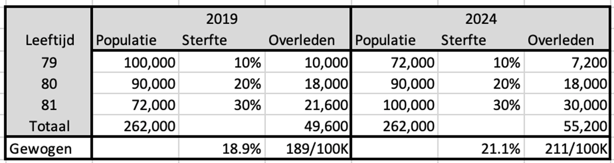
We concentrate on mortality among 80-year-olds. The mortality risk is 20% and it does not matter whether we look at this mortality risk in 2019 or 2024. In this example we assume that this risk does not decrease due to better health or other causes. Based on the mortality risk, we also calculate the number of deaths per age in 2019 and 2024.
We then assume that we do not have the figures for 80 years, but that they are only available as a composite cohort of 79-81 years. We then estimate the mortality risk for an 80-year-old as the average of the 3 cohorts aged 79-81.
In 2019, we therefore counted 262,000 inhabitants in that cohort and a total of 49,600 deaths. If we divide that together, we see a mortality risk of 18.9%, which is considerably less than the 20% we see among 80-year-olds. Only by merging with the two adjacent ages.
In 2024 we will switch the populations for 79 and 81 years. We are now seeing more deaths than in 2019, while the total number of inhabitants and the mortality rates remain the same. The average mortality risk of the cohort has now increased. So the outcome of that mortality probability depends on the distribution of the populations within the cohort.
How it should be
In 2023 we published this article: An analysis of excess mortality based on age and sex; the possible role of Covid-19…Here we describe the calculation method based on trends, which are calculated on the basis of populations and deaths, but per age and gender. This is now the basis for what we have called Norm Mortality.
The calculations were done at the time with a linear model, so we assume that the decrease (or perhaps increase) in the mortality risk is proportional to the year for which we calculate the expectation. This is still OK for a limited period of time, as mortality rates change only slowly. In ten years we see a decline of around 20%. But one day the decline will have to slow down even more or perhaps even come to a standstill, after all we will not become immortal. That is why the trend lines have now been replaced by an exponential model. The differences appear to be small, but still…. As an example, the mortality rate at the age of 50:
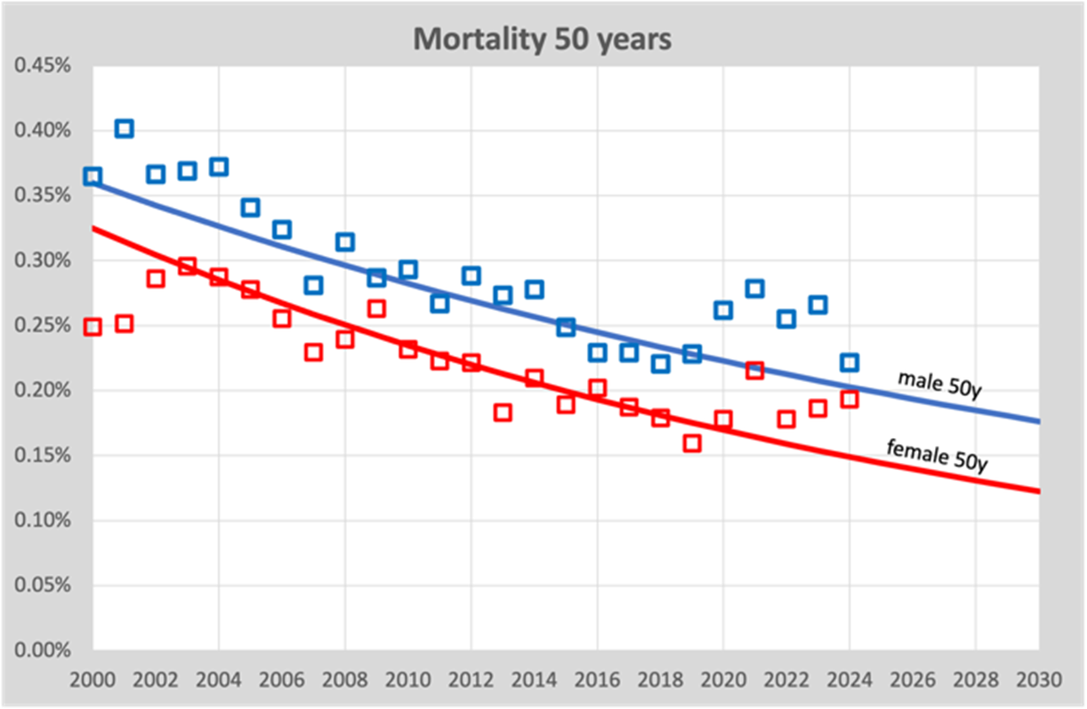
We see here that over the course of 20 years (2000-2019), the mortality risk slowly decreases from around 0.35% in 2000 to 0.2% in 2020. We also see that the trend line is slightly curving, which is due to the exponential model that we now use. But it is minimal. It is important that we see the risk of mortality slowly decreasing.
So at the same time we have to realize that this graph is a single age cohort of only 50 year olds. This means that other cohorts are aging not applicable, this only concerns deathskans. A contrary trend because due to aging, the mortality rates of the population as a whole are increasing, while theoretically each 1-year cohort could show a decreasing trend.
All ages together
We can now show the total number of deaths in one graph in relation to the trend line of mortality from 2010-2019. Here's this graph:
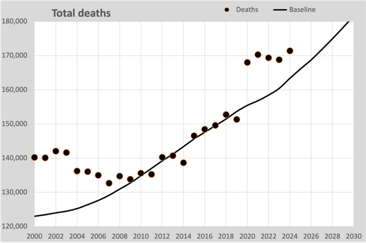
The black line is calculated on the expected mortality probabilities based on all 1-year trends 2010-2019. The annual deaths therefore fit nicely around this line.
In 2009 there was a reversal in the decrease in the mortality rate. After a decreasing mortality rate, especially above the age of 50, the decreasing mortality rate stabilized to approximately 2% per year. We see this in this graph: the declining mortality is turning into an increase due to an aging population.
Now based on annual figures per 100K
In this step we simplify our calculation, as is done by many. We use the total figures per year and convert them into mortality per 100,000 inhabitants, usually abbreviated to “per 100K”. This graph then arises:

We see that the dots are roughly the same compared to the previous graph and that is correct. Mainly the scale is different. But the graph is also slightly tilted, because the population grew slowly. In 2019 there were 10,000 more deaths than in 2000, but calculated per 100K it was almost the same. Population growth and aging were the cause. There were 1.4 million more inhabitants.
The solid line is again the same baseline as from the previous graph, again extended to 2030 using estimated populations after 2025.
But then…
Wrong models
Many home calculators assume that you can fit a curve through the 100K points up to and including 2019, which will predict the course after 2020.
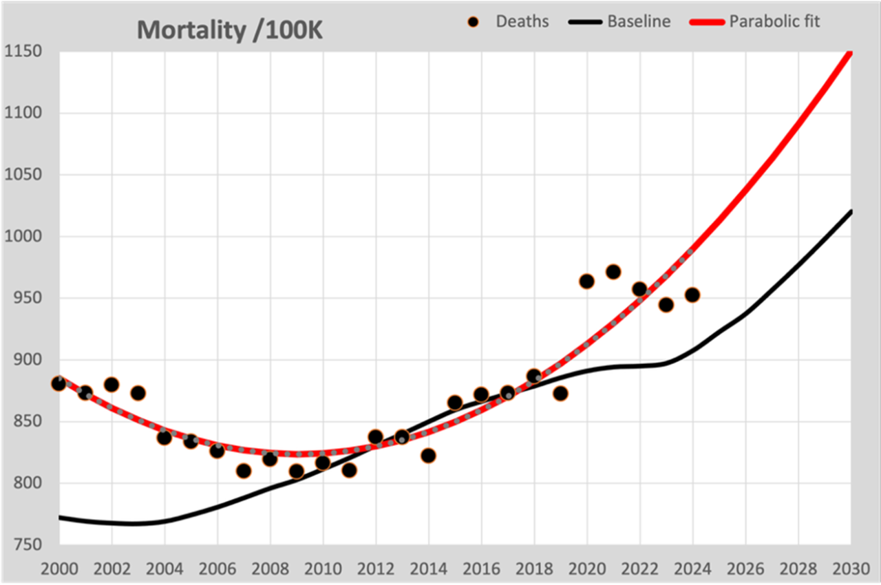
In this graph the parabolic fitted line is now drawn in red, as you see in many graphs. Two things go wrong here:
- The fitted curve (regardless of the model chosen) mainly follows the figures resulting from population growth and not the expected mortality rate. The nod to 2020 is so missed.
- The declining mortality from 2000 to 2010 tempts them to opt for a parabolic model, which also describes the figures well before 2010. The consequence is that an increasingly steep increase in mortality is predicted for the future.
Failure to include the known figures for population composition means that the line is forced to fit those changing figures. It is therefore an incorrect assumption that converting to deaths per 100K of the population neutralizes this effect.
Good models
Because there is still no stable health situation, we have to make a “best guess” forecast for figures from 2020 onwards. We can largely base the forecast on the population composition as CBS publishes it every year. The big unknown is of course the expected figures for mortality rates. In our calculation model we assume that the actual expected mortality is a continuation of the trend we saw until 2019. CBS has also long indicated that they work according to that principle. The total figures from CBS and our Standard Mortality Model corresponded very well with each other until 2022.
Good models therefore assume individual mortality probabilities for each age and gender. These mortality probabilities show a development over time. The chosen model determines how good the continuation would have been if there had been no “unexplained mortality”. It is also still unclear whether what has happened to us since 2020 affects the long-term mortality risk. It may even be that there are groups of people who are not affected by what we still don't know. Perhaps we will learn more about this in the coming years.
ASMR
The ultimate way to compensate for changes in population composition is the ASMR (Age Standardized Mortality Rate). The mortality rates are converted to a standard population. In our case we choose the population structure of 2019, the last without the influence of the “great unknown”. We also convert the baseline into the 2019 figures in this way. This is the accompanying graph:
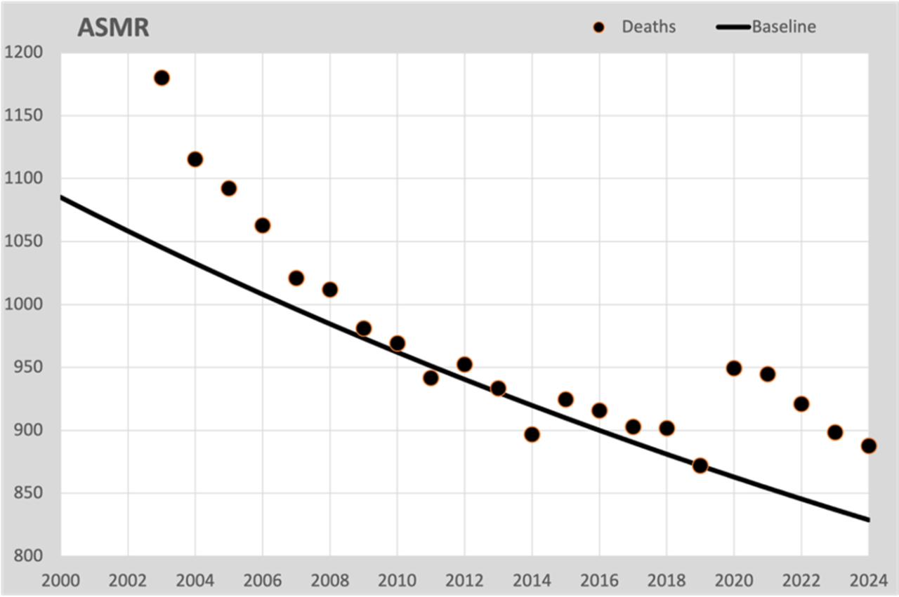
This is, as it were, the mortality risk if the population composition had not changed, no aging. Although we cannot directly compare these figures with the actual mortality, it does provide a good insight into the development of mortality expectations. As with the mortality expectation for 50 years in the first graph, the same decrease is also observed here, calculated for all residents according to the ASMR method. And most importantly: here we see the excess mortality occurring from 2020 onwards. Stripped of all aging effects. So anyone who cites aging as the cause of excess mortality can see from this graph that it has nothing to do with aging.
Choice of history and model
A linear trend line is unsuitable for longer periods where even the gentlest curvature will show an increasing discrepancy between expectation and reality. That is why we have now opted for an exponential calculation model. This assumes that mortality decreases by a fixed percentage every year.
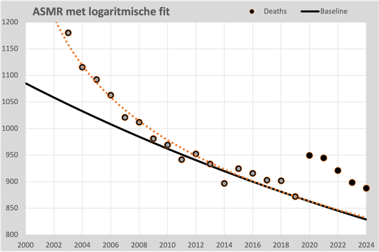
For a longer reference period, a parabola is sometimes chosen, which shows a decrease until 2020 and then an increase. If you want to be able to follow that curve further into the future, there are demographic impossibilities that stand in the way, such as a continued acceleration of mortality, an unlikely development.
However, the points from 2000 onwards also show a clear regularity that seems to be formalizable. We find the best fit in a logarithmic progression, which fits almost seamlessly with the points 2000 to 2019. It is well defensible that we can continue this line for the time being; it does not lead to impossible scenarios. In fact, it strengthens the validity of the exponential 2010-2019 line because both lines are virtually the same from 2014 onwards.
Conclusions
The forecast for the expected development from 2020 depends strongly on the choice of the calculation model and the chosen time period with which the model is fed. We see these options:
- Linear from 2010-2019. Published in Researchgate. Seems to describe the expected mortality well and provides a prognosis that fits well with the CBS figures.
- Exponential from 2010-2019. Gives almost the same figures, but is slightly more realistic in the long term.
- Parabolic. Also provides a good description for the years 2000-2010, but predicts a strong increase from 2020, that is a choice.
- Logarithmic. A trend that is not substantiated by a physical background, but is remarkably similar to the figures from 2003-2019.
In conclusion: only the calculation model that assumes a parabola as a model predicts a mortality trend that will be forced to increase from 2020. This will result in under-mortality from 2022 onwards. The other three models all predict almost exactly the same course from 2014 onwards. The first two fit very well with biologically explainable behavior. The latter also works very well, but is more of an optical and numerical fit than substantiated by demography or biology.

Good model, four of course!
This assumes that in a normal situation, mortality decreases by a certain percentage from year to year in most age groups. Advantage: mortality can never fall below 0.
This is certainly an improvement over the previously published article. Although unfortunately, inevitably, some speculation remains behind it. But it certainly makes sense. However, it cannot be ruled out that the most realistic trend would have reached an inflection point in 2019 even without Corona and without mRNA, because our mortality was already so darn low. But let's put that discussion aside for a moment...
The 1st graph with its fluctuations makes me even more curious about the figures for 2025.
Because are 50-year-old men at or even below the blue trend line? After all, in 2024 their deviation from the line is no greater than in 2002-2006, 2008, 2012 and 2014: the “natural fluctuations”.
And what will women look like in 2025? Back on track, or permanently elevated?
For now the conclusion is:
– women of 50 = an issue
– men of 50 may be back on track
I am therefore, once again, very curious about the graphs from 2010 – 2024 in which you can see all fluctuations per year and per age, and not just the values of 2019 and 2024 as in the previous article. Because this more zoomed-in graph of only the 50-year-olds, but with all years, provides a nice illustration that there were quite a few fluctuations in all those years.
But perhaps that will not provide essentially new information/insights... Maybe those graphs will come again? I'm also fine if they only come in 2026 together with the 2025 figures.
P.S. Nice that you used my extreme (completely unrealistic) numbers example, inspired by Herman's, to illustrate the population growth and aging effect of 21.1/18.9 = 11.6% on the mortality of 80-year-olds in a crystal clear way for everyone.
Thanks for your response Jan. You can find all the figures via the Excel sheet that we have published in the article we wrote for this:
https://steig.nl/2025/04/rekenschema-normsterfte/
That is still the linear model.
Figures for 2025 will not be available until around June 2026, CBS will not have finished counting before then.
That there would be a “planned stabilization” in our health in 2020 is an assumption that we have not made. We see the mortality risk decreasing by about 1% every year from 2010-2019. That does not feed us the feeling that it would suddenly be 0% from 2020 “because it has been taking so long”. Healthcare is increasingly able to prolong our lives, especially in the ages of 50-60, as we see in the figures.
In contrast, we see a decline of 2% per year for all years 2000-2008. A nod (fast steps in the development of treatment methods??). That is why our model runs from 2010, while CBS only takes 5 years into account to calculate a trend.
And yes, because of this fact, a logarithmic model responds well to this kink and therefore also assumes that this leveling off will also occur from 2020 onwards. A choice of your model, just as much as a parabola assumes that the excess mortality since 2020 can be explained by it. The choice of your model is going to confirm what you want to see.
And differences in the outcome of your calculations must be due to the unconscious choices you have made.
Oh well, a freehand extension of the trend line is also “realistic” or logical. But that is a bit more difficult to calculate, so the exp() line, which yields exact points, is fine. But it remains “apparent exactness”. I (or Claude) will end up 3% higher than you. So a little less excess mortality.
Even then, women aged 50 still show a clear excess mortality for 2024; and the men will then be within the bandwidth in 2024. So the 2025 figures are crucial to see where things are going for the men (and also for the women, of course...).
I had missed that Xcel; thanks; I'm going to see if I can make those missing graphs myself. Although I have very little time right now….
The excel shows the trend lines for all ages. So all the graphs you have in your head. And feel free to create your own variants by combining cohorts.
Thanx, I'll look into it.
And. Of course I'm not going to combine them...
That depends on the question. For example, if you want to know how much mortality you expect above the age of 65, you have to multiply and add.
No, that doesn't interest me that much.
I'm just curious about excess mortality per year and what the trend per year looks like. So approximately 80 (or approximately 160 m/f) graphs with about 20 years in them (x-axis) and deaths/100,000 (y-axis). Maybe I can get ChatGPT to generate all those graphs...
Just 2 more details:
1. I don't understand why logarithmic follows "reality" and exponential does not at all. Mi. With exponential, you can also choose the 3 parameters a · e^(bx) + c in such a way that in a smooth curve it practically corresponds to a logarithmic curve in the series 2000 – 2019. In any case, much better than your illustration suggests!
2. You write "Logarithmic from 2000-2019. A progression that is not substantiated by a physical background, but is wonderfully consistent with the figures from 2003-2019." In my opinion, many natural processes have a logarithmic (decreasing with asymptote, e.g. saturation effects, diminishing returns, learning curves, adaptation to new treatments, the easiest improvements are achieved first, then further improvement becomes increasingly difficult) and/or exponential (half value, e.g. every improvement in healthcare gives a constant percentage improvement) churn So it's not that wonderful at all….
Double check:
Claude ends up a lot higher with exp(), namely 855/100,000 instead of approximately 830/100,000 for you. That makes a difference of about 3% and is quite a lot for the definition of excess mortality. Or did you have a completely different exp() function?
Rara?
The log() function (has only 2 parameters) does not easily fit through 3 points, but an approximate log() comes out to approximately your 830/100,000.
P.S. Claude finds a well-fitting exp much easier than a log function. You claim the opposite.
Rara?
Exponential function
y = 516.204 × e^(-0.133482x) + 834.132
Forecast 2024
855.1
Logarithmic function
y = 1360.342 + -166.417 × ln(x)
Forecast 2024
831.5
Verification: Do the curves pass the 3 checkpoints?
Year Actual Exp predicted Exp error Log predicted Log error
2003 1180 1180 0 1177.51 -2.49
2010 970 970 0 977.15 +7.15
2019 875 875 0 870.34 -4.66
Herman and I didn't completely agree on that either. It remains a choice for a descriptive approach. The demographic approach remains the most justifiable predictor.
I personally rely on Excel for drawing trend lines. So I don't know exactly which 'benchmarks' you mean, nor why those years should be benchmarks. I feed the entire series to Excel, I don't select years that I think are more important (or better supports for a line) than others. Then the end is lost again.
The choice of segment is even decisive. If you take 2000 as a starting point instead of 2003 (or 2002, that's also possible), then it is no longer correct. The period before 2000 is different again. It remains a kind of cherry picking: which one looks best and could display something predictive? Which crystal ball will soon turn out to be right?
For the prognosis, the choice between the two (and even a linear one) currently does not make much difference for the tens of thousands of unexplained deaths.
Maybe Claude calculates slightly differently than Excel. I've argued about this with ChatGPT before, who says: The log trend in Excel has the form: 𝑦 = 𝑎 ln(𝑥) + 𝑏
I took it for granted.
By the way, we are not talking about a 'bending' in 2021 but about an unexpected plateau increase, a trend break out of nowhere, which immediately flattens out and slowly drops back, hopefully permanently.
Fortunately, a slowly downward trend can be discerned, although 2024-2025 ended higher than 2023-2024. I don't find the focus on 2024 particularly interesting. In any case, it would be much better to look at the seasonal years, but then again you would be off track. You would have hoped that it would have been over after 2021-2022 – or actually: immediately after vaccination. After all, that was promised. It remains to be seen what 2025-2026 will do, especially this winter.
What do you mean by demographic vs. descriptive approach?
For a comparison with 3 unknowns you need 3 benchmarks. I have taken the extremes of the graph and one approximately in the middle, so 2003, 2010 and 2019. With that choice you should not take outliers, but points that are as close to the middle of the line as possible in advance. And that was 2010. Hence.
I don't agree that linear produces the same thing. That really makes a big difference as you can see from my previous post. So there is a better fit with an exp() function than the one Xcel calculates for you: Claude's. But you're right: it remains extrapolation into the future, and therefore you are looking at coffee grounds.
There will certainly be a significant deviation from the trend until then in 2020 and beyond. I meant that in 2019 there could be an inflection point (just like around 2010) from which life expectancy would increase less quickly anyway. Again, that is and remains speculation. No one has a monopoly on The Truth there. And due to the disruption of Corona (and the “great unknown”), we will unfortunately never know what would have happened without those disruptions...
I also found Bonne's seasons very enlightening. Not much to say against it...
We do not draw a line through 3 points, but 200 lines through 20,000 points and a product of 200 lines with 20,000 population numbers per year.
Demographic: Predictable population structure is taken into account
Descriptive: A formula that describes approximately how a pattern (usually a line) of outcomes runs.
And if the course of the curve is almost entirely determined by demographics, you no longer need to describe it, because these figures are already known... 🙂
If a period can be described with a formula, it is a serious candidate for prediction. If the predictions don't match the demographics, it was nice that things went well for so long 🙂
My point is that the population composition is exactly known. You are not going to “invent” a parabola to describe that progression. You must include this as a given in your model. What remains is a model that only reflects your development in health.
If the forecast were to agree well, this is not proof that the model is correct.
Nice article with excellent graphs that I will also use. In my opinion, it is mainly to be able to see through the eyelashes and not to try to derive any further speculative insights from them. This is useful to separate the mortality jump from an aging population, which cannot be a turbo-rise.
As is known, at the Biomedical Court of Audit we still strive for more transparency of figures. At RIVM. At CBS. Right down to raw data for the causes of death entered, but CBS declared itself inadmissible due to the CBS Act. Given this interpretation of the law, a political solution must be found in the form of a change in the law. At least if good governance is the aim. And as for VWS/RIVM, we are still waiting for the Higher Appeal in the Deltavax case! Council of State, get on with that planning, I would say.
And we also work with a focus mainly on pathology. Any insight will have to be integrated with causal medical observations. A lot is already known about this, despite the fact that research is actively suppressed and discouraged. And soon more will follow about how much sand has been thrown into the health engine and how it can be detected. With serious consequences for mortality, but also for morbidity. Stay tuned!
Hello Cyril, thank you!
I closely follow the good works of the BMRK. I've been paying attention to it again recently, as you have here you may have seen.
Causal medical observations certainly already exist. Everything depends on how the media handles them. So far there has been little interest in it. The reasons are obvious.
Data transparency is crucial; as far as I am concerned, even priority 1, because causal observations without numerical impact are easily dismissed as anecdotal, not significant or even as disinformation. We see that now. I am very curious whether the MPs will agree to a change in the law - if such a proposal is ever made. Fingers crossed and keep going!
Dear Cyril,
Thank you for your positive comment. If we can support your useful activities, please let us know!
I am also working on an article about “effective vaccination rates”. This allows you to calculate a good estimate of the effectiveness of the vaccine based on the well-known figures. But due to lack of time, there is not much progress in writing.
Especially very useful in the first months of vaccination, when the unvaccinated group is much larger than the unvaccinated. Useful to keep in mind!
Greetings, Herman
Will virusvaria become a national threat?
I recently received an automatic privacy warning when searching for a site!
Indeed, it is dangerous to visit this site.
You might just start to doubt the prescribed narrative.
Time for a name change? “Excellent” comes to mind. Excel, graft (several meanings), inoculation, excellent... perhaps I have too much imagination, but unfortunately I also have experiences with strange warnings.