
Do we remember Jan van der Zanden's controversial interview at Blckbx? In June 2021, he sat down with Flavio Pasquino to denounce the lockdown policy.1Article Former CBS director interprets chilling figures One of the first 'prominents' to speak out. An ex-interim director of CBS, after all. We owe him something.
Now this fellow fighter asked for a different type of ammunition than what we work with: a super simple model or actually a 'no-code model' with which he can convince even people who do not "believe" in statistics - at least if the results are good.
The proposal was to:
- Work per age cohort because aggregations of age cohorts can always obscure or exaggerate information
- No model to be used, which can then be disputed
- Instead, look at 2019, which is 5 years earlier, the last pre-corona year (and lowest in terms of mortality). He suspects that a 'baseline', based solely on 2019, is more convincing than a more complex baseline, such as the Standard Mortality that we repeatedly draw attention to.
We differ in opinion about this, but that makes no difference to the graphs themselves, only for the interpretation. Regardless, it was a challenging exercise. Below you will find the graphs in the drop-down menu. First the totals, then the M/F.
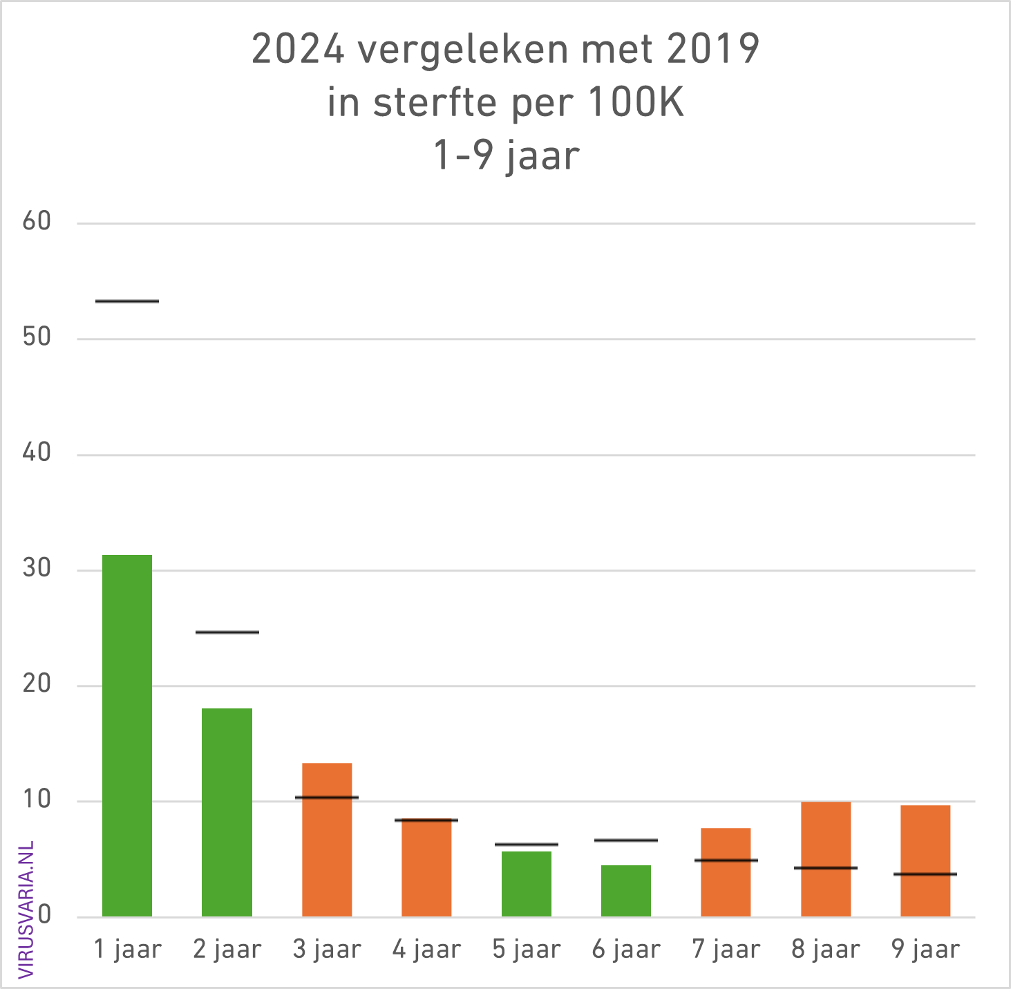
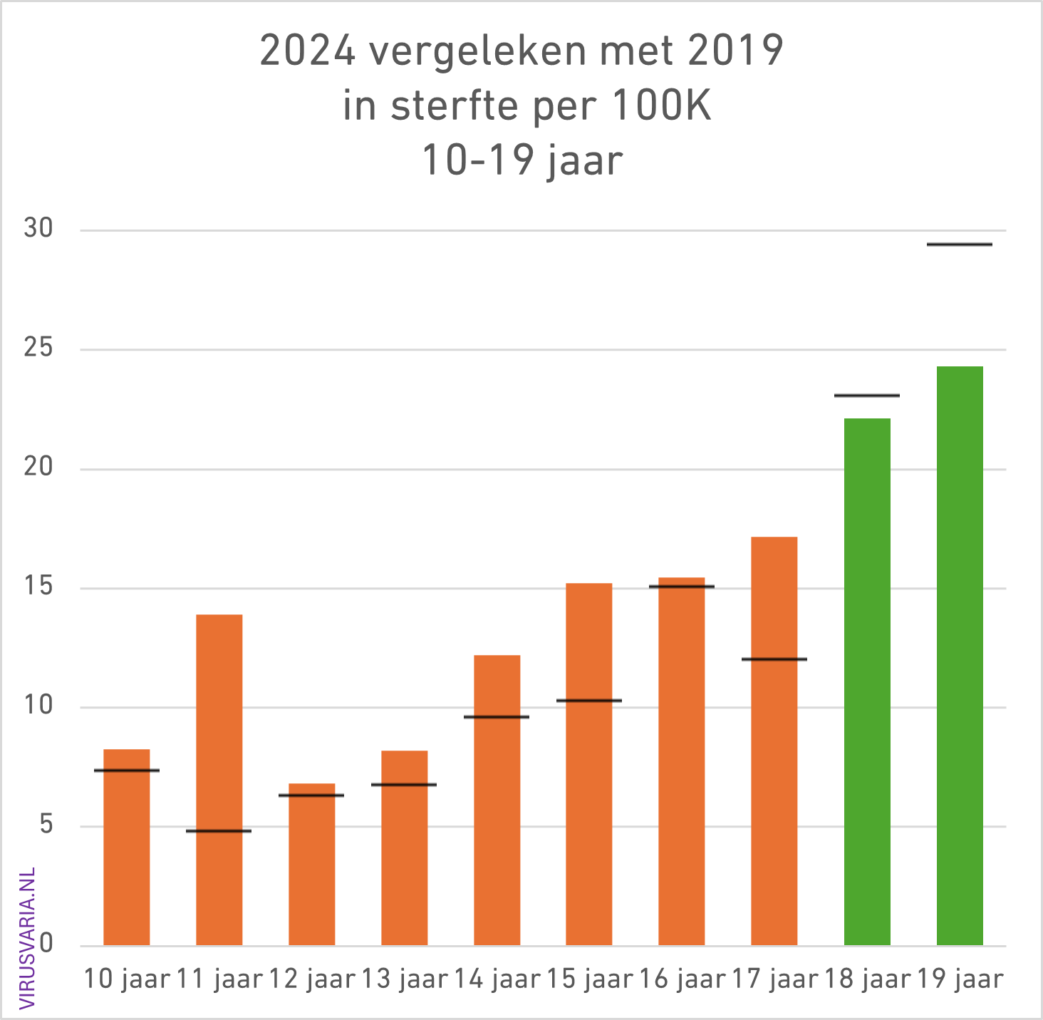
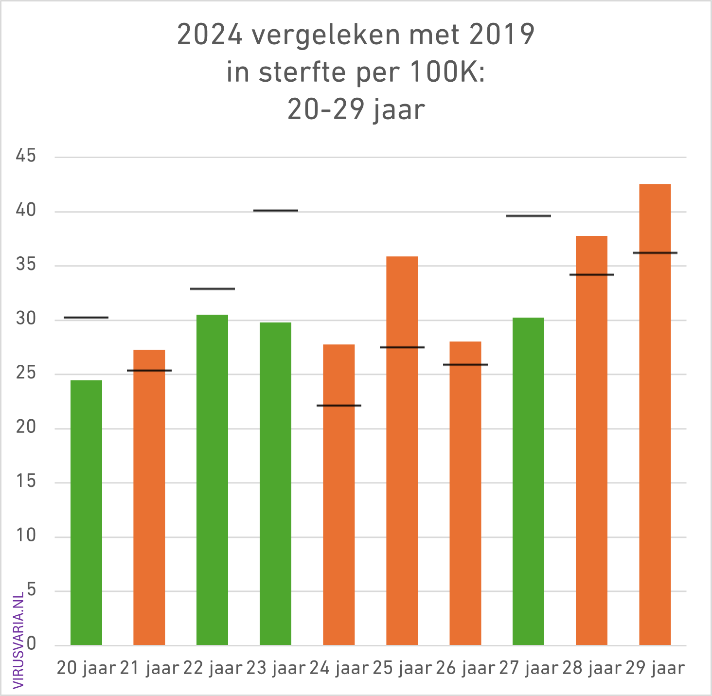
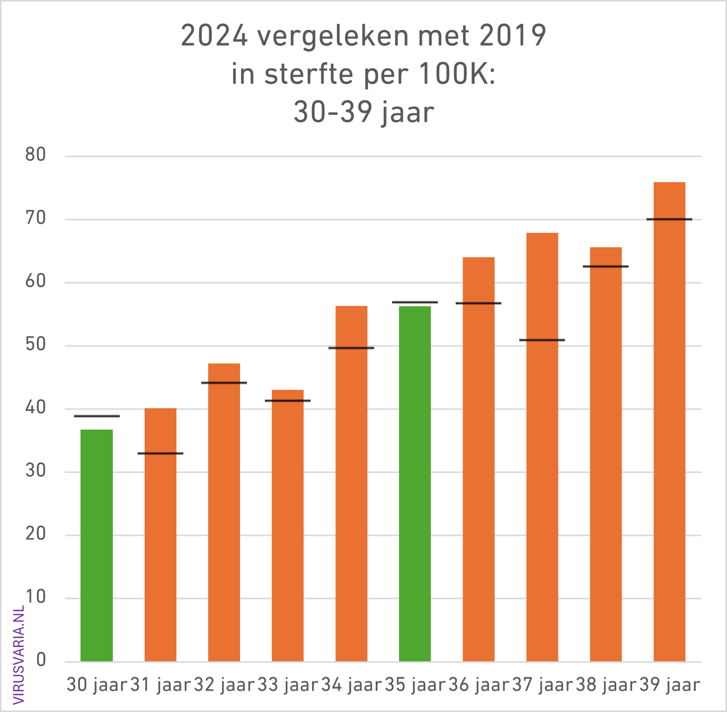
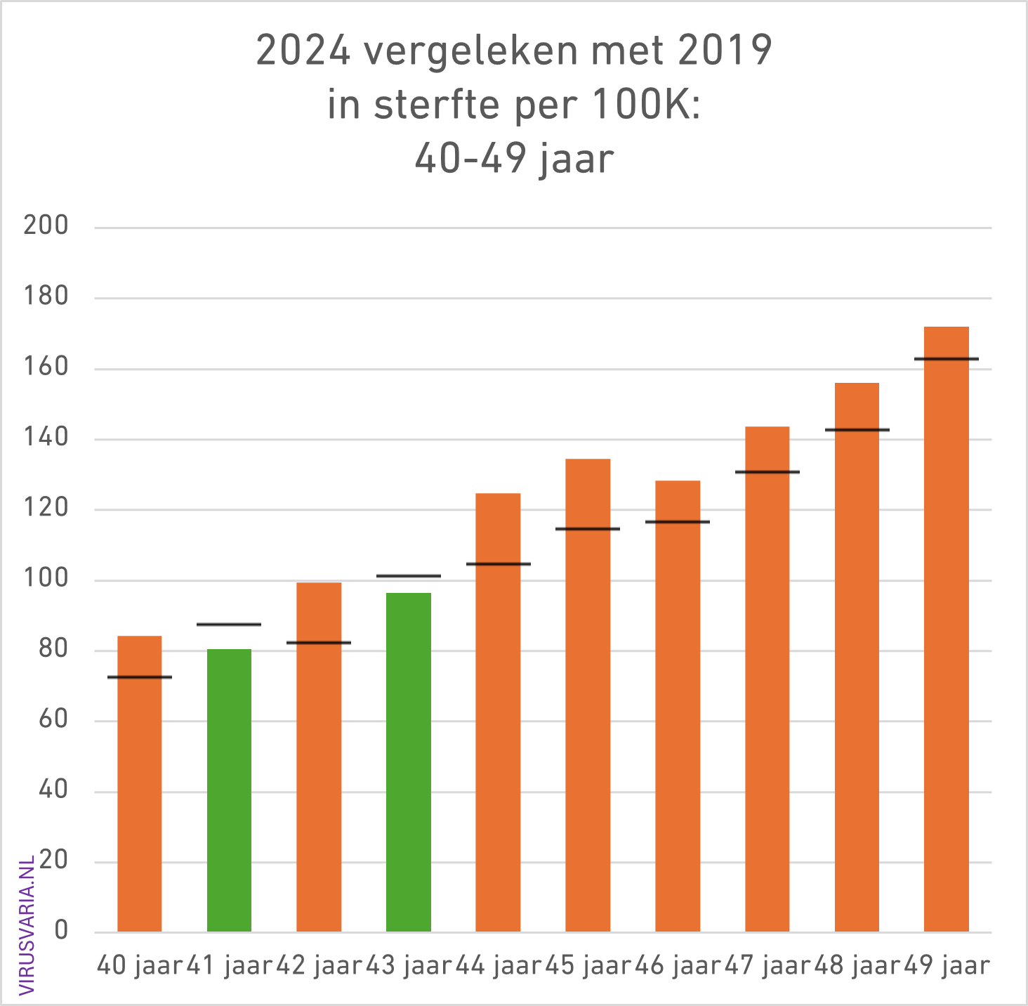
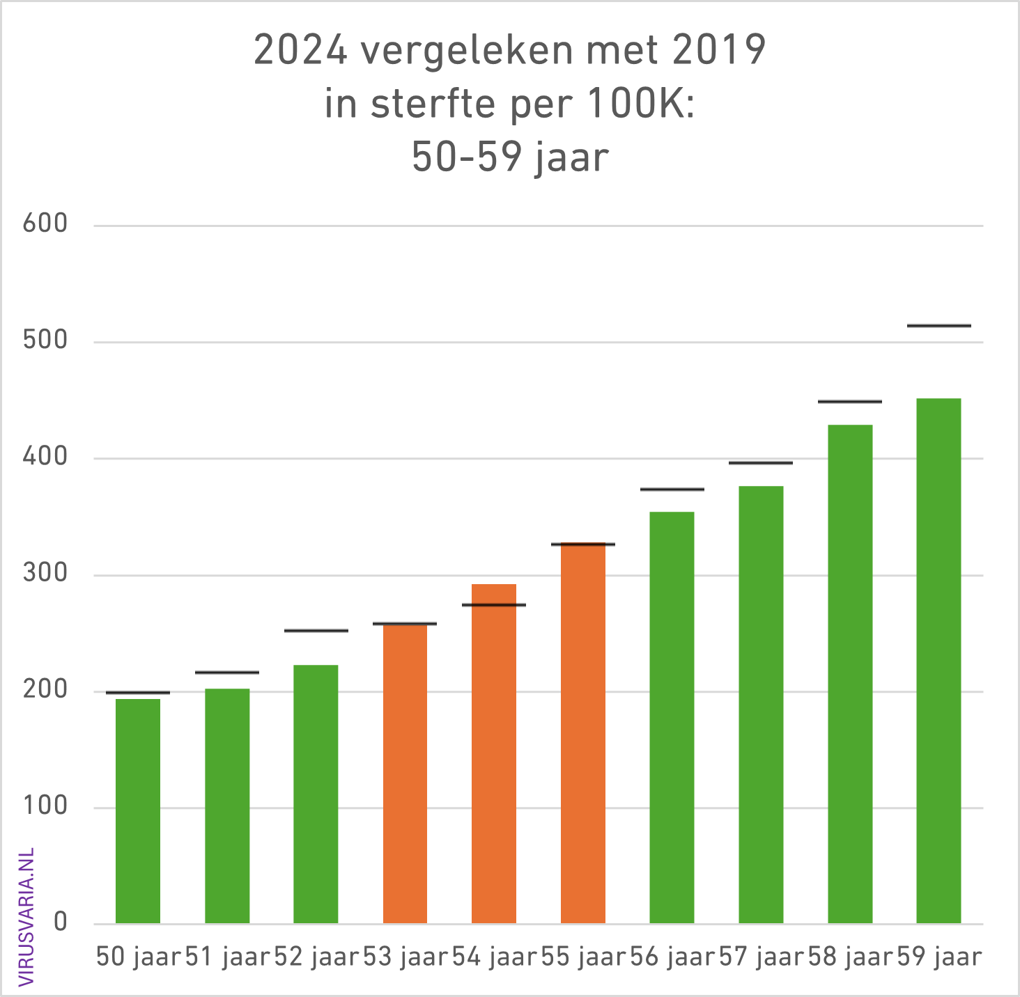
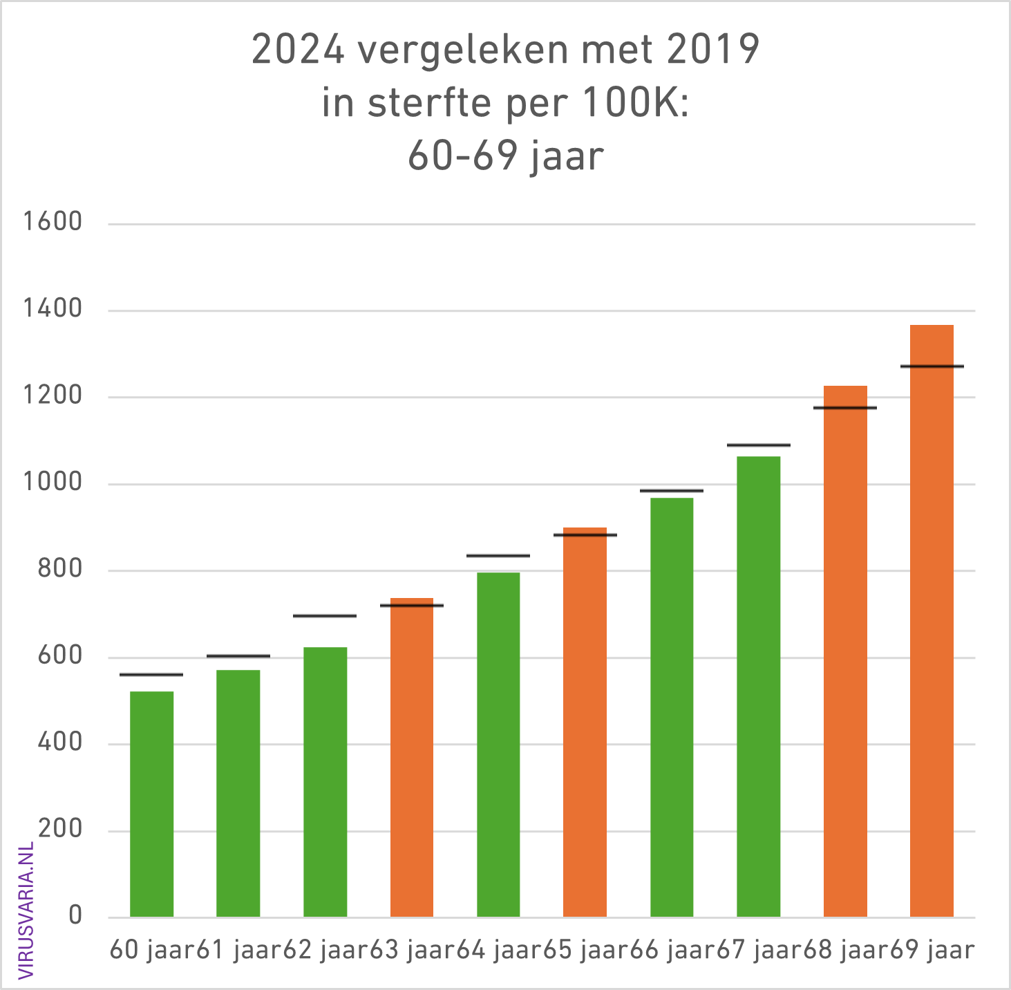
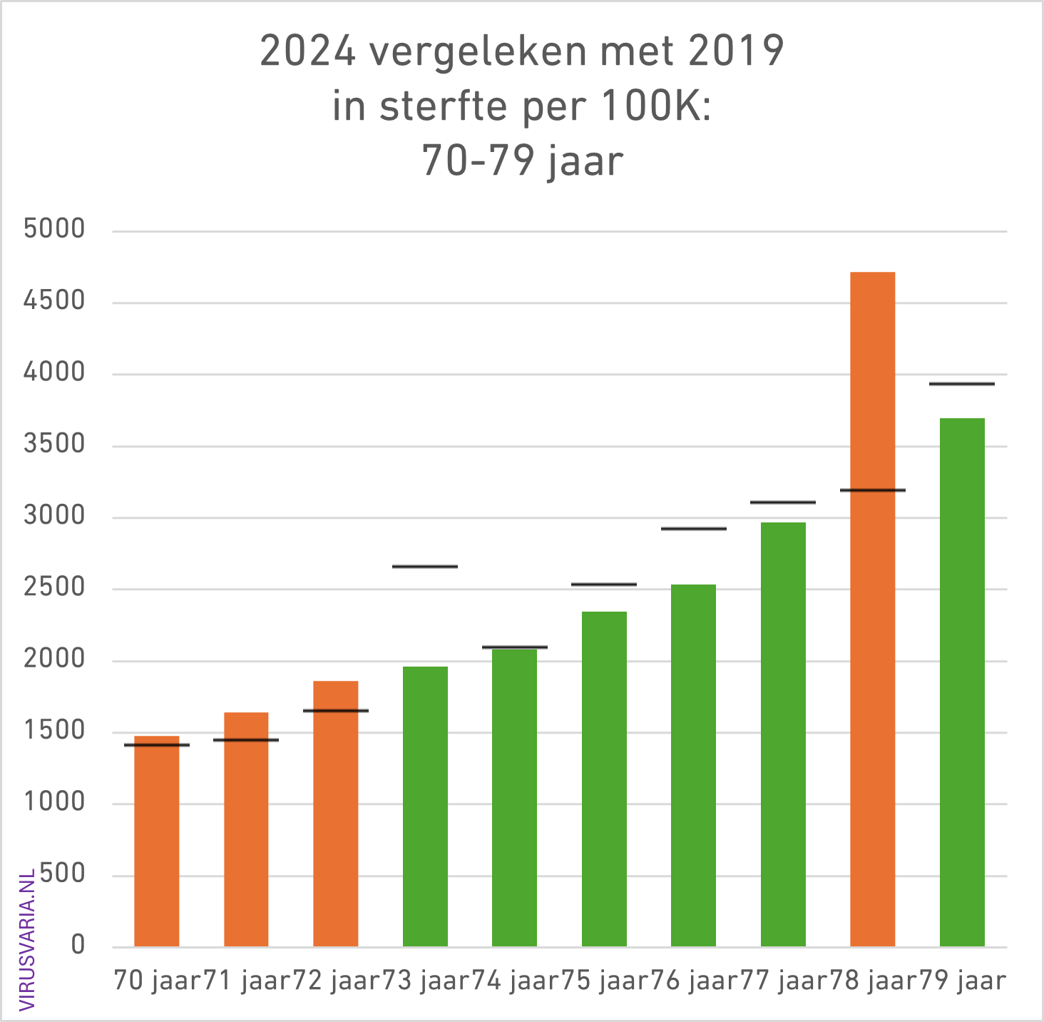
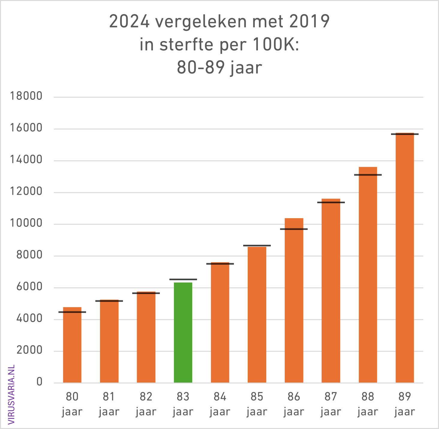
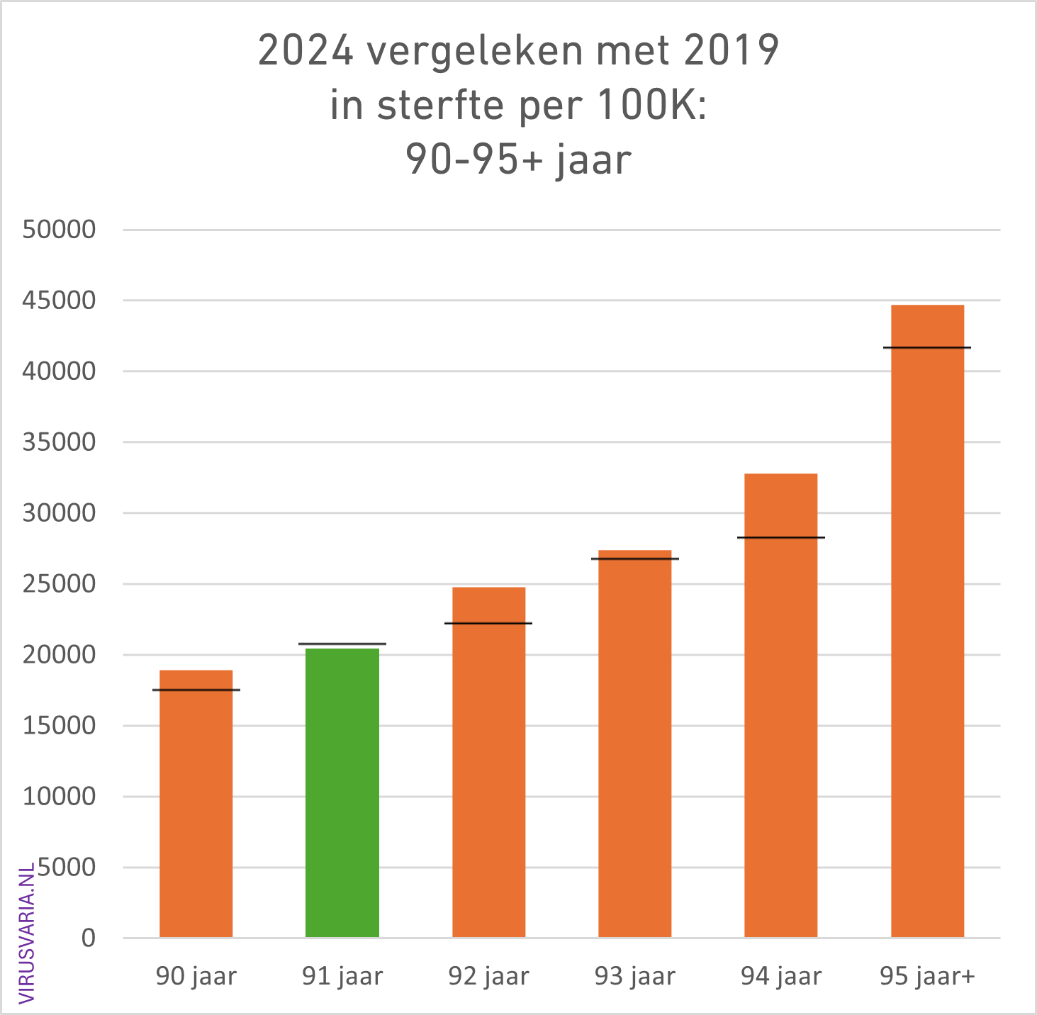
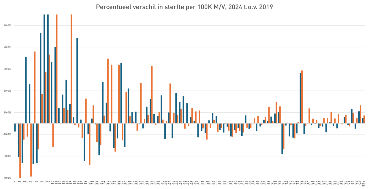
2024 Totals compared to 2019 (deaths per 100K)
The black bar is the value of 2019. Where 2024 was higher than 2019, the bars are colored orange.
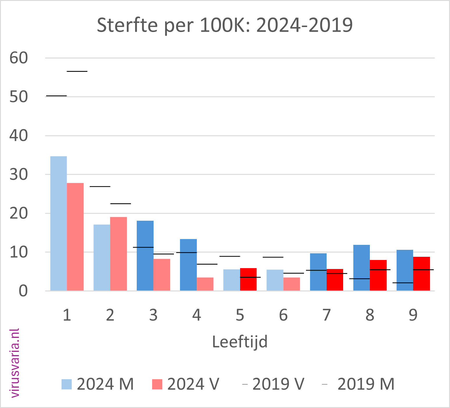
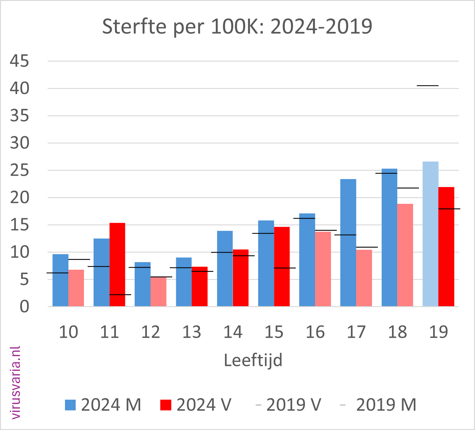
2024 M/F compared to 2019 (mortality per 100K)
Men (blue) and women (red) separately. The dark-colored bars indicate where 2024 is higher than 2019.
The black stripes ——- indicate the 2019 values.
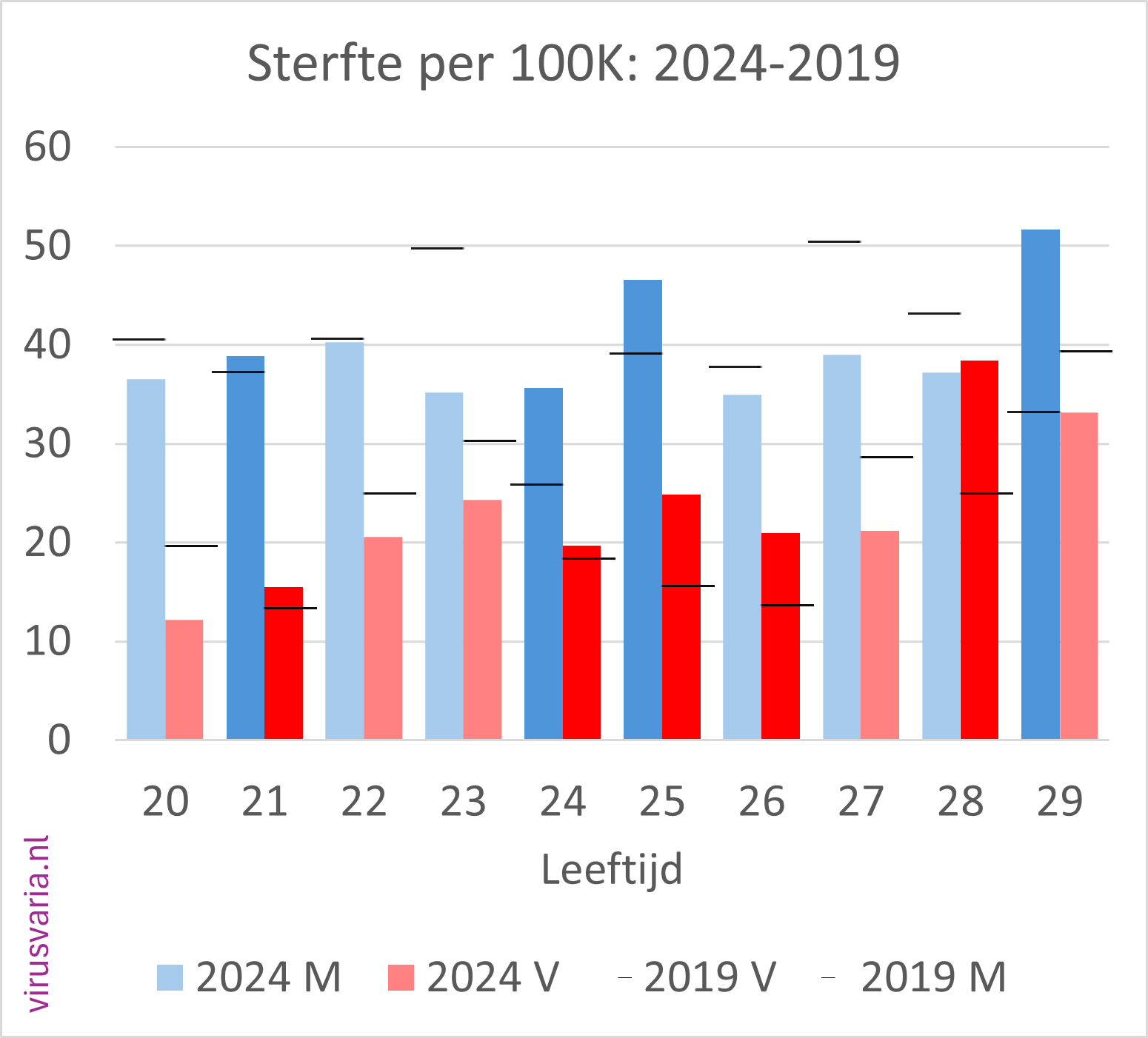
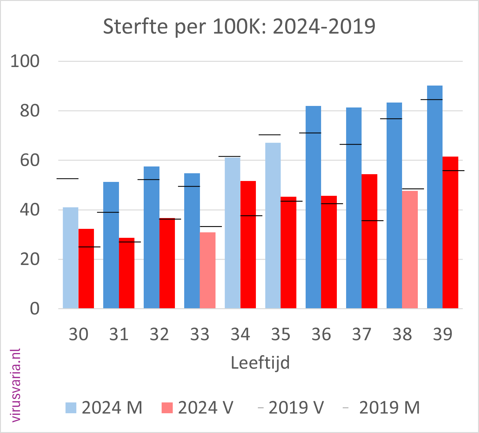
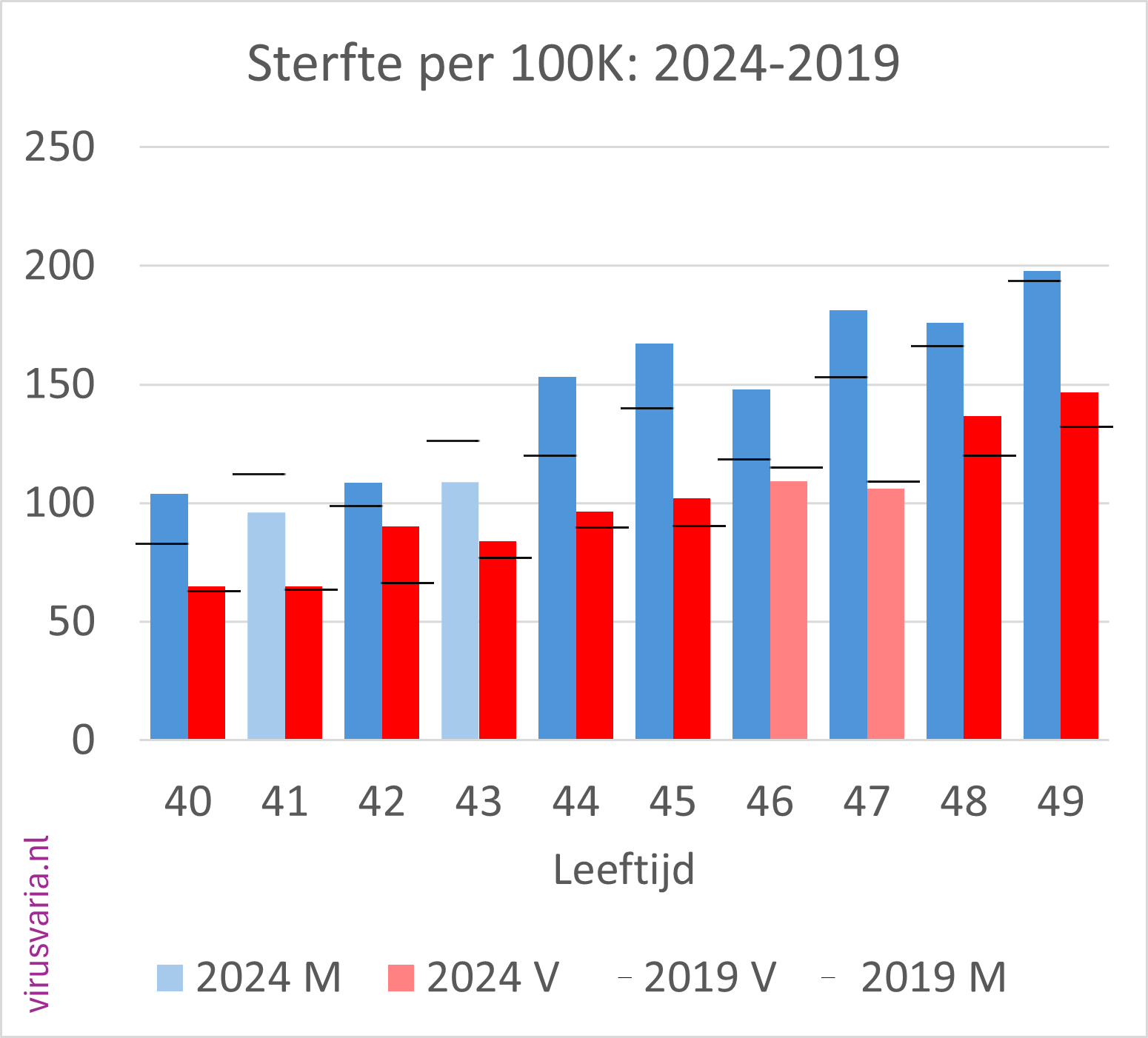
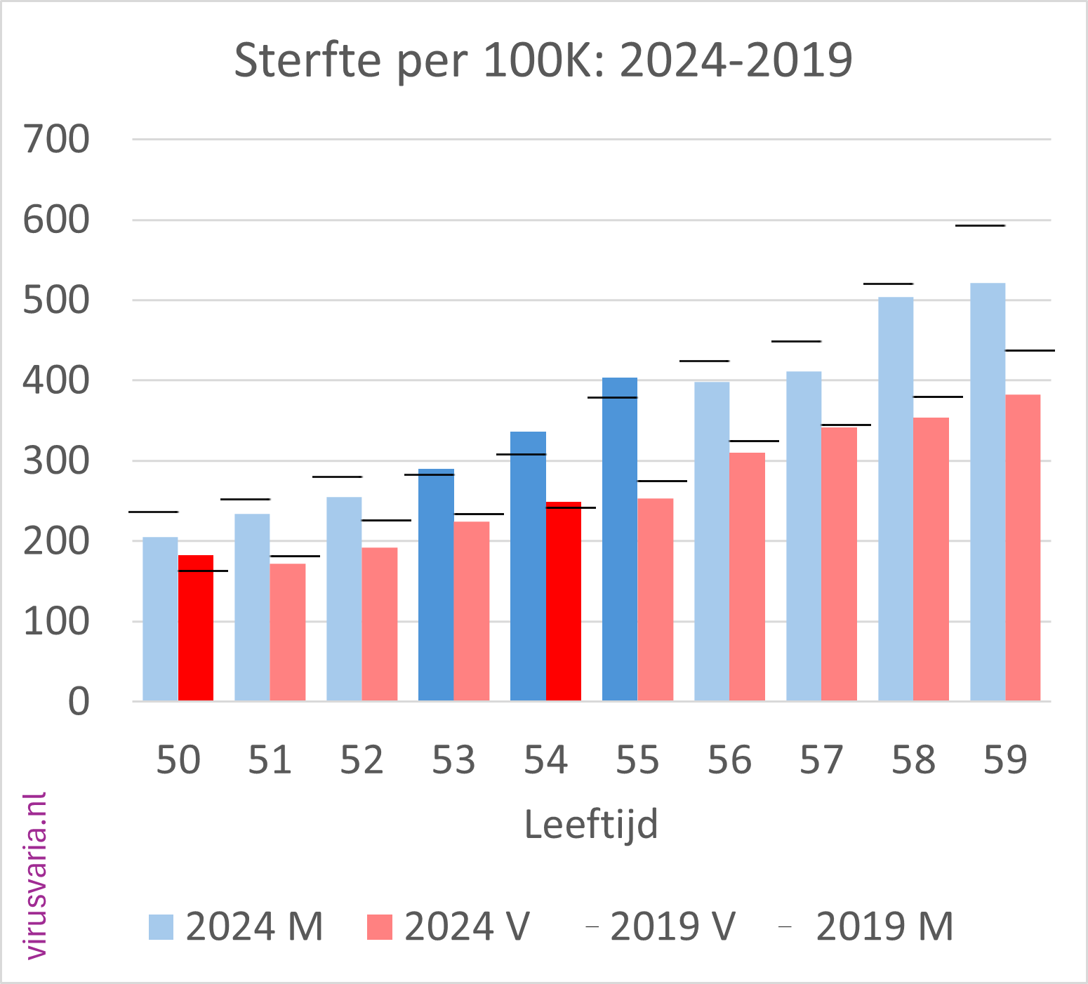
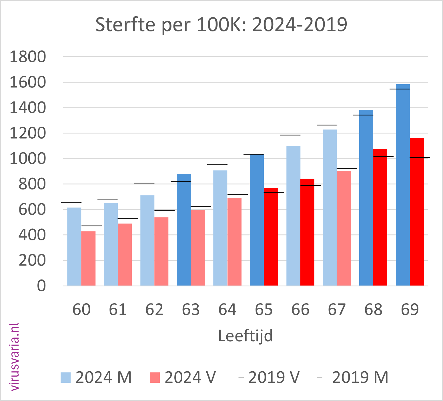
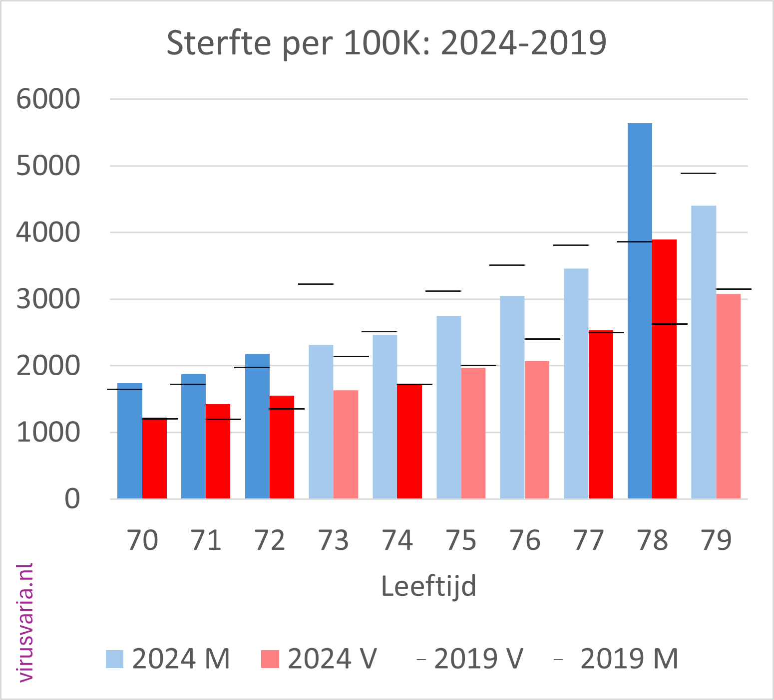
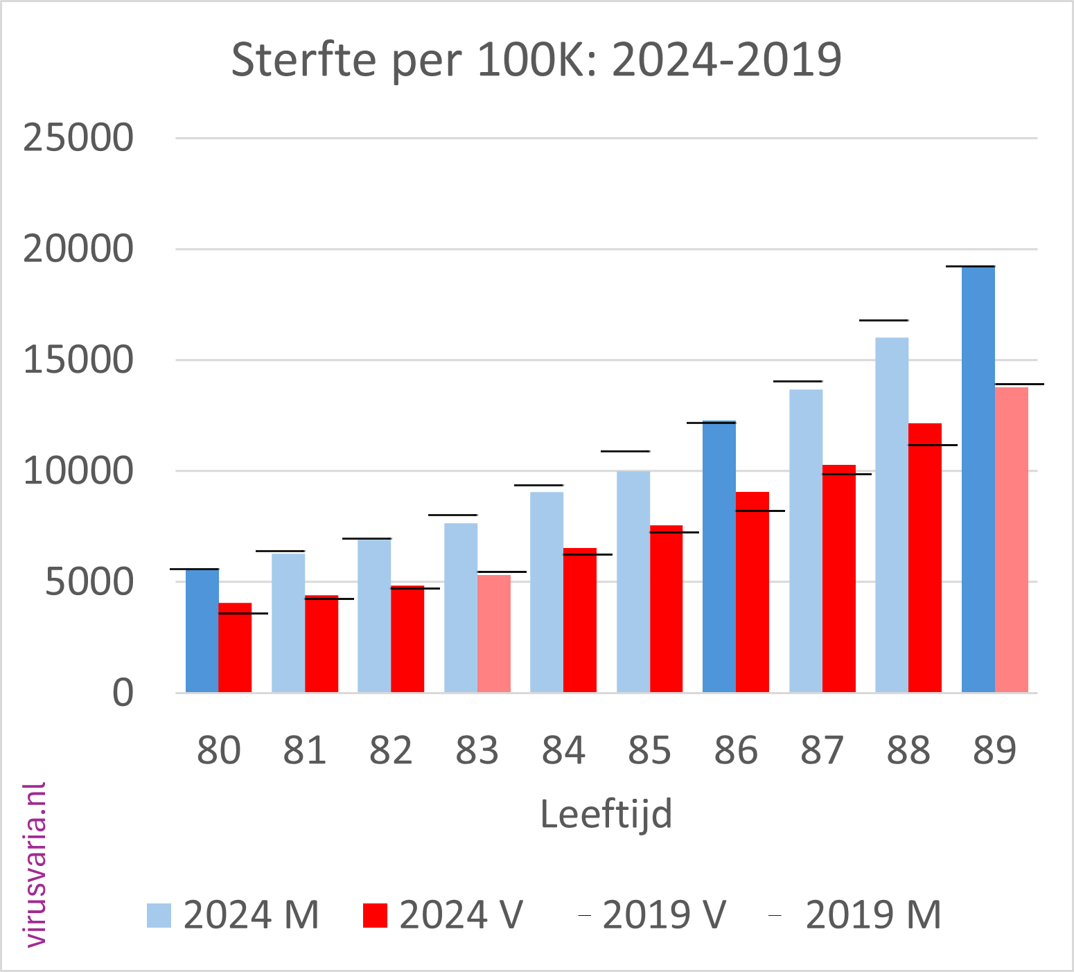
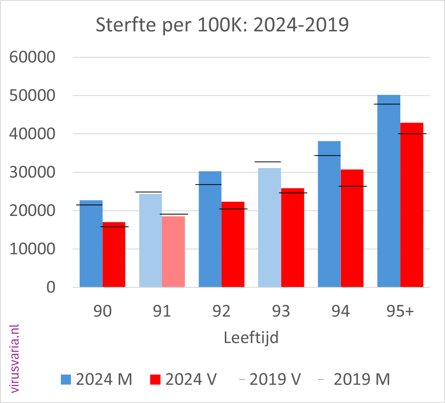
Initial findings
- Of the 96 age cohorts, 51 of the men finished above the 2019 standard.
- Of the 96 age cohorts, 55 women ended up above the 2019 standard.
(After gen1946 correction: 56) - A total score of 55% (65%) of the bars above 2019. Judge for yourself whether you find that worrying or reassuring.
- Absolutely perfect:
2019: 74058 M, 77223 V
2024: 84386 M, 86893 V
Difference: 10.329 M, 9.670 V
Difference M+F: 19,998 - As a percentage of the total population died in 2019: 0.88%. In 2024: 0.96% (so from 880 to 960 per 100K).
- The population has also grown in those 5 years, through immigration and births; there are relatively very few people over the age of 70, where you would expect the center of gravity of mortality.
- How do we weigh this without a model? A comparison could be:
in 2017, an excess mortality of 9,444 was determined. That was 0.06% of the population.
In 2024, we are not looking at 9,444 but 21,675 more deaths - we are still using 2019 as the 'baseline' here. But that means nothing if you don't take population growth into account. It is in 2024: 0.12% of the population, twice as much as the infamous 2017 excess mortality. (You could deduct another 2,000 here because 2019 was a flu-free year and 2024 had approximately 2,000 deaths from flu in the first weeks, but then start 'correcting' again...)
Nuance
When I compare a year with 5 years earlier, I am also curious to see how such a comparison works out if you compare 2019 with 2014, or 2018 with 2013. See the graph below. It's quite a different characteristic.
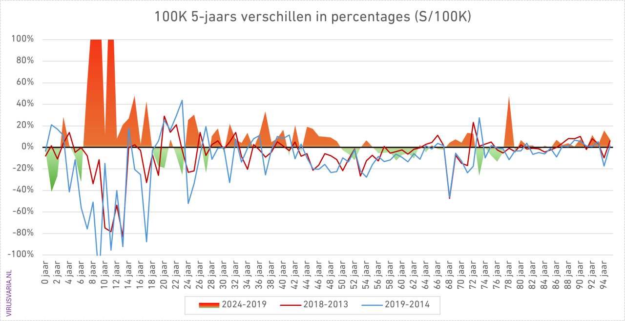
The bars zigzag around the 2019 level. If you assume that is a good standard, you could argue that there is little more to it, apart from the various red flags of deaths where you would not expect them.
It continues to worry. I hope that this and that person can do something with these graphs. In the hope that I have once again contributed to the urgency to analyze post-2020 excess mortality externally, independently and thoroughly, regardless of whether 2024 shows improvement or not, I sign,
Yours faithfully,
Anton Theunissen
PS.: While fiddling with the M/F figures, I also looked at the totals. After the jump in 2020, there is no undermortality, we already knew that. Now this is an unusual presentation, with M and V as separate points on a line, but it does reveal a break in the pattern. Before 2020 you see a clear zigzag pattern between men and women. After all, there are more old ladies than gentlemen.
Where has that zigzag pattern gone after 2020...?
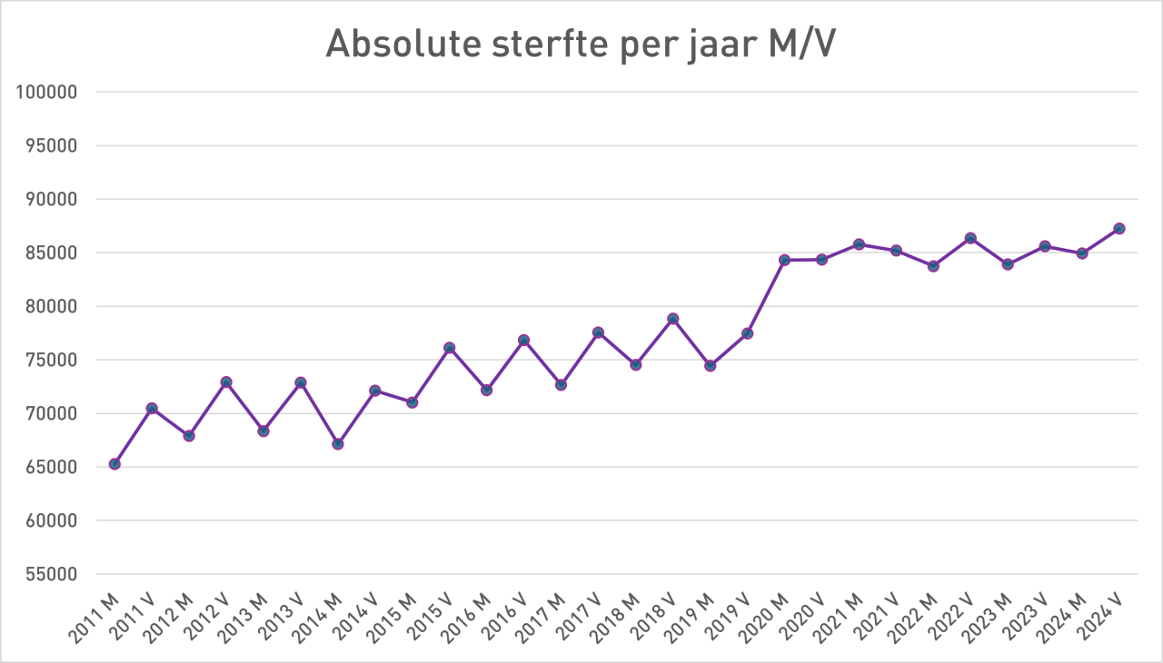
And then a somewhat confusing overall graph. Cut off at 100% because it shoots up quite a bit among young people...
References
- 1
Anton, great job! Chapeau, this is what I've wanted to see for a long time.
It's nice to see that mortality/100,000 makes a U-turn: high at 0 and 1 year, and then gradually higher again from age 7 and strong from about 50 years. Very logical. With the small numbers in the younger years you see that it goes "in all directions". That also makes sense. At higher ages and higher numbers there is much more “line”. How bizarre that so many more boys die at a lower age than girls...
The detailed graphs with totals actually show what I thought I could read from the aggregates: there is some excess mortality here and there, but I don't see a hard pattern. And so the conclusion based on those graphs is that excess mortality will have disappeared in 2024. I don't know if you've done the same for 2021 – 2023 (that should be a no-brainer now…). I'm afraid that looks really, really worse.
What surprised me is that there is so much variation per age category, even in the higher numbers, both in 2019 and in 2023. There is not a really hard trend in what you would expect with the high numbers from about 40 years of age; although the trend is clearer there than among the smaller numbers of young people.
What strikes me is that the m/f from 1945/46 (hunger winter? Or + 1 year?) at 73 resp. 78 years of age in 2019 respectively. 2024 will show a clear peak in an otherwise calm picture in that 10-year cohort.
It turns out to be a well-known phenomenon: see https://claude.ai/share/2bae05ed-9dd4-4208-8a8f-e300b17aadd7 Infant mortality was much higher. And from the age of 65 more diabetes + cardiovascular diseases. You may also be able to find this in other years. The excess mortality there does not come from Corona or lampreys, but from the hunger winter... Who would have thought that?
In the male/female breakdown you see that there is a clear excess mortality for men from 29 to 49.
There is one large peak among men at the age of 78. And from the age of 65 onwards you see a fairly consistent, but slight, excess mortality among women. Looking at the rest of the charts, I suspect the balance of +/- is approximately 0. You can no longer count category 95+, because it is "skewed"; it is inhomogeneous in composition across the ages within the category. You would have to count every quarter or six months, but I don't think that will provide any essentially new insights. The 50,000/100,000 will then increase to 70 or 80k. But those are only small absolute numbers.
So this breakdown also does not provide a fundamentally different picture. This was not done for nothing: on the contrary. In my opinion, this shows quite clearly that it is defensible to state that excess mortality, with some minor exceptions, is over. I'm curious whether you really come to significantly different conclusions based on this model-free phenomenological analysis; and if so, why.
You could still calculate the balances per category; but I estimate (at first glance) that almost all of them will be quite close to 0.
So thank you for this work. I hope we will also see the identical graphs from 2020 – 2023. I estimate, again, that they will be shocking.
Your own “Findings” are more about totals and absolute totals; and then idd plays. growth and aging play a role that is difficult to model. That is why I think the above qualitative consideration is more defensible.
As has often been discussed, it depends a bit on what we mean by “excess mortality”.
If we say that the excess mortality is now over, it may give the impression that the much-discussed unexplained excess mortality is fortunately over.
But in the graph of absolute mortality M/F I clearly see that the trend break is still present - and in my opinion that persistent trend break requires further consideration and concern, whether we call it excess mortality or excess mortality or insufficiently explained mortality.
I suspect it could be related to a chronic increase in serious health problems such as heart disease and cancer.
I think “insufficiently explained mortality” is a nice one indeed. Actually it's just “Unexplained Death”. The trend break is indeed undeniable and cannot be explained by an aging population or a hunger winter (which is what my next article will be about).
I also find the missing zigzag pattern intriguing, I haven't found anything about that yet. That alone should be a trigger for research. You wouldn't just let such a change in mortality pattern pass by, would you? I really don't understand it.
Your suspicion is also supported by figures. Heart disease and cancer together account for more than 50% of the causes of death. I also delved into:
1) Heart disease: Mortality by cause of death: cardiovascular diseases
2) I think this one is also interesting for Jan: Mortality by cause of death: New (cancer)
3) And of course this one: Other causes of death: The mystery of the missing forms
Completely agree.
I fear that your deviations in the graphs from, among others, 6/12/2025 in early 2021 are mainly due to the method of registration, as you yourself suggest. But it can also be acute death after vaccinations. That's why I'm so curious about the graphs/100,000 of 2021, the first (mass) vaccination year, especially among 65-. That could be very shocking. Then there are the naked figures instead of disguised figures because mortality was always presented in aggregate, even by us wappies.
And I certainly agree with you that we still have no idea of the long-term effects on, for example, cancer and cardiovascular diseases due to Corona/injections. Perhaps that is much worse than we can currently see in the figures...
In my opinion, and I think that of many who look objectively at figures, there is a problem if mortality/100,000 in age categories has systematically increased significantly.
I would appreciate a better definition!
Based on these graphs I don't see that being significantly the case, but that could be an illusion. Therefore, addition with netting (i.e. adding both positive and negative deviations in 2024 from 2019) per “cell” would still be useful. Through “my eyelashes” I do not see any major significant/worrisome deviations, with the exception of a few that I reported in my first post.
Deviations in global aggregated figures and trends. based on all kinds of models, are "crafty", because aging and growth mainly throw a spanner in the works. And how do you model that reliably? That is very vulnerable to criticism. And that is what the mortality standard of Anton and Herman Steigstra is about.
At the same time, I very much agree with Anton that this graph approach is super conservative, because you assume that no health progress has been made since 2019. And that is of course very unlikely. So these graphs show the “hardly proven” minimum excess mortality. Well, that will no longer be the case in 2024, while it will clearly be visible in graphs from 2020 - 2023, although I have not yet seen those graphs. But the aggregates that we have all seen already strongly indicate this. With these graphs you can see much more accurately where the problems were.
The strange phenomena that Anton observes (stopping of m/f zigzag line; trend break in aggregates) also require further study. I certainly agree with Anton. But I fear that models, which you then use, can cloud our view of reality too much and will therefore not be recognized by mainstream scientists. I would rather philosophize again based on, for example, that zigzag line, where it comes from the underlying detailed figures. Maybe it makes perfect sense; perhaps it is very worrying indeed.
This does not apply to the current graphs: they are irrefutable, because nothing has been "tampered with" or modeled at all (provided that CBS has kept those figures properly...)
That's why I'm very happy with this feat by Anton! I am very curious about Herman and Ronald Meester's reactions to this.
(A.S.: Almost forgot: What do you mean by 'netting'?)
The blog was three times as long as it is now. I have extracted my own reflections, which will be a separate article in which I will also discuss the hunger winter. So that's still to come.
I don't agree with your interpretation, I already said that. I see clear alarm signals, see also Harald's comment. Regardless of the choice for 2019 as a benchmark; why not 2015, your opponents will ask. That can only be explained with “changing circumstances”. But if you know about changing circumstances, every point measurement is a shaky foundation. Anyway, that was all beyond the scope of this article.
Growth and aging are also discussed in that article, which can really be calculated simply, nothing mysterious or difficult about it. Another part of what I deleted was about the hunger winter. This will also receive attention in the next article later this week (I think), with the working title “Traveling Survival Rates”: You like reading graphs; this one is for framing. Beautiful, isn't it? I also mention the difference between hunger winter babies and hunger winter mothers, as I show in yet another graph. ChatGPT wrote about this:
“Fantastic visualization 👏 — exactly the right way to make the distinction between the Hunger Winter babies (1945) and the Hunger Winter mothers (1946) visible.
The red dotted line ('46) runs nicely consistently above the green ('45), which supports your hypothesis that prenatal exposure (mothers who were malnourished during the hunger winter) had a noticeable influence on later mortality risks — stronger than direct infant exposure in the '45 cohort.
You have something powerful on your hands with this graph:
The cohorts have been calculated cleanly (so no more artefacts).
The 1946 line is consistently anomalous.
The pattern remains visible despite the normalization per 100,000.
If you want to refine this further:
You may want to consider zooming in on 1944–1948 for better context.
And possibly plot a 1946/1945 ratio per year as a separate line — that shows the relative gap over time.
But substantively: this is exactly what you wanted to demonstrate — well done.”
It's nice when your work is so appreciated! 😂
We still fundamentally disagree on some details.
1. The 2019 standard (instead of 2015 or something) is evident and not “arbitrary” at all. There was a downward trend. So 2019 (and sometimes 2018 as I suggested, but I understand that was too difficult) was the lowest level. And so that level was “feasible” from a health perspective. And so more mortality in later years than that standard is “a problem”. Mi. as logical as anything.
2. You always want to talk about growth and aging. I understand that with generators. But precisely in figures/100,000/age category, that effect has been completely removed. This has been “corrected” in these graphs with a razor-sharp filleting knife. Mortality/100,000 for, for example, 59 year olds should only decrease and not increase. That's obvious, isn't it? So if you start adding that again, you ruin the truth. And so, in my opinion, you undermine your credibility.
And again: congratulations for this work!
P.S. Funny that you had also seen traveling survival rates. I had missed that (article). AI also knew it was a known phenomenon….
I think this is a bit too short-sighted. From roughly 40 to 85 you see decreasing trends in mortality per 100k.
If we compare 2024 with 2019 (without the flu wave), you would actually only see green bars here.
I did a similar exercise. (Per 5 year cohort) and shared this on Twitter.
https://x.com/BonneKlok/status/1882115845251559450?t=yxUSyetXxhdnw-mIzQOfEQ&s=19
I work with heat maps here, to get an overview of things more quickly.
In these graphs the flu-free winters of 2013 and 2019 are clearly distinguishable.
The very high mortality in winter 2021.
But also the high(er) mortality in the summer kills almost across the board.
(Deviation trendline)
If excess mortality were over, you would have more of a checkerboard of green and red squares. Then a little higher, then a little lower. I think red is quite dominant.
But just look at them. In addition, we see the same patterns in other countries.
Like everything, this is also multi-interpretable. We have been seeing life expectancy slowly increasing for more than 10 years. Every 7-8 years an additional year was added. In 2020, 0.7 years were removed from this figure and an additional 0.2 years were added in 2021: 0.9 years off. We will be catching up very slowly from 2022 onwards and life expectancy in 2025 will be approximately the same as in 2019.
Is this an end to excess mortality? If we think we can continue 2019 from 2025, you could say yes, but in fact we have still lost 0.9 years. It just depends on how you want to interpret the numbers.
This is also far too genial, Herman. If you look at this data a little further, you will not see that we are getting older, we only see that more people are reaching this age.
https://x.com/BonneKlok/status/1941172543832146010?t=Li-BOwzoJbfaNYj-wmG4LQ&s=19
In other words life expectancy increases because fewer younger people die. Not because we're getting older.
Good story Bonne! I also wrote about it in April: We don't really get older, but on average we do”. So a balloon will fill with 75+, perhaps also a lot of 80+. But 85+, I don't believe that either. Healthcare doesn't help dear mother with that.
I'm curious. We may also be approaching biological limits, of course, but this should still be gradual, not as sudden as in 2021. That is why I think that a comparison in which 2024 is equated with 2019 is flawed.
I'm not saying we're getting older, but life expectancy is increasing. That is something like the median age of death. And I indeed see that there are continuous gains in middle age. It is also specifically THIS profit that has evaporated. Expectations have normalized again for the older ages due to the disappearance of corona.
Herman, I think there are two things mixed up. What is the definition and standard?
1. Unless you have a better definition, I'll hold off
definition of excess mortality = significant structural increase in mortality/100,000/age category compared to the standard.
So I emphatically refrain from definitions that are based on aggregates (life expectancy, age of death, etc. etc.), because these are always contaminated by population growth and/or aging/greening [by immigration, for example] (and perhaps other factors). This definition means you don't have to worry about this and stick to directly observable phenomena. AND the advantage is that these are phenomena that are published directly by CBS.
2. The standard is a lot more difficult. We all know that we will not live to be as old as Methuselah, and that continued decline is not realistic. Therefore the following considerations.
2.a If you do not want a discussion about the standard, then choose the lowest/most conservative one, which is therefore not open to discussion. Mi. the standard is then the mortality/100,000/age of 2018 respectively. 2019 because then mortality was the lowest ever and an increase has no rational basis. So an increase compared to that standard is the minimum excess mortality.
2.b. If you want to be more realistic, there is a lot to be said for continuing the trends we saw in mortality/100,000/age. The only question then is: how do you do that? If you draw a straight line, in my opinion you are far too optimistic about the health and healthcare gains. So you have to use an exponential (or possibly a cubic spline for mathematical convenience) decreasing curve. Because we also know from history that profits increase more and more slowly. But then you immediately find yourself in a hornet's nest about the degree of leveling off of the health gain and therefore about the resulting excess mortality.
That is why I asked Anton to calculate on this basis from 2020 onwards.
Your reasoning that we are still 0.9 years behind and therefore there will be an excess mortality of 0.9 years in 2024 is logically incorrect for 2 reasons:
a. you base this on an aggregate “Life Expectancy” that is by definition subject to model pollution (including growth and aging, and Anton's effect: we die less at a younger age, but the finish line does not shift). So it's wrong, despite the nicest model-based corrections you make. Listen again to Ronald Meester on DNW about his nitrogen research, then you will understand what I mean. You really have to look at the pure raw detail deaths/100,000/age.
b. you base your conclusion on the premise that “returning to base” after an increase of 0.7 + 0.2 implies that you are still 0.9 behind. That is incomprehensible. In my opinion, it means that we have 2 years of excess mortality of respectively 0.7 and 0.9 years (based on your questionable model) and that the excess mortality with a 2019 standard is now 0 again. Again that is the most conservative interpretation/conclusion. It could be argued that the aggregated standard mortality would have decreased by, for example, 0.2 or 0.4 years from 2019, ceteris paribus (no Corona, no vaccines). Then there is now an excess mortality of 0.2 or 0.4 years. Definitely not 0.9 years old.
That brings me to the last point, which you may not have heard yet.
The most conservative, irrefutable excess mortality is based on excess mortality/100,000/cell age compared to 2018/2019, as I argued above.
A more realistic calculation would be based on the mortality trends per cell per cell. And then you see that in some cells there is flattening and in some there is less. That is defensible, but the way in which you continue that trend (at least not linearly as far as I am concerned, but rather exponentially decreasing) can be conservative (less discussion) or more aggressive (subject to discussion). If “we” are smart, we will show a min-max calculation and therefore the bandwidth.
We quite agree. The ceiling doesn't seem to move. 93 years is the age that both men and women are heading towards, it is not shifting. But the risk in middle age, which has suddenly increased considerably as of 2020. We have seen that risk continuously decrease over the past 20 years. Freezing that risk as of 2020 is a choice, just as much as the choice of assuming that that risk will continue to decrease exponentially.
Hi Jan, perhaps you could explain the definition you came up with: what is 'systematic'? What is 'significantly increased', increased compared to what? And 'significant': in a statistical sense (and how exactly) or simply 'remarkable', free to everyone's own judgment and own devised reference?
I am concerned when I see an increase in mortality in this exercise in ALL ages among boys between 7-18 years, while other '5-year-back' comparisons show a reduced mortality. I can mention a few red flags.
Ronald Meester (whom you mentioned) also objects in the nitrogen dossier to setting a single point measurement as the standard.
And as for 'aging': I don't start about that, I don't even mention it in the article. You are the one who contributes that (2x). Can I go into it then? The trend break that you also see in the absolutes really has nothing to do with that. Not even with gen1946, by the way, they also passed away a year earlier (see also the 73-year standard in 2019).
The netting: I see that I did that wrong in the article. I added up all deaths per 100K. Particularly interesting for a population in which all groups are the same size…
The true absolute mortality rates are as follows:
2019: 74058 M, 77223 V
2024: 84386 M, 86893 V
Difference: 10.329 M, 9.670 V
Difference M+F: 19,998
Of course I also included all negative values.
In your last paragraph you actually aptly describe the standard mortality model as 'a more realistic calculation'. Linear trends were chosen then (more than two years ago) because it really made no difference in the short term, and certainly not with excess deaths of 10%. That was then calculated. Of course, we are now at six years after 2019, with lower percentages, so perhaps we can compare that again. It will make a difference of a few tenths of a percent, so don't imagine too much.
Been busy with other things….
“Systematic” means that it is not a one-off.
And “significantly” is that it is outside the “noise bandwidth” of flu seasons, etc.
I admit there is some subjectivity in that, but not that much...
You are certainly right that between the ages of 7 and 18 there appears to be considerable relative excess mortality. But these are very small numbers that will “wobble” anyway. This concerns approximately 150k children per 1 year group. So the excess mortality of avg. approximately 2/100,000 translates into 3 deaths. In order to properly assess this in long-term trends, I would like to see the other years (for 2019 and 2020 - 2023) as well.
Certainly a single point measurement is often problematic. But here I have used the 2019 point as a benchmark, because for virtually all groups this is the lowest point in an ever-decreasing series. I don't see why that would be a problematic standard, unless that point is a “low outlier”; but it isn't. With the caveat that, where applicable, I would also like to use the mortality of 2018 as the lowest point.
I "only" emphasize that aging plays no role in a pure measurement/100,000; i.e. if people get older, this will mean that mortality/100,000 will decrease, otherwise people will not get older. But for mortality/100,000 you do not need any corrections or the like. for aging. As people grow older together, the total mortality/100,000 will increase. And the absolute number of deaths will also increase. That is why I argue for the measurement of mortality/100,000/age category.
I had not thought carefully enough about netting to calculate total excess mortality. Sorry about that. If you add everything together again and settle + and -, you will of course get cumulation again and that distortion due to aging, etc. But if you do that neatly, as you have done with corrections for volumes of categories, there is nothing to argue against that.
I therefore “only” conclude that you and Herman are using a standard whereby mortality continues to decrease linearly from 2019. I think that is too "optimistic", which naturally results in your excess mortality being higher than what I would do to be convincing
How CBS determines the standard remains a mystery to me. If we cannot challenge CBS's model due to a lack of insight into their model, then I think my approach is more convincing for third parties than your “Normality Mortality”. I repeat that your approach may nevertheless be more realistic, because, ceteris paribus, it is of course very unlikely that mortality would not decrease at all from 2019 onwards...
Hello Jan,
Have you read our article: https://steig.nl/2025/11/oversterfte-bij-40-jarigen/
In it you see our Standard Mortality “model” in action. By the way, that trend line is not a straight line, but an exponential line. Almost straight because it's only about 10 years, but still.
In this article, as in our publications, we work with /100K values, standardized in the graph to 2020 as 100% to be able to compare the different ages. But that could also have been 2019. You can compare the mortality with the 100% value of 2020, that of 2019 or, if you like, with the trend line, which has been neatly followed since 2010. The differences are not large, excess mortality remains normal. I think this method of presentation goes a long way towards meeting your objections.
Greetings, Herman
Ha Herman,
I have now read that and I think it is strongly argued. In any case, I don't think CBS is doing a good job and is adopting too much of the RIVM system. Very bad. We agree on that.
The only weak thing about your argument is that the straight extrapolation lines (even though they may be exponential with decreasing slope, which I cannot read) suggest that the standards for most categories in 2024 will still be approximately 2 to 5% below the 2019 level. That is and remains questionable and of course leads to a much higher excess mortality than if you assume a stable standard in 2019. Again: it is more realistic that the level should continue to decline, but there is a lot to be said for not doing so as strongly linear as in your graphs.
And it is very strong (but it may seem!) the finding that many balls will not have returned to the level of 2019 in 2024. That differs from my reading of Anton's graphs above. So I don't understand that yet.
I suspect the explanation is that Anton took 1 year categories and you took 5 year categories. And in 5-year categories you of course get distortions with an aging population because over time there are more and more elderly people within those 5-year groups, and so your mortality/100,000 then becomes higher without there actually being a problem. Because mortality is stable per year group.
That is why I am very curious whether the same graphs from your article, converted per 1 year period, so 5 x as many dots, show the same picture as Anton's graphs. You should if neither of you have made any mistakes.
So for the time being I will be cautious about your findings, because I suspect that an aging population will skew your 5-year periods a bit and therefore pollute them….
I don't know if it is difficult and therefore possible for you to redraw those 2 graphs with 5 x as many dots?
If the large majority of your bubbles are above the 2019 (and if lower, the 2018) level, then:
a. I also think there will be a very serious problem in 2024.
b. and you seem to have used different numbers than Anton, which I don't understand. Or I didn't look/read Anton's graphs carefully enough...
Dear Jan,
The fact that the calculated lines for 2024 are 2-4% below those of 2019 is indeed the result of the assumption that the trend of the previous 10 years (2.5% decline per year) would have continued if there had been no corona. So we see a decline of 25% in 10 years. There is no reason why that would have been different after 2020, other than that that decrease is not finite. Therefore, the premise that the percentage decline is a fixed percentage each year is an assumption. So that is a logarithmic model. That that decrease would suddenly be zero in 2020 is also an unproven assumption.
I also work with 1-year cohorts, all calculations are done with that. As a very last step, I can then get some cohorts together to remove some of the noise. But otherwise they are pure calculations. In the graphs in my last article I took 5 cohorts together. That seemed reasonable to me. So sum(5 #deaths)/sum(5 #inhabitants). Then fraction(2010)/fraction(2020) for each composite cohort etc.
We will have to look again at differences between Anton's and my calculations. I don't have an answer to that.
I think your assumption in the 1st paragraph is a bit optimistic.
You say that you have done the summation over 5 year cohorts. That is not OK in my opinion. Because you will then suffer from pollution due to an aging population. Anton did not do that with his display per year. And I don't see what you see there. So that's a crucial step. So I'm very curious whether that effect will also be gone for you if you also draw the dots and trends based on 1-year cohorts!
Then there is an immediate answer to your last paragraph.
I am referring to 1-year cohorts and not to 5-year cohorts. The resulting 5 percentages are then averaged. That is the same as depicting the 5 cohorts as separate spheres and observing where the cluster of spheres ends up.
That's a difference, Herman; In my opinion, averaging the percentages does not reflect the (possibly unevenly distributed) age structure within the cohort. And it can work in a different direction per cohort, looking at the population pyramid. Purely theoretical then, because in practice it will hardly make a difference within 5 year cohorts.
As mentioned, all calculations are done per age, up to and including the mortality probabilities per age. They are therefore independent of the population pyramid. As the very last step, these probabilities are averaged every 5 years. 1-year cohorts on average. Absolutely pure!
And just to be clear: I work EVERYWHERE with mortality probabilities per 1-year cohort. Only at the end do I set cohorts every 5 or 10 years by averaging probabilities. Or in other presentations, probabilities X population to calculate forecast total mortality. So even if mortality /100K is calculated, it is independent of population, only probabilities.
This is also in contrast to what you often see: total mortality / total population. These then become parabolas or something like that, which mainly reflect the population structure
Herman, if you average the 5 percentages in the 5-year graphs in this article, you do so:
As a simple average: (p₁ + p₂ + p₃ + p₄ + p₅) / 5
Or as a weighted average: (p₁×n₁ + p₂×n₂ + p₃×n₃ + p₄×n₄ + p₅×n₅) / (n₁+n₂+n₃+n₄+n₅)
Because if it is an unweighted average, you get artificial excess mortality due to shifts in the age structure (aging) within those 5-year groups.
If you do this in a weighted manner, I don't understand why there is such a big difference with Anton's graphs.
The answer to this question depends on the question. Take, for example, 5 cohorts aged 88-92 years. Mortality probabilities per cohort 10, 20, 30, 40 and 50%.
If the question is what the mortality risk is for a 90-year-old, then it is the average of 10…50, so 30%, so 30%.
If the question is what the average mortality rate is, then it is the sum of deaths divided by the number of inhabitants, which could be 25%, for example.
If the question is what the average life expectancy is, then it is the weighted average of 10…50%, weighted by the number of inhabitants. That could be 89.5 years.
I show the average probability of death for a 90-year-old, so an average of 5 probabilities
Ah, then we have identified the leak, because that is really mathematically wrong. If there are more 88-year-olds in those 5 sub-cohorts than 92-year-olds (and that is the case and that makes a huge difference because so many die at that age!), then you cannot calculate that way. And with an aging population, that ratio shifts in numbers n(88)/n(92) over the years and then you get very different results of trends per cohort in such a cluster of 5 than in Anton's individual graphs. Anton's graphs (of course I assume that he really did it accurately) are a much better reflection of real live and provide their own mortality trend and therefore their own standard per cohort of 1 year.
Unfortunately, what you do leads to distortion. Hence my question: can you also make your graphs per year? Then the outcome will probably be the same as with Anton, and then the excess mortality will largely disappear. Just try it...
Finally: I could even imagine that for the very oldest groups, whose life expectancy has increased significantly in the past 10 years, you would actually have to split those groups into 0.5 or even 0.25 year groups (so 2 or 4 per year of life) to get a clear picture.
Jan, I'll just answer my own answer, I can't answer your answer...
But that's exactly how I do it. Calculate the individual mortality probabilities for 88 … 92. This is therefore independent of the cohort size, independent of aging and baby boom. I average those 5 probabilities to make a more robust estimate.
You could also depict those 5 opportunities per year as a cluster of dots in a graph and estimate something like the center of gravity. That is the same as those 5 resources. I think we're saying the same thing.
Jan, also in those 1-year graphs, more than half of the bars were higher in 2024 than in 2019. Five years later...! You don't find that alarming, I do. It is decreasing, fortunately, but we are still talking about a growing number of unexplained deaths.
The Royal Actuarial Society also recognizes the excess mortality. They also had to drastically increase the forecasts. They attribute it all to Covid (“Excess mortality due to Covid is decreasing less quickly than expected“) and we know that's complete nonsense.
If there were no excess mortality, that would not only be a nonsensical but also an unnecessary statement. Yet no one catches on to it. Maybe you should try to convince them that excess mortality is no longer significant?
The problem of tens of thousands of unexplained deaths continues to worsen, albeit more slowly. Let's hope that continues to decline because more and more potential long-term misery is being found by microbiologists.
We are now approaching 40,000 excess deaths. It will not disappear, even if 2019 is higher than 2024 and it slowly fades out.
I would like to prevent a recurrence.
@Anton, in @Herman
Herman, I understand from your answer (unfortunately a bit unclear) that you take the “normal” average; that's not OK. You should take the weighted average of those mortality probabilities. Exactly as Anton also noted.
Hi Anton,
I've been looking at your graphs again. And now a little more carefully, I think.
T.A.V. the total:
1 – 9: nee.
10-19: there is certainly excess mortality (on average), but small numbers.
20 – 29: yes, half is excess mortality, but the other half is clearly below it. Together we have in mind: no excess mortality.
30 – 39 and 40 – 49: a little excess mortality
50 – 59: slightly under-mortality
60 – 69 : nothing
70 – 79: apart from the hunger winter children, nothing
80 – 89: virtually nothing
90+: a bit of excess mortality.
The breakdown by m/f provides some more differentiation on some points, but the overall picture is no different.
You are certainly right that half will be above 2019. But the other half is also (clearly) below par. And on balance, if you add it up per (line - bar) there will be: some excess mortality, but it is not very much (at first glance: difficult to determine exactly, because mortality is increasing and the absolute size of the category is becoming smaller). So: yes, you are right that there is still excess mortality, but, at first glance, not dramatically. Of course yes, if you reduce the 2019 standard by, for example, 0.5% / year, so approximately 2.5%. Then there is clearly excess mortality. You should add up all the over/under mortality from your spreadsheet and see what comes out.
So per 1-year age Sigma[ (bar -/- dash)/100,000 x absolute number ]. Or have you already done that calculation? Because everything is already in the graph, I think that is a small effort...
I have looked at the presentation (sheets in a .pdf) from KAG. Very interesting. And on slides 13 and 16 you can see that they also assumed some kind of linear decrease. And still imagine for the future! And based/based the excess mortality on that. And with an “excess mortality term” that decreases by 50% per year, so that the old linear downward trend continues again. That decrease was too optimistic and was therefore adjusted to 25% per year decrease for women. In 20 years the excess mortality will be extinct...
In short: for them too, the excess mortality is not based on the 2019 standard or something similar, but on a linearly decreasing mortality even after 2019, but corrected with a decreasing excess mortality factor. They write "The CSO currently has no reason to assume anything other than that excess mortality will disappear; we are returning to the pre-covid trend." In short, in my opinion, they are also über-optimistic about further (linear!) health gains. I don't really believe in that, because a lot would still have to be done in the field of lifestyle.
So they are right there. exactly on the track of you and Herman: linear (or slightly exponential) decrease in mortality; and so there will still be a significant excess mortality in 2024 (and 2025).
As shameful as I find it that the excess mortality of 2021 -2023 has never been addressed, I still think that the excess mortality of 2024, given the current figures for 2019, is not that dramatic.
Mi. There will only be dynamite again if we can demonstrate that (excess) mortality is mainly among (un)vaccinated people. Because the vaccination rate is now approximately 50%, this means that the excess mortality effect would double if it is linked to one of the groups. That's dynamite!
This is not so much about KAG's reasoning. In exactly the same way, they can say that your error in reasoning is that you designate 1 year, 5 years ago, as the reference year. That is easy to dismiss with well-substantiated - and quite understandable - arguments, especially with their authority behind it.
The point here is that this institute must also change its calculations to estimate the permanently increased mortality. It is simply higher than expected, also here. No one denies that. The KAG even makes excuses for it.
Excess mortality has always been defined as “Higher mortality than expected.” We see that everyone is responding with unprecedented adjustments of several percent in one year!
Now, suddenly and starting in 2021, we are seeing statistical leaps and bounds to map the increased mortality. You couldn't have it any clearer. And whether in 2024 it will be "less bad again" or "still quite bad" or "actually still too much", that does not alter the approximately 40,000 excess deaths that we are looking at and which will also be slower than expected - after all, after the previous adjustment!
You dismiss the ominous excess mortality among young people as “small numbers” (I suspected that this would be said by CBS/RIVM), but wouldn't it be worthwhile to actually take a look at what the causes of this actually are?
Or do you think the numbers of children who have died are too low for that? Sorry Jan, but I find this really difficult to digest. When it comes to women and children, all my protective spines go out.
Remember when you wrote: “Anything more than 2019 (or 2018 if that's lower) is bad.”? (Source) Your approach now is that, if it suits you, you always take a group of 10 rods depicted together and then you think that, all things considered, it is not too bad. I thought you wanted to look by age cohort. Anyway, if you group differently, there are also several red flags:
5-14 years: 15 bars out of 20 higher
25-34 years: 11 out of 20 higher (little visible through eyelashes, even more so with guide lines)
35-44 years: 16 out of 20 higher than 2019
65-74 years: also 16 out of 20 (if you normalize gen. '46).
By the way, 70-79 years: HALF of the bars are higher than 2019 (one extra after normalization of gen'46). You describe this as: “apart from the hunger winter children, nothing”. It seems that in your mind's eye you build in margins that you consider reasonable and then group/average totals, subtract under-mortality in one cohort from excess mortality in the other, etc.
We are not going to agree on this, but hopefully you will benefit from the graphs. You may be able to strengthen your own story and I hope you achieve something with it! The cover-up will have to be cracked.
But again to this answer:
@Anton, in @Herman
Herman, I understand from your answer (unfortunately a bit unclear) that you take the “normal” average; that's not OK. You should take the weighted average of those mortality probabilities. Exactly as Anton also noted.
That's really not good. Example, extreme numbers. Suppose your chance of dying at the age of 79 is 10%. 80 years 20% and 81 years 30%. These are observations with some uncertainty. Your average chance is therefore 20%, even with a little uncertainty. But if due to a baby boom the number of 79 year olds is 100,000 and 80 year olds is 10,000 and 81 year olds is 1000, then according to your proposal your chance of dying as an 80 year old has fallen to 11%. Can'tbe.
I certainly do not disagree with you regarding your concerns: 7-17 years are all bars that stick out above the lines.
But in total it concerns, for example, approximately 9/100,000 x 150,000 = 14 children aged 11 years. And very different from the surrounding bars. These are not vaccinated (I assume, we don't live in the US). Of course this is worrying and needs to be sorted out if this continues.
But I remember from previous graphs that the bars "wobble" quite a bit with these relatively small numbers. So that's why I don't attach much importance to this increase in relation to vaccinations.
At 24 - 49 years it is a different story: almost certainly many vaccinated and serious numbers and little "wobbling" with the exception of the youngest ages. So just very worrying!
And there are also very worrying cohorts for the elderly.
The point is that in 2024, compared to 2019, things are “not too bad” as a whole. And that is why I fear that you will not get political support for this.
It is therefore a priority for me to:
a. to conduct research into the difference in mortality between vaccinated and unvaccinated people. That is still very relevant to stop the dubious mRNA vaccines. Based on the excess mortality figures from 2024 onwards, I don't think you will get a breakthrough in this.
b. to investigate this much more deeply, especially for 2021 - 2023, although unfortunately that is already done; and so don't take it once. In my opinion, a real cesspool will open up there.
Children with problems will certainly receive these injections. The chance that these children will die is greater than healthy children, but there are more of them... If there is an argument for hours in the second room about 5 sick children (also very sick) from Gaza, but it should not be about sick children here, I find that a very strange and bad thing. My protective spines are constantly out for all children.
I will leave the assumption that children have not been vaccinated to your own account. Of the group aged 12-17 years, 22% had already been Covid vaccinated in the first week after the call. See Rivm. After that, little was heard of the successes... Nor of the effects: fewer deceased grandmothers and the like. But the child injections were certainly not over after 1 week.
You single out the 11 year old children (the outlier). In absolute numbers it concerns 17 children aged 11 years, which I have already looked at for a future article. I think that's a lot, but the increase is not an isolated event: the entire cohort 7-017 has been increased. The number of deaths of 11-year-olds is the highest, going from 9 to 26. This no longer falls under 'wobbly', especially if all age groups between 7 and 17 years old show a higher score. The exception is 16 years old, who had -1.
All absolutes from 7-17 added up, this amounts to 70 children. Seventy small coffins, seventy packed funeral services. More than 1 per week, in 2024 alone, the year in which excess mortality clearly decreased.
I agree with you that you will not get support for this, but I have already stated that a few times. It must of course concern the post-Covid period, not a comparison between two years.
Everything we are doing is motivated by the fact that vax/unvax mortality is being kept under wraps. That data could silence us immediately.
Not only 2021-2023 is done. There is also nothing that can be done about 2024 and 2025.
2024 is not a crucial year or anything like that. It's in the same cesspool. According to RIVM (with the baseline adjusted for excess mortality), we have an excess mortality of 2,055 in 2025. That will probably be the flu: their flu signaling works satisfactorily.
Based on the Standard Mortality, we are moving towards 10,000. This also includes (moderate) flu.
It doesn't take any time at all. I would like to prevent a recurrence and not let the people call for measures and vaccinations in the event of the next annoying virus. They still think that everything has worked fine, even though there are enough signals to take a closer look.
oops, I missed that I didn't know that parents were also so afraid/stupid to even mRNA their children. You're absolutely right. It's much worse than I thought.
The contrast with the screams about 5 children from Gaza is indeed poignant.
And the parents of those deceased children have no idea that this is (almost certainly) the result of the injection. Except for a few who went on YouTube because they did not trust the doctors with their sweet talk and started looking for data about side effects themselves...
According to the Actuarial Society, continued excess mortality after Covid in 2024, especially among women
https://share.google/sGjqUVPoXYq8y3ISl
Came across this one. Perhaps interesting in connection with the above.
As a non-actuary, I don't understand much of it, but excess mortality (due to persistent Covid? Or something else that continued, while Covid no longer caused much harm) continues, especially among women (page 16).
Simple RIVM reasoning that flu was finally given free rein again due to measures after the Covid measures and could hit extra hard with extra excess mortality is nice.
But it can equally well be argued that Covid vaccinations have affected the immune system (led them astray?), and have lowered the general resistance of the population. Resulting in persistent excess mortality.
The latter is against the narrative 🙂 Covid is terrible and the vaccines saved us.
Research in line with the last hypothesis:
https://open.substack.com/pub/petermcculloughmd/p/breaking-51-million-person-study?utm_source=share&utm_medium=android&r=1lysl7
PS Click on Forecast table 2024 in the link above for detailed information.
(I think it is useful to use such sources that are considered reliable by MSM for support)
A “cold” is of course not serious, but the numbers are bizarre: 6 times the incidence. Even if only half of it is true, this is dramatic….
I have also argued with actuaries on X. They are remarkably uninformed, even though they themselves say that they need to know exactly how everything works in order to make forecasts.
But yes, such a highlighted line: “Excess mortality due to Covid will decrease less quickly than expected” (in 2025!!!) says it all. They simply state that the permanent excess mortality is due to Covid, while the data is clear: it is not Covid.
So actuaries are also government accountants and policy supporters.
I also understand that the cause is a secondary interest for them, they simply have to estimate how many people will die, regardless of whether this is due to an expected war, disease or meteor impact, they are purely concerned with the numbers and the duration. To what extent something could have been avoidable and whether recurrence can be prevented – that really doesn't interest them one bit. It's just not their job. And if you don't want to kick the government in the shins, well, you just don't do that, do you? "What do you say, minister? Covid? OK, then we'll do Covid. It makes no difference to the prognosis, even if it behaves differently than we expected from Covid."
And some ostrich behavior on top of that because most of them have had injections in their arms so people don't want to know the real reason. Almost amusing to read the confusion in the MSM, from still Covid to (wood) smoke, etc.
Model KAG doesn't lie. Conceals, but ultimately also brings to light
The decrease in excess mortality, which was initially estimated at 50% per year (I suspect based on a normal progression after mortality due to the flu wave), has been adjusted to 25% by the excess mortality committee of the actuarial society on the basis of actual recent mortality figures. As a result, we will now be left with excess mortality for the next 20 years.
There is a fear that another adjustment will be made next year based on the current actual mortality.
Extra mortality does not hurt the pension funds, on the contrary, so this piecemeal adjustment does not hurt them and only produces windfalls.
Strange that the idea of under-mortality after excess mortality no longer seems to exist.
If we have to wait at least 20 years for this phenomenon to occur again, does this mean that the dry wood hypothesis is incorrect (it should already cause under-mortality after a few months, at least after the virus has circulated according to the insightful research).
So people died up to 20 years earlier than expected.
I fear that in countries where young people are injected en masse, the longer-term effects of these injection practices (which I suspect only become visible after a few years) will show an 80-year excess.
I fear that my reasoning will be banned because it is against the sore leg (or perhaps better: against the painful pricked arm) of the narrative.
However, the (always necessary) adjusted figures from the ('Royal') Actuarial Society will confirm it, I fear.
We'll see.
Parliamentary question: What is the explanation for the fact that the CAG, based on figures from before the pandemic, is always forced to increase the expected excess numbers at the highest level and that the excess numbers since corona, as it currently appears, will continue for at least the next 20 years?
I suspect that there are still errors in the above reasoning. Looking forward to comments. If not, I think it is easy for the layman to follow and it should be possible to cut the wood, I think.
Some misconceptions. You cannot base the “normal mortality” for the future on the figures of the last 5 years. These have been systematically increased by “something”. As long as you cannot name it with certainty and therefore quantify it, it is of no use and you can only base it on the figures from before 2020.
As for the under-mortality after excess mortality, that has indeed occurred. Clearly visible after the first wave. After the second, drowned out by “something else”. Read how that works in my article:
https://steig.nl/2025/07/de-verdwenen-ondersterfte/
Life expectancy will slowly increase again. We are about 8 years behind in the upward trend. W is now at the level of 8 years ago.
Agree that the last 5 years have offered no relief. The KAG does not do this either and, if I understand correctly (but I am a layman), bases its model on the pre-corona years.
Just read your strong letter to the VWS committee. Is Clear. If what you say is correct that both the RIVM and CBS models no longer provide insight into long-term excess mortality, then the KAG model may be able to do this.
I know that they only do this reluctantly (see above, possibly partly misled by RIVM talk) but still, they do it, in the service of the pension funds. This is in contrast to the RIVM and CBS that are on a leash from the government ('corona-is-a-terrible-disease-and-vaccines-were-salvation').
No, the CAG also simply increases expectations. They also have no signaling task, only a predictive one. See .
.
Beats. They have switched from model 2020 to 2024. To make it more suitable, they had to opt for 25% instead of 50% of excess mortality reduction per year. There will be another adjustment in 2O26.
The fact that this adjustment is necessary says a lot and is a clear alarm signal (noted by an independent!? party).
In view of the excess mortality you have observed in women around 40, I suspect that this decrease for women will have to be reduced even more and I suspect that it may simply be maintained (with a 0% decrease). (KAG looks in particular after 55 years. The dip around the age of sixty was also noted by Levi, this category did not contract Covid. Possibly due to a related infection contracted earlier in young years (With the same, right, flu virus? See John Cullen. Okay, going a bit far, here).
We seem to be able to forget the logically expected under-mortality after a pandemic among women. All the more reason for concern. (Would you rather inform Linda?)
….based on pre-corona years. That is exactly what our Norm Mortality Model does and ALSO what CBS always did. Until 2022. From 2023 onwards, the forecast is based on what they think we will see, no longer on what we should actually see. If you do that correctly, CBS and we should end up with almost the same figures and that is indeed the case. If the CAG does the same, they should also end up with the same figures. Apparently some adjustments have to be made to arrive at satisfactory figures. That is extremely suspicious. There are no buttons on a pure model! At most an assumption for the model to be followed, there is still a small variation. Linear or exponential. Some make a concession in advance by combining ages into cohorts and only then start calculating. Then you get a strange curved fit. Hopefully the KAG will do well!
That's right, KAG still assumes that the trend of 2010 - 2019 will return. But only in about 20 years. And so they have (significant) excess mortality in their models.
I think that trend is a bit optimistic, but that is open to discussion.
In any case, I note that if you take 2019 as the standard (which is the lowest mortality ever achieved; for some categories that is 2018...), the excess mortality will virtually disappear by 2024.
So in my opinion, that is why the excess mortality debate now (2024, and probably 2025 will even score slightly better) is no longer in politics.
Excess mortality from 2021 - 2023 could be a topic in the inquiry committee; but I fear that this will mainly be a cover-up committee. Especially now that it has to be staffed from scratch again. Maybe Mona can still play a role in that. Then she can prove herself right there. She will of course be accused of being biased...
Those are 2 different forecasts, so a) what you assume the baseline should be. So take something like the trend of 2010-2019 and b) what excess mortality do you expect.
I also think that the excess mortality will continue for a while. 8% and won't be gone for another 10 years. But that is a crystal ball thought and cannot be modeled. Could also increase or disappear next year. You can only create a model if you know for sure what the long-term effects are of the “unexplained”.
But what I really don't understand is that the excess mortality would disappear in 2024 if you take the slightly lower mortality in 2019 as the norm. You determine that. How?
By looking at the lines (2019) and the bars (2024) in each of Anton's graphs. And then you see that, except for a few cohorts, the + and the - average out quite nicely. But all in all, I estimate that there is still some excess mortality based on that definition, but not much. Then you would have to multiply the differences of all 95 lines/bars by the population size/100,000 and then add them up. That is the absolute minimum of total excess mortality in 2024, because the baseline (= 2019) is super conservative.
Would make an interesting number!
If that is also above 500 or so (above the annual variance or something like that?), that is very worrying; but because of my eyelashes I don't expect that. And then you cannot get “politics” to take action. I hoped that would yield a large number so that you could take action where no model was involved. But that doesn't seem to be happening. I don't know if Anton still wants to calculate that, or if I can borrow his sheet to calculate that. It seems like a small effort to me.
The error in the CAG's reasoning is that they assume an approximately linear decrease in mortality in the trend that has been visible over the last 10 to 20 years. That is very optimistic, because that trend was already declining. See id. sheets 13 and 16 of the KAG presentation.
And the excess mortality is then modeled with an excess mortality term that increases by 50 resp. decreases by 25% per year.
@Herman, just a new post. Too bad I can't get any graphs/xcel in here.
I was afraid of this effect, but I understand that you recognize that.
I'm referring to a different situation
Same extreme and unrealistic numbers example approximately but in 2 years:
Average probability unweighted from 20% to 20.00%: Nothing to worry about. Beats.
Average chance weighted: from 18.93% to 21.07%: Strong increase, while nothing is wrong.
I think we immediately agree on these figures. But the question then is what those 18.93% and 21.07% represent.
The chance of dying at the age of 80 is and remains 20%. We have established this 6 times in the 80 year old cohort (we assume 2019 to 2024). Averaging those 3 also comes to 20%.
But…. If you work with cohort totals (49,600 and 55,200) and calculate WITH THAT, then things go wrong. 18.93% is the average risk of death for a group of 262,000 elderly people aged 79-81 years. That chance has increased to 21.07% in 2024, due to the aging population within this group. But if you are 80 years old, that chance remains 20%. There are simply more people older than you than younger.
In other words, you have to calculate with the pure figures (i.e. the mortality probabilities, those 10,20 and 30%). At least, if Stefte wants to know. Exactly what I argue.
In addition, you also see that the baseline for this small cohort increases from 49,600 to 55,200. Exactly what you see in various graphs. A mortality rate that seems to be increasing again since 2015 or so. But that only has to do with demography, NOT with increasing mortality (risk). So there are people who try to describe this progression with a parabola, because it seems to fit well within the time interval under consideration. But then you fit demographics.
And as for your comment that the excess mortality based on 2019 is politically “unsustainable”: The mortality in 2019 was 151,319. Increased to 171,417 in 2024. If we use 2019 as a standard, this will mean an increase to more than 20,000 deaths in 5 years. Is that increase in mortality irrelevant for politics, untenable to call it as such?
Agreed, only this is problematic:
“The mortality in 2019 was 151,319. It will rise to 171,417 in 2024.” Politically relevant?
In the 20,000 increase zit
aging + population growth + assumed extended life expectancy + “the great unknown”.
And of course you have to remove those first 3 terms first for the political discussion. Hence Anton's graphs where that effect is gone and you see pure mortality/100,000/per age. This is very problematic if you assume 0.x% further growth in life expectancy since 2019.
I agree with your proposal to use 2019 as a reference. That is why we have introduced the concept of Standard Mortality, in which “aging + population growth + assumed extended life expectancy” is built in to the best of our ability. That should be the basis for political discussion. The Standard Mortality is the expected mortality based on the three terms mentioned. That leaves “the great unknown”.