
Since the start of the ongoing repeat vaccination campaign, Theo Schetters has noticed a sudden increase in mortality that requires further investigation. Ideally, this should be done by parties who have relevant death dates. Because they do not care about excess mortality, we can only get started with the available reports ourselves and calculate from them.
In the first two weeks of the recent vaccination campaign, excess mortality has risen from 5 to approximately 35 people per day. Schetters rightly points out that this is a very alarming fact. This article shows that Theo Schetters certainly has a point about the need for research and, even worse: that we have been in that alarming situation for a year and a half.
For anyone who follows the vaccinations with suspicion, we are in the middle of an exciting experiment. The campaign for repeat injections started on September 19. Last weekend, on 8-10-'22, TV Minister (if we have TV doctors, why not TV ministers) of Health Affairs Marcel Levi assured us that by taking a shot you are doing yourself a small favor, but someone else might be doing a very big favor.
If he were talking about drinking an extra glass of water, clapping on the balcony or taking vitamin D3K2 daily (not too much!), I would understand that. After all, we know that it does not make you sick. A small personal effort that can mean a lot to someone else, why wouldn't you do that? Well, for example: because it can kill you or cause heart damage. We don't hear anything about that. No possible side effects of the vaccination were mentioned. A complete overview does not exist either; it has been researched too briefly and is already being expanded upon. The word 'rare' was not even mentioned because you might have to contrast that with the rare serious consequences of an omikron contamination.
It has also not been said that vaccinations in a number of Scandinavian countries (Norway, Sweden, Denmark) are no longer offered to younger age groups, that data from reporting systems (V-Safe) have become available and how we should interpret it, that Florida for a clear and scientifically based policy has opted for selective vaccinations: none of that, while there is still so much information.
"Studying the safety and effectiveness of medicines, including vaccines, is an important part of public health. Far less attention has been paid to safety. Many people's concerns have been ignored - these are important findings that should be communicated to Floridians."
Surgeon General Dr. Joseph Ladapo on https://floridahealth.gov
Yet everyone wants to be able to make a well-considered decision one way or another. How do we form a judgment then? Then we come up with scenarios ourselves and build models that we understand. Scenarios can be imagined for short-term and longer-term effects. Both can be questioned because they are nothing more than hypotheses. The short-term aspect of virus variants is underexposed, we focus more on the systemic impact that becomes visible in the longer term. This article, thanks to Theo Schetters, is about a short-term alarm that fits exactly into the long-term context.
As an aside: Soon more about the five-month period that we regularly show. Similar observations are now coming from other parts of the world. Other possible causes of death are also discussed.
An immunologist sounds the alarm
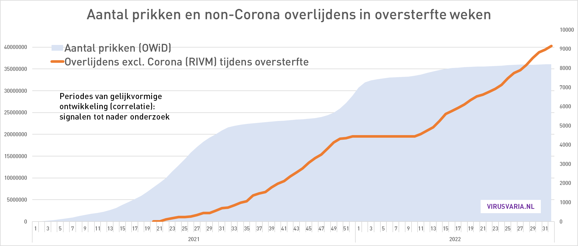
Theo Schetters, esteemed immunologist - until he questioned the corona vaccines - already drew attention in this video to excess mortality increases in the weeks that immediately follow the injection campaigns. Mortality sometimes even went hand in hand with doses. In normal circumstances, these are red flags that urgently require investigation.
On October 9, Dr. Schetters sounded the alarm again with an update of the same graph, via Wouter Aukema's Twitter account:
He is now mainly concerned with the last two balls in the red line. The blue almost vertical dotted line on the right indicates the number of vaccinations (left Y-axis). The graph above zooms in on the red-framed part in the graph below. (We leave small differences aside for a moment). In both charts, we see a big jump up in the last two weeks on the far right, almost from the baseline.
Immunologist Theo Schetters deserves great appreciation for his commitment and the way in which he always calmly and thoughtfully expresses his views. If only there were more scientists who dared to call for reliable monitoring, independent evaluation and research, with the skill and thoughtful tone of Theo Schetters.
As corona critics, we have to walk on eggs. While major newspapers publish one blooper after another, critics on social media are judged not only on who they are (the ad hominem argument is by far the favorite) but on every slip, an unspoken word or a false alarm. This is harmful to anyone who wants to improve the corona policy. For a scientific or even sensible and substantiated discourse, we no longer have the climate in the Netherlands.
I therefore plead for caution, even when it comes to the highly questionable vaccinations. In this particular case, I fear that we must be careful not to fall into the same nonsensical doomsday rhetoric as the OMT. Hence this on the one hand relativizing, on the other hand even more alarmist sound on my part. I would like to be ahead of the Keulemansen of this world, with due diligence and context.
The chance of false alarm
Of course, in both graphs we see an increase from 7, which starts when the vaccination campaign starts. And the increase in mortality has increased in precisely the groups that have been vaccinated. That too is a worrying sign. But let's try to keep the peace and look critically. What, if any, can be said against it?
- Mortality level is in line with the long-term trend
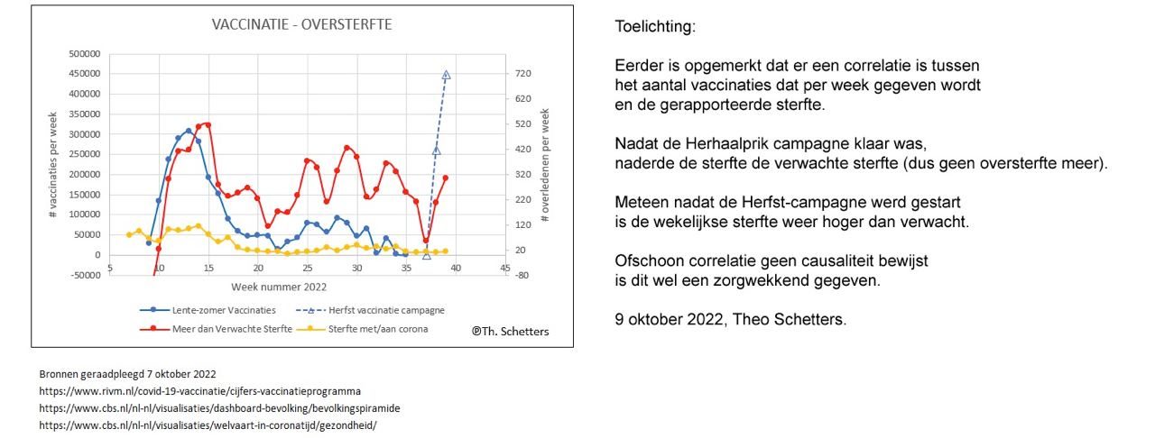
In the week prior to the repeat campaign, we had calculated a relatively low excess mortality of about 7 per day. In times it has not been so low. The average excess mortality per week in the last 20 weeks is about 40 people per day. That low weekly mortality was therefore far below the average of the previous weeks, including the summer. And that in October! A noticeable anomalous dip, it could also just have an administrative cause.
In the past two weeks, that dip has recovered to the trend level that we have been observing for some time (blue dotted line). This trend in itself is particularly alarming, but there is currently no question of a sudden exceptional situation. The current level is in line with the structurally increased mortality that virusvaria has been trying to draw attention to since August 2021. An outlier will also emerge. That could be next week and maybe the week after that too - it's simply too early to see this as a meaningful correlation. If this continues for weeks, it will be a different story.
Actually, this should lead to much greater unrest: what now seems so alarming has been going on for more than a year... - Causal relationship leads to an unlikely scenario
On the corona dashboard, it is reported that the vaccination rate among the over-60s is currently 13.3%. I suspect that the sales team has something to explain to the boss.
It is precisely in this 60+ group that the mortality increase can be observed. If this correlation is what it seems, vaccinations would have directly led to the observed increase in mortality over the last two weeks. Let's calculate that, beer mat.
If we aim for a vaccination rate of, for example, 65% (or 67%, which is 5 times higher than now) and there is a direct causal relationship, then mortality will have to increase accordingly and become 5 times higher. Calculating according to the methods we know from government institutions, the increase is even continued (this is then called a 'model'). This leads to a doomsday scenario as shown in the graph below. It would cause mortality in the coming months that would dwarf the Delta wave, but with non-corona deaths. And that alone when injecting people over 60...!?
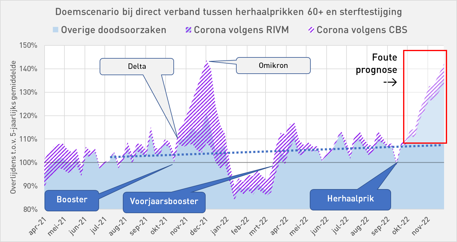
What would happen if the entire population, i.e. all people over the age of 12, were to be injected again! Well, the vaccination rate in the entire population (12+) is 4.5%. If we take that as a basis, the scenario becomes even more ominous, the forecast becomes another 3 times higher than the incorrect forecast in the graph... That might be suitable to scare the hell out of the whole of the Netherlands, especially the loyal Op1 viewer - but, dear virusvaria friends, we will not fall for that! 😉
A few more observations that raise eyebrows:
- Very quickly - but very little?
In the current Autumn Campaign, according to the graph, twice as many were made in the first two weeks as in the first two weeks of the Spring Campaign. However, the number of deaths is the same. That means: half of the previous mortality rate.
That seems contradictory to the doomsday scenario. It's just what you want to get out of it: the period is simply too short to sound the alarm.

- Creative correlating
The first big red and blue bumps coincide nicely. They also coincide with a flu wave that peaks from weeks 12-18. That's a coincidence, unless you suspect that the jabs indicated the flu.
The red after-bump in weeks 18-19-20 comes out of the blue (or put the flu chart over it). As a result, the temptation is great to recognize similar patterns, even if the scale is not 1:1. For example, the blue line of week 18-22 unmistakably follows the red line of week 20-24. Scaled smaller and pushed a bit to the right. The pattern matches.
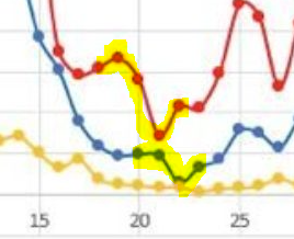
- Wie hier een correlatie herkent (en dat is de suggestieve kracht van deze grafiek, een soort 'template recognition') zal moeten erkennen dat de sterfte hier eerder is dan de prikken. Een causaal verband als gevolg van de prikken is er niet. Ik was toch even gefopt met een optische illusie. Wat een toeval! Laten we niet vergeten dat de correlatie juist optisch zo goed werkt door gelijkvormigheid die we onbewust waarnemen als "dat loopt congruent, dat is wel wat!".
- Older people suffer less
What could be the story behind the mortality trend? The blue line sinks more than the red. A rough count tells us that in the first bump (week 13) 1 in every 650 injections died. In week 33 this would have risen sharply to 1 in every 160 injections! The pattern may be suggestive, with the same number of optical bumps and 'it gets worse with every booster', but how is it possible that the young and less vulnerable, injected later, die four times as often as those injected first? You wouldn't expect that. - Up to 45 unexplained deaths per day Under point 3 we arrived at an approximate mortality ratio per number of injections: in the current campaign that would amount to approximately 1 death per 1,400 repeat injections, an unprecedented number of course. If the entire campaign lasts six months, that is a daily excess mortality of 45 deaths for six months (that's approximately how long the previous campaign lasted). We have been at 40 per day for quite some time and no action has been taken. In a few weeks we will see whether it has been extended to 45 per day. And whether there will be action... who knows?
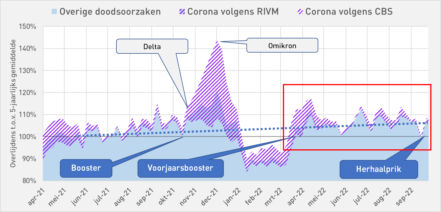
About the graphs with the shaders
Anything above the 100% line is excess mortality. The entire purple shading is the corona mortality according to rivm. Then the shading with blue background also falls under the non-corona mortality, largely unexplained.
The solid blue is the non-corona mortality according to CBS. According to CBS, all shaded areas are corona deaths. Between the 100% line and the shading, less excess mortality can then be explained.
The rivm figures
In this graph, the uncorrected values of RIVM are used. We used to multiply those values because it seemed to fit better into the overall picture. Based on CBS, approximately 70% of the corona deaths are missing from the RIVM reports. These are apparently not reported separately. It could be that fewer and fewer reports are being made than at the beginning of the pandemic. Then about 50% was reported, now only 30%.
Calculating with fewer corona deaths results in higher vaccine effectiveness. But with fewer corona deaths, there will be many more 'unexplained deaths' than there are already. If these are vaccination-related, it may look bad for the vaccines. So the vaccinations are either barely effective, or they could be a major factor in the excess death waves.
Statistics Netherlands figures
What was a problem with the RIVM figures was the strange increase in other causes of death in times of increased corona mortality, such as in Nov-Dec '21, which raises questions about vaccine-related causes. The CBS figures fit better with the trend line that we now think we see.
We therefore do not have to 'correct' those CBS figures. Based on these figures, there have been more corona deaths than in the RIVM figures. This also means that the vaccinations have been significantly less effective than if we follow the RIVM reports. But unexplained excess mortality is also lower.
Postscript about 'corona critics'
Via-via, thanks to this blog, I came into contact with like-minded people last year, some more famous than others, interested, knowledgeable and clever readers, helpers in the background, coaching and motivating. Broadly speaking, we agree: we are all dissatisfied with the shady behavior of our government institutions, we fear that lockdowns and vaccinations have been very bad interventions. When guessing what we are not allowed to know, our scenarios sometimes differ. Especially when it comes to the underlying intentions.
What's so nice about that group is the open exchange of ideas. You try to help each other with your own expertise, to point out mistakes and to supplement them. I sometimes think that we are more productive than a clique that agrees to 'speak with one mouth' and then does not want to hear any other sound.
Ik heb getwijfeld om dit artikel openbaar te plaatsen. Het publieke debat is weliswaar precies wat we zo missen maar ik wil ook niet dat populistisch georiënteerde propagandisten ermee aan de haal gaan om mensen in de "yet another wappie" hoek te plaatsen. Het moet ook niet lijken alsof ik een van onze meest gewaardeerde voorsprekers, Theo Schetters, onderuit wil halen. Zijn zorgen zijn méér dan gerechtvaardigd. Ik plaats zijn alarm in een bredere context: één alarmbel is eigenlijk veel te weinig.

Vitamin D2K3 must undoubtedly be vitamin D3 and K2... D2 also exists but is less potent, but K3 does not exist as far as I know.
The combination of D3 and K2 is well chosen because D3 ensures that calcium becomes available and K2 that calcium ends up in the bones and not in soft tissues (arteriosclerosis).
Incidentally, this combination only has an effect with a high dose of D3. The Health Council of the Netherlands recommends 200 IU of vitamin D3 daily, but that doesn't make a dent in a packet of butter. An adult person is more likely to need 6,000-10,000 IU per day, and with a vitamin D deficiency even more. At such doses, it is recommended to add vitamin K2. And then preferably the MK7 variant (menaquinone 7) which is the most effective compared to the cheaper MK4 variant.
My daily use: 10,000 IU vitamin D3 (NowFood gel capsules with olive oil) and 100 mcg vitamin K2-MK7. After 3 months my blood level for vitamin D tested: 65 ng/ml or completely fine.
I corrected it right away, of course. I have also followed a.o. regarding recommended, under- and overdose of Vitamin D. Too bad that there is so little attention for something so essential. Who controls his Vit. D-levels? There is simply no business model in it. A pill that reduces a statistical risk is a bit different than a real "injection" that removes fear of death. In the past, you had to sacrifice something for that. Not now – at least that's not what it says.
Even if the blood is pricked on D3, the question is whether the doctor in question does something with it because it falls "within the bandwidth".
About facts: I think in the corona waves in 2020-2021 there were many people with not only comorbidities, but also many non-western immigrants and people with (morbid) obesity in the ICU. If you take physiology into account, you know that people of more southern latitudes produce much worse vitamin D in our climate. Vitamin D is fat-soluble, which means that the vitamin D that is in the body is not in the bloodstream. This would imply that Vitamin D, if not already researched, plays a much greater role in the resistance to Corona than we are told.
That picture with the caption: "Same pattern, but wrong" can hardly be presented as proof to the contrary. That can be fine noise. Furthermore, the big movements are all clear: more, followed by more deaths.
That on those few data points it seems the other way around does not power the rest of the graph.
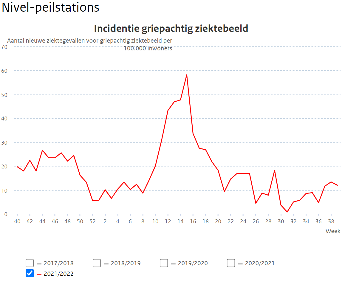
Yes, but if it is correct, it can also be noise... It could be registration delays but I thought it was strange that they first run neatly in sync (death about 1 to 2 weeks after the injection) and then suddenly 1 week before the injection. Then there are registration differences of almost 3 weeks. But anyway: again something to investigate. In the meantime, I have also made a graph with the flu wave in it (reports Nivel). That is also true and perhaps even better.
It's just too meager data to really be able to handle anything.
I count myself among those like-minded people. Xxx