
Thanks to Herman Steigstra and Jillis Kriek
In discussions about excess mortality, reference is sometimes made to the bandwidth, which allows for abnormal deaths on a weekly basis. It is the light blue area around the predicted weekly value. If that margin is taken into account, there would be no significant excess mortality on a weekly basis. In this article I hope to make it plausible (also for non-statisticians like myself) why this is not true if we consider longer periods. Even if there is excess mortality during an entire calendar year, it is still possible that there is no excess mortality in any week because the weekly figures always remained within the bandwidth. Statisticians then say: "There is never significant excess mortality".

Every expectation has a degree of uncertainty, and that is certainly true when it comes to demographic data such as mortality expectancy. The extent of this uncertainty depends on all kinds of factors. For example, there is uncertainty in the estimation of an average, uncertainty in the number of deaths counted and weather influences that make the fluctuation greater or shifts in the composition of the population. It is a mix of statistical uncertainties and the difficult to predict variability of the subject of that statistic.
The actual mortality is rarely, if ever, exactly as expected, but that is no cause for concern. When 2,600 deaths are predicted in a week, it could also be 2,500 or 2,700. If the prediction is correct, the actual mortality will swing around the forecast or the "baseline". Within a few weeks, a deviation is compensated by a deviation in the other direction.
How far that pendulum movement may go before there is an alarm signal is a statistical matter, but also depends on agreements about what we can and want to live with. All kinds of circumstances determine the extent to which many people die at the same time and what we find acceptable. Because more people die in winter than in summer and because it is accompanied by stronger swings, not only is the baseline higher in winter, but the bandwidth is also considerably larger (as much as 2x as large as in summer). So we find that acceptable.
That fluctuation is normal – given normal circumstances, without heat waves or severe epidemics. The measured mortality may therefore deviate from the expected level every week. Weekly margins are used for this.
Excess mortality or not?
Excess mortality per week
CBS uses the terms excess mortality and undermortality for the weeks in which the dark blue line (mortality) breaks out of the light blue area (the weekly margin). The margin is the area between two threshold values that we have agreed on for an expected number of deaths in a week. Of course, there are uncertainties here too, but that is going too far now. The signal values are clear and CBS publishes them. See for example the "Download CSV" buttons in the monthly reports at this page.
There may be increased or decreased or increased mortality, excess mortality, decreased mortality etc. etc. that also remains within the light blue area that indicates the weekly margins, so inside and outside the signal values. In this article, we use the terms for this increased mortality and reduced mortality.
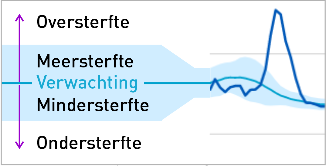
Without a bandwidth in mortality expectancy, we would not be able to interpret fluctuations properly. The bandwidth therefore mainly has a signal function: within it there is no reason to worry for that week. Under normal circumstances, we can see in a moment when something excessive happens that needs to be explained. In the Netherlands, this is usually a heat wave or a flu epidemic.
Excess mortality per month
It seems obvious to use the successive weekly margins as a signal value when evaluating a longer period. No matter how far back we look, we continue to consider those weekly margins to be normative. That is not justified.
You can't just stick weekly margins one after the other to include them in longer periods.
It is easy to see that roughly adding up the weekly margins - because that's what you do - leads to absurd results. If you add up all the excess mortality margins of 2021, you arrive at an excess mortality margin of 13,413 excess deaths. There would therefore be no excess mortality within that margin. This is not consistent with the fact that both CBS and RIVM speak of an "average annual excess mortality of 6,500 deaths more than expected". That is not even half of that 13,413.
Now this seems like a sought-after example, but this is exactly what happens when you look back on a year and check each week separately whether the weekly margin has been exceeded or not. Continuing to assess whether or not excess mortality is a weekly basis will therefore be misleading. After all, there is the possibility of getting a more precise picture because of the longer period of a month or six months.
So how can we stick those weekly margins together to a longer period?
Combining such weekly margins into a period is fascinating. On the one hand, you know that after several weeks it is about bigger and bigger numbers. On the other hand, you also expect your estimate to be more accurate after a longer period of time. You expect that what actually happens will be more in the direction of your estimate. If you take into account that you can be off by 1% after a year, that's very little. But in a short period of time, such as a random winter week, you can be off by as much as 20%. So: the longer the period, the narrower the bandwidth. But at the same time, the number of statements you make about increases every week and larger groups make the margins larger in absolute terms.
Compare it to a coin that you expect to throw as many heads as tails with it: if you compare the two, you have to get closer and closer to 50 : 50 after a lot of throws. If you throw up three times and you have three heads, that doesn't really mean anything. If you throw up three more times, the chance that you would have thrown heads three times in a row is the same, but the chance that you would have thrown heads six times in a row is much smaller. Every time you make three more throws, the chance of 3x "heads" is always the same, but the chance that you will throw heads for all throws is smaller and smaller for the ever-increasing number of throws in advance.
If you toss the coin 365 times and you get heads 365 times, that's a signal that something is wrong with your coin. Then you will either have to adjust your expectations regarding this coin or reject the coin (or investigate: maybe it has heads on both sides?). If you then stubbornly insist "yes but every time I threw it was really a chance of one in two so there is nothing special to see" then you are applying the wrong rule to be able to judge a series of events.
The fact that a science journalist or a fact-checker does not immediately see this is perhaps justifiable. This would surprise me from statisticians. We will soon be reviewing a monthly CBS report on this subject.
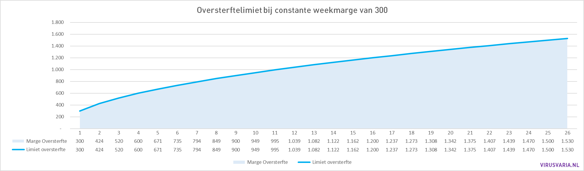
Back to excess mortality: if, for example, we take an excess mortality of 300 per week as the limit value for excess mortality, this does not mean that the margin is 600 after two weeks and 900 after three weeks. That line is increasing more and more slowly and only reaches 600 after 4 weeks (depending on the chosen reliability limit, but that is beyond the scope of this blog. Usually 95% probability is chosen).
To calculate this decreasing increase in probabilities, there is a formula that comes from binomial statistics. The spread (statistical name for the deviations upwards and downwards) in the number of deaths (in this case) increases with the square root of the total number.
How the formula works out is best illustrated if we assume a constant weekly margin and a fixed number of deaths per week. The bandwidth at a constant weekly margin of 300 looks like a curve that gets flatter and flatter:
Week 1: 300
Week 1 to 2: 424
Weeks 1 to 3: 520
Weeks 1 to 4: 600
etc.
How does that relate to an excess mortality of, for example, 75 per week? We see that below.
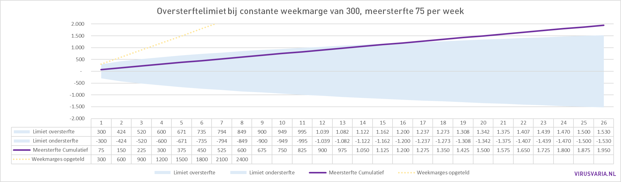
In the first week, the 75 excess mortality is well below the upper limit of 300, in the second week at half the margin limit. After 16 weeks, the zero point is reached and the 'official' excess mortality begins. If we look back at the past six months in week 26, we see that there is excess mortality over that six-month period. The purple line breaks out of the margin.
For example, from week 17 we are in a period of growing excess mortality.
An excess mortality situation can therefore arise with an excess mortality of only 75 deaths per week, despite the fact that the bandwidth indicates a signal value of 300 per week (that is 4 times as much!).
The light yellow dotted line in the graph indicates what happens when the weekly margins are simply added together, as is sometimes suggested.
CBS reporting example
CBS collects, manages, evaluates, interprets and plausibises our national data. In short, CBS tells us what the figures mean.
An example: May 2022.

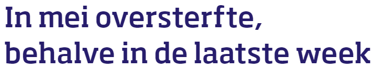
In the headline of the article, we already see that excess mortality is back in the safe bandwidth in the last week of the month. Nice, right? We are already in the safe zone, things are going in the right direction, excess mortality is decreasing. So that headline of the article is completely correct – if you only look at the individual weekly margins.

But if you look back at the past month in your monthly report once a month, can't you get a little more out of your data, trends perhaps? Signs that require attention?
With the basic knowledge about period margins, you should also look at May as a whole and the weekly mortality in relation to each other. And on the basis of that, perhaps the connection with previous months, if there is reason to do so. This produces a different picture: over the entire month of May there was excess mortality, ultimately more than twice as high as the monthly signal value!
 CBS report
 CBS report
The message that follows from data is not always desirable. It is precisely in such cases that knowledge institutes in particular can and must show their usefulness and strength, it is precisely then that the alarm must be sounded. They are there for the population, the population pays them for it. They are the ones who are qualified, who possess the authority, expertise and reputation that can make all the difference. An amateur with deviating grades is laughed at by the pallbearers in the media and their followers on Twitter. CBS is quoted and lauded.
The harsh conclusion could not be otherwise. It is not just that our institutes keep data hidden, which in itself is a huge thing. It is a blatant violation of the guidelines for scientific integrity that should have had consequences. That did not happen (in fact, RIVM received a scientific prize from the KNAW) and attempts to do so were rejected. It also appears that data that has been made public are presented in a disguised way, as shown in this article.
Carelessly, a few weekly reports are stapled in a row, someone has to write a summary of it, and now get out.
I do not want our health to be treated in this way, at least not mine. There is much more to say about it, but the message will be clear. And then I don't even enter into the possibility that this is done intentionally. It is now happening so systematically that I can no longer put that option aside, even if it has the appearance of conspiracy thinking, from which I want to stay far away if at all possible.
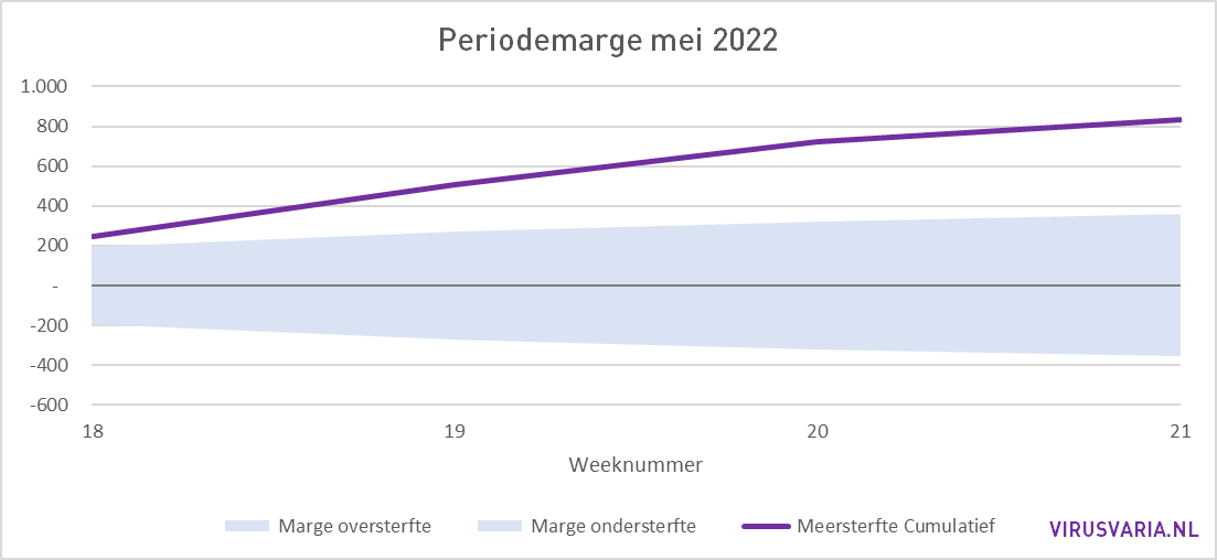
The real numbers of the past six months
So let's take a look back at the past six months. The weekly margins vary. In the first weeks, the weekly margins are still high (winter), the bandwidth is rapidly increasing. The arc is therefore not as regular as the example with a constant weekly margin. In the last weeks of the graph (the summer), the margins are more than half smaller, so we see the graph flattening out faster there. If we apply the same period adjustment again, but this time to the actual weekly margins as determined by CBS, the half-year margin looks like this:

The kink where winter mortality changes into summer mortality is clearly visible.
In the graph below, the purple line is the cumulative mortality deviation compared to the expected excess mortality (the baseline). Where the line decreases, there is less mortality and just no undermortality. After week 18, there is excess mortality. Week 18 is the first week of May 2022.
As early as August 2021, I drew attention to excess mortality. As a result of my articles and attention from Maurice de Hond, parliamentary questions were asked about this. Thierry Baudet tried to get it on the agenda. It was only months later that it was picked up more widely, Pieter Omtzigt submitted a motion (which was complied with through a surrogate exercise) and now structural excess mortality is a point of attention worldwide that is curiously ignored by the authorities.
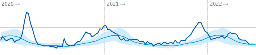
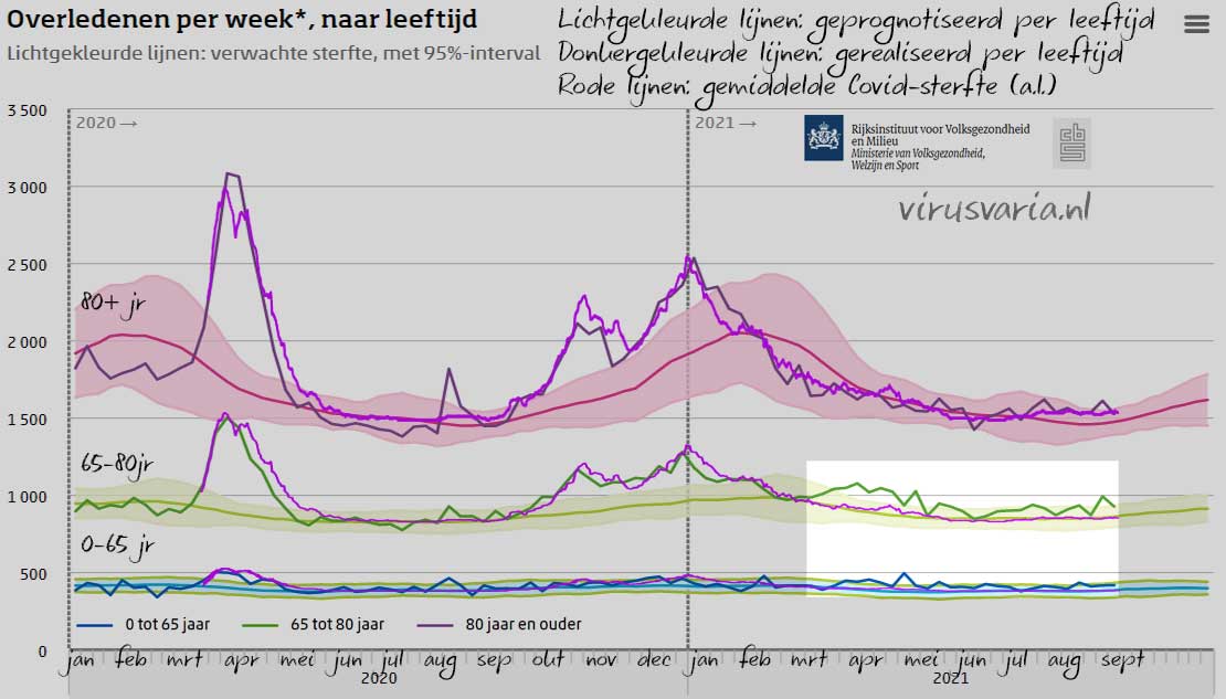
Below is that first visual with the summer highlighted for 0-80 years: excess mortality or not? The article was from August 25, 2021. I am aiming for next week, August 25, 2022, to release the above check at least on this period. To celebrate the excess mortality anniversary.
Addendum: Advanced Bandwidths
With this article, I wanted to show that the cumulative range is much narrower than the cumulative weekly margins. Bandwidths can become even narrower over time, if one takes into account the fact that excess mortality makes the population at risk smaller. For this article, that was needlessly complicated. Read more about this in a later article: "Excess mortality breaks all records".
"It is now happening so systematically that I can no longer put that option aside..."
Since the government does not want to provide transparency, I think we should assume the darkest scenario that the government deliberately does not want to reveal the actual excess mortality in order to hide the bankruptcy of the corona measures.
With the knowledge of Agenda 2030 that is secretly supported and implemented by our government, I want to go even further: the government is working on a plan to destroy existing structures and has no qualms about decimating the population. That may sound a bit harsh, but without evidence to the contrary, it seems to me to be a good theory for the time being...
At the risk of not properly understanding the purpose of the expected and actual figures, it reminded me of the following. In my position as a software developer, I was asked by a mining company to predict the price up to 10 years in the future based on the gold price used on the London Exchange with daily corrections based on current value. A wonderful challenge and methodology behind it has been used there and in London for years. Maybe even now, I don't know. Still, in principle it was not that difficult. The schedule started per day, then per week, per month, per quarter etc. Ever larger intervals.
The base values were calculated on the basis of the past, so that an estimated percentage change could be observed.
By applying that course to the current current market value, you got an excellent prediction. Of course it was
obtained expiration value also reordered daily based on correction with current value.
It's a bit more complicated than I'm explaining quickly here, but all in all it was extremely reliable and got better the longer it was used. Partly for this reason, I am often immensely annoyed by many statistics, which are really very sloppily compiled. But I must be too old for that.
The government is not able to provide reliable figures, they don't understand that. Data is something the government does not understand at all or even controls or manages. And they are not planning to do anything about it, only appearances are important.
There is a misconception that the government is there for the citizen. In practice, as a civil servant, I have never literally heard that a civil servant works for the citizen. He is there to keep the citizen in line, that is the primary goal of the civil servant, at least that's how it works.
Because most civil servants do have (had?) principles and a conscience, the civil service is largely still citizen-friendly. But the corona crisis has made it clear that the civil servant has now become an übermensch. At least that is what he has determined himself.
During the Corona crisis I received gifts from the higher priests, I mean managers. While thousands of people feared for their jobs, people were locked up and freedoms were restricted, the civil servants received various gifts because we were having such a hard time(???). Useless gifts, sweets with wrong E numbers etc. It all disappeared into the trash. (Divorced) I think I got about 150€ in junk, including expenses. Apart from what we get extra anyway, even a 13th month!
As far as the workload was concerned, 95% of the civil servants were much less busy because they could work from home more efficiently. 20% could actually start looking for another job, in the higher scales, if working from home were to become the norm. (So they also bravely fight back against working from home, the trolls confirm again and again that it is so nice to work in the office)
If I criticized these knickknacks and referred to the people who really needed it, I was ungrateful and it's a nice gesture, who cares? (just the extra environmental impact of delivering those thousands of useless packages?)
These are signs that the average civil servant has no idea what his primary goal should be.
It interests him, on average, really not a bit, I can assure you.
I have climbed from scale 2 to 11 in 40 years and have experienced that the more I earned, the less I had to do for it. It is abundantly clear to me that the civil service is sick through and through and no one is going to do anything about it.
So my expectations of the government as reliable are now nil.
So not much of those figures will add up.
Hi Leo,
Thank you for your honest answer about the role of civil servants. I know there are many sincere officials, but the rest. . .
Maybe Anton wants to provide you with my email address, then I refer you directly to an unprecedented injustice that is done to us personally, but that is not possible on this forum. If we hadn't kept the thousands of proofs, no one would believe this horror. We are placed outside the law because we refuse to commit fraud. That says it all.
Hkr: If you mean that our pensions are being squandered by Frans Timmermans for green EU bonds that are worth nothing, then I am already aware. They will certainly succeed with this cabinet.
Oh no, this is something completely different. I can't say anything about this publicly, but it will be a very big national item. An investigative team is now collecting the facts from thousands of documents. They call this almost incomprehensible horror.
Sorry I can't say more here, but maybe you can and want to be of support to us. Hence the friendly question.
Thank you so much