
Aanstaande dinsdag (morgen dus) zit ik in Ongehoord Nieuws om iets te zeggen in hun nieuwsitem "Oversterfte". In de voorbereidingen stuitte ik op onderstaande grafiek uit het oversterfterapport van rivm en CBS. Het werd ook weer tijd voor een Virusvaria-artikel, bij deze.
t.ly/oDW-
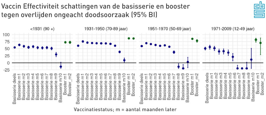
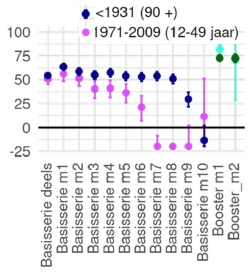
'Basic series Deels' is the first of the two basic injections. This immediately shows a VE of more than 50%. The second injection (basic series month 1, month 2, etc.) improves this somewhat. Please note: this is not against Covid. This is an effectiveness against dying to any cause of death!
This seems like an elixir of life...! Far fewer people will die, people will grow older, life expectancy will increase because the majority of people have been vaccinated. How many houses should we build now?
To our surprise, an injection protects 65% better against cancer, heart attacks, brain haemorrhages, traffic accidents, domestic accidents...? Or against all other infectious diseases? After all, even in the most rabid calculations, Covid-19 does not exceed 20% of the causes of death, which cannot cause this difference (See causes of death 2020(!) of the central government) because even if under this 20% assumption every corona death is saved, you will not get to 65% effectiveness against total mortality. Have unvaccinated people suddenly died much more from other causes? Very unlikely.
It is certain that total mortality remains at the same level and more than that, there is excess mortality. This addition to the prevented deaths should then come from the unvaccinated, but we see nothing of this in hospitals and ICUs: those figures should then have approximately doubled. See the calculation example below.
Calculation example
Suppose (rounded numbers!): 3,000 people die every week. If two-thirds have a protection against dying of 65%, far fewer people die, more than a thousand. If mortality remains the same, the small unvaccinated group should show almost double the mortality rate. The data just can't be right. The exact calculation will follow in a later post.
'Basisserie m1' betekent de tweede prik, die na twee weken de bescherming nog eens verhoogt van 50% naar 75%. We nemen maar aan dat die twee tussenliggende weken bij "Basisserie deels" worden geteld, anders zou je sterfgevallen missen en ten onrechte als 'ongevaccineerd' registreren. Zoiets zou dan weer kunnen leiden tot een sterk verhoogde VE tegen alle doodsoorzaken.
You could check that in the data, but the institutes did not snoop.
Decreasing protection (delusion)
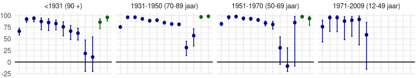
The progression of protection over the months is downright worrying. In the youngest group (12-49 years), the VE falls below zero after just 5 months: more mortality among vaccinated people. Months 11, 12 and beyond are not even shown, although the young people do give an impression of what happens when the protection curve decreases. The protection extends to very negative, which means that the chance of dying as a double-vaccinated person is greater than if you are not vaccinated. It is not clear to what extent this will pick up again 'of its own accord'. Let's hope that our natural immune system can also come up with a meaningful response to this.
We do not know what happens next to the double-injected patients (20% of the population). After 10 months, the blue dots are left out and only the boosters are shown. That will boost things enormously, although we will have to wait and see for how long. The first two visible blue dots do not seem to be equally stable everywhere...
The spirits are now being prepared for injections every eight weeks...
Graphlighting: how negative?
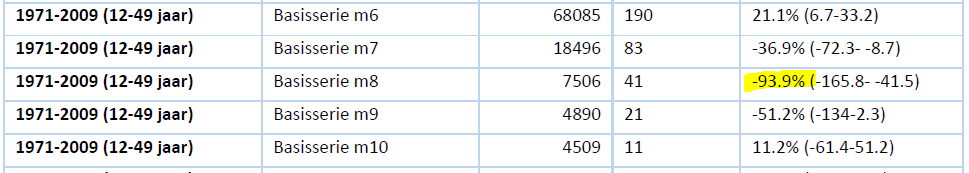
In the CBS graph above, it is also striking that at 12-49 years three blue dots are next to each other at -25%. You would almost think that all negative values are shown as -25%. In the underlying figures we even see a Negative VE of -93%! Apparently, 8 months after your injection, you were twice as likely to die as usual, at least if you were double vaccinated and between the ages of 12 and 49. A data error? Or something about the wrong registration of the vaccination status? What's going on here?
This is apart from the shameless misrepresentation, not to say disinformation in the graph. See how CBS displays it and what it should have looked like if the actual values had been displayed.
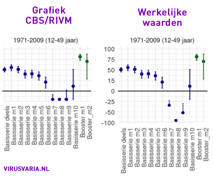

So the graph should have looked like this:

We also encountered a similar phenomenon in the UK data. As soon as the boosters come into view, the basic series is no longer reported. The group of double-vaccinated people may then be considered too small because the majority (about 75%) of the get the booster. This apparently makes the double-pricked less interesting. The UK data that still exists with regard to the double-vaccinated group also show clear signs of negative effectiveness. This is smoothed out by replacing it with the jacking effect of the boosters.
What is also striking in the CBS graphs is that it seems as if the decline occurs much earlier in young people than in the elderly: about three months earlier. You wouldn't expect that with strong immune systems.
Faster disappearing effectiveness has been reported in multiple studies. For example, in an Israeli study we read:
Published work on many vaccines, such as those against measles, mumps and rubella, has shown a small drop of 5 to 10% each year in neutralizing antibody levels. On the BNT162b2 vaccine, we saw a significant and rapid decrease in humoral response within a few months of vaccination.
Israeli study among approximately 4,000 healthcare workers
They're talking about three to five months. So that rivm interval of 10 months seems like a long time.
[edit 18-9-2022:] In the House of Representatives hearing, Jaap van Dissel presented a different graph. The last four red dots at 12-49 also indicate a higher mortality risk than for unvaccinated people, but much less than the blue above.
In the graph VE against death by Covid-19, the last balls have been omitted. We have to guess whether they turn into negative values: vaccination mortality.
Risk of death after 2nd dose of basic series
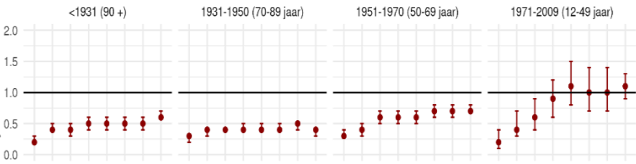
Vaccine effectiveness (VE) against COVID-19 mortality
Theo Schetters on Negative Vaccine Effectiveness
In accordance with the working method of the world's top journalists, I consult an expert to ask Science how things are going. In the video below, vaccine expert Theo Schetters emphasizes excess mortality immediately after the injection campaigns: red flags that require urgent further research.
From about 16 minutes he also deals with the self-report of rivm/CBS. It is clear that these data should have consequences and that the conclusions of the report are not in line with the data.
A variable interval?
Statisticians are looking further in the direction of that 5-month interval, given the findings in the US and UK. In the Netherlands we only saw those 5 months among the young, the elderly received protection for months longer - but against what? Against everything? Isn't that very unlikely, are those data correct?
In this graph the oldest and the youngest group: 90+ holds the protection for months longer than the group of 12-49 years.
The over-90s were vaccinated months earlier than the 50-year-olds. The protection of both the elderly and the young began to fall away at about the same time, that was in the last quarter of 2021. On Twitter, Maarten Keulemans notes that we were dealing with Omikron at the time.

So when Omikron came up and the vaccines could start proving their protection, they failed, they even proved counterproductive.
The graph could also be explained differently: excess mortality was already increasing when vaccine protection began to decrease. When the vaccines were completely exhausted (or escaped away), it paved the way for omikron.
However, this explanation is not compatible with the rest of the world. We were later with than other countries and omikron did not care about that at all.
Another hypothesis is that the immune systems are severely disrupted and that virus-rich periods reveal this. If that is indeed the case, we are heading for an exciting autumn.
In conclusion
All in all, more reasons to explicitly mention vaccinations among the possible causes of the excess mortality that has been structurally continuing for almost a year and a half, since May 2021, and flares up in the meantime. In no particular order, I will list the most important starting points for thorough, independent, scientific and therefore critical and public research:
- Effects of non-medical interventions: policy measures
- Psychological factors (depression, decrease in zest for life, lack of perspective due to loss of work or lack of meaning, deprivation of liberty, death need, life threat, life threat of loved ones, threat of death by guilt, etc.).
Note: Diffuse matter and therefore difficult to harden. Just try to quantify. - Delayed care (in particular, delayed diagnoses are often mentioned)
Note: Delayed care will only be able to explain a small part of the excess mortality, which is easy to quantify.
- Psychological factors (depression, decrease in zest for life, lack of perspective due to loss of work or lack of meaning, deprivation of liberty, death need, life threat, life threat of loved ones, threat of death by guilt, etc.).
- Effects of medical interventions: vaccinations, treatment protocols
Note.: This research is made impossible by the unjustified protection with privacy rules. This is the biggest red flag and will have to be followed with suspicion. There are too many interests involved, for example financially, politically, in terms of reputations and consequences for the general willingness to vaccinate. - Aftereffects of Covid-19
Note: To be considered in relation to other infectious diseases, which will also be a challenge because less is known about them
We will soon re-examine the quantitative share of a number of these categories - as far as possible. Because the government insists that the vaccines cannot be an option at all, we often pay a lot of attention to it here with signals that indicate that there are all kinds of ways in which the vaccines can indeed play a role. Will independent research ever resurface or is it forever drowned in the turbulent waves of technocratic inclusivity thinking?

"Effectiveness estimates"
How are they estimated?
Wet finger work? Computer model?
Unfortunately, we are only allowed to see the results, not how they made the sums.
"Scientific" research has shown that direct injection of Haarlemmer Oil is 234% effective for: hair loss, lupus, shingles, cholera, the plague, hernia, a tennis arm, psoriasis and acute diarrhea.
But above all, it prevents Covid-19 to Covid-99. A real panacea. Studies are funded by Pfizer, Moderna and Marianne Koopmans, so that's fine. Available at Tel-sell and the better DIY store.
I saw this on Joe Smalley's website. Rather interesting seems to me, and in line with your article. Maybe you already knew it, Anton, but better 2 times than not at all.
I think this research is worth reading.
It's worse than you think....
Fri. Gr.
Cees Mul
https://papers.ssrn.com/sol3/papers.cfm?abstract_id=4206070
No, I hadn't seen it yet. A clear argument and incomprehensible that it is necessary to make such a plea!