
What follows seems complicated, but it's not that difficult. Think of fire-safe and fire-hazardous homes. If the number of fires increases, it will mainly concern fire-risk homes. If that is not the case, then the whole story about fire safety is not correct. This is how we look at vaccination protection in this article. We compare a low-covid month with a month in which covid mortality peaks. In the month with high covid mortality, the mortality increase among vaccinated people appears to be comparable to the increase in mortality among the unvaccinated, among people over 50. There is no vaccine protection. Among people under 50, it is striking that mortality among vaccinated people decreases when they come into contact with the virus more. This internally contradictory story simply can't be right. The consistency test is not passed.
A graph is circulating on Twitter showing the general mortality, not just 'corona mortality'. The special thing about this graph is that the unvaccinated are compared with the vaccinated. A tip of the veil seems to be lifted because the raw data is carefully shielded or declared unusable. We can see what can be made of it after the necessary edits and Dutch propagandists are again given 'proof', which is then promptly blindly tweeted triumphantly. But the story doesn't add up.
With increasing covid mortality, mortality among the unvaccinated should rise significantly more sharply than among people who have been vaccinated with an effective vaccine. This does not appear to be the case, on the contrary.
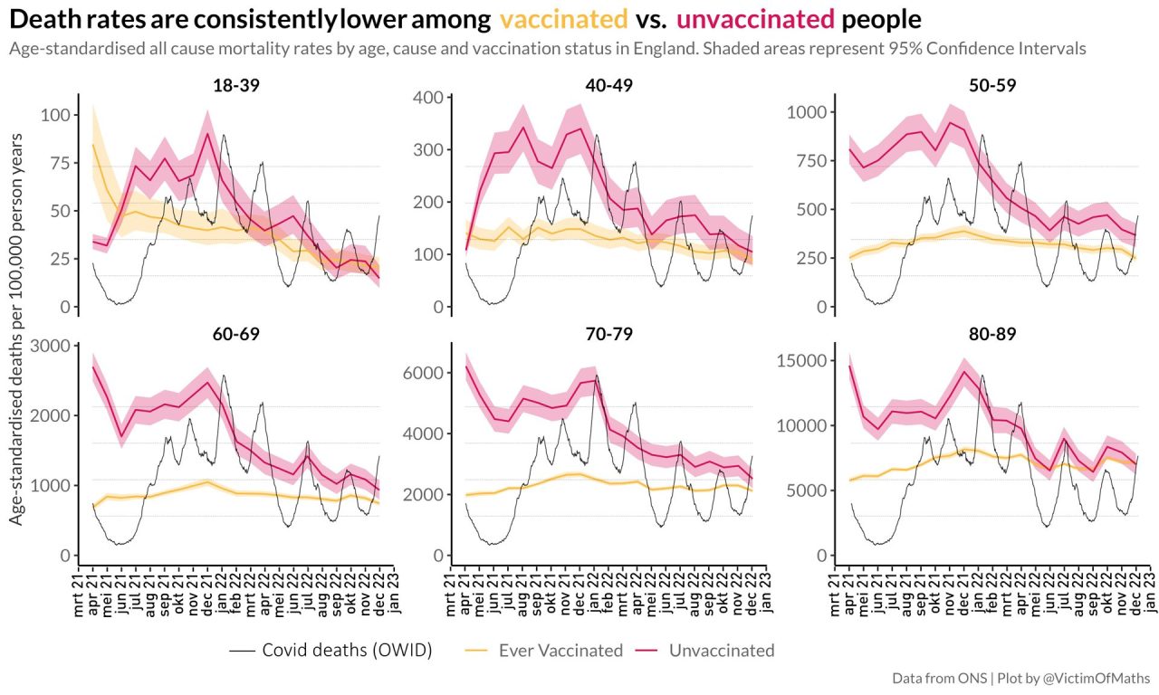
We look at graphs from which we have to read that English unvaccinated people were for a long time much more likely to die than vaccinated people, up to three times as many! Overall mortality per 100,000 of vaccinated people is yellow, unvaccinated red.
Wherever the red line rises above the yellow one, in almost all of 2021, mortality among the unvaccinated is much higher than among the well-vaccinated. So vaccination works, is then the desired conclusion.
We have known for a year and a half that the underlying figures are incorrect (see my article from July '22)but that doesn't stop the narrativists from playing them off through national media. Lying is allowed, lying is allowed. Finally.

In virtually all age groups, unvaccinated people were about 2.5 to 3 times more likely to die than vaccinated people throughout 2021, with differences by age group. This fact alone is enough to set aside this information.
If the vaccine has no serious (read in the context of this graph: fatal) side effects, mortality reduction from the vaccine can be seen in the all-cause mortality in the vaccinated group compared to the unvaccinated. But then there must be a lot of disease, otherwise differences in the noise quickly disappear. This is more difficult to measure with a weather-dependent disease than with a more constantly present disease. Sometimes the disease prevails and almost everyone seems to get it, sometimes the virus goes back into standby and there is little to nothing going on in both groups. Those fluctuations make it more difficult. But they also expose a lot.
What you can expect is that the effect of covid vaccination occurs much more strongly in periods when there is a lot of covid mortality than in times when there is virtually no Covid mortality. If there are no corona deaths, the vaccine cannot do anything, that will be clear.
Think about fire safety again: If there are no fires because it rains, the number of fires per 100,000 fire-risk homes will drop sharply. You may not even see such a decrease in fire-safe houses.
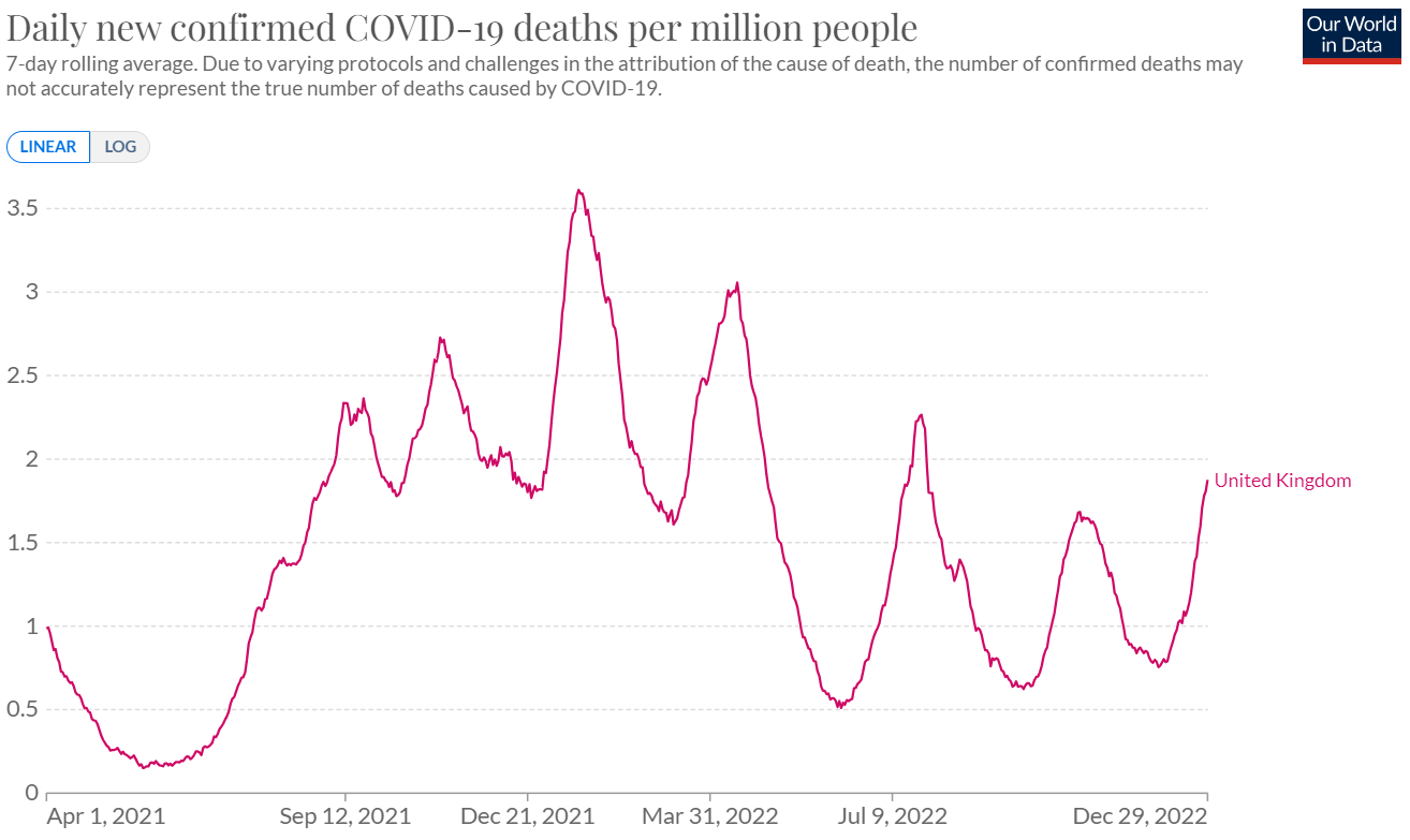
It is therefore interesting to see to what extent covid mortality is more or less in sync with the reported rise and fall in mortality rates red and yellow. The grey line shows the rise and fall of Covid mortality (OurWorldInData).
Note: the grey lines are scaled and indicate when mortality was close to 0 and when it peaked.
The grey line indicates dips and peaks in covid mortality across the population. At the top of this chart, there were 36 per 100,000 per week. In the valley from May-June-July 2021, there were only 2 per 100,000, across all age groups combined. (In 2020, that was sometimes as high as 200 per 100,000.)
The absolute figures
I asked Herman Steigstra what he thought of the article. The first few months, up to the blue vertical line, told him enough. His comments include:
"My hair rises when I add the absolute numbers. Statistics Netherlands (CBS) has figures for expected mortality, broken down by age. We also get the seasonal influence from there and make an estimate for the UK for the expected mortality throughout the year. This is a chart with that baseline.
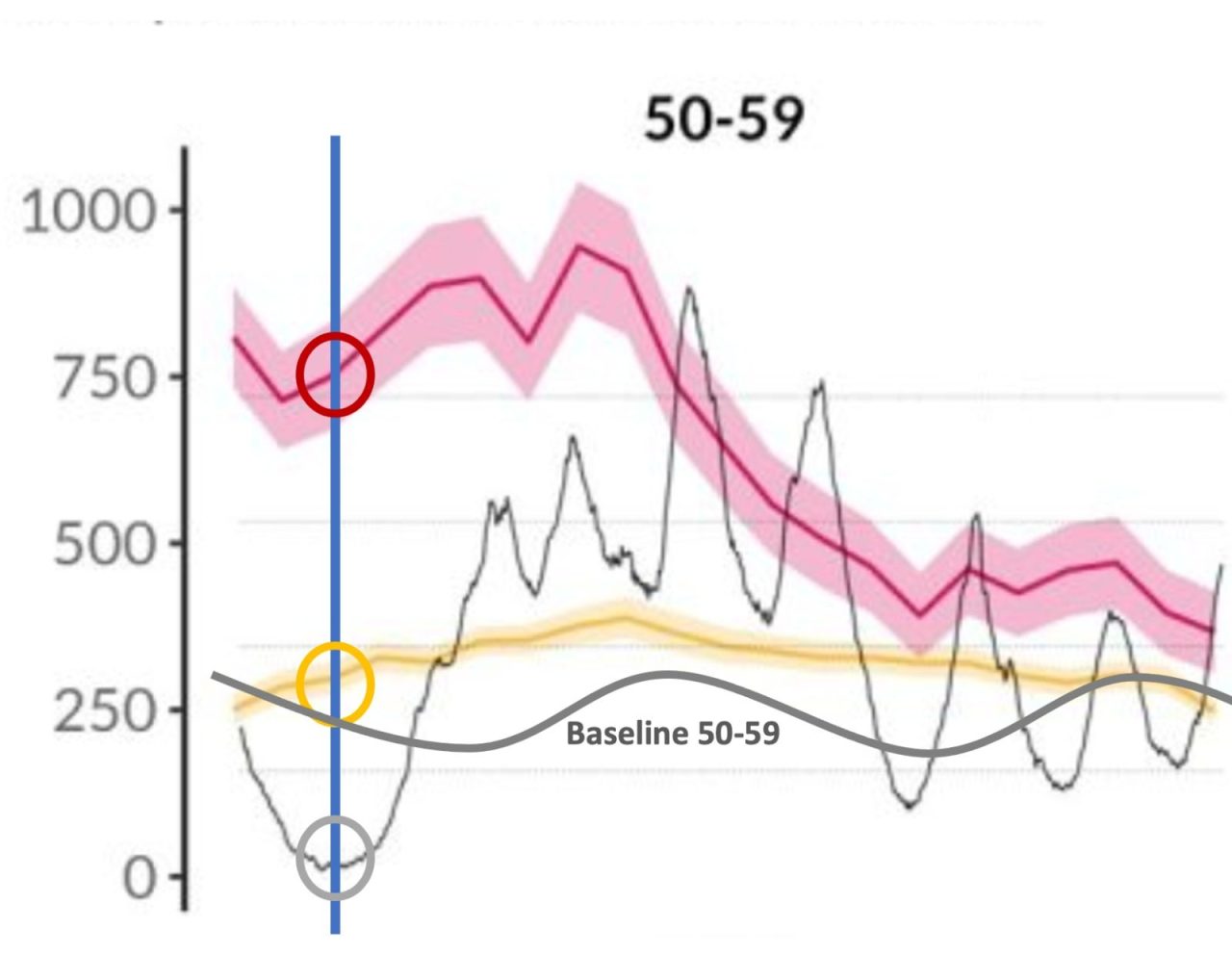
"Two things stand out after placing this baseline. Despite the absence of corona in June 2021 (the grey circle), the aboutmortality among the unvaccinated 4 times higher (red circle) than that of vaccinated people and that is extremely curious in the absence of Covid. However, mortality generally follows the seasonal pattern.
"Among the vaccinated, on the other hand, we see the mortality in the course of the summer increase (the yellow circle) and that too is strange. The total mortality is increasing, while the mortality from covid itself up to the blue line is increasing Decreases according to the figures of OWID. In June 2021, there is already 20% excess mortality among the vaccinated.
"It is almost inevitable that the accounting for the vaccinated status is wrong, because a fourfold excess mortality in the middle of the summer is very unlikely."
18-39 and 40-49 years
Mortality among the unvaccinated is rising during the coronavirus downturn, even if we were to move the grey covid mortality line to the left for a month. That's curious, especially since the youngsters started to get pricked. At 40-49, unvaccinated mortality skyrocketed as early as May '21. What did all those 50-min unvaccinated die of? Against which disease(s) did the vaccination protect? After all, it can't have been Covid.
The age groups of 50 years and older had already had that jump up before, these graphs do not show that.
Angry tongues claim that you can tell from this exactly when the vaccination started in each age group. The graph shows that the unvaccinated died more after that. It seems as if a mechanism is being activated by which nature tries to portray the vaccinated in such a favorable light that the mortality among the unvaccinated spontaneously triples in a period when no covid mortality is observed. It sounds nonsensical but that's what the graphs show. We also sometimes see this effect occur when asmr and person-years are calculated back with possibly other statistical plausibilizations.
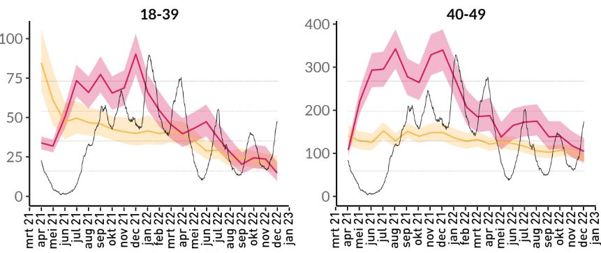
Another curious detail: 18-39 years, April-May 2021. The vaccinated then did about three times as badly as the unvaccinated. This can be explained as a healthy vaccine effect: the young people who were preceded in vaccinations were the most vulnerable and in that group the mortality rate is simply higher. OK, but also so much higher than a few months later? Or had most of the pricked vulnerable all died after a few months? To what? And weren't there any new vulnerable people? It's a detail, but still.
Summer 2021 versus the middle of winter
In the early summer of 2021 (May-July) there was - I'll say it again - hardly any Covid mortality. With an effective vaccine without side effects, you expect that the mortality per 100,000 unvaccinated people will hardly differ from the mortality per 100,000 well-vaccinated people. After all, the disease against which protection is provided is virtually absent. Then the mortality per 100,000 unvaccinated people must therefore decrease significantly – you would think.
In July 2021, however, unvaccinated mortality is up to 2.5x higher than vaccinated mortality. The general Covid mortality is then 7 per 100,000 per week (see possibly. OWID, link at the bottom of this article).
Covid mortality will then increase by a factor of 5 in the course of 2021, from 7 to 35 per 100K per week (OWID). Towards the turn of the year, mortality among unprotected unvaccinated people should therefore increase significantly, while the vaccinated should hardly increase thanks to their vaccinations. Depending on the vaccine effectiveness, there could be a factor of 3 in between.
Now there is indeed an increase in vaccinated people, look at 60-69: from 800 (July) to almost 1,000 (December). 70-79 vaccinated went from 2,200 to 2,700, unvaccinated from about 4,500 to 5,500.
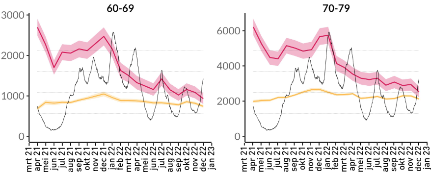
Then it is inevitable that there has been a mortality explosion among the unvaccinated. Fortunately, that was not too bad: they rose from 2,000 to 2,400 (60-69 years) while covid mortality increased fivefold.
At 18-39 years (earlier graph), the mortality rate will even decrease among the vaccinated in the course of 2022... How is that possible? Surely a certain disease is on the rise? Do fewer die the more they come into contact with the virus? That sounds contradictory.
The number of vaccinated people will of course grow in 2021, but per 100,000 the number does not matter, that is precisely what the calculation is about. You could say: growth in vaccinated people in 2021 => fewer infections => reduction in mortality, both among vaccinated and unvaccinated people => declining mortality. That doesn't happen either. It rattles on all sides.
Anyway, general picture:
Conclusions
- Among the vaccinated aged 60-69, Covid mortality has gone from 800 to 1000 in the period under review, an increase of 25%.
- Among unvaccinated people aged 60-69, mortality then went from 2000 to 2400, an increase of 20%.
- In the group of 70-79 years, vaccinated mortality increased by 23%, the unvaccinated by 22%.
The increase in mortality among vaccinated people was no less during corona waves than among the unvaccinated. The protection even decreased somewhat.
Also in periods with little to no Covid the mortality per 100,000 unvaccinated remained more than twice as high as among vaccinated people. Unvaccinated people continued to die 2x as often when the disease hardly caused any casualties. We do not know what.
If a disease spreads, protected people should be less affected by it. That's not the case, according to these graphs. Although the red line is much higher than the yellow line, its improbability has been demonstrated: even in the absence of the disease, that line is much higher.
Protection against a deadly disease cannot manifest itself in a lower mortality level of vaccinated people during periods when that disease is not circulating.
Such an incoherent inconsistent message must now be the ultimate proof of the effectiveness of the coronavirus vaccines. The fact that we are not getting beyond this rickety work is extremely worrying.
I suspect that the raw data (if still reliable) will tell a different story than what we read in the newspapers. The mysterious ASMR/person-years algorithm seems to have been supplemented with the following functions and preconditions:
- If vaccinations are carried out, mortality among the unvaccinated goes up
- As the effect of the vaccine wears off, mortality among the unvaccinated decreases
- In this way, we maintain a high statistical vaccine effectiveness
- The spokesman at de Volkskrant can take another Tweet and write an article about it
- Developments towards equal mortality can be justified by declining vaccine effectiveness from 2022 onwards. If desired, boosters can be used against this.
Only raw data can put independent research on the right track. Questions about this are rejected, dismissed with death eaters or not answered at all. In any case, I hope I have made it clear that there is something wrong with this pre-cooked propaganda.
Sources used
Related concerns:
- How is the number of unvaccinated people estimated? Because only the jabbed are registered and in the UK it is unclear how many unvaccinated people remain: a lingering problem. Blogged about it earlier and otherwise consult Prof. Norman Fenton. Perhaps there are more unvaccinated people than expected and the red line needs to be lowered a lot.
- Does 1 jab count as vaccinated? Or were the fallen seen as unvaccinated after the first jab? Does it take up to a few weeks after a jab before you are registered as fully vaccinated?
- According to the spokesperson of the rivm, the fact that the lines will creep together in 2022 is because the immunity in the group of unvaccinated people is increasing and their mortality pattern will therefore be more similar to that of their vaccinated fellow citizens. He does not mention other explanations: vaccine immunity decreases and no longer exists if the jabs were put too long ago. Vaccinated people are now even more likely to get Covid again than unvaccinated people, hence the rush with the boosters at the time.
- Also think about what it means if only the unvaccinated are responsible for the excess mortality. In the Netherlands, for example, there was a 30% increase in non-natural causes of death, one of the main drivers of excess mortality. A group of 20% of the population (the unvaccinated) would then be responsible for the overall 30% nationwide increase. Then, within that group of 20%, the number of non-natural causes of death must have increased by 150%. How?! You can ask this question with all causes of death.
It is striking that the highest corona mortality peak of OWID falls anywhere 1 or 2 months later than the corona mortality in the English graphs. At OWID, that's mid-January. However, a double check on data.gov.uk produces the same image as the black line. The blue bars do connect.
How is that possible?
A different dataset has been used in the English graphs, the date axis is simply not correct or we are dealing with a statistical artifact, which (unintentionally?) has brought mortality to the fore. A sharp science journalist should have looked at that.
We don't slide the graphs neatly over each other, to avoid accusations of 'juggling'. There is no need for juggling at all. And if something has gone wrong that prevents the peaks from coinciding exactly, I'd love to hear it.
Anton, the source of these graphs is Table 2 from the last ONS dataset of February 21, 2023, the dataset that we also used (i.e. Table 5) for the piece about the null hypothesis.
the rates of "Ever vaccinated" are calculated from the deaths and lost person-years of the six categories of vaccinated people.
As far as I am concerned, the weakness lies in the calculation of the number of person-years lost. How that was done is not mentioned. That is why we have used a different source file for the vaccination rate per group over time. In this way we were able to eliminate the person-years.
Kind regards, Hans
Thanks Hans, I've thought of that, but these graphs are going around in this form on Twitter. Without looking for the underlying data, nothing remains of it even in this form after critical consideration.
That was the approach this time.
Greetings back!
Anton
The weakness is mainly in the 1st 4 month. Because it is missing, you do not have a benchmark. NL data does show this, and then you see unvaccinated start low, and then skyrocket during vaccination. In 3 months, mortality triples. That is impossible. The bottom line is that you do not make a directly proportional distribution, and "unknowingly" have many people who will die quickly in this group. That is why that line drops back to the benchmark fairly quickly, and does not remain consistently high.
1. Smart of those Englishmen, not to show the first 4 months of vaccination.
2. I wanted to do it myself, but I see that you are now also working on it, I suspect, that that data is fairly similar to NL data. Graph S3, column B.
There are the 1st 4 months to be seen, and that is not cheerful in terms of mortality. But you're smart enough to see the similarities.
https://www.medrxiv.org/content/medrxiv/early/2023/05/31/2022.07.21.22277831/DC1/embed/media-1.pdf?download=true
BTW, here's my thread on that.
https://twitter.com/BonneKlok/status/1681649533036445696?t=MXG4Eu4G8rR32xDSDusetA&s=19
Shall we dive into this together?
P.S. Maarten, I don't know if you're reading along. I've had half a discussion with you about these charts a number of times now. Hardly anything substantive, and you would ask a bit more at jet NL research.
Instead of placing the English graphs, you could have placed the NL graphs with the same ease. But you did not do this, because this did not create a favorable picture for the 1st 4 month. I think that's super underhanded about you, while you praised the existence of this research on Twitter.
It is clear to me that you are not concerned with the real story, but that you want to promote the vaccine at all costs.
Kind regards, an activist!
Anton, I receive newsletters from Steve Kirsch via substack. His latest stack is about nursing homes and what the effect of the "vaccinations" has been there. This is so worrying that even I can hardly imagine that it is true. In 2020 0 deaths due to Covid, and immediately after vaccination (end of December 2020) 40 deaths within a short time. And this is just an example.
https://substack.com/inbox/post/135922469
I get so much information over me that it makes me dizzy every now and then. I am very curious about your opinion. I think Twitter is a terrible platform, so just through your own site.
Dramatic indeed. I don't have time to figure it out. I admire Steve Kirsch for his drive but I also see him go wrong sometimes so I don't dare to take what he writes at face value. It may well be that the case he describes was indeed a 'spoiled' batch or something, he says so himself. Nevertheless, that too should be a red if not a black flag. Without transparency, this is dismissed as collateral damage. "Every drug has unwanted side effects, that's always the case." It's heaven-shattering.
Thanks for your reply, Anton. That's exactly why I doubt it. It's TOO bad, and maybe Kirsch is jumping to conclusions. But let's see what else he comes up with. He's opened up a kind of poll on his stack for people to comment on. The request is then to collect real-life experiences (with care homes). I think that in itself is a good idea. If you can prove 3 such situations, then the end should be discussion. I know better, of course.
What is actually bizarre: a completely new way of 'vaccinating' is being introduced worldwide, and those who are victims have to prove that the drug does not work and causes far too many serious side effects. If they're still alive... Should be the other way around. At the first suspicious signal, recall the trade.... Unfortunately.
What we already knew from the Pfizer trails is now also supported by the data from England.
The primary and secondary endpoint of the Pfizer study was the effect of the vaccines on reducing mild and moderate (flu-like) symptoms.
Not on the occurrence of serious complaints and / or death.
The (vulnerable) group with co-morbidities that were more susceptible to serious complaints/ death fell under the exclusion criteria of the study. ( the vaccine could come out worse in the research......)
Despite this, the vaccines scored poorly on preventing deaths.
See the article below.
https://jaaphanekamp.com/posts/2022-02-08-de-covid-prik-effectiviteit-en-het-coronatoegangsbewijs/
Jan Bonte asked the important questions that were not answered in the Pfizer study
Here are the key questions that a good study of the efficacy and safety of a vaccine should answer:
What is the effectiveness of the Pfizer/BioNTech vaccine in reducing hospitalizations, ICU admissions and mortality?
What is the effectiveness of the vaccine for the above outcome measures in the longer term, in this case a period longer than two months?
What is the safety of the vaccine in the longer term, in this case a period longer than two months?
What do we know about rare, but perhaps potentially serious side effects such as autoimmune disorders, side effects that can still occur in the longer term and for which this study did not have the required duration and power?
Is the vaccine able to break the chain of transmission? Which means that the vaccine is able to prevent transmission of the virus from one person to another?
Those are certainly unanswered questions. Hence the call for micro-data with vaccination status.
In addition to all the arguments and reasons in the article and comments, one reason is overlooked. Thousands of people whose life expectancy is minimal do not receive injections. And if they do get injections and die (quite) quickly, they are registered as unvaccinated dead a few weeks after the second shot, so sometimes two to three months. The same applies to seriously ill cancer patients who are not allowed to have a shot due to chemotherapy or certain medication.
We don't know how many thousands that is, and I know that even hospices were vaccinated. If only to give people some hope.
I want to go back to that. You see this effect much less at 90+ and 50-.
I also think that this effect becomes stronger the higher the vaccination rate. Groups where mortality is already quite high also have less of this effect. But I'm also pretty sure this effect of seriously ill people not getting vaccinated is the biggest "bummer."
In addition, you also see the increased mortality drop back to normal proportions quite quickly. In my opinion, these are indeed the seriously ill, who want to die.
Funny to see in Dutch research, that everything is compensated for the vaccinated, but not for the unvaccinated.
I think it should be fairly easy to understand which people are in hospice, and to remove these people from the dataset.
Anyway, every trick to show a good vaccination effect is used. It doesn't surprise me either.
Greetings Bonne.
I'm not so much talking about people in hospice who are allowed to stay there for up to three months. Rather about people who are likely to die within a week and or are so weak that a shot speeds up the dying process. That's already at least two percent of deaths. Whether they had a shot or no shot is not that relevant by counting someone who had the second shot two weeks earlier. Because then we're two or three months down the road. Together with the boosters, this means that people who were vaccinated in 2021 were always registered as unvaccinated for a quarter of the time. So even if they are deceased.
People who have not been vaccinated due to medication etc. also have a much higher risk of death than ordinary citizens.