All charts in 1 post.
Explanation
The data comes directly from ONS, the Office for National Statistics in England. Our experts should be aware of this. Those who, with knowledge of the development below, still recommend vaccination to all age groups, either for their own protection or to protect others, have blood on their hands. I hope that this awareness will permeate the vaccine promoters in all walks of life, even if they are unwittingly driven by pharmaceutical companies and governments.
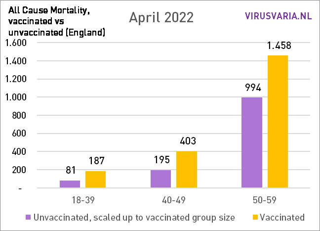
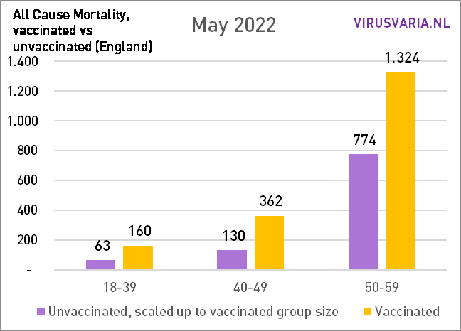
Lang verhaal kort: in de eerste maanden van 2021 hebben de vaccinaties een enorm netto levensreddend effect gehad op 80-plussers. Bij de jongere groepen was het effect eerder negatief: de vaccins hebben daar levens gekost -maar veel minder. Ook bij de ouderen zullen de vaccinaties slachtoffers hebben gemaakt maar dat werd ruim gecompenseerd door de bescherming tegen de ziekte die toen nog heerste: Covid-19. Bij de jongere groepen was die compensatie niet haalbaar: daarvoor was de ziekte niet gevaarlijk genoeg. Midden 2021 begint het voor alle groepen om te slaan: positieve effecten verdwijnen en maken plaats voor een negatief saldo. Cijfermatig gaan er verhoudingsgewijs nog steeds meer mensen dood die een coronaprik hebben gehad, dan ongeprikten. Het is de vraag hoe lang dat nog aanhoudt en we hopen maar dat April een afname van die toenemende trend zal laten zien. Het zouden bijwerkingen kunnen zijn. Misschien raken ook die uitgewerkt.
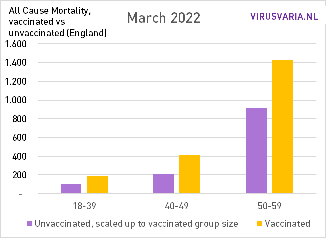
Legenda De groene balken geven de werkelijke sterfte onder ongevaccineerden weer. De gele staven de werkelijke sterfte onder gevaccineerden. Deze absolute aantallen overlijdens zijn alleen te rekenkundig te vergelijken als we beide groepen even groot maken. De paarse balk geeft de sterfte onder ongevaccineerden weer als beide groepen even groot waren geweest. Het is dus een berekend cijfer, geen reële sterfte. Waar de gele staaf lager is dan de paarse, is er minder sterfte onder de gevaccineerden en dat effect kennen we toe aan de vaccins. Waar de gele staaf juist hoger is, is de sterfte onder gevaccineerden dus hoger dan bij de niet-gevaccineerden. Dan rijzen er stemmen dat het niet door de vaccins komt. Dat zou heel goed kunnen maar een verklaring is nog niet gegeven.
More explanations and resources in a previous post.
When looking at the first graphs, also pay attention to the adjusted scale in the first three months, because the calculated mortality increased enormously there. That is why the scale has been adjusted.
Also realize that the group 18-39 is more than 2 times as large as the other groups. And remember:
Purple should be higher than yellow, then the vaccines are fine!
January 2021
De meerderheid van de bevolking is nog ongevaccineerd, vandaar de hoge groene balken. De 80-plussers kregen eerst de prikken - en dat is te zien. De vaccinaties waren voor deze groepen toen bijzonder effectief. Begrijpelijk dat artsen enthousiast waren: die zijn gewend om op oude kwetsbare mensen te letten.
(Note: The scale of the Y-axis (red numbers) changes during the first three months. As of April, the scale remains constant.)

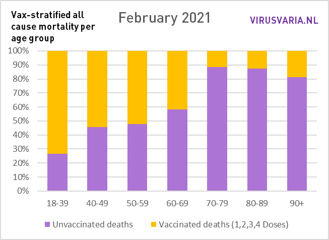
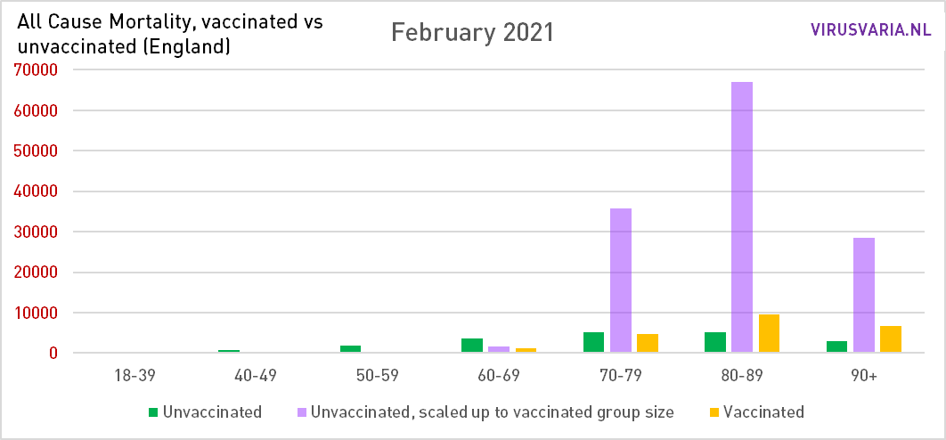
February 2021
Vaccination coverage is rising. The over-70s are now also participating: there are considerably more deaths among the unvaccinated over-70s than among the vaccinated over-70s. Not in an absolute sense, because the green bars have become lower than the yellow ones, but after equalization of the group sizes. We would have liked to have seen this in all age groups. Later we zoom in on the 60-minners.
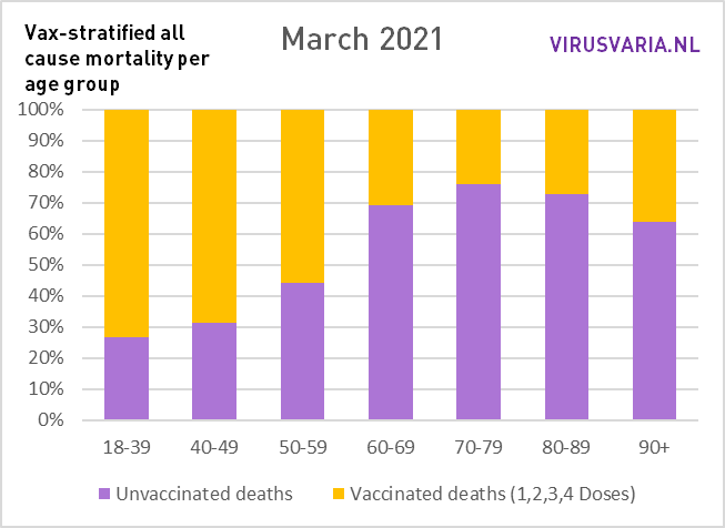
March 2021
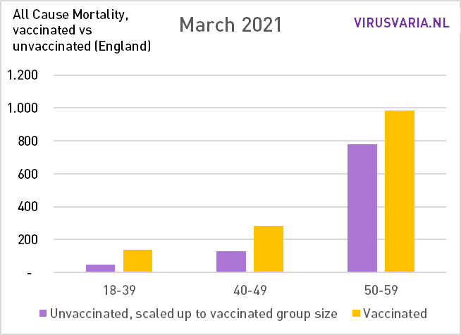
The yellow bars become higher in relation to the purple ones. But also the group 60-69 now has a clear advantage. The advantage of the vaccinations is now decreasing slightly among the over-70s (and therefore also those over 80). Tens of thousands of lives are still being spared. In the group 50-59 there is strangely enough something else going on.

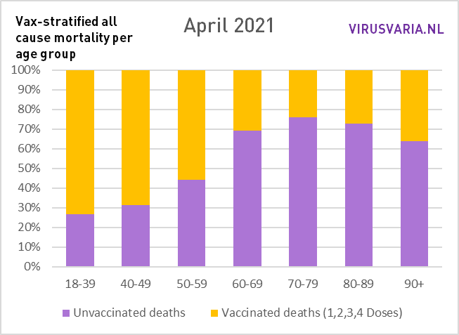
April 2021
Covid mortality is falling sharply in England. The vaccinations are already largely losing their effect. Immunity increases. The difference between purple and yellow becomes smaller. Also at 50-59, an advantage of vaccination can now be seen. Among the over-90s, on the other hand, there is no longer a significant vaccination effect.
(Note: from here the scale remains the same so you can better compare the height of the columns)

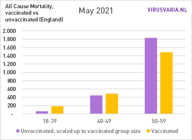
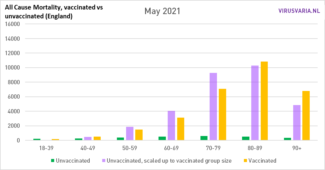
May 2021
The balance is now also tipping among the over-80s: the mortality rate among vaccinated people is higher than that of unvaccinated people. Covid mortality is falling substantially, so any vaccine effectiveness may make little difference. What's left?
Mei en juni waren in Engeland maanden met zeer lage coronasterfte. In de lijngrafiek van ourworldindata is ook goed te zien hoe hoog de covidsterfte was in de eerste drie maanden van het jaar. Een vaccin dat ook maar een beetje positief werkt zal daar verschil maken - en dat deed het ook voor de ouderen.
As the year progresses, we will see how the effectiveness drops (also the booster only briefly brings relief). At the same time, immunity among the population is increasing, making it even more difficult for the vaccine to distinguish itself positively.
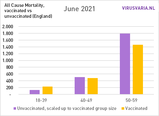
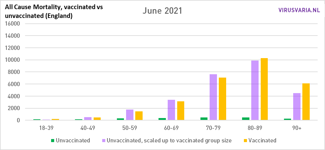
June 2021
Almost no covid mortality but still difference in favor of vaccinated people, also among the over-50s. Als je kijkt naar de grafiek van ourworldindata zou je je bijna gaan afvragen waar die ongevaccineerde overledenen eigenlijk aan zijn gestorven in de zomer. Iets waar gevaccineerden minder last van hadden, terwijl er geen covid was... Er waren nauwelijks coronadoden. Dan denk ik onwillekeurig toch weer aan een "technische fout". I cannot explain this otherwise. Suggestions are welcome.
The seventies are also approaching the critical limit. It now looks just like what we have seen all these months in the groups up to 50 years of age: relatively more mortality among vaccinated people, even in times of high covid mortality as seen in February and March.
This is most likely a confirmation of the fact that the first were also the first to go without protection. Look at the over-90s. And why the mortality then becomes even higher is the elephant in the room.
Purple must be higher than yellow, otherwise it is not good with the vaccines!
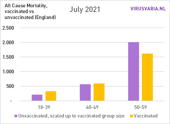
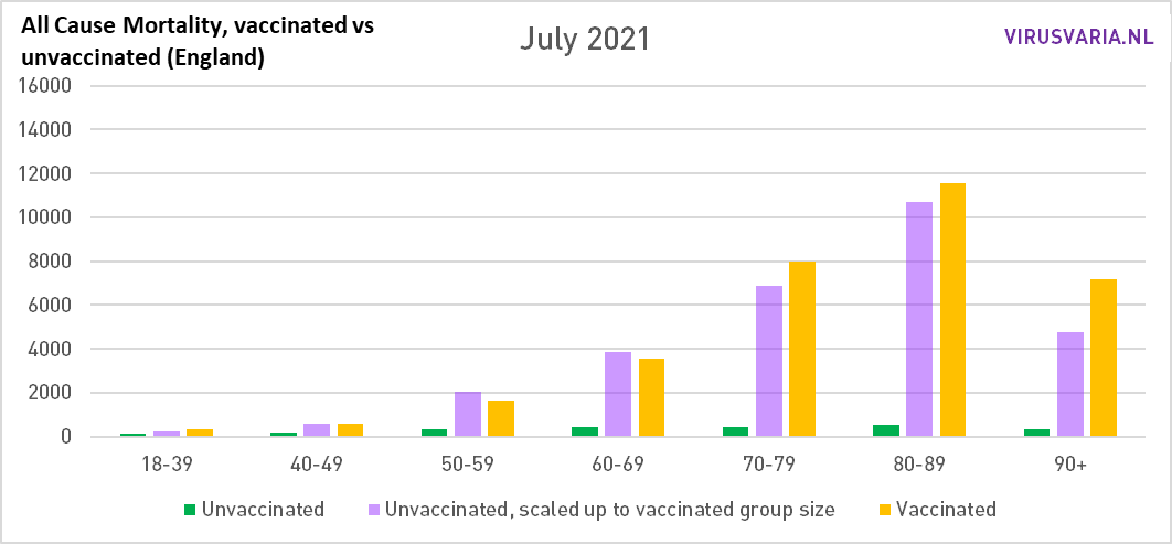
July 2021
In July, the covid mortality in England starts to rise again, that only happens again in the Netherlands in October. If anyone knows of an explanation for this, let them know in the comments. 70-79 is now also on the wrong side.
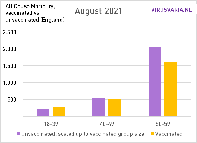
August 2021
Hetzelfde beeld als in Juli, al trekken de zeventigers even bij. Zo'n trendbreukje kan ook een administratieve kwestie zijn.

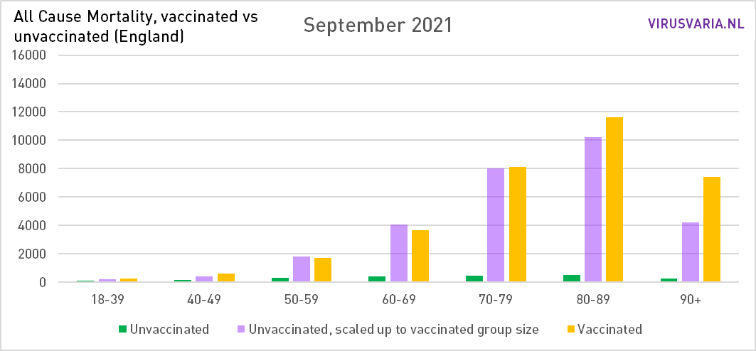
September 2021
Ook bij de vijftigers begint de effectiviteit nu na te laten. Bij de jongere leeftijdsgroepen blijft de gele balk maar langer dan de paarse: aanhoudend meer sterfte onder gevaccineerden. QALY-berekeningen zullen hopelijk nog wel eens uitwijzen of het opweegt tegen de levenswinst bij de 80 en 90-plussers...
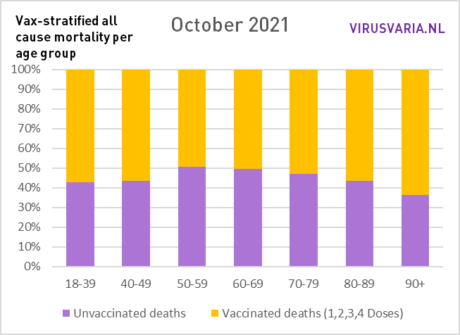
October 2021
Winter is coming. Nevertheless, covid mortality remains fairly stable in England until January. Do we still see clear benefits from the vaccinations? At 50-59 maybe a tiny bit (just checked and indeed: 1797 to 1769). Those are not differences that will make us very happy or worried. Overall, it doesn't seem like it offers any benefits in this month to have vaccine immunity in your body. If you had used drugs such as Vitaminde D and ivermectin, you could have stopped using them. You can even turn off ventilation.

If yellow really gets higher than purple, then it's wrong with the vaccines.
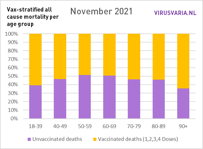
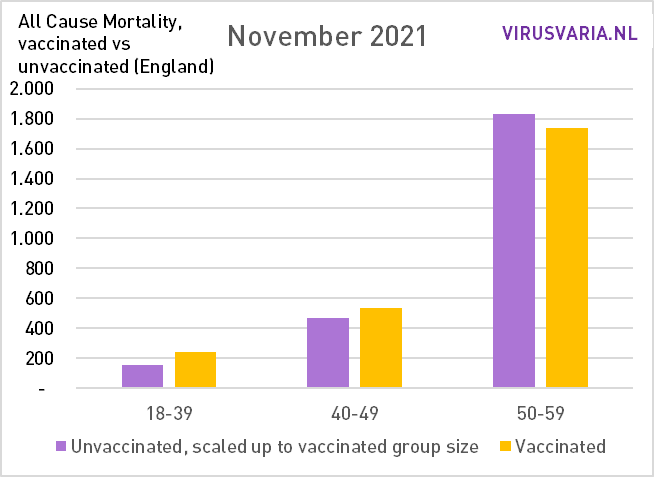
November 2021
Little difference with the month before. Covid-19 solves further in the noise thanks to Delta.

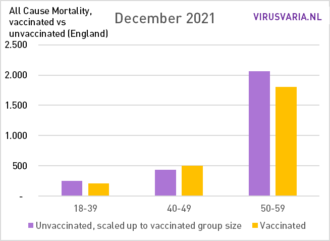
December 2021
The entry of Omikron. It is striking that the group of 50-59 is the only one still to benefit from the vaccinations.

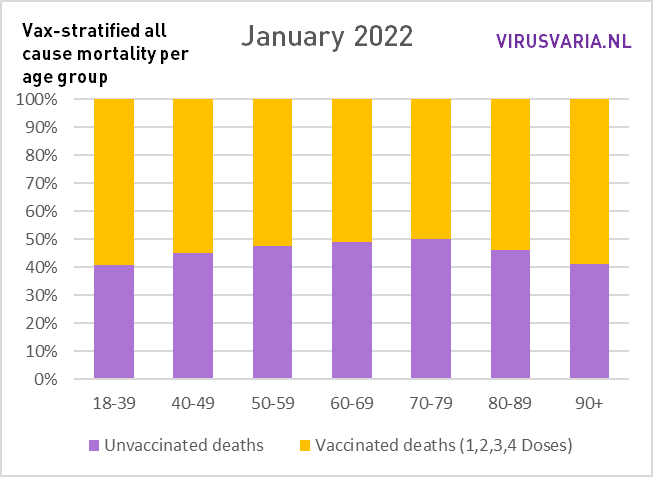
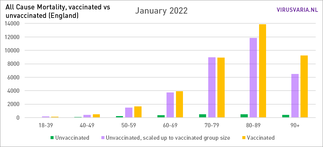
January 2022
Omikron jaagt door Engeland. Mogelijk dat de extra sterfte die dat met zich meebrengt (zoals elk griepseizoen) de balken van 50-79 nog enigszins in balans houdt. Daarna zakt het via Februari snel af naar Maart...
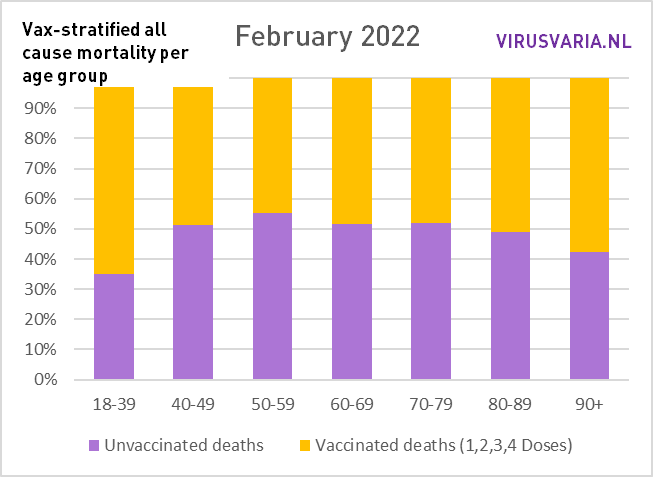
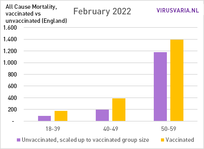
February 2022
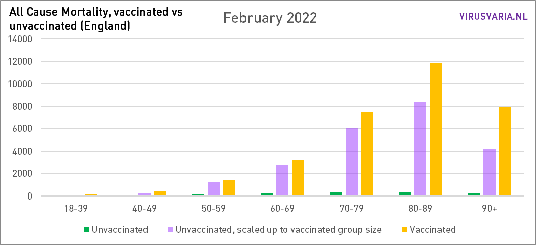
The End Game. for the first time, mortality among vaccinated people is higher In all age groups, even at 50-59 who bravely lasted so long.
How long will this remain the case? This is more mortality than necessary. Because even in the groups under 70 it still does not look good and that is ticking, especially in terms of lost years of life. This should be visible in the excess mortality rates. Wasn't there a committee somewhere in the process of interpreting excess mortality? Send them this blog?
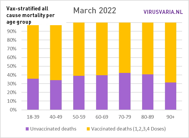
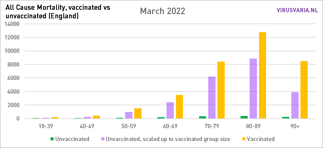
Maart 2022...
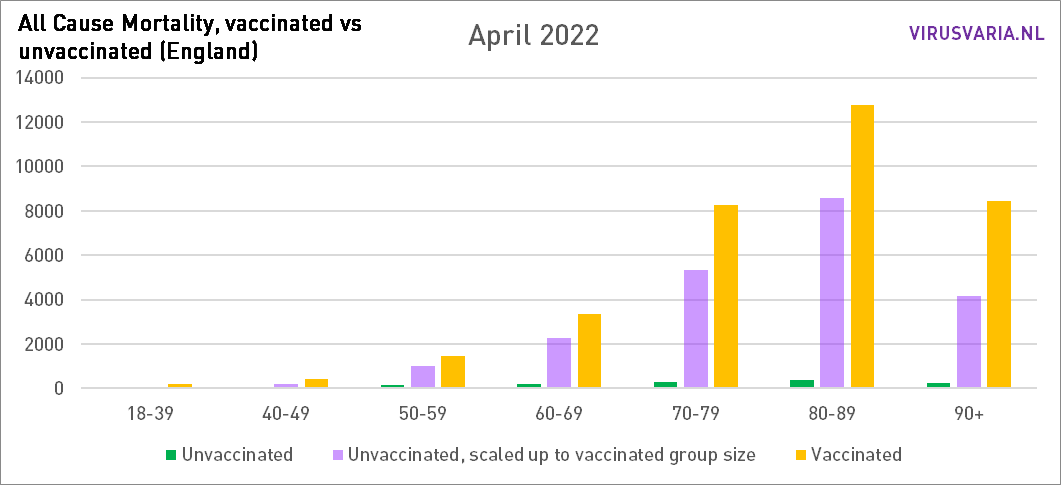
A downright dramatic picture. We'll just wait and see what April will look like. If this continues for a long time - let's hope that the trend does not continue, it has already been bad enough - a cause will have to be invented that actually kills all those people. Monkeypox? Who's to say. As long as there are things to hide, such as causes of death, we have to guess (I'm also going to unabashedly throw a throw soon. It's been enough now.)
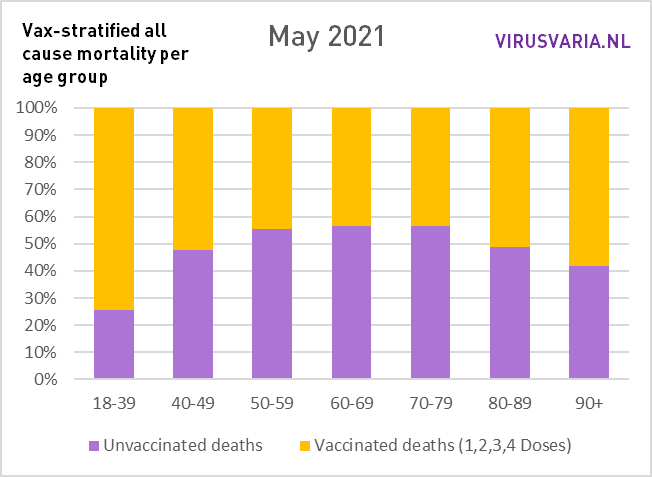
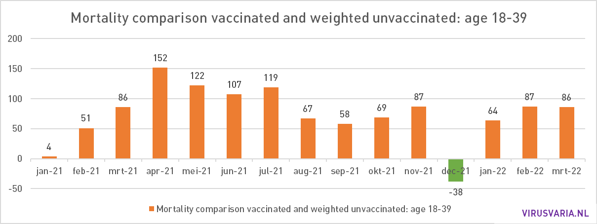
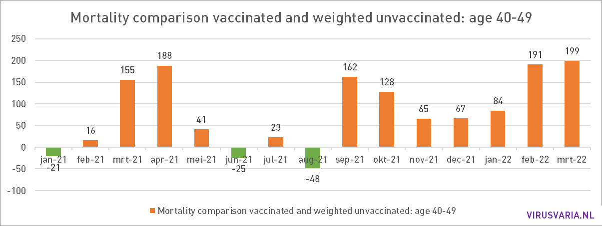
18-59 in more detail
In the two youngest groups, mortality rates are traditionally very low. The group of 18-39 consists of 19 million people - but with minimal mortality chances. Every death, especially at 18+, is one too many. This is not clearly visible in the graphs above.
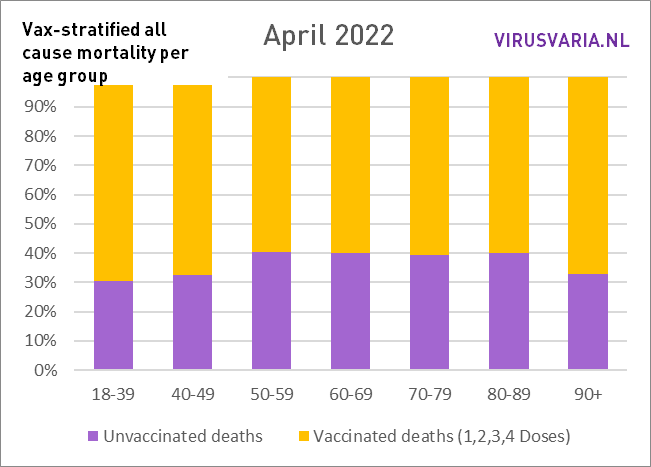
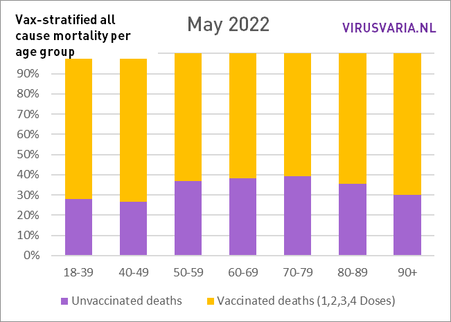
Therefore, below is the proportions with the older groups. The larger the yellow or purple part, the more deaths relative to the other vax group. Over the course of the year, the yellow bars get bigger and bigger, which means that the unvaccinated will do relatively better as time goes by. Again: all based on the figures from the Office for National Statistics, UK.