
In the graphs below, the population data from NIMS are used. As a result, mortality rates among the unvaccinated, at least in some age groups, may be lower than they actually are.
Because England works with impure population estimates, we don't know how many unvaccinated there are. The population size used has a direct effect on reporting on unvaccinated people. The deviation also differs per age group. It is not yet clear whether and if so, how this can be adjusted; the UKSHA (UK Health Security Agency) is working on this. The ONS says about this:
"We hopen dat het werk dat UKHSA doet om de NIMS-gegevens te verbeteren (inclusief het verwijderen van duplicaten), samen met het werk dat ONS doet aan bevolkingsschattingen en de volkstelling van 2021, ons inzicht zal verbeteren. Het is echt positief dat ONS en UKHSA samenwerken om te proberen een oplossing te vinden voor dit probleem, dat zo belangrijk is voor zo veel statistieken. Gezien deze onzekerheid kan kennis van de implicaties van de verschillende keuzes gebruikers helpen de gepresenteerde gegevens met de nodige voorzichtigheid te interpreteren."
Uitgebreidere verantwoording vind je in de post "UK professor: 'Data on mortality by vaxx status are junk' "
Let's hope that the de-duplication is carried out without batting an eye at the effects on vaccination effects. Organizing an independent supervisor would be wise (Prof. Fenton will certainly want to help) otherwise it will become just as powerless an operation as the excess mortality research by CBS/rivm.

United Kingdom Reports transparent tables with key figures, for example about England (part of UK). It produces spectacular graphs - so spectacular that questions arise about the reliability of the data. I will go into that in later posts. In any case, the data for this article comes from the UK reporting on England, as in the previous posts on mortality trends per 100K, using the same official sources:
Source 1: Vaccination status population by age, from start vaccinations of the UK corona dashboard. As CSV, JSON and XML downloadable on the Vaccinations in England, scroll to the last purple chart, and click Download. This states exactly the number of vaccinations per age group. I found the CSV hard to convert, the XML goes better. If you have problems: this is the Excel version.
Source 2: Mortality rates by vaccination status of the Office for National Health Statistics (Table 2) of this page.
METHODE: In dit artikel zijn de groepsgroottes per leeftijdscohort, zoals in Bron1 vermeld, als uitgangspunt genomen. Ik heb daarna alle "Eerste dosis" prikken bij elkaar opgeteld, die waren opgesplitst in korter en langer dan 21 dagen. De som daarvan vormt in dit artikel de groep "gevaccineerden". Die heb ik afgetrokken van de groepsgrootte en wat er overbleef als "ongevaccineerd" behandeld.
We have reviewed it several times with several people. The graphs are the correct visual representation of the data reported by ONS.
A common misunderstanding
The fact that more vaccinated people die than unvaccinated people is often misused to indicate that the vaccines do not work or worse. In itself it means nothing because if 100% of the population is vaccinated, only vaccinated people will die. The causes of death do not have to be related to the vaccinations. If 70% of the dead have been vaccinated, it is at most interesting to compare this with the percentage of vaccinated people in the population - and this must be done per age group.
Als er wordt gestreefd naar een vaccinatiegraad van 100%, heeft dat -als het lukt- tot gevolg dat er in elk geval geen controlegroep meer is om cijfers van de gevaccineerden mee te vergelijken. Die controlegroep is er nu wel: de ongevaccineerden. De sterfte van de ongevaccineerden moeten we dan wel rekenkundig vergelijkbaar maken aan de hand van de grootte van de groep gevaccineerden waarmee we willen vergelijken (het "wegen" van aantallen).
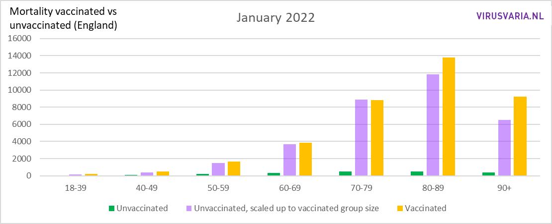
In the graph below, that's not happened. The image below is therefore not as crazy as some fake news sources would like to make it seem. After all, especially in the older groups shown here, there are many more vaccinated people than unvaccinated people. And so, unfortunately, many more vaccinated people are also dying.

Far fewer unvaccinated people automatically means much lower numbers of everything, including deaths. We can correct for this if we know exactly how large the groups of vaccinated and unvaccinated people were in that month. We also have that data. It's a matter of rearranging.
Correct by group size
The method followed is simple. As an example: With 2,000 unvaccinated people, 10 deaths are to be regretted. That would then mean that, assuming equal mortality rates, with 10,000 well-vaccinated people (5x as many) you would have about 50 should see deaths. Or less thanks to a well-functioning vaccine at the time of a viral disease epidemic.
Die berekende "50" is in de grafieken de paarse staaf "Unvaccinated scaled up to vaccinated group size", ook wel "gewogen". Daarnaast staan de werkelijke sterfgevallen onder gevaccineerden, weergegeven door de gele staaf.
We know how big each age cohort is, and we know how many first (and second and third) vaccinations have been put into that cohort. The graphs below only look at unvaccinated versus vaccinated, from 1 dose.
In green and yellow are the absolute mortality numbers. So (again) this is not about Covid patients but about all causes of death (All Cause Mortality).
- The green bar indicates the number of unvaccinated deaths. That bar is small because there are relatively few unvaccinated people in England.
- The purple bar is the number of deaths you would expect if the group of unvaccinated people had been the same size as the group of vaccinated, so after multiplication as explained above.
- The yellow bar is the registered number of deaths in the relevant age group of vaccinated people.
Is de gele staaf lager dan de paarse dan is de "all-cause mortality" van gevaccineerden lager dan die van de ongevacccineerden. Dat is in januari het geval bij de leeftijdsgroep 70-79, maar dan moet je heel goed kijken.

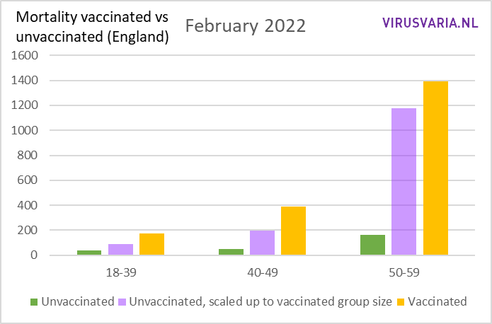
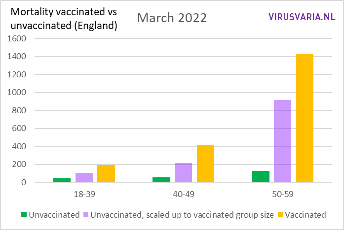
Zoomed in on 18-59:

How do we explain the differences? At the time of an epidemic of a serious deadly List-A disease, an effective vaccine will make the increased mortality invisible in vaccinated people, while the unvaccinated are affected by the deadly disease. Maybe there is an error in the ONS data?
The yellow bar will be smaller than the purple one in an effective vaccine, similar to the line graphs of the older age groups in early 2021 from this previous post. De vaccins bieden echter nog steeds bescherming tegen COVID-19, uit griepseizoen 2019-2020. Nu die ziekte in 2022 niet meer bestaat, komen de bij-effecten bloot te liggen - althans dat is een plausibele verklaring van de verschillen. Andere mogelijke verklaringen worden nog genoemd onder het kopje "Confounders".
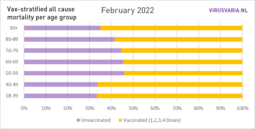
Percentage
A different representation of these data makes the effects in the younger groups more visible. The graphs below show what the distribution would be like if 50% of the population were vaccinated. Click on the graphs to enlarge them.


Interpretation
The mortality in Omicron (and influenza) month of January 2022 among vaccinated people does not dip significantly below that of the unvaccinated in any of the age categories. Omicron has caused very little mortality at all, so it would be understandable if there were not a lot of benefit to be seen in it. Unfortunately, the picture is reversed. The differences are undeniable and fall to the disadvantage of the vaccines.
Looking for confounders
Is deze eenvoudige vergelijking te kort door de bocht? Ik voorzie de tegenwerping "je kunt niet zomaar vermenigvuldigen, die groep is misschien heel anders samengesteld".
It's a possibility that the high-spirited, self-confident over-60s who declined the vaccination don't compare well with those who meekly allowed themselves to be injected because they lived in fear of dying a horrible death of suffocation. A mentality issue that affects life expectancy, who knows. Whether we will ever be able to uncover such influences is uncertain.
The higher educated (with a higher life expectancy) may be somewhat underrepresented among the unvaccinated. That could reduce mortality there somewhat, so that the purple bar is also lower. On the other hand, there are also groups among unvaccinated people aboutwho have a shorter life expectancy.
What are other reasons for not taking the vaccination? Diseases? Terminal patients? Sure, but they actually raised the purple bar and narrowed the gap in favor of the vaccines. Or are these vulnerable people more vaccinated? At the beginning of the campaign, yes, but after the completion of the campaigns, that difference has almost disappeared.
UK Jan 2022 in context:
is it Covid after all?

January 2022 on Euromo. Overall mortality is well above baseline throughout the month. If this is roughly in sync with Ourworldindata, then Covid-19 may be partly the cause, but not the most important of the excess mortality.

January 2022 on Ourworldindata (Covid mortality only): more Covid deaths in the second half from Jan '22, whereas Euromomo shows less total mortality. These very low numbers of Covid mortality and their course cannot explain the excess mortality.
We continue to hope that one day there will be a similar high-quality report on the Dutch situation, without plausibility or interpretation by government institutions. This is in accordance with the Omtzigt Motion that is currently being evaded; That remains worrying, so I will mention it again.
Noot: De sterftecijfers zijn in 10 jaar cohorten beschikbaar, de vaccinatiestatussen in 5 jaar cohorten. Het "optellen" van twee 5-jaar cohorten tot een 10-jaar cohort is statistisch niet helemaal zuiver. De verschillen tussen de opgetelde groepen zijn echter zo klein dat ze geen ander beeld op zouden leveren terwijl de informatie moeilijker te begrijpen wordt. Afhankelijk van de leeftijdsgroep verschilt het 0,06% tot 3%.
Thanks to Andre Redert Hotels, Herman Steigstra and other unnamed experts for thinking along
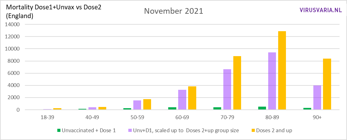
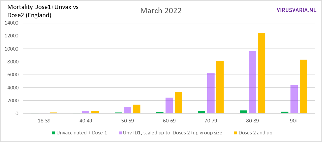
If 1 jab = unvaccinated
Officieel worden mensen die één prik hebben gehad als niet-gevaccineerd beschouwd. Ze zijn dus wel geïnjecteerd maar een aantal van hen heeft om onbekende redenen besloten om het daarbij te laten. Wat voor effect heeft het verhuizen van die prik (inclusief sterfte) naar "ongevaccineerd" op de sterfte van gevaccineerden versus niet-gevaccineerden?
To visualize this, we have taken the single injections from the 'vaccinated' group below and added them to the 'unvaccinated'. The mortality among the 'single jabs' has also moved to the 'unvaccinated'.
Ter onderscheid met de vorige grafieken heb ik de groepen gelabeld als "Unvaccinated + Dose 1" (ongevaxten inclusief 1 dosis) en "Dose 2+": alles NA de eerste spuit, inclusief de geboosterden. Ik gebruik dezelfde UK-data over Engeland (links onderaan dit artikel).
It is striking that after this permutation in January 2022, a positive effect of the vaccinations could be seen in most age groups.
[June 19: After reading recent studies, I see that the results get better everywhere when you exclude older jabs. So having been jabbed recently has advantages, after that there is even negative effectiveness. The tipping point is around 4-6 months after the injection].


Later post about UK:
Earlier post about UK:

Under the heading 'Correction by group size' there is the sentence :
"That would mean that for 10,000 vaccinated people (5x as many) you would have to see 50 deaths, with the same mortality rates."
I assume it should read: ... 10,000 UNvaccinated people...
Hi Ed, no, it's correct as it is... Compare: "As an example: In 2,000 redheads, 10 ankle sprains are to be regretted. That would mean that, assuming equal percentages, you would have to see 50 ankle sprains in 10,000 blond people (5 times as many)."
It's about weighing in to a different group of different sizes.
Yes, of course, healthy people in their sixties, etc., are less likely to be vaccinated than weaker people, and weaker people are more likely to opt for vaccination. And people who have had corona are less likely to get vaccinated again.
But there are also tens of thousands of weak people who are not allowed to be vaccinated due to their illness and/or medication use/chemotherapy. For the sake of convenience, let's consider those effects as equivalent. You then keep side effects 'vaccines' and up to four months a year a shut down immune system with four shots a year. The latter effect may have a greater impact on mortality and more serious illness than is currently assumed.
These are quite shocking findings. But don't be surprised. Curious if there will be a follow-up in other media. Do you have a way to get this kind of message posted on other media? Must finally get through to the masses, you would say.
By that 0.06% and 3%, do you mean the difference in group size between, for example, 30 to 35-year-olds and 35 to 40-year-olds who have been vaccinated? I can imagine that people in their early 30s are less likely to get vaccinated than people in their late thirties (the same goes for people in their 40s, 50s, etc.). And that late 30s, 40s, etc., are more likely to die than the early 30s, 40s, etc., respectively.
I don't think there is much further to conclude as long as so little is known about either group.
Yes, exactly. These differences are too small to give a different picture. Vax rates hardly differ within a 10-year cohort. The risk of mortality differs more in the older groups, but still.