
The conversation about the baseline has become topical again, now that the House of Representatives a motion by the NSC (Ria de Korte). In this letter, RIVM is instructed to take a closer look at the calculations.
What is this actually about? It RIVM has in 2024 the reporting of the excess mortality figures is taken from Statistics Netherlands. Since then, in the eyes of the RIVM, excess mortality has virtually disappeared again. In an article published last year (Evolution of the baseline during the corona pandemic) we have already explained this, but here again in a more concise form. A plea for the transition from expectations to norm mortality.
RIVM's baseline until 2021

In this graph we see the baseline as calculated by the RIVM until the corona pandemic. The exact calculation procedure has not been published anywhere, but we can partly understand it. This is the graph that we have constructed on the basis of the available figures. The black line is the weekly number of reported deaths since 2016 as reported by Statistics Netherlands.
The green band is the pre-estimated bandwidth, within which the majority of the weekly figures should be. As soon as the weekly figures fall above that, it is a signal for which a solid explanation must be found. In general, this is an epidemic or a heat wave. This bandwidth is higher in winter than in summer and is adjusted annually on 1 July. With a "smart procedure", an average over the past five years is calculated and this determines the course for the following year.
The shape of the bandwidth is the same every year: a sine wave with an amplitude of 6% and the top on February 1.
That is fine, as long as there are no diseases that extend over several years. This is not a problem with flu, because after each flu wave we see that mortality is lower in the following months. That is the "undermortality after excess mortality".We see this happening after the flu waves in 2017, 2018, but also after the corona wave in 2020.
The bandwidth calculated by RIVM has a signal function. That is why RIVM does not include peaks when calculating the forecast. As soon as the number of deaths reported by CBS falls outside the bandwidth, there is apparently a flu wave or another disease that prevails at that time. Both the flu waves and the corona waves were identified in this way. That signal function has disappeared since 2024, as we will see.
CBS will take over in 2020
In the summer of 2020, the government Corona Dashboard Set up. In addition to the daily figures on corona deaths and infections, CBS published the weekly mortality figures against the background of their own expectations. If RIVM had maintained its calculation procedure, a distorted picture would have arisen due to the multi-year very high mortality rates since corona.
CBS has a different calculation procedure, based on the population structure and the historical mortality probabilities. It uses the mortality figures from 2015 to 2019 as a basis and extrapolates these figures to the forecast for the years from 2020 onwards. These expectations are shown in this graph.

A number of things immediately stand out in this graph. The bandwidth no longer has a smooth course like at the RIVM, but it is a choppy curve. This is because CBS assumes the average weekly mortality for the week in question over the years 2015-2019. The fluctuations in these figures are reflected in annual fluctuations in the bandwidth.
Because CBS also includes the flu waves of 2017 and 2018 in their forecasts (which RIVM does not do), the bandwidth created in the winter is much larger than at RIVM. As a result, CBS will notice a flu wave much later, because it will fall within their bandwidth sooner. But the structural excess mortality that we have observed since 2020 is thus identified.
Own model
Based on the best features of the models of RIVM and CBS, we have developed our own calculation model. To determine the annual average, we have developed a procedure that resembles that of Statistics Netherlands and therefore also arrives at almost comparable figures. As far as we know, the calculation method of CBS has not been published anywhere, ours has. You can read it here: An analysis of excess mortality based on age and sex; the possible role of Covid-19, delayed care and vaccines. We choose the bandwidth in the same way as the RIVM does: a sine wave of 6% with the top on February 1. This graph is then created:
Here we see the familiar picture of a weekly mortality that has rarely fallen below the baseline since 2021. Whereas until 2020 mortality only exceeded the bandwidth during a flu wave, we are now seeing a succession of waves.
RIVM will take over again in 2024
In 2024, RIVM will take over the reporting of mortality again on their own website: Monitoring mortality figures in the Netherlands. A scientific justification is still lacking, but we think we understand it. The philosophy of the RIVM is fundamentally different from what it CBS until 2024 Published.
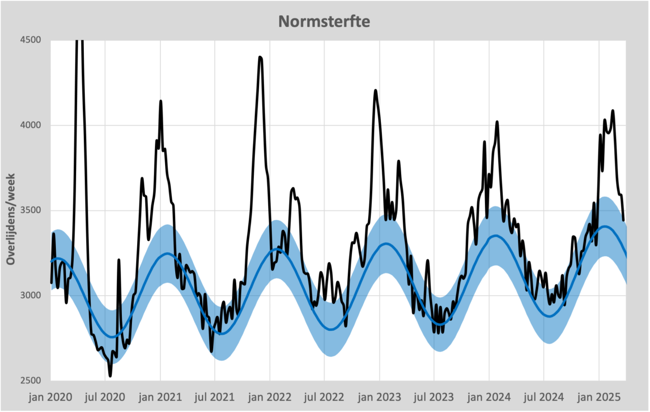
Statistics Netherlands based its decision on demographic figures combined with the trend in life expectancy up to 2020. RIVM only looks at the mortality figures of the previous five years, which therefore showed persistent excess mortality. These are the mortality figures compared to the bandwidth published by RIVM.

We note that RIVM has made the following adjustments, if we compare the top in 2025 with the upper limit that RIVM published in 2020:
- The upper limit has been increased by 17%
- The bandwidth has been increased by 34%
- The top of the range has been brought forward by a month
We see these adjustments not only as jumps in the bandwidth, but also hidden in gradual increases. So only when the weekly mortality is 17% higher than expected in 2020, the RIVM considers the weekly mortality to be "elevated". The result is that almost all excess mortality is now back within the expectations of the RIVM. Not only is the systematic excess mortality of around 8% compensated in this way, but also the much larger fluctuations in mortality and the much earlier onset of seasonal mortality. The sole purpose of these adjustments seems to be to better describe the observations and not to signal the changes in our health since 2020.
The price we have to pay for these modifications is therefore the loss of signal function. Only when the flu waves are really severe will the mortality figures of the RIVM be labeled "Elevated". So that is only "increased" compared to the excess mortality expected by RIVM. If RIVM starts applying the calculation method again on 1 July 2025, the expected mortality will be even higher. After all, the 2019-2020 season with virtually no excess mortality will fall out of the calculations and the 2024-2025 season will replace it.
Norm mortality
The current expectations of our institutes reflect the future well. However, predictions are no longer suitable to use as a standard. In the past, this standard could be derived from mortality in previous years. Since 2021, there has been an unexplained break in the trend in these mortality levels: mortality has since increased structurally. Mortality rates are increased, deaths are premature. This is an undesirable development that should not simply be accepted as a new norm.
The motion submitted by Ria de Korte is therefore an important one, with a deadline of 1 September: the request to RIVM to see how excess mortality can remain visible.
There is no doubt that the RIVM expectations give a substantiated picture of future mortality development. However, that is not necessarily the desired development, that is something completely different. Comparison with other expectations makes that easily clear. Some examples:
- Global warming. The earth is expected to warm up further. According to the model of our health institutes, this would mean that there is no reason for concern as long as warming follows expectations, based on a calculated trend. So there is an awareness of a 'target temperature' somewhere.
- Sea level rise. The rise in sea level is often predicted. If the sea level adheres to the forecast, it is still seen as worrisome. Here too, the expectation is not elevated to the norm.
It becomes even clearer with these examples:
- Nitrogen. If the RIVM's nitrogen standard were calculated in the same way as excess mortality, nitrogen would not be a problem at all. That level is even falling. So a separate 'nitrogen standard' has been created.
- Body weight. The average Dutch person is getting fatter. That is undesirable, while it corresponds to expectations. That is why the term 'target weight' was coined, a standard that does not blindly follow developments (See also virusvaria.nl). The BMI calculation is a practical tool for this.
Different criteria therefore apply to the standard or target values than to predictions based on statistical trends. Here's what's missing from mortality reporting and monitoring: a norm mortality, regardless of expected developments. One new to introduce 'norm mortality', based on mortality probabilities, differentiated by age and gender, would keep the excess mortality calculation pure.
Mortality forecasts such as those currently made by CBS and RIVM will be given social relevance with a norm mortality as a reference.
We would like to see the 'De Korte Motion' used to create a norm mortality . The necessary work has already been done for this. Countless knowledgeable people have already studied the matter, see the work of statisticians, scientists and calculators such as Ronald Meester, Maurice de Hond, Herman Steigstra, Anton Theunissen, Theo Schetters, Bonne Klok, Hans Verwaart, Gijs van Loef, Hans Lugtigheid etc. etc. This does require an exploratory look outside the inner circle of the government.
The Netherlands hopes for a scientific deepening of the RIVM. It is explicitly not the intention that RIVM will defend its own methods by referring to foreign institutes and studies that use similar methods. These studies are of course easy to find, but they do not solve the problem of pure mapping of excess mortality. The conclusion could then be that there is no reason to change anything. If that is the result, the clear intention of the motion has not been heeded.
Very clear that the "new normal" should not be elevated to normal
So life expectancy is falling – even the RIVM will not be able to ignore that, unless there is a drastic redefinition. Life expectancy graphs will, therefore, most likely show a trend break around 2021.
Life expectancy, on the other hand, has been rising again since 2022. Very slowly, the damage is being made up. In about 10 years' time, we will be back on the slowly rising trend from before 2020. At least, if the forecasts come true, and that is by no means certain.
Good story.
The problem is that any "smart" baseline is open to discussion. And the smarter, the more open to discussion.
I would be in favor of looking mainly at raw figures per 100,000 per age category or something like that. There is no arguing with that.
And even then you can immediately see from an (enlarged) graph that it is completely wrong from 2021 (see graph with thick red dots previously published by Herman and you).
Average life expectancy, which has fallen sharply, is also such an uncontroversial indicator.
Then the wrong trend since 2021 can no longer be denied.
Nu wordt met allerlei woordspelletjes de oversterfte steeds weggeredeneerd met de modellen als excuus. Waardoor er evenveel excuses zijn om niet naar de kern van de oorzaak te hoeven zoeken.
Of course, there are several ways to look at the figures. This article is in line with the assignment to RIVM to look again at the baseline. We have enough material to look at the bare mortality figures and we are working 😉 that too