
Today I was allowed to join Arlette Adriani and Raisa Blommestijn at public broadcaster Ongehoord Nederland. The broadcast can be viewed on NPO Start. What we (immunologist Theo Schetters was also there) tried to convey does not fit in 1 news item. This also applied to the corresponding graphs. See below. A bit of a messy but hopefully inspiring post, also for those who do not know Virusvaria yet.
The expected mortality with weekly bandwidths
Voor de volledigheid: de standaard CBS-grafiek "Overledenen per week". Deze is wel in beeld geweest.

Summer mortality alone in 2021 is reason for research
After the start of the Double (Spring/summer 2021, approximately during the alpha wave), there was continuous increase mortality from April onwards. In May it was clear that we were in an excess mortality situation.

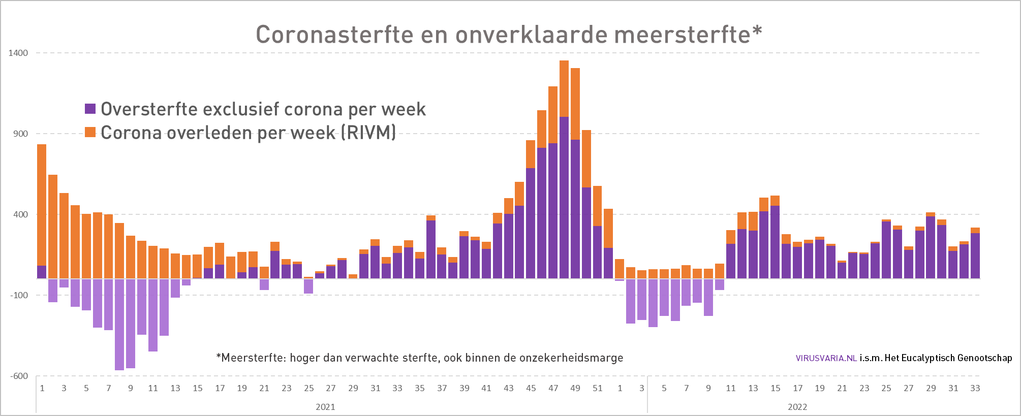
Realised mortality with seasonal bandwidth
The graph runs from August 1 to July 31.
Purple: 2019-2021, Excess mortality due to Covid.
Blue: 2020-2021 less covid, more mortality.
Red: 2021-2022, hardly any covid, even more mortality.
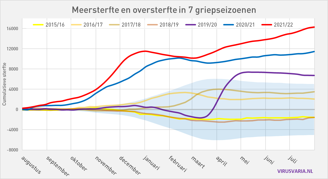
And not only the elderly
Contrary to what is claimed, the 65-year-olds are also affected. Worrying is not the hump around the turn of the year (winter) but the steadily rising line in the rest of the season. The graphs below are only 0-65 years.


Other signals - which may mean nothing. Or is it?
Vijf maanden na de prik volgt de sterfte dezelfde curve. De "5-maanden theorie" zou te maken kunnen hebben met vaccine waning. Ook hierover binnenkort een blog, er zijn meer signalen over die uitgestelde effecten.

Curious reporting - why is that?
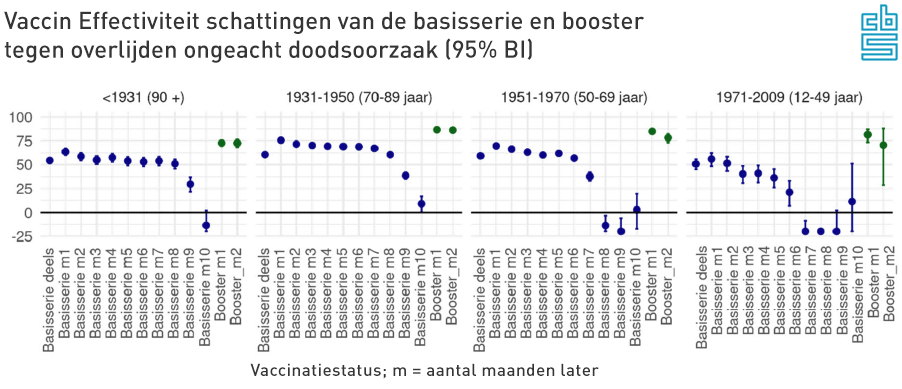
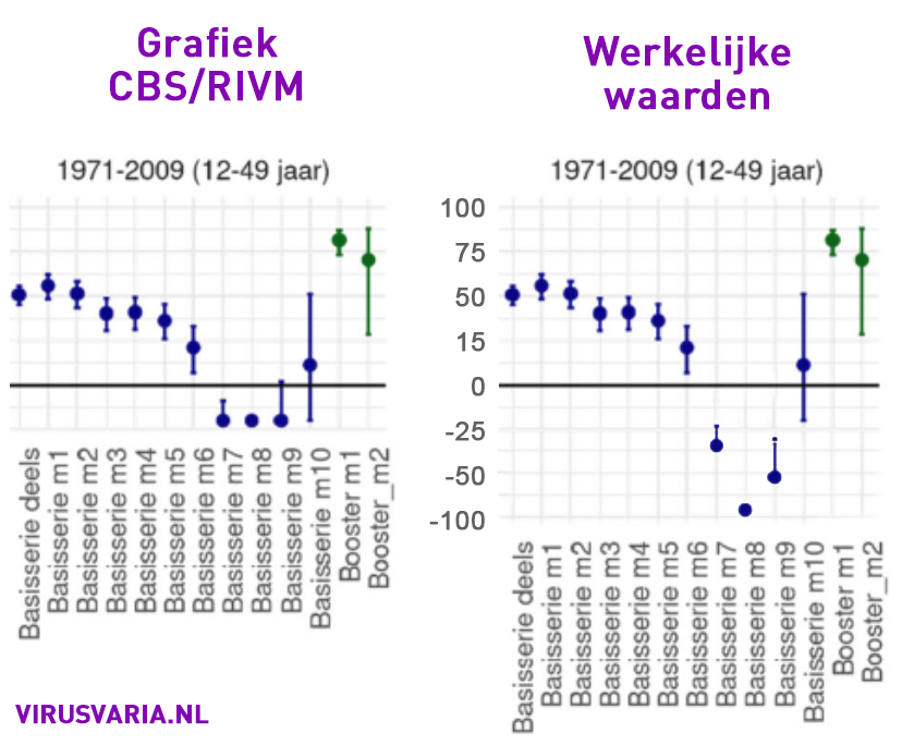
Het effectiviteitsonderzoek, dat in de grafieken een periode beslaat van twaalf maanden, wordt in het Oversterfterapport gepresenteerd met de linkergrafiek "Grafiek CBS/RIVM". In de bijbehorende tabellen staan andere waardes. Daarop heb ik de rechtergrafiek aangepast. Per ongeluk...?
Studies of side effects are usually limited to a few weeks (with these vaccines).
The results also point to vaccination damage at other ages - but only after six months. Isn't that a reason for a longer study into vaccine damage?
0-65 years in nl: more excess mortality in the past year than covid deaths since March 2020
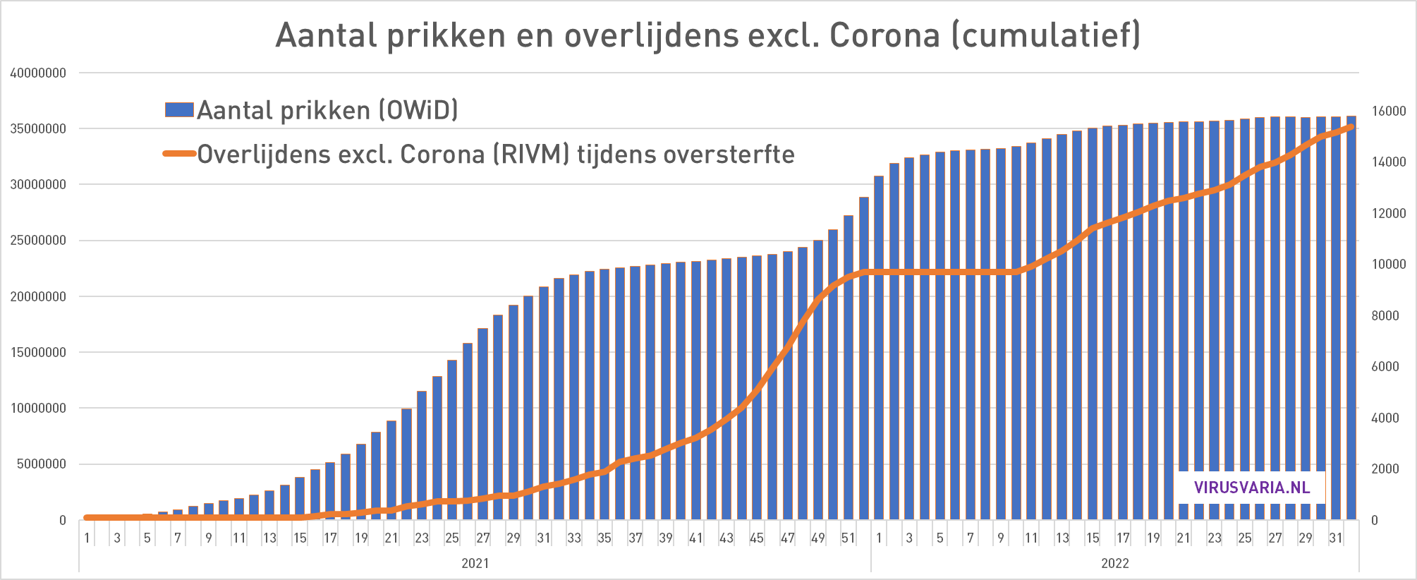
Like explained in a previous article. This graph could have clarified a lot: the total mortality split into Corona mortality (in accordance with rivm) and non-Corona.
The counterargument: Sweden
Just a trip, not in the broadcast: Sweden is just about the only (more or less comparable) country where hardly any excess mortality has taken place in the past two years. Compare the blue line after the first wave with the Netherlands (orange). They come off much better:
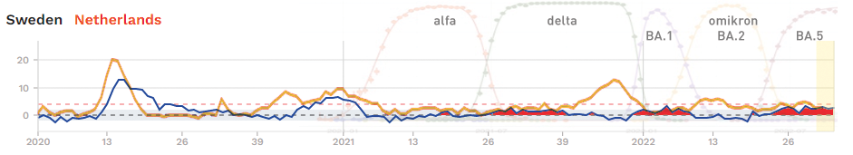
Sweden is also vaccinated but does not have the excess mortality. Is there something special going on there that we overlook or is this proof that the vaccinations not can be the drivers of excess mortality? But then what? Aspirating? Also in comparison with the neighboring countries, Sweden is an odd duck in the bite. You could almost say that they injected a placebo there!
More about The Wonder of Scandinavia soon: More Vitamin D in food as an additive, different building regulations, no carnival. Sweden: Natural immunity against the 'mother' virus - possibly also effective against damage from similar spikes?
The broadcast
is view here
05:00 Theo Schetters: uitleg "meersterfte" (Een term die hij by virusvaria has come across)
07:00 Theo Schetters on a) the Omtzigt motion and b) the rivm/CBS self-report
09:15 Anton Theunissen: generalities about unexplained excess mortality and its duration
12:30 Theo Schetters on the ashes. booster campaign
14:00 Theo Schetters on the safety of the vaccines
15:15 Theo Schetters on correlation peaks
15:50 Anton Theunissen: red flags and reasons for research into vaccination effects (I have to laugh because the ladies immediately jumped on Theo again, I was hardly outspoken 😉)
16:40 Theo Schetters has hope for more movement in Science and the questionable quality of current vaccines
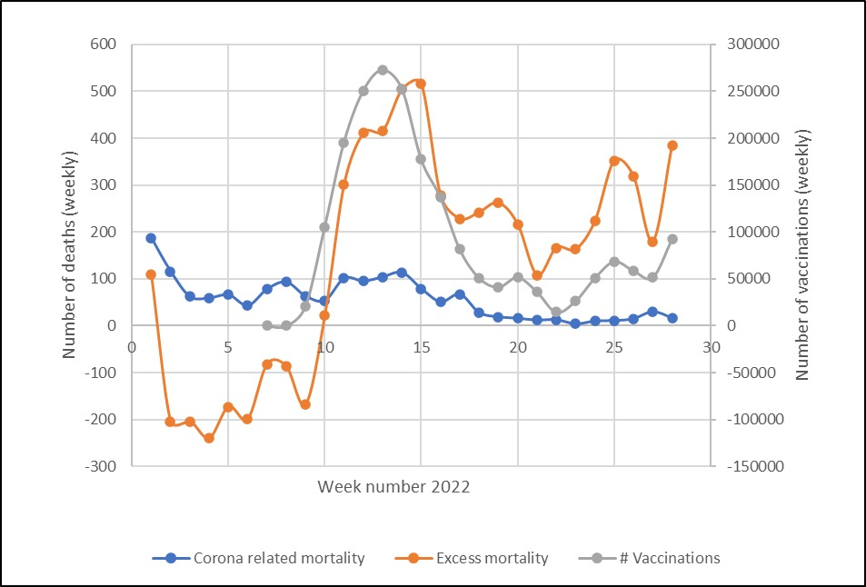
Theo Schetters: Correlation repeat shot and death peak
This graph is the reason that Theo Schetters was at ON. There is criticism of this graph that I may discuss.
It's about the correlation in time: is that a reason for research or should we just insist that it can't be a causal relationship and therefore continue to vaccinate?

Great that you are the first to bring out the excess mortality. 1 sheep over the dam .....
Pfoe, Anton, what a tricky puzzle. What I have hardly seen as an option: could the combination of vax and infection – which seem to be the most protected – be the most risky in the long term?
That could be, I will pay attention to that. What I have already thought of: First infection and then vax, that is the model of Sweden. Was the 'original' virus the best vaccine against side effects of the later jabs? That would make the story a bit more accurate. Wild thought, not yet presented to immunologists, but the broad natural protection may make short work of the spikes of the vaccine.
W.b. Sweden and vaccinations you may also need to look at details. What vaccines, production, when/ how often given, ..
No idea if that can be figured out.
This news is not heard... one will not hear it, one will deny it and ridcule the messengers. What I find much worse is that both Anton and MdH always assume a government that has our best interests at heart but has accidentally taken some wrong turns and now wants to prevent loss of face.
My position is a bit sharper: the government does NOT have our best interests at heart and all "wrong" policy choices are always made very consciously according to a preconceived plan. Now I am prepared to add: 'until they prove otherwise'.
And that is precisely what the government refuses... important information about vaccinations and excess mortality are withheld. And that is why I unfortunately have to assume the most black scenario, namely that our government cooperates in a globalist plan to decimate the world's population. As long as the government does not cooperate to make all relevant information transparent quickly, that is the only way I can look at our government.
As citizens/consumers, we have more power than we often think. We decide what we spend our honestly earned money on. In this way, anyone can decide to no longer use the services and products of the WEF's business partners. Just look up which companies are all affiliated with the WEF and then look for alternatives.
https://www.weforum.org/partners#search
Australia ms also interesting to take with you. Little covid before the vaccination rollout... Have the idea that there are many side effects (unfortunately, the majority of doctors and nurses do not take them seriously... seen a lot of stories on instagram..).
What a good idea! I'm going to take it with me.
The last graph is misleading. What you want to know is: could it be that the unexplained excess mortality has to do with vaccinations? Then you have to put unexplained excess mortality and vaccinations both in a graph. That doesn't happen here. What is shown here in the graph is ALL excess mortality.
So also the excess mortality that we know is due to heat waves – which you know in advance that they have nothing to do with vaccination. This pollutes the pattern of the graph by data that you already know in advance that it has nothing to do with it.
Worse still, some of that declared excess mortality DOES have an indirect interdependence. The more corona, the more oversteft – so in a corona wave you will see more explainable excess mortality, namely excess mortality from the virus. At the same time, the more corona, the more people see sick people in their environment, the more they are confronted with the facts, and the higher the willingness to vaccinate will be.
So you see here two trends that are simultaneously driven by an underlying third trend, namely the corona waves themselves. It makes perfect sense that you then see a correlation, but it is not because the trends drive each other. When car traffic increases, you see more traffic victims, and you also see more air pollution. That does not mean that air pollution causes traffic casualties.
A not misleading graph would be: plot the UNEXPLAINED excess mortality against the vaccinations. I wonder how much remains of the correlation.
The bar graphs show respectively unexplained excess mortality vs vaccinations and corona mortality vs unexplained excess mortality.
Much remains unexplained.
The graph that Schetters has submitted fits into a longer story, see video in https://virusvaria.nl/cbs-en-rivm-zien-ook-negatieve-vaccin-effectiviteit-in-zelfrapportage/ and he means as a signal of something that deserves more attention. For example, your analysis, but from people who have access to verifiable data to substantiate the possible explanations. He repeats a few times in his presentation that it is not evidence of causation.
The graph shows official, available data. It is the explanation that could be misleading. You can also take the graph as suggestive and be indignant about it, but that must also be substantiated with data. That data should be available to consult, then the sting would have been quickly removed.