I co-signed a letter that Herman Steigstra sent to parliament. The request to them is to pay attention to the model that we used last week. announced and of which today there is a detailed explanation posted on maurice.nl. The Excel document is also on Github so that anyone can review it and improve or supplement it. The model has been kept simple, especially to make it explainable. Below is the letter:
Dear Member of Parliament,
There has long been a strong debate about whether the vaccines are (partly) responsible for the excess mortality that has been there for more than a year. We have thoroughly analyzed the figures and come to the firm conclusion that for people who have had 5 vaccinations, the risk of death within 24 months after vaccination is 1 in 250. This is a very worrying situation, which unfortunately we cannot reverse.
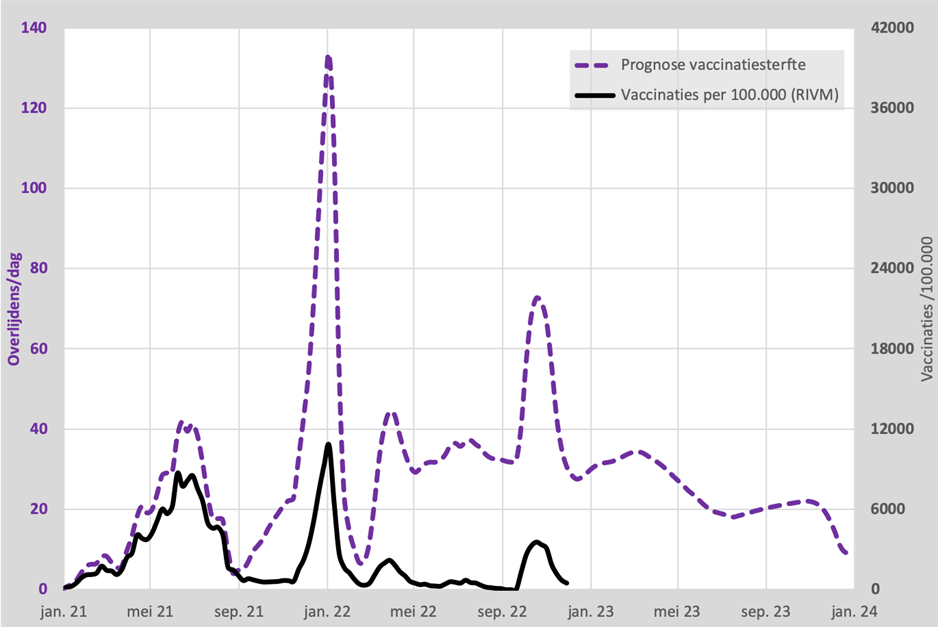
This graph shows how the number of deaths from the vaccination has built up from the beginning of the vaccinations:

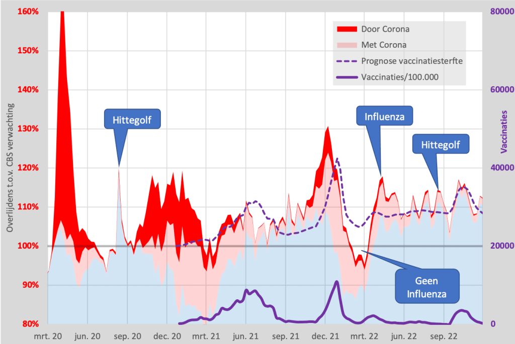
This forecast follows very closely the CBS mortality figures after deduction of corona deaths themselves, also according to CBS.
The article where you can read the entire analysis can be found here: https://mdhnd.nl/vaccmodel . On this page there is also a link to the calculation model that is public. May I invite you to study them?
Perhaps also some numbers: the unexplained excess mortality (which is therefore predictable from the vaccination figures) will rise even further to around 33,000. For every future 1000 vaccinations, there is 1 death. The chance of dying from corona is 1 in 100,000.
I would like to hear from you whether you can agree that the risks of vaccination have become excessively high compared to the chance of dying from corona.
Sincerely,
Herman Steigstra
Anton Theunissen
This is the graph as we present it in the article, output of the model:

An extra mortality rate of 1:250 within 2 years...?
The mentioned risk of death within 24 months is in addition to the normal chance of death. The normal chance of death within 24 months is 1:59, which means 17 deaths per thousand inhabitants. The additional risk of death after vaccination is 1:250, which means 4 per thousand. That brings the total to 21 per thousand, an increase of 23.6%. A number of those people would otherwise have died of a different cause, so that has to go away. A 20% increase in the mortality rate can be well defended on the basis of the model.
And now?
There are certainly points for improvement. The point is that you can achieve a better result with more complicated calculations, but the method becomes more opaque. It could give the appearance of data manipulation. If a simple, imitable method cannot perform a signal function, then it will not work with a more precise, more difficult to explain graph.
Read the article on maurice.nl


Will this be the straw that makes transparency demand data???
Great work. The question is whether excess mortality is deplored by this government. That makes it even worse!
No idea, ignoring it has been an effective strategy so far.
The government can also ignore this, because the regular newspapers hardly report on it. And what the government also plays into the hands of is that it is not an exclusively Dutch problem: excess mortality is currently playing everywhere in the Western world.
Once again, I would like to thank you for this initiative and the excellent work. 👍🙏
A small note/ question:
"That's a 1:208 chance. A chance of 1:250 is therefore 20% higher."
I think that should be '('only') 20% lower (than that probability of 1:208' ... nevertheless? In other words: 20% higher than what?
I could be wrong, of course, but if not, I don't understand it (again 😉) well, I'm afraid. Perhaps I am not the only one and an explanation / adjustment would help.
Hoe dan alvast (& wederom) heel veel dank!
You understand that well, I put that sentence in there later. Something is not right there. I corrected it!
Thank you Anton
I just read on Frontnieuws that the excess mortality is actually even worse: there should have been an under-mortality after an excess mortality. If that doesn't happen, then you actually have to add that under-mortality deficit.
Is this true? Did you take that into account?
Greeting
(https://www.frontnieuws.com/waarom-de-werkelijke-oversterfte-erger-is-dan-u-denkt/)
We have taken that into account. In this explanation on maurice.nl it is more extensive. It has been estimated what proportion of deaths from a death peak would probably have occurred within two months. There are no hard formulas for that. You only see it clear 'pits' if there are many elderly and terminally ill among the deaths in a short time. Also in subsequent flu seasons you see that a very heavy flu season is followed by a light flu season. In any case, that is not the case now; mortality continues to rise.
How many almost dead and then seriously ill people, quite sick people, people with chronic complaints, people with vague complaints etc etc are like iceberg in the form of a pyramid under water (only thing we see and notice are the extra deaths). This is almost not noticed anywhere to indicate the extent of the drama and also the overload of care. On top of that, the possible / plausible health problems within now and let's say the next 10 years