
Covid-19 is the most commonly reported side effect of Covid vaccinations, Wouter Aukema concluded after studying the database of the European Medical Agency. Is that also reflected in the figures 'temporarily'? Are we seeing ups and downs where we'd expect them to? That's why we're working with R-values in this post.
Following an extensive LinkedIn post by Herman Steigstra
An R-value of 1 indicates that there is a constant situation. We know this from 2020: an R-value below 1 was good: then each infected person causes less than 1 new infection and the disease will die out. With an R-value above 1, the number of infections increases.
Now the number of infections is difficult to count - and a cold is not that relevant - so we are looking at corona mortality. What is our expectation and what will come of it? We will determine an R-value of the expected and observed corona mortality. If there are more or fewer, the R-value rises or falls. In doing so, we limit ourselves to the first injections because factors such as naturally built up immunity, booster campaigns and seasonal influences will play a role later. We therefore only look at December 2020 and the first quarter of 2021, when the vaccination effect should be most acute. First, a graph of what we expected.
Prognosis in case of an effective vaccine
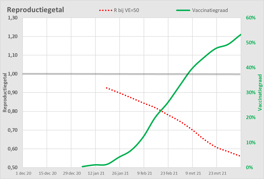
The red dotted line indicates an estimate of the expected corona mortality for a vaccine with an effectiveness of 50%. Promised was once 95%, then the dotted line becomes slightly steeper. The starting point is the R obtained by natural immunity at that moment (i.e. already below 1).
The green line indicates the vaccination rate. The vaccination campaign will begin in January 2021. If this were to take off, the corona mortality rate would start to fall faster and faster: the R-value would then have to be lower.
The observed effect
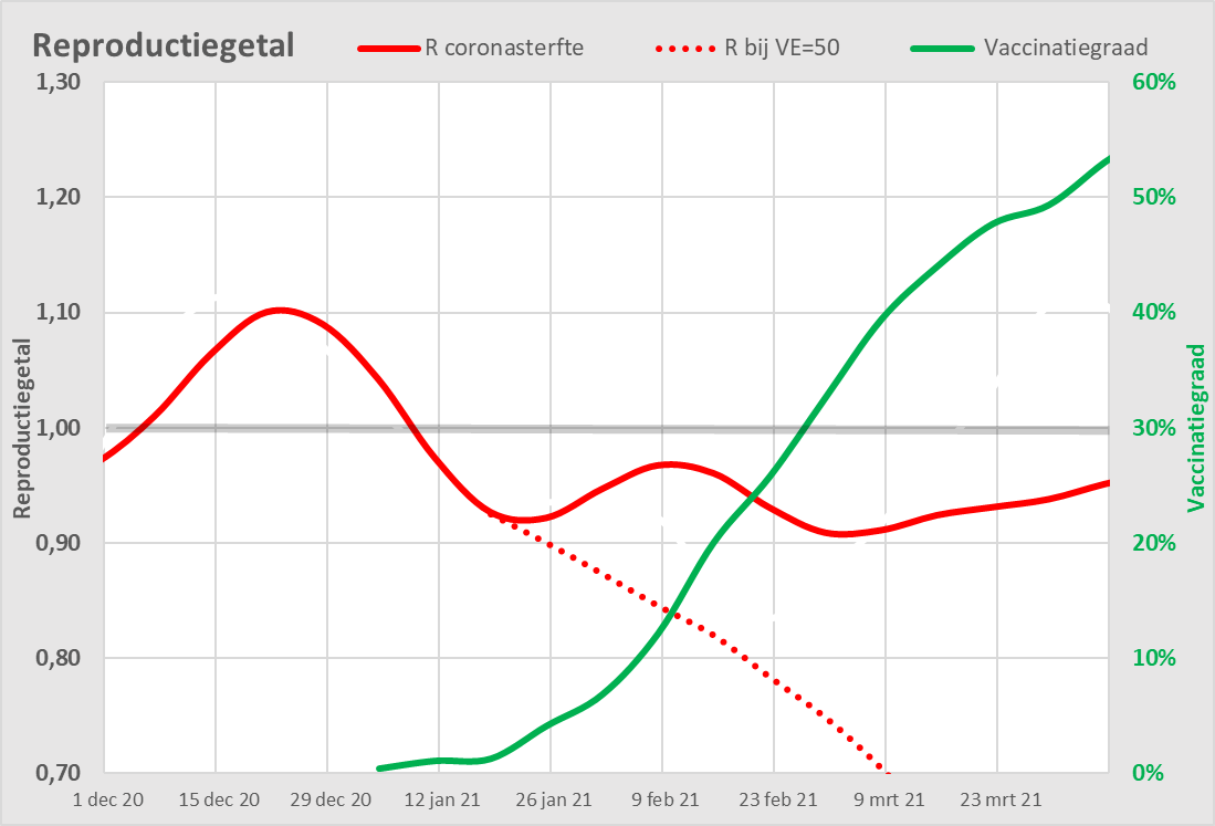
We scale the left axis back to the relevant part of the graph. The red line is the R of the Corona mortality. The expected decrease thanks to vaccination has not materialized. Due to natural immunity, the corona mortality rate has fallen below 1 and mortality is therefore also decreasing in absolute terms. This stagnated in January 2021 and even rose again briefly in February, against the vaccination pressure and of course immunity build-up, and then remained constant. We even see a slight upward trend where we had foreseen a plummeting line.
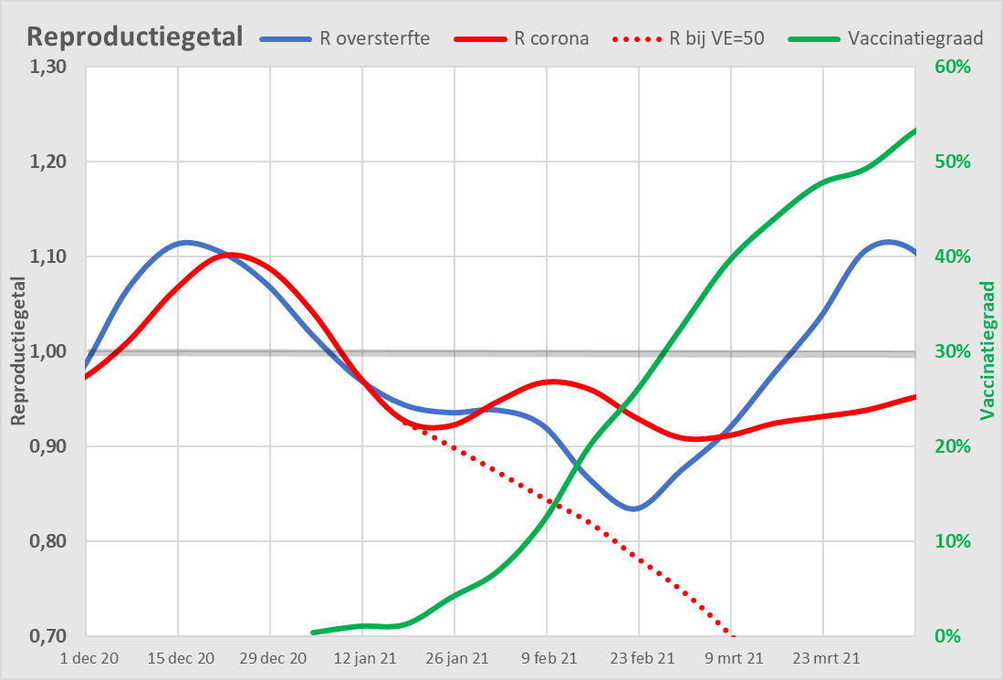
Correlation with excess mortality
(The previous graph shows you See here)
We add one more line, another reproduction number: the R of excess mortality. This is in good sync with the corona mortality – until February 2021. This makes sense, because that excess mortality was caused by the virus.
Then, in February, the general excess mortality decreases considerably faster, while the corona mortality decreases much less quickly. As a result, it seems that this corona mortality also includes deaths that would otherwise have succumbed to other causes.
From March 2021, we also see excess mortality increasing again (R-value above 1), while corona mortality continues to disappear (R below 1). Excess mortality is rising in line with vaccination coverage.
Discussion
We can test four hypotheses on the basis of this graph.
- Vaccination reduces mortality from Covid-19.
Then mortality from covid-19 should decrease faster and faster from January 2021, faster than before. We see the reverse, so this hypothesis is incorrect. - Vaccination is safe.
To this end, the general excess mortality after vaccination should no longer increase. We actually see this excess mortality increase one month after the start of vaccination. This hypothesis is also incorrect. - Mortality is a side effect of the vaccinations.
This is not denied by anyone, but the extent to which is the big question. If it were an isolated case, it wouldn't show up in these graphs. In any case, this hypothesis cannot be disproved by the blue and green lines running at the same time. So we are worried. - Covid-19 is a side effect of the vaccines.
That was the finding we started with. The build-up of natural immunity does not do its job properly. It is possible that the vaccines will play a disruptive role in this. Several immunologists have outlined mechanisms for this.
NOTE: ARTICLE HAS BEEN SLIGHTLY MODIFIED
A critical question from reader WimdR led to a new insight that, in retrospect, has less impact than we thought. The red dotted line had to be moved to the right for a month. After all, the effect should only be clearly visible when the basic series has been completed in the elderly/vulnerable. This group determines the excess mortality curve, because there is hardly any corona mortality in the youth groups. It is certainly more correct formally, but it turns out to be lead to old iron.
Full immunity (well, let's say "optimal protection" would only be achieved after a 2nd shot, presumably after a week or 2 or so.
It was said....
On what basis do you expect the sharpest drop after the first round of vaccinations?
(I'm playing devil's advocate for a moment).
There has also been some talk about that "95% effectiveness" but I'll leave that aside for now.
How nice that critical questions can be asked here! Helping each other! Also, in my eyes, this is real science! Until recently, I thought that vaccination was not done in the Netherlands for babies from 6 months and young children, but unfortunately it does happen and often also to the most vulnerable children. The information can be found on the RIVM website. In the meantime, it has even been said in a court case that there is no urgency to stop these jabs because it is voluntary... one could simply look up dissent and information... I expect a site like this to "explode" due to an overwhelming interest and it deserved it from the start! Sorry I can't make a scientific contribution, my knowledge is mainly in disease prevention and lifestyle.
The site doesn't blow up though. Too long articles, too many figures. But that doesn't matter: there is a small but quite exclusive readership. You can also see that in the level of the comments. I don't want to think about that filling up with trolls...
Hello Wim,
We have moved the prognosis line around, but it doesn't really matter. Also that 95% vs 50% VE: the line becomes a bit less oblique, well... I have adjusted the graphs, especially that delay is correct to do of course. But it doesn't get any better.
In the end, it's about that dotted line going down and that doesn't show up in other lines. But thank you for your attention, we thought for a moment that it would have much more effect. See the last graph, which you can compare with the previous version (link is below).
Greeting
Anton