
A cryptic headline, prompted by my birthday today. I would therefore like to treat the readers of my blog to a new little discovery. Because if you know little, you make a lot of discoveries!
De gemiddelde Nederlander wordt steeds ouder, dat realiseer ik mij vandaag weer als geen ander. Iedereen die leeft wordt voortdurend ouder (nog los van het feit dat "ouder" worden ook weer in context moet worden begrepen) maar er komen tegelijkertijd ook weer 0-jarigen bij. Maar wordt de gemiddelde Nederlander daadwerkelijk ouder? En dan bedoel ik eigenlijk: wordt de sterfteleeftijd hoger? Als je mensen hoort praten over "het eeuwige leven", "waar ligt de grens", "binnenkort wordt iedereen 120, en dan?", dan zou je denken van wel.
It doesn't seem to be going that fast. We are all no longer getting older, while the average mortality age is increasing. That sounds crazy, but that is because between the ages of 0 and 88, the group of young people becomes smaller and the group of older people increases. So we haven't actually lived to be older than 88 for a number of years.
If we look from 2010-2020, the average age of death increased by 1 year every 5 years. This development previously accelerated when the importance of hygiene was recognized and more recently when medical sciences underwent important developments (in cardiovascular disease, for example, between 2000 and 2010). That progression is becoming slower and slower because we have now had the low-hanging fruit. Lifestyle, nutrition, etc. may also be discussed, but we will see about that.
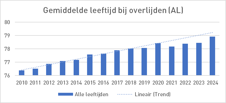
Calculating this way, we will be 80 years old in 2028, 90 years old in 2078, etc. That is if you follow the dotted line straight ahead. Of course you can't go on linearly to infinity, there has to be a limit to what we deflect to - but where is that limit?
Should we now be afraid of the spectre that we will soon be withering away in a nursing home without care at the age of 96? Rest assured: the development of aging only applies to the average. If we look at the average age of death of people over 80, you see something different.
Since 2018, people over 80 have died on average around the age of 87.8 years. So that has stabilized for seven years. Since 7 years they DO NOT GET OLDER. You could also include 2017: then it has been stable for 8 years. While I always thought that people were reaching an increasingly older age.
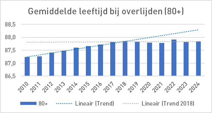
Have we reached the limit? In itself a reassuring thought.
What says CBS About that?
That becomes more difficult because then you quickly end up with their life expectancy, defined by CBS as
"Het gemiddeld aantal nog te verwachten levensjaren op een bepaalde leeftijd".
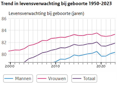
In elk geval lijkt het daar niet op, het is géén realistische verwachting. Ik lees Grafiek 3 dan alsof de levensverwachting van jongetjes geboren in 2020 en 2021 driekwart jaar korter is dan geboren in 2019, na een epidemie van een ziekte waar jongeren geen last van hadden, en baby's in 2023 zijn bijna weer terug zijn op niveau 2019... Waarom noemen ze dat "Verwachting"? Het is "Gemiddelde levensduur".
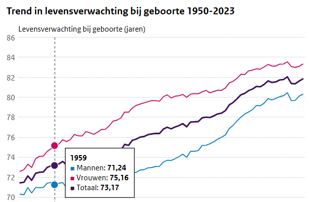
And then Chart 4, born in 1959... Oops... I only have 5 years left! But that was the expectation when I was born. Mortality rates slowly decrease, so as you get older, your life expectancy increases. (At first I thought it was because my peers were losing weight - but that's not the case).
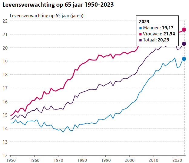
Fortunately, I see in graph 5, 'Life expectancy at 65 years', that I still have approximately 19 years to go. The year will be 2044. But then, in 2039, I will have turned 80 years old. And then it gets a little higher again: around 87.8 years, or even higher because by then the horizon may have moved a little further away... Or not? Because then I am at the limit of 87.8 years that we saw in Chart 2.
Well, at least I've got everything out of it!
"Het CBS verwacht in 2070 een levensverwachting van 87,3 jaar voor mannen en 91,6 jaar voor vrouwen." Ze zeggen er helaas niet bij voor welk geboortejaar dat geldt. Ze bedoelen "Het CBS verwacht in 1970 een gemiddelde levensduur..."
Het wordt tijd voor een "Levensverwachtingen voor Dummies". Weg met die mystificaties.


Congratulations!
And get the most out of it as long as you like it. 🎉🎉🎉🎉🥂🥂🥂
I do SuSanna, thank you!
Congratulations young man.
I see in the first graph that in the first corona year (2020) the average age (AL) at death was higher than in 2019 and fell sharply in 2021 when the shots were given en masse, especially to the elderly.
Now you can reason that this is (largely) because at that time it was mainly (stick) elderly people who died of corona. But if I see the following statement: age at death 80+, then the difference between 2019, 2020 and 2022 is minimal.
Can you give a plausible explanation for this?
The group 65-80, and that the same (stick) elderly would also have died without corona. Seems plausible to me.
Congratulations on this new, sharp, light-hearted and at the same time insightful piece.... And of course also with your birthday 🙂
Haha, thanks Herman
Congratulations. 1959 was an exceptional year of construction. Coincidentally, I'm out of 🙂 that too
It's not about how old you get, but how you get old.
And that may be as healthy and free as desirable as I want (not possible because that is becoming more limited by the day) Seize the day.
Which number is better
1. Average life expectancy?
2. Or average age at death?
Ad 1 has the advantage that it tries to take into account that we seem to be getting older, but has the disadvantage that a model has to be used to calculate it.
Ad 2 has the advantage that they are real numbers (nothing modeled), but the disadvantage that someone who dies as an 87-year-old in 2020, maybe if he was born 40 years later, would still be alive in 2060 (due to all those fantastic medical advances, and clean air and so on...)
Personally, I tend to find ad2 more reliable than ad1.
What ad1 does not take into account is that the average age is not only increasing because of clean air and so on, but is also increasing because there is less and less infant mortality (see e.g. https://www.cbs.nl/nl-nl/cijfers/detail/37979ned)
In 1950, 75,929 Dutch people died, of which 6,126 were infants (8.0% of the total), while in 2023, 169,521 Dutch people died with an infant mortality rate of 598 (0.4%).
To follow now, beer mat statistics...
Suppose that the average age at which someone dies (and who has passed the age of infant) is 88 years in year out, but you don't include that in your averages (because you count from birth), then the average age of death for the 1950 cohort is (88*92)/100=81 years and for the 2023 cohort (88*99.6)/100=87.6 years
In other words: since 1950, almost 7 years of life expectancy has increased if you don't take into account infant mortality.
Now I get from your graph 4 that the average age of death for the 1950 cohort is about 72 years, and for the 2023 cohort is about 82 years. In other words, a 10-year increase in life expectancy of which (according to my beer mat statistics) 7 years is explained because fewer children die as infants in 2023 than in 1950. The remaining 3 years will then (maybe) be due to better care (perhaps something: thrombolytics for cerebral infarction does something, so do pacemakers, antibiotics I still believe in, blood pressure reducers can be useful, anesthetics in operations are also becoming safer and laporoscopic operations are also safer than open surgery, etc), cleaner air (would it??) or (seems to me also a very likely: the drastic decrease in the number of smokers (in the 50s more than 90% of the population smoked, now 'only' 25%).
What I want to say is that our increased life expectancy is largely explained by decreased infant mortality, which I have dressed up above with numbers, with the help of a... coaster!
Now it's time to do other things...
Congratulations on your King's Day, Anton!
I also made a graph of 1+ but the difference on this time scale (from 2010) was so small that I chose All Ages.
Growing old is a concept that we need to look at because it can happen to you.
Imagine you live to be 100 and spend the last 30 years of your life staring at a ceiling.
Or you turn 90 and in the last week you feel something like a bad feeling.
Just capture that in a graph!
Then you have to search for QALY. This is converted into a unit figure.