
I expect carefully compiled information from a 'quality newspaper'. They can even boast of the self-proclaimed 'corona reporter' Maarten Keulemans, who - presumably at the request of the ministry - is being fed by the RIVM with facts that fit into the government narrative. In the Volkskrant on Saturday, this corona journalist was allowed to make a big splash with a spread about group immunity. In The digital version supported by animated figures that change color when infected. Is the UK putting its house in order?
No fewer than four authors/editors were involved in the content of the 'analysis': Ronald Veldhuizen, Maarten Keulemans, Corinne van Duin and Janne Heling. They thank Casper Albers, professor of statistics at the University of Groningen and Quirine ten Bosch, infectious disease modeler at Wageningen University. I can assume that they have been reading along. No fewer than six professionals! That raises expectations!
What surprises me is: how do you find such a club together? Six people who you can assume are not only interested but also read and aware of the state of science. Especially if they actively work on such a special. However, the piece shows incomprehension on a few points, not to say far-reaching silliness and ignorance or lack of knowledge. We now know this about Maarten Keulemans, but those five others should correct him, right?
Below are the 'mistakes' that I noticed as an interested layman. These are telling details. If you understand how things work, you won't leave something like this alone. It suggests that this corona team is doing something interesting without a good understanding of the virus, they have simply overlooked too many things.
The animations on the square
"zelfs als tweederde van het plein besmet is [...] waart het coronavirus toch nog rond totdat bijna iedereen op het plein besmet is."
Most, rather static, animations take place on a square with stationary people. One infected male walks in between. The process of infecting that they try to show is difficult to comprehend. The infected male infects a few others and they pass on the infection, as can be seen from the green color. Finally.
First: a square is outside. It is inconceivable that almost everyone there is spontaneously infected. So a wrong image is being portrayed; The reader has now been casually familiarized with the idea of being infected outside. All of them, in fact. However, there are numerous studies that make it clear that the infection problem is indoors and not in an outdoor situation.
To avoid the appearance of cherry-picking, I urge you to search for it yourself. For example, start with this search: https://pubmed.ncbi.nlm.nih.gov/?term=covid+transmission+indoors . This also applies to the claims I make later in the article: check them and try to form a well-founded opinion. Look for evidence to the contrary, too!
Male R=18 infects 12 people
The green man with corona infects two others, as an example of the effect of R=3. The male influenza, described as R=2, infects one other person. The measles man, R=18, infects twelve... What do you actually want to illustrate, what kind of strange thing is that, in a childish information video. The R now stands for the number of people someone infects. Isn't that understandable? Is that deliberately misrepresenting information - but why then...
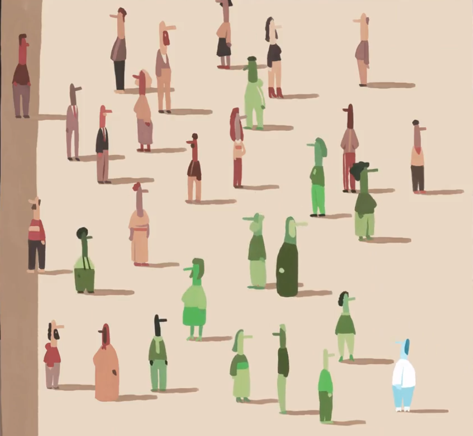
R=18: When entering the square, 1 person infects 12 others. We don't know why only 12, because an R=18 is illustrated.
Green = sick, blue is (now) immune.
Those distances seem at least 1.5 meters...
Most of the figures are well spaced, apparently neatly at a distance of 1.5 meters from each other. This clearly has no influence on contamination. Ok, that's a wrong signal - at least it doesn't matter to me because it's outside, but in the context of the measures it doesn't seem well thought out. By the way, they look away from each other, even in the open air. Infection is thus absolutely impossible.
Everyone gets infected, quickly or slowly - or not?
In the corona and measles simulation, all figures are infected. Apparently not with influenza, see the final shot below. This will mistakenly mean that a lower R number means that fewer people will become infected. However, it doesn't have to mean that. Elements are smuggled in that actually only serve as a distraction. While other important elements have been omitted: existing immunity, for example. Very important, not shown, not involved in the story - research enough to pay some attention to this. Or, despite everything, is the view still held that there is no basic or cross-immunity in a healthy immune system?
Final situation in influenza simulation.
Enough about those illustrations. If you want to see educational illustrations and animations, check out this article in El Pais. That is months old (and still underestimated the role of aerosols) but already gave many times better insight than the nonsensical vaccination panic we are in now.
I understand that the language area and therefore budget play a role, but in the UK things are simply presented incorrectly. On to the lyrics. Never before have we had such a great interest in correct information, and then the Volkskrant achieves this... Bad, reprehensible, whatever you want.
Misleading texts
Wrong view of infection
After talking about the influenza and coronavirus, it says:
"het mazelenvirus, dat zich via de lucht verspreidt"
This suggests that only measles is spread through the air, unlike influenza and corona. If you are not well versed in language, you may say 'no, that is not what it says'. However, that is what it really means. If a commentator discusses two footballers and then says of a third 'who is left-footed', then the other two are not. Then he should have said 'who is also left-footed' or 'who is left-footed just like X. A journalist from a quality newspaper, with of course the associated careful use of language, knows that.
It is not only incorrect but also extremely harmful. As long as the population is kept in the dark about the modes of infection, they will not be able to protect themselves against them.
The A-word is still on the blacklist
A few weeks ago, Keulemans found out that he had cleaned shopping carts for nothing. So he did not follow the developments for almost a year. It looks like the coin still hasn't quite fallen.
The fact that corona (and influenza too, by the way) 'passes through the air' is not accepted. Anything but aerosols. Is that misplaced pride, having to admit that as a 'corona journalist' you have been wrong for a year? Is it ignorance, RIVM propaganda or should people be kept afraid and ignorant because they are then willing to do anything?
We have just heard from de Jonge that we have Korean figures in terms of vaccination readiness. Perhaps Korean information is part of that.
Hysterical R-number
"De nieuwe varianten [..] zoals de Britse en Zuid-Afrikaanse [...] hebben een R-getal dat een half tot een heel punt hoger ligt."
Am I misunderstanding the word 'point'? It concerns the difference between the well-known virus and the British version with R numbers of 0.9 and 1.3 respectively (which is probably too high, by the way). Why is that difference of 0.4 between half and a whole point...? The statistician involved must have said something about points somewhere and someone thought that sounded good. But suppose the R number is 0.9 plus 1 point = 1.9, which is more than twice as contagious! If you are even a little bit involved in the corona figures, then you know that that is really nonsense, they are just culpable lies. You could almost say: fear-mongering. Or is one point 1/10? Then, based on 0.9, we are talking about super-contaminants with R-values from 0.905 to 0.91.
Superspreadevents work differently
The fact that the word 'super spread event' has now been removed from the Volkskrant blacklist has not led to progressive insight, let alone demonstrated this. A Superspread event is caused by a room with a lot of contaminated breath. This can come from 1 or more people who have stayed in the room for a longer period of time. This cannot be deduced from the text.
In the illustrative animation of superspread events (yes: indoors! Apparently they went too far to have that also take place on the square) only people who come close to an infected person are infected. This is contrary to everything that scientific research, clinical and observational, has shown about superspread events. You could perhaps represent a 'superspreader'; someone who emits an above-average amount of virus, a phenomenon that is being investigated because it has been seen but not yet explained.
What we see in this animation is exactly NOT how super spread events are created. If you want to show that, it would be better to start with one dancing infected male, sweating and panting. A group that comes in a little later (male can actually leave) is then infected in its entirety in one go. This is due to the contaminated breath, in which aerosols transport the virus particles like nano-zeppelins. Which brings us back to the visuals.
In summary: the Volkskrant gives a wrong picture of how infections work and leaves people in the dark so that they do not understand how they can can protect themselves cheaply and effectively.
This is not an accident, this is structural. De Volkskrant is one of the most important spreaders of disinformation.
