
The article below is an adaptation of a part of the CBS report Health in times of corona (cbs.nl). Virusvaria attaches great importance to the theme of 'excess mortality'. However, CBS's explanation is such that the editors of virusvaria had to make some corrections before informing its readers about this. Naturally based on exactly the same figures. What you read below is therefore not the explanation of Statistics Netherlands, but an analysis of the figures due to virus variants. Feel free to put both pieces next to each other to see the differences and judge for yourself.
De coronacrisis is naast een beleidscrisis ook een gezondheids- en informatiecrisis. De angst voor een pandemie houdt de wereld nu al bijna twee jaar in haar greep. Beleidsmakers en gezondheidsadviseurs beklagen zich over het feit dat het cijfer dat zij zelf tot kencijfer hebben verheven, niet bekend is. Hun kencijfer is weten "hoeveel mensen zijn er besmet of zijn er besmet geweest". Dit blijft een bron van discussie, ondanks dat besmettingen al geruime tijd geen correlatie meer hebben met druk op de zorg, ernstige ziekte of sterfte. Het 'besmettingscijfer' hangt voornamelijk af van het aantal mensen dat is getest. Dit kan per land, per regio en in de tijd sterk verschillen. Ook geeft een positieve test wel aan of iemand in contact is geweest met het virus maar niet of iemand 'geïnfecteerd' is, laat staan of die persoon er ziek van wordt. (Denk aan een voorwerp: een tafeloppervlak kan ook 'besmet' zijn maar wordt er niet ziek van en hoeft ook niet 'besmettelijk' te zijn.). Om precies te weten hoeveel mensen zijn overleden aan COVID-19, kijken we naar de doodsoorzaak. De oversterfte geeft dus geen enkele indicatie van hoeveel mensen door respectievelijk corona, de vaccinaties of gevolgen van de lockdowns en andere maatregelen zijn overleden. Vanuit die optiek volgt hieronder toelichting op de sterftecijfers.
Excess mortality due to corona, measures and/or vaccinations

On average, more people die in the cold months of the year (roughly from mid-November to mid-April) than during the rest of the year. If there is a cold or flu is common, mortality will exceed 'normal' mortality. One then speaks of excess mortality. This happened, for example, in 2018, when a long-lasting flu epidemic occurred. In eighteen weeks, more than 2,500 more people died from the flu than what has been normal for that period for the past five years ('normal' is 6,500 more than expected). After a period of excess mortality, mortality is usually lower than normal for that period.
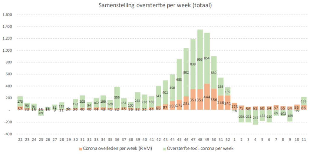
In 2020, there was excess mortality due to the COVID-19 outbreak. In the first nine weeks of the coronavirus pandemic, excess mortality was estimated to be nearly 9 thousand people, i.e. almost 2,500 more than the average over the past five years. This is about the same as during the flu epidemic in 2018, but the number was now reached in only half the time. This does not necessarily say anything about the severity of the disease, because a faster spread due to a higher infectivity has the same effect. The curve then peaks higher and is over faster. Worldwide, we see steep, short-term peaks that indicate this.
The highest point in the Netherlands was reached in the first week of April, when more than 5 thousand people died, more than 2 thousand more than normal for that period. The coronavirus pandemic only started in the second week of March, while the period of excess mortality during the flu epidemic in 2018 already started in the penultimate week of 2017. Due to the lower infectivity, the curve was longer and flatter: it took thirteen weeks before the highest point (over 4 thousand) was reached.
The first wave of the coronavirus pandemic in 2020 was followed by a period of lower mortality (yellow shading). Since mid-May, mortality has fluctuated around 2,600 per week. At the beginning of August, for the first time in 13 weeks, there was some excess mortality related to the heat wave. In the second week of August, 3.2 thousand people died as a result.
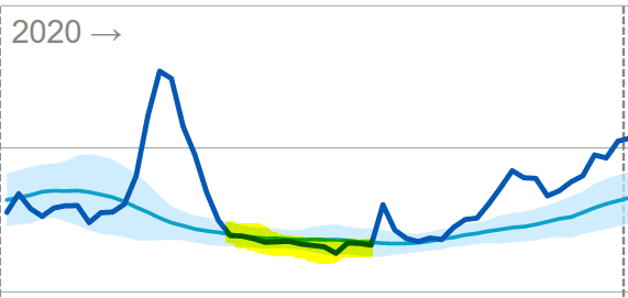
From mid-September 2020, mortality rose again. There had been excess mortality since the end of September. This continued until mid-January of 2021.
Substantially higher mortality after March 2021
In the first weeks of 2021, the considerable excess mortality disappeared and even, in mid-February-mid-March, briefly dipped below the expected level. After a period of high mortality, this can be explained as the influence of undermortality. However, the lower mortality lasted only 1 month. In mid-March, the mortality rates went up again; The reduced mortality - which lasted remarkably short given the substantial excess mortality that preceded it - therefore became invisible.
As of April 2021, mortality remained structurally above the expected level for the rest of the year (yellow shading). The light blue area indicates the fluctuation margin within which mortality should fluctuate. The peaks and troughs should more or less compensate for each other. Especially in the spring and summer months, it is therefore very unusual for actual mortality to fluctuate structurally above expectations. The only exception was a small dip in mid-June.
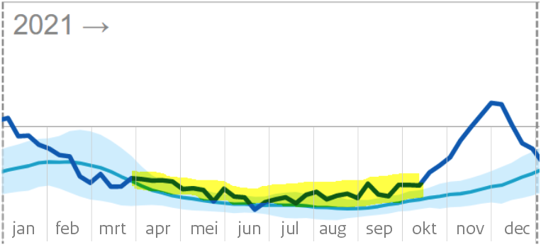
From July 2021, mortality will even fluctuate above the fluctuation band
After that, mortality continued to increase. From the end of July 2021 (during the summer!), mortality even exceeded the upper limit that is used as the 'excess mortality limit' in a regular mortality pattern (blue shading). From mid-October, mortality suddenly started to rise even faster.
This could be due to the arrival of the autumn/winter season, were it not for the fact that the reported covid mortality also lags far behind the observed general mortality in this period. The period of excess mortality will last until the end of 2021. In the first weeks of 2022, mortality is lower than originally expected. This also indicates an influence of undermortality from the large mortality that took place shortly before.
After a period of persistent higher mortality, a period of lower mortality is common. This depends on the age of the deceased. If they are elderly people who would otherwise have died within six months to a year, this is quickly reflected in lower mortality rates in the following months and also in the flu wave of the following year. If, on the other hand, it is mainly people in their thirties, for example, there will be no clear undermortality during this period. Undermortality therefore only refers to the deceased elderly, while excess mortality relates to all age groups.
WLZ users
FromWLZGivesstraightcare for insured persons who are permanently dependent on 24-hour care in the vicinity or permanent supervision because of their condition(s) or limitation(s).
Dit zijn voor een belangrijk deel ouderen en kwetsbaren. Het is goed te zien dat de ondersterfte daar langer doorloopt, dus niet al eind maart stopt. Dat de totaalcijfers voor de hele bevolking vanaf maart toch weer als "normaal' kunnen worden gepresenteerd komt dus door hogere sterfte in de andere groepen.
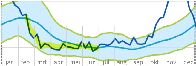
The undermortality among long-term care users masks what happened to the rest of society in the spring of 2021, starting with April.
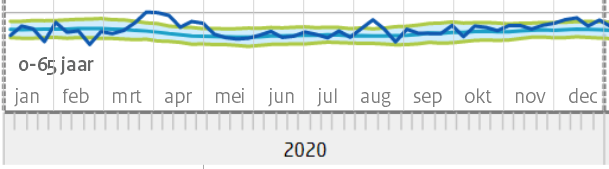
Age groups 0-80
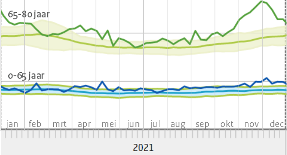
The over-80s line shows almost the same picture as that of Wlz users, both 'cohorts' overlap. That is why only the groups under 80 years are shown below. The traditional reporting uses cohorts 0-65 years, 65-80 and 80+. In the case of a highly age-discriminatory disease such as Covid, 0-65 is defined too broadly: interesting subgroups can be distinguished within that group. However, this would produce a more complex picture for the reader. CBS also adheres to the usual generalization for the sake of scientific consistency with previous reports.
In the 65-80 age group, mortality in the whole of 2021 was above expectations, with several peaks above the fluctuation margin. One exception in week 9: there were six(!) fewer deaths than the expected 975. In April-May, there is a clear excess mortality (above the fluctuation margin). The corona wave from October shows great similarities with that of 2020, despite the largely vaccinated population.
Mortality in the age group 0-65 years has also been structurally elevated since March 2021 and has not fallen to the expected value, even in the summer. An explanation for this could be found in the causes of death.
De eerdere bewering "In de weken erna [na half januari 2021, red] was er geen oversterfte" geeft in die zin een misleidende voorstelling van zaken. Er was wel degelijk oversterfte in die weken. In de gemiddelden komt die niet tot uiting vanwege de flinke ondersterfte bij de groep 80+, die eerder zwaar getroffen was.
Both compared to 2020 and compared to previous years, there was an extremely increased mortality in 2021. Even after deducting covid mortality and an occasional heat wave, a large part of that mortality remains unexplained in a year in which all kinds of things have happened to the population.
If COVID is still determined as the dominant cause of death, this indicates insufficient effectiveness of the vaccines. The decision to urge vaccination would then possibly be seen in a different light.
If, on the other hand, the vaccines did offer significant protection against Delta and we can therefore disregard them, it remains unknown which disease caused the death. To avoid further confusion about this, the causes of death will only be made available in plausibised reporting form, edited by RIVM and Statistics Netherlands, both under the auspices of the Ministry of Health, Welfare and Sport. The state interest prevails here over parliamentary questions, WOB requests and court rulings.
Editorial postscript: extremely increased mortality, no 'excess mortality' according to CBS
We consider it essential that the links between possible influences on health on the one hand and mortality rates on the other are thoroughly mapped. An interpretation such as that given by CBS does not help with this.
Het CBS lijkt net als het rivm te willen schermen met de term "oversterfte" als "sterfte die buiten de fluctuatiemarge valt". Deze definitie is echter alleen te hanteren bij een reguliere fluctuatie rond de nullijn van de verwachte sterfte. Dit is in 2021 evident niet het geval: de sterfte fluctueert een groot deel van het jaar rond de bovengrens. Zolang dit niet expliciet wordt geconstateerd, hoeven we van verklaringen uit de hoek van de overheid niets te verwachten.
Increased mortality now appears to be re-emerging in week 11 of 2022. We are heading towards spring and summer again. There is no Covid, but there is some flu. In any case, this should not continue in April.


Dear Anton, in the last post you use the excess mortality graph of the corona dashboard (VWS) it might be interesting to use the excess mortality graph of the RIVM for this. fr gr Karel Balder
Hello Karel,
In this article, I have only shown what I think the explanation by CBS could have looked like. I only used the graphs that they used themselves. Except in the 'postscript of the editors'. Which graph do you mean exactly, this one? https://www.rivm.nl/monitoring-sterftecijfers-nederland
To be clear: of course, these are not 'my' data, they are the data from CBS.
I have only given a more realistic explanation of their own graphs.
The fact that there are differences between RIVM and CBS excess mortality is explained on the RIVM site:
"The excess mortality estimates of CBS and RIVM can differ at a weekly level. CBS looks at the averages over the past years for the week in question, which include increased mortality in the flu season. The RIVM also wants to map excess mortality due to the flu every year. For that reason, the estimates of CBS and RIVM differ."
I'm not going to get involved in that debate, but if you can find any interesting differences in it, I'd love to hear what that is!
It would have been so clear if it had been stated where the italicized parts come from.
Hi Jan, those italics come from the same tube as the rest of the text. They don't really have an equivalent in the CBS report. Because they were separate new additions, I made them italic.
I don't understand the sentence "normal is 6,500 more than expected" (paragraph under the first graph "excess mortality.."). I would think: normal is what you expect. Where am I mistaken?
In 2015-2019, there were an average of 6,500 more deaths than expected during the flu seasons. Every year again. This did not cause any unrest or measure. So that is 'normal'. I think that RIVM does not adjust the 'expected mortality' to keep flu mortality in line with excess mortality. That will be easier for them to calculate. So the expected mortality is about 6,500 below the normal mortality. https://virusvaria.nl/sterfte-normaal-dus-hoger-dan-het-rivm-verwacht/ That excess mortality will continue to grow considerably, by the way: https://virusvaria.nl/oversterfte-binnenkort-naar-ca-10-000-per-jaar/