Guest blog by Hans Verwaart (in collaboration with Anton), who has worked around the omissions in the UK data and comes to a remarkable conclusion. The article can be seen as a follow-up to the exercises with last year's UK data. There, the graphs showed a large mortality bump in early 2021, who moved along with the vaccination campaigns per age group over time. The months of January-March 2021 have now been removed from the report. It is worth mentioning that the bumps were then in the unvaccinated, now the offshoots are still visible – but in the vaccinated... What happened there is unclear. Only around May/June 2021 will the dates become consistent.
After a long time, the English CBS (ONS) has published a report on the mortality rates per age group based on the vaccinations taken against corona. There has already been a lot of criticism of the figures, especially where an absolute number, for example mortality in a certain age cohort, has been translated into a relative number, for example mortality per 100,000 unvaccinated people of that cohort. If the number of unvaccinated people is incorrect, the outcome becomes unreliable.
For that reason, I did not use tables 1 to 4, but only table 5. Table 5 shows the absolute numbers of deaths per age cohort and per month in only two categories: "ever vaccinated" and "not vaccinated" against corona. For the determination of the numbers of (non) vaccinated people, the official source of gov.uk, which gives the impression of containing more reliable numbers than ONS must have counted on.
Someone who has ever been vaccinated must have at least gotten the first jab of the basic vaccination. For each different age cohort, we will determine the vaccination rate per day based on the number of first jabs taken.
Hypothesis
The intention of the corona vaccine is of course that serious illness or death is prevented and that there are few serious side effects. This means that the total number of deaths in the vaccinated group is at most equal to that in the unvaccinated group, after having made the groups arithmetically comparable.
Now corona has come in waves, with the variants leading to different numbers of deaths over time.
The simplest hypothesis is therefore to state that the percentage of deaths among vaccinated people is equal to that of the unvaccinated, for the same month and age cohort.
The expected number of deaths in the vaccinated groups is then only a function of the vaccination rate and the number of unvaccinated deaths.
At ONS, a vaccinated person counted as "vaccinated" from the date of vaccination. This means that someone who dies, for example, one week after the jab, is actually counted as vaccinated. In the past, this vaccination status was sometimes postponed in both the UK and the Netherlands.
Method
Given the uncertainty of the population size of the unvaccinated, only the number of deaths is a hard absolute number. By combining this number with the known vaccination rate, we can calculate per age group how many vaccinated people would have died if the vaccine has no effect on mortality. By comparing this expectation with the actual number, something becomes visible about the effect. Now, the vaccination rate may also be somewhat uncertain, but we will see that conclusions can nevertheless be drawn.
Example: in a given week, the vaccination rate is 80% and 400 unvaccinated people died in that week. That is 400 among 20% of the population. You can expect that in the 4x larger group (80%) there are also 4x as many or 1,600 deaths. So, in other words, if you divide the actual deaths in vaccinated people by 4, you should arrive at the same number as in the unvaccinated. If you divide those two numbers on top of each other, the result (quotient Q) must be 1.
Now, let's calculate an age cohort as an example. The ONS spreadsheet shows the mortality figures from April 2021 to December 2022. The mortality rates are presented in seven groups: 18 – 40, 40 – 50, 50 – 60, 60 – 70, 70 – 80, 80 – 90, 90+.
(The first months, until June 2021, are incorrect due to errors during the implementation period of the central registration system. For the sake of completeness, they are included in the graphs.)
18 – 40 years
First, let's look at the youngest category, 18 – 40 years. The calculated (vax expected) and actual mortality rates per month are as follows:
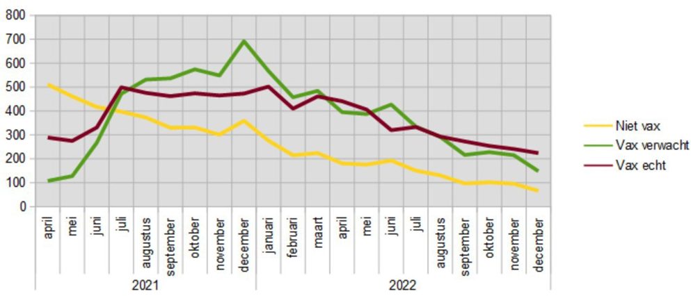
The Y-axis shows the number of deaths in that month (the months are on the X-axis).
From yellow line shows the actual numbers of deaths of the unvaccinated.
Calculated from this on the basis of the vaccination rate and taking into account the hypothesis, is the number of people ever vaccinated, which we therefore expect to die. That's the green line.
The purple line reflects the actual mortality in that group.
We actually see three periods here:
- April to July 2021 – we have to ignore this period due to misclassification;
- July 2021 to March 2022 – actual mortality among vaccinated people is lower;
- from March 2022 – actual mortality is approximately equal to the expected mortality.
These periods are also clearly visible in the following graph, which shows the ratio of actual mortality in the group of once vaccinated people divided by the expectation. If the hypothesis were correct, the quotient (Q = real / expectation) should be one:

A Q that is clearly greater than one implies that a number of people died shortly after taking the jab (or that those with the highest mortality rates were vaccinated first). Of course, there may also be other causes, but we will soon also see this phenomenon in the 40-49 age group, which was a little earlier in the past.
In period (2), Q moves below one. The vaccine does better in that group during that period than described in the hypothesis.
In period (3) we see an increase of Q to above one, which manifests itself most clearly in the autumn of 2022.
All age cohorts
The following graph shows the evolution of Q for the seven age cohorts:
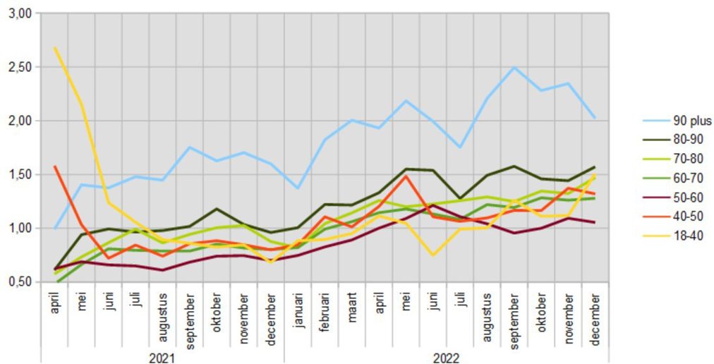
The periods mentioned above can also be distinguished in this overall picture, although period (1) is only visible for groups 40–50 and 17–40: the groups that were last vaccinated. For the older groups, that period falls earlier. Nothing can be deduced from the exact height of the curves.
In period (2), the Q is predominantly below one in five of the seven groups. With the two others: 80 – 90 it is at or just above one in this period and for 90 plus even around 1.5. The group 50 – 60 scores the lowest in this period, that group apparently benefited the most from the vaccine during that period.
In period (3) only the group 50 – 60 actually meets the hypothesis and - with a wide margin - 18-40 years. In the other groups, Q is clearly above one and in the oldest group even above two.
All groups together
The following graph shows the value of Q, i.e. the actual number of deaths divided by the expected number of deaths in the vaccinated groups combined. In it, it is quite easy to draw a linear line, which runs diagonally upwards. The determination coefficient (R2) is 0.90 (minimum 0, maximum 1) indicating a high correlation.
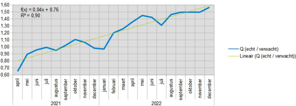
The autumn booster 2021 is striking. The oldest groups started at the end of September, the group 15 – 40 reached the peak in mid-December. The graph above indicates that, after a brief positive effect in December 2021 and January 2022, the negative effects increased, initially jumping back to the trend line in one month (Jan-Feb). It seems that after Delta was supplanted by Omikron, the autumn booster could not even briefly have a positive effect.
Possible correction
After comparison with the penultimate report, it was noticeable in the overlapping period that values have now been raised in the last months before publication, in the new report. This may be due to reporting delays.
- Reporting delay was greatest in unvaccinated people (17-10-7% to 8-4-2.5%)
- The increase decreases exponentially as the month moves further into the past.
Assuming that this will also be the case in the latest report, we have already made the same correction in the final months of the new report. This leads to the graph below. The linear Q runs up to 1.50 instead of 1.60. The blue line seems to find its limit at 1.40 in May 2022. It seems to stabilize around 1.30 but this will be the top of a line that drops back to 1.00. In the following graphs, the differences in recent months are also somewhat smaller.

Conclusion
Over the entire period, the hypothesis that the mortality rates among unvaccinated and vaccinated people are the same for the same age cohort is not met. There are cohorts where the hypothesis applies for part of the period in 2021.
In fact, in all age groups taken together, there is an upward trend from start to finish, which means that there is an increasing mortality rate among the vaccinated compared to the unvaccinated.
If the vaccination rates are still adjusted, remember that the line as a whole can shift slightly up or down. The upward trend will continue.
Excess mortality
Finally, a few comments on excess mortality. The expected mortality is roughly between 35,000 deaths per month in the summer months to 50,000 in January. Here is the picture of excess mortality among vaccinated people in 2021 and 2022:

In 2021, excess mortality will occur throughout the second half of the year. In 2022, only in the under-mortality dip, immediately after the Delta peak, there will be no excess mortality for three months. In total, of the 21 months, there is 15 months of excess mortality, with the largest in July and October 2022, also seen in percentage terms as a function of the expected mortality.
Let's take a look at the mortality rate among the unvaccinated and vaccinated. It's interesting to see what the graph above would have looked like if no one had been vaccinated or everyone had been vaccinated. This method magnifies trends and eliminates opposite trends.
Where there was 20% unvaccinated, we multiply the number of unvaccinated deaths by 5.
Where there was 80% vaccinated, we multiply the number of vaccinated deaths by 1.25.
That shows the following picture:

We see that in 2021, for both groups extrapolated to 100%, excess mortality still occurs in six out of nine months. This implies that both the vaccinated and the unvaccinated contribute to excess mortality. However, that picture is completely different about 2022. For the unvaccinated, there is not a single month more excess mortality. For the vaccinated 10 out of 12 months.
Of course, this is not "the" picture if there had been no vaccines. Small statistical differences are magnified, especially in the group of unvaccinated people, because this group is much smaller. But the trend is clear. I think there is little chance that in reality without vaccines the blue line would have been around the expectation.
With that, I dare to say quite harshly that the vaccinations against Covid-19 are a major contribution to the "unexplained excess mortality".
Note: perhaps the distinction in type of vaccine can distinguish between period (2) and (3), in period (2) AstraZeneca was also used, in period (3) no longer. I have searched for figures on how many % of the population has received AZ, but I have not been able to find them.
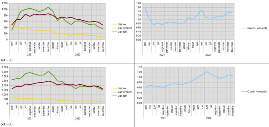
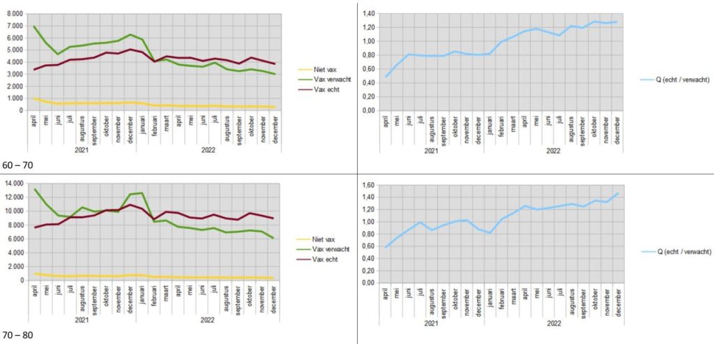
Additional graphs by age group


You write 'It is worth noting that the bumps were among the 'unvaccinated' in January-March 2021'. Logical: in January 2021, only the first elderly and vulnerable people in Limburg and Brabant got their first shot and the second at the beginning of April. So until mid-April, the whole of the Netherlands was registered as unvaccinated.
Astra Zenica was then offered to 65 minners, but they took few people, because in March-April it was clear that it was less effective and had many side effects and this age group had barely been called up. Moreover, in the spring, the Health Council changed the age advice to 'only for people over 65'. In the meantime, they had already mostly been grafted with Moderna and Pfizer and the rest had little or no interest in AZ due to the negative coverage. The group 60-65 has chosen non-grafting the most because of this zigzag policy. (happy)
These graphs are about the United Kingdom, not the Netherlands. Never vaccinated people are compared with those who have had at least 1 jab. Which vaccine and how many follow-up shots does not matter and does not explain anything, except (perhaps) what Hans mentions in the note at the end.
It doesn't make sense that the bumps were among the unvaccinated at the time. Certainly not on the grounds that that group was larger at the time. The number of unvaccinated deaths has been peated and is fixed. A larger population of unvaccinated people would mean a lower mortality among that group, not a higher one.
The fact that these same bumps have now apparently been transferred to the vaccinated gives cause for thought.
Addition. You also had a similar trend in the UK. Only it took place a few weeks earlier because they started grafting earlier
True. Hence my addition below.
Even with a shot that only counts after two weeks and perhaps just like in the Netherlands after four weeks with Janssen, you get differences in favor of (more) effectiveness of the shots. Furthermore, people who are known to die very quickly are much more rarely vaccinated. To what extent does that also affect the results?
That is also stated in the article: calculated from the jab.
I have seen the Healthy Vaccinee Effect explained in two ways:
1) people who are terminally ill no longer get vaccinated: this increases the mortality rate among the unvaccinated.
2) healthy people who rely on their immune system do not get vaccinated. This lowers the mortality rate among the unvaccinated.
To what extent that affects the results, no one knows.
The title of the article seems to contradict the conclusion.
The zero hypothesis is that there is no effect. So Q should be 1. That hypothesis is being tested.
Sometimes I summarize the article in the title, sometimes I try to arouse curiosity.
P.S.: Did you intentionally enter a non-existent email address? Then you will not receive a notification of this reply.
I also find it a confusing title.
Do you know a better one, which does trigger you to read? If I think it's an improvement, I'll adjust it...
@Anton: no, no intent. It was a typo.
One word Anton: ..."has no FAVORABLE or POSITIVE influence ...
.