
The now infamous Chapter 6 in the excess mortality report of Meester-Jacobs, by Bram Bakker, has caused quite a stir. The pictures that caused the most controversy were the Kaplan-Meier graphs. All kinds of things were written about it. But not everyone reads graphs with ease. In a subsequent post, about Nivel and an Italian study, they play an important role. Below is a basic explanation and then applied in a discussion of a few graphs from Bram Bakker's piece.
What are KM charts?
A Kaplan-Meier graph shows survival curves. It can also be about the repair success of devices, but we will stick to mortality and medical interventions for now.
The horizontal axis shows the time lapse from the moment of an intervention, the vertical axis shows the percentage of people who are still alive. By putting two of those curves together, you can clearly show the effect of different medical interventions (an injection, for example), or the difference between intervening or not intervening in an incident. Ideally, the intervention is the only difference between the people you compare. This is what we strive for in research. In reality, the decision 'whether or not' already causes major differences between the two groups.
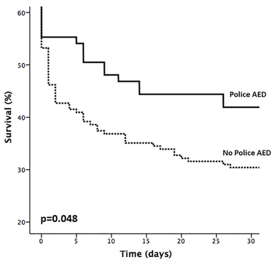
Illustrating. The effect of AED (Automated External Defibrillator CPR) in heart failure is as follows.
You can see here that five days after heart failure, 55% of the people who have undergone AED treatment are still alive and of those who have not had an AED, only 40% are still alive (this is just an example). In any case: the 'belly' at the beginning of the dotted curve in particular is characteristic: those people were already in a critical condition on day 0. So there was an incident in each individual patient that resulted in action being taken (or which was not possible).
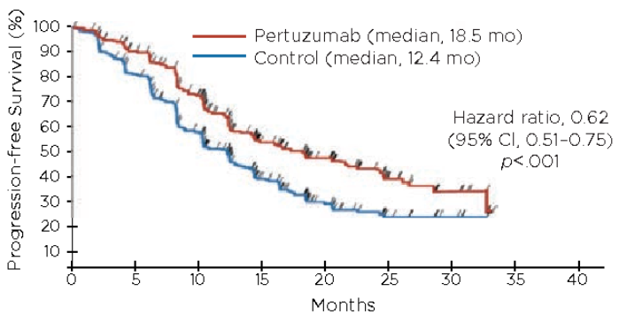
In patients with a more chronic, even progressing disease, the curve is more sloping. In this case, the difference between treatment and control grows steadily over the first two years after the start of the medication. The effect then seems to diminish somewhat, the lines come closer together again. This is not about mortality, but the idea is the same: disease inhibition or not.
Now these were graphs that were about people with a disorder.
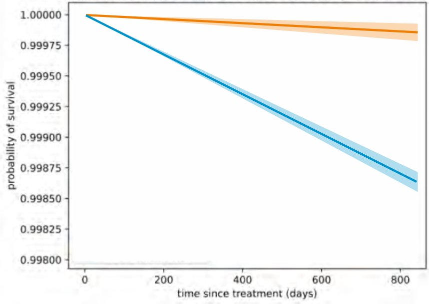
Charts of Preventive Treatments at healthy people, think of vaccinations, look very different. Ideally, the lines should be as good as straight (or they curve in a similar way, which has to do with age and the term), but with a pure design and a working intervention, they deviate further and further apart during an effective intervention. No heavy belly. After all, the moment of the intervention is independent of having complaints or illness as with the AED. And terminal people did not participate in the measurement here. So no huge dip in the first days or weeks of the intervention in those who were too sick for that.
So much for the theory. Now for the practice.
Bram Bakker analysed the CIMS data: databases with death and vaccination data. In the Meester/Jacobs report, he presented graphs such as these:
We have just seen where such a huge belly comes from from day 0: those people were already (deathly) ill. So this did not only concern healthy people. It could also be the result of the intervention itself, but in this case that is not possible: after all, it is the not-vaccinated people who have a lower chance of survival. Not vaccinated BECAUSE their end was near.
Hun overlijden heeft dus niets te maken met de kwaliteit van het vaccin. "Daar zie je aan dat er tijdens de coronagolf is geprikt" riep een wetenschapsjournalist...
Now it's about nun-Covid overlijdens dus het argument "tijdens een coronagolf" doet weliswaar wenkbrauwen fronsen maar vooruit, iedereen mag wat bijdragen, hij ook.
The orange line also shows that the vaccine offers 100% protection: not yet a dent due to Covid, for three years we see a straight line while the vaccination moments still fell in the same period. You should be able to see an epidemic again.
The data is hard, the math is right, the graph is clear, but the story doesn't close. Vaccinated people with lower mortality thanks to the jab? No way. This increased mortality among unvaccinated people does not show the effectiveness of the intervention. The experts had lost sight of that last step for a while.
Op X bogen statistici zich ook over de vreemde "buik" in de blauwe lijn. Met enige trots strooien ze met termen als "HRD" (High Risk of Death), "Mortality depletion", "Survival Bias" enzovoorts, alsof dan alles verklaard is, kennelijk zonder de begeleidende analyses van Bram Bakker gelezen of in elk geval goed begrepen te hebben. Hij bespreekt die verschijnselen expliciet en duidt ze als gradaties van het Healthy Vaccinee Effect.
Whatever name you give it: as long as that initial curvature is in the line, there is no point in comparing if you want to know something about healthy people. Those who ended up in the blue curve were not vaccinated because it no longer made sense or was life-threatening. If you include those deaths of people who have not been vaccinated in the calculations, you get unjustifiably very high vaccine effectiveness. When Nivel realized that (there are signs of that), they thought they could get rid of that effect. But Bram Bakker had already tried that. That doesn't work.
In addition to the HVE, we are also dealing with data pollution (read Maurice) and data gaps (see Herman Steigstra's 'waiting time'), as a result of which deceased vaccinated people have ended up in the unvaccinated group. Then we will make good progress with that mortality difference. If from a group of 90% deceased vaccinated people, five are included among the 10% unvaccinated people, the number of unvaccinated deaths increases by one and a half times. The poor survival rates in the first period of the graph are therefore explainable.
Optical exploration
What if we ignore the first curvature? See where the line straightens again and thus a stable effect becomes visible. We then move that line segment upwards to be able to compare it properly. The more oblique the line, the more deaths. And yes, the purple line is steeper.
Hurrah! Will the provaxxers shout: do you see that the unvaccinated have a lower chance of survival than the vaccinated!? The purple line runs down faster!
And indeed: if you had well-composed groups and this graph was about Covid mortality, that could be the conclusion.
But this graph is also about NON-covid mortality: ALL causes of death except Covid! This means that we are still looking at vaccinated people who were already healthier than those who would not be vaccinated (or you have to believe in the Elixir Effect of Life that CBS and RIVM applauded early on. And Dijkgraaf too, for that matter).
Now the difference between those two lines provides valuable information because you can also see approximately how much healthier the vaccinated people were, how much those mortality rates differ. If you correct for this in the graph that does deal with Covid mortality, you correct that away and you may be able to get an impression of how effective the vaccine really is! I'm treading on thin ice with this, but I'm trying to get a feel for the proportions.
So we do that provisionally in the graph with the covid mortality, but oops: those lines are almost the same without that correction...!
If you apply the intended correction to this, we will get a negative vaccine effectiveness...
The real vulnerable
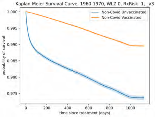
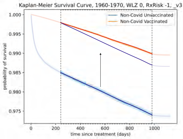
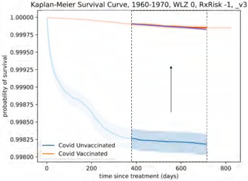
But maybe it's not fair. We have now looked at healthy people in their fifties/sixties without nursing homes, etc. So let's look at a more vulnerable group, people in their seventies/eighties including WLZ, for whom the vaccines were really intended. The more oblique the line, the worse, we remember. Three graphs: Covid deaths on the left, non-Covid on the right and all causes of death below.
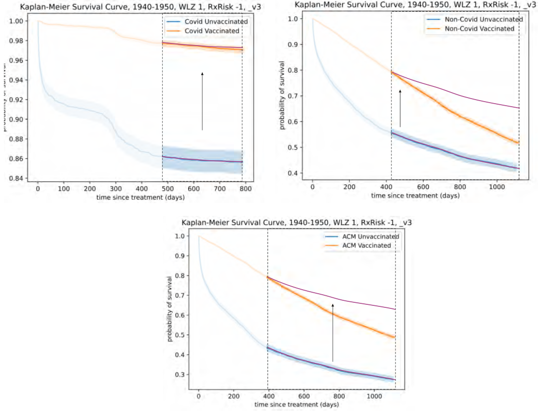
Even at the Covid mortality graph at the top left, my sketchily displaced unvaccinated line indicates a slightly higher chance of survival than that of the vaccinated. Not to mention the other two graphs. It's all just experimentation, but still: they are graphs that ask for explanations, instead of providing answers to questions. They don't speak for themselves.
De laatste grafiek geeft bijvoorbeeld aan dat ongevaccineerde oudjes het na de initiële sterftecurve veel beter doen dan de gevaccineerde. Dit fenomeen kennen we als "survival bias". De groep is na een jaar van samenstelling veranderd. Nadat degenen die binnen een jaar zouden overlijden inderdaad zijn heengegaan, blijft er een sterke groep over die het beter doet dan het gemiddelde en zelfs beter dan het gevaccineerde gemiddelde. Een wondermiddel is de vaccinatie dus zeker niet.
The group that does so well at the end is interesting. They are healthy, have assessed this correctly and feel - or know - that a vaccine will mean little to them. Perhaps they have also heard about risks associated with it. Or they thought they would die quickly and that turned out not to be true. Or they are religious or anti-vaxxers from home. You should ask them that.
To find out, you would want to split up such a 'sub-cohort' in a matched manner and then vaccinate one half and not the other half. This poses practical and ethical problems because some did not want to be vaccinated, which is why they are in the unvaccinated group. They will therefore never participate in an RCT. Every RCT lacks the test subjects who know that a vaccination will not do them any good. Are you also such a person? Then at least no testing has been done for you! 🤷
Conclusion
We'd better stop with all those Dutch analyses and first see if those CIMS data can still be repaired. I doubt it: Bram Bakker pulled all kinds of things out of the dining cabinet and was still not satisfied.
The file requested by the Biomedical Court of Auditors could have contained crucial information. Unfortunately, the institutes have carried out post-processing on this just to be sure. As a result, the relevant data was impoverished to such an extent that it could no longer serve the purpose for which it was requested.
The lesson that can be learned from all this: only a Randomized Controlled Trial generates the best quality information possible, if carried out and interpreted by independent researchers. Transparent data is required. Looking back on fait accompli, the uncertainty always remains too high, especially if the data has been improperly collected and managed and strict monitoring has been neglected. The Netherlands will not be the only country that has made a mess of it. Governments all over the world have blood on their hands - not something to want to be transparent.
Without a proper, carefully matched serial Phase I - II - III RCT, it is Russian Roulette with those vaccinations. Inciting or forcing to play Russian roulette is attempted manslaughter. That must also have been on the minds of those who tried to boost the now Nivel report.
Afterburners
Armand Girbes used a different strategy. He tried to calm it down: never mind, there is simply nothing to be gained from that data, what happened is what happened. He ignores the fact that we are at the mercy of grumpiness. And that was it: on the basis of the same ignorance, which did not recognize even the most deformed data as such, citizens have been deceived for years. This has cost thousands, possibly tens of thousands of lives.
Dat er nu in Japan alweer nieuwe soorten "self-replicating" vaccins op de markt zijn gekomen is onbestaanbaar. Opnieuw zijn er geen degelijke trials gehouden, slechts onderzoeken door het eigen vlees keurende slagers. Dat lijkt gewetenloos en dat is het ook: instituten en commerciële machtsbolwerken kunnen niks met "geweten". Het zijn reptielen. Die organisaties, verenigingen, overheidsinsitituten, ze hebben allemaal als enige opdracht om zich in stand te houden en te versterken. Streven naar ongebreidelde machtsgroei helpt om relevant te blijven. En dat doen ze met het mandaat dat ze van ons hebben gekregen. Wij willen toch daadkrachtig beleid? Nou dan!
De wegkwijnende media hebben bewezen met die instituten te zijn versmolten. De "Vierde Macht", die transparantie had moeten bedingen in plaats van propaganda bedrijven. De media hadden kwaadaardige celgroei tijdig moeten blootleggen en afvoeren. Ons maatschappelijk immuunsysteem is echter platgelegd door de inmiddels uitgezaaide celgroei die het zou moeten bestrijden. De overheid kon zo middels instituten en NGO's een totalitaire kant op waaien, richting een globalistische centrale wereldmacht, te beginnen met een oorlogvoerend Europa. De media lopen aan het handje mee. Hoe moet dat ooit goed komen... Bob de Wit to the rescue?

This morning I received a message from the NOS forwarded from a concerned family member that the program Pointer 30 Podcasten accused of conspiracy theories with all the possible consequences that entails... Don't lose heart and hope, I said, and put some useful messages in return. M-L genet at DWIV showed the leaflet of the injection with a p (which is called differently if you want to find the leaflet yourself, see fragment). Something like 756 pages and now also death included. Some podcasting will disappear but we already have most of the info and today I learned more about kaplan-meier graphs and applications. Thanks Anton!
Strange, that the mainstream media continues to remain silent, the Recht Oprecht foundation is conducting a lawsuit against Rutte Hugo etc, but also against Bill Gates and Pfizer Bourla in the court of Leeuwarden, also the National Union against Government Affairs is conducting four lawsuit against the government! Doctors Collective .NL are 2700 doctors and medical scientists have placed advertisements in the Telegraaf against the poison jabs, and billboards lance the busiest highways, no one talks about that, five states in America are conducting lawsuits against Pfizer Texas was the first, in Germany the Robert Koch Institute documents [after 3 years of litigation] were big news, here 0 ,from Germany the request for a court ruling on the German jab responsible has been submitted to the war crimes tribunal in The Hague, almost every day I read official reports, investigations about excess mortality etc from all over the world in the news letter from tkp.at and The Expose, highly recommended! Glad people like you don't give up !
What is missing under the KM explanation is that the number of people who are still being tracked should be under the x-axis. This allows you to see whether or not people 'lose' what happened, for example, in the Pfizer trial where an equal number of people were randomized to 'vaccine' vs placebo at time t=0, but in the Kaplan Meier analysis a lot fewer people were analyzed for vaccine at time t=0
That's a lot of explanation for dummies, but no doctor or epidemiologist was upset about it at the time, with the exception of Peter Doshi. In fact, doctors and epidemiologists at the time didn't need a mile to know what more than 90% effective means: a Pfizer CEO said... And that was enough...