Anyone who wants to know about the effect of corona vaccinations, for better or worse, must look for circumstantial evidence. The key data that contain all the answers are certainly not being shouted from the rooftops. People have even abandoned scientific principles to avoid revealing the data. As a result, Science™has become as unreliable as government communication. Its own policies are promoted and evaluation is out of the question.
This is why everyone turns to public data to infer something. Lately, therefore, we often see the effectiveness of vaccines "proven" through all kinds of graphs based on public data.
Negative effects that many countries struggle with are negated by pointing to other countries. Or even to just one other country. Bulgaria is also often cited: a country with very low vaccination rates and high excess mortality.
Shortlink https://t.ly/wIlr
How convincing is this comparing of countries?
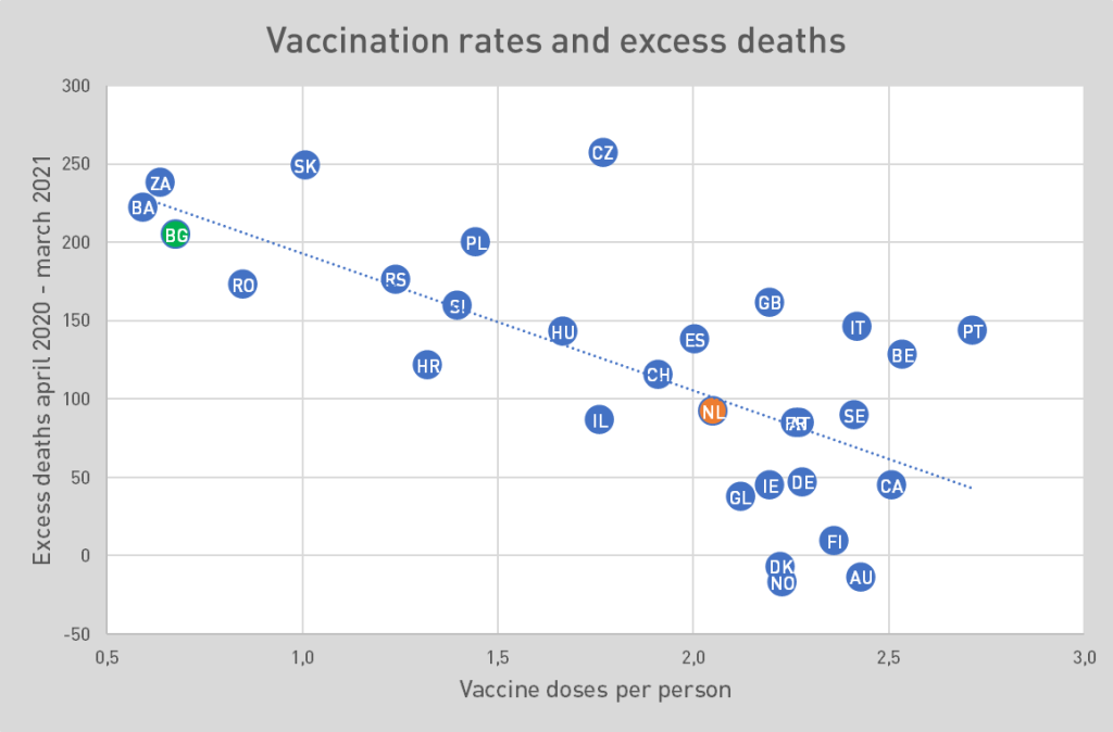
At first glance, this point cloud of countries presents a convincing picture. The lower down the graph, the lower the excess mortality. The further to the right, the higher the vaccination coverage. (Imagine here that if the line were horizontal, excess mortality would be the same everywhere, regardless of vaccination coverage.)
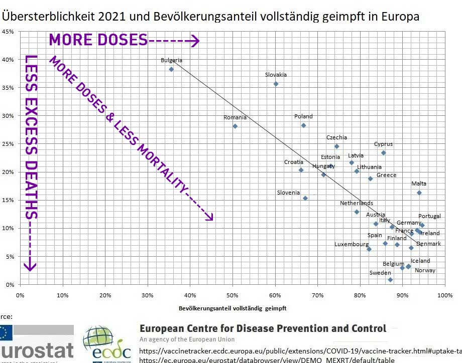
This chart is what vaccination advocates like to see: a line from top left to bottom right. That means: the lower the excess mortality, the more vaccination was done. A causal relationship is then easily read from that.
But is what we think we see here correct?
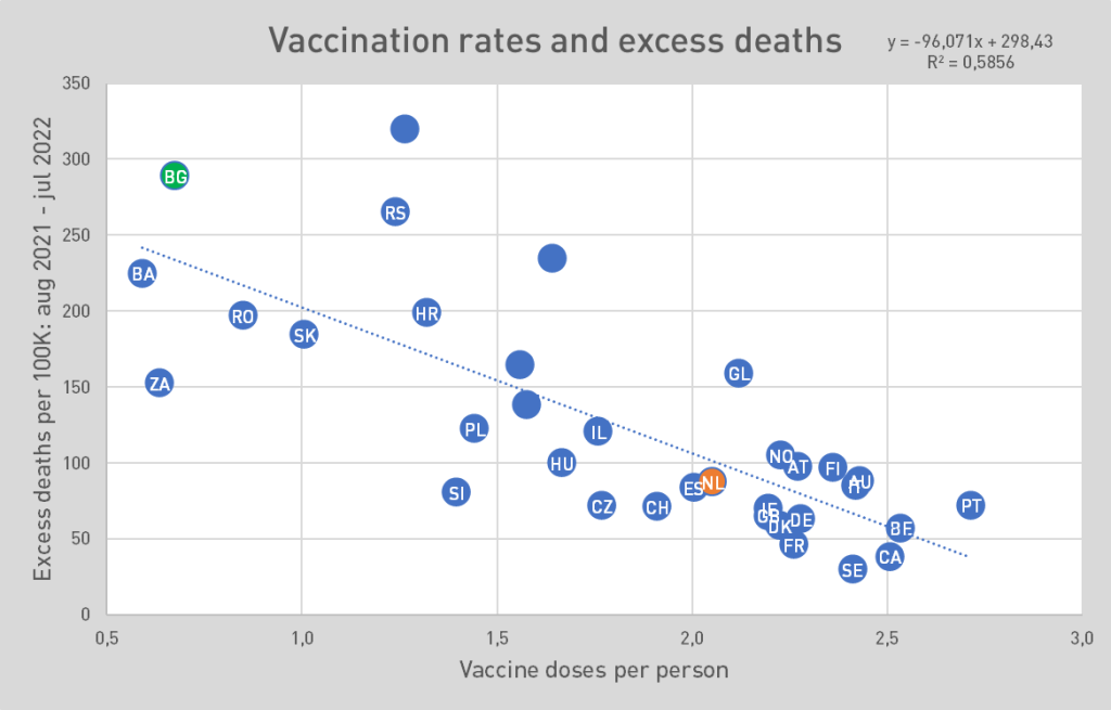
Chart B shows the same thing, filled with data from OurWorldInData. The units are chosen a bit differently to get a better spread across the axes. The picture is similar: a descending line. Again, we find Eastern European countries at the top left.
But anyone paying close attention will see on the left axis that here we have taken the excess mortality rates from before the vaccination campaigns, to be precise April 2020-March 2021!
Mortality as a predictor of vaccination coverage
The vaccination campaigns that were still to be rolled out at the time could not possibly have had an impact on excess mortality – and yet we see the same link. That could be a coincidence, but it is still useful to think about other factors that may lead to both higher excess mortality and lower vaccination coverage: a less efficient healthcare system? Poverty? Developmental delay? Geographical location, culture & lifestyle? Nutrition?
Whatever the connection: you might expect the post-vaccination excess mortality rates to lead to a steeper line from top left to bottom right. From that, you could see that vaccines are having at least some effect on All Cause Mortality.
This is the graph showing the excess mortality rates Aug. 2021-July 2022. Here the vaccinations have had a chance to prove themselves. Again, we see that countries with higher vaccination rates have lower excess mortality rates.
So what can we learn from these graphs?
No effect of vaccination on ACM
The steeper the line, the stronger the correlation that could indicate positive vaccine efficacy. To compare the trend lines, we superimpose the graphs: blue is before vaccination, red is after. The difference is negligible. There appears to be NO correlation between vaccination coverage and improvement in mortality.
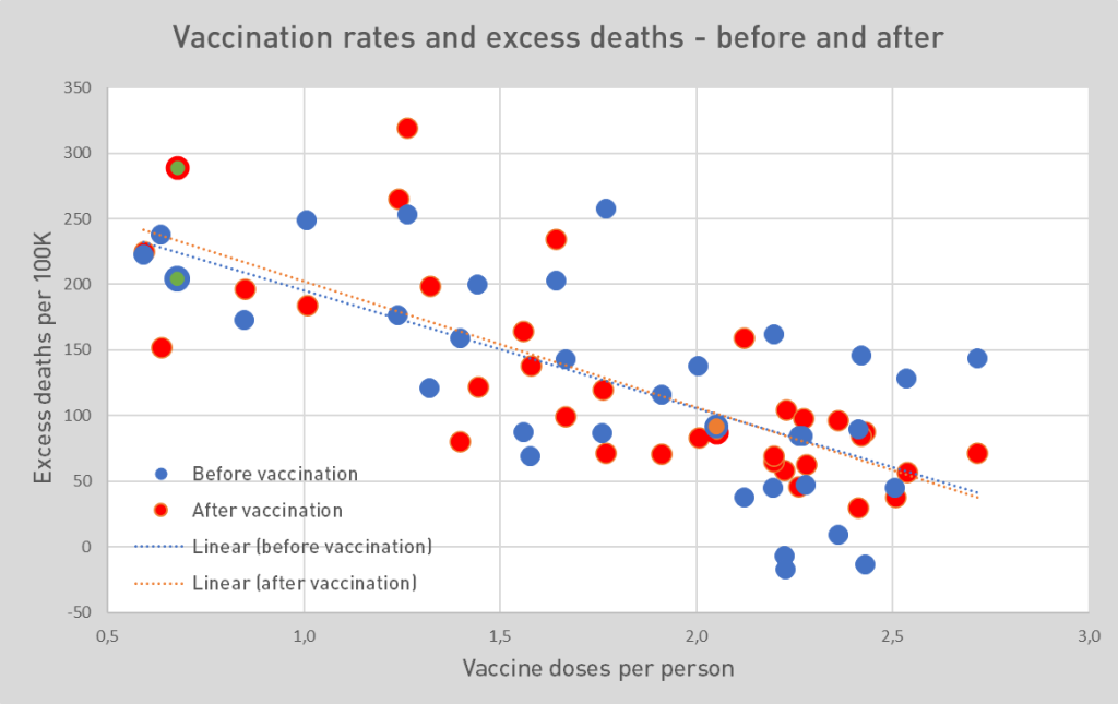
Of the claimed positive effect of vaccinations, nothing at all is seen when comparing European countries.
The differences before and after are miniscule. In any case, of the claimed positive effect of the vaccinations, nothing at all can be found.
And now 2022...
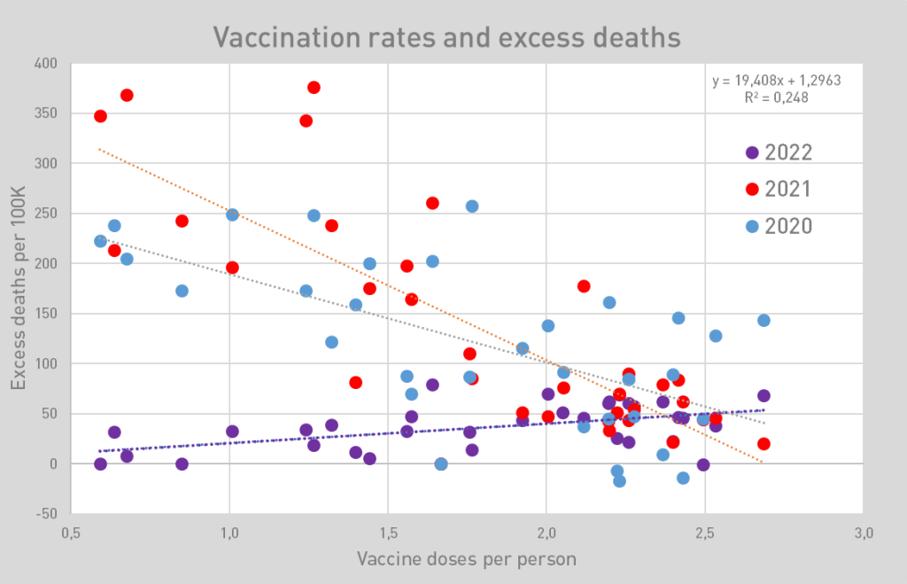
Because not all data from 2022 are yet available, we have chosen a smaller time frame in order to compare the years as purely as possible. Therefore, the trend lines of 2020 and 2021 run slightly differently from each other here than in the earlier graphs.
What is particularly noticeable is that in 2022 the dashed line rises for the first time. The corona mortality has all but disappeared with Omikron. What remains is unexplained excess mortality. It appears that this is increasing as the vaccination rate increases.
When the data from the last months of 2022 are also known, we will see how that purple dotted line evolves, although it will not change very much. As far as we can judge from recent excess mortality levels, the line is more likely to steepen than flatten.
THE ABOVE IS FURTHER EXPLORED IN EXCESS MORTALITY IN 34 COUNTRIES, FAILING VACCINES?
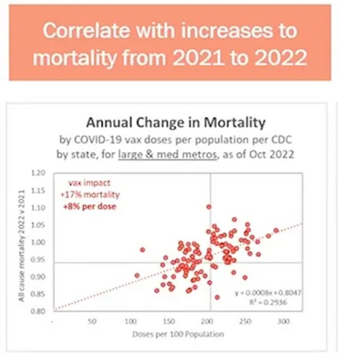
Even more convincing: an American insurance expert, Josh Stirling:, explains, using similar graphs, that highly vaccinated areas show higher mortality in 2022 than in 2021. He, too, looks at the shifts in mortality.
Conclusion
The countries with the highest excess mortality later had the fewest vaccinations. This did not increase the differences in excess mortality. Thus, vaccination is not the determinant of lower mortality, as suggested by Chart A .
There are undoubtedly people who endured Covid better thanks to their vaccination(s). That none of that is reflected in the ACM is very worrisome. Earlier, the rivm still bragged about 80,000 prevented corona deaths. How that can be reconciled with the still rising excess mortality was not explained. Despite those 80,000 lives saved, the balance is not positive. Also: if 80,000 deaths were prevented by 2.5 times vaccination, similar results were achieved in other countries with 0.5 times vaccination.
One more country comparison
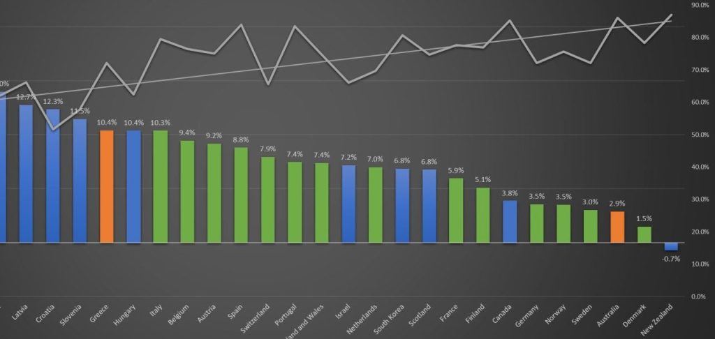
Another picture that could convince us of the vaccines' effectiveness: Chart E, in which the countries are listed in order of excess mortality. What period this is about is not clear to me, in any case it does not match the current state of affairs. The zigzag line above it indicates the vaccination rate of each country.
Italy is the country with the highest excess mortality rate in this cutout. There are 19 countries with lower excess mortality rates. Of these, as many as 13 have lower vaccination rates. So not even one-third of the countries have been able to combine higher vaccination rates with lower excess mortality rates, compared to poor performer Italy.
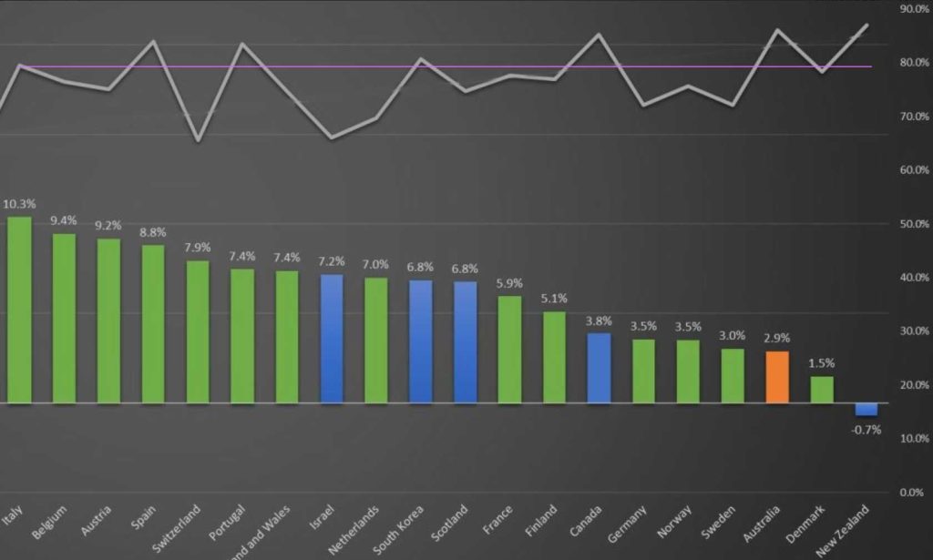
Or take Sweden: of the countries with higher excess mortality, only THREE have lower vaccination rates, the rest all higher (or equal). Italy has a higher vaccination rate and over three times higher excess mortality.
Vaccination rates are between 65% and 85%. This should somehow lead to the huge differences in excess mortality. Note also that Italy and Denmark have nearly equal vaccination rates - Denmark even a fraction lower. Yet in Italy, the excess mortality rate is eight times higher. In short ... there is no line in it.
Of the 19 countries with lower excess mortality rates than Italy, as many as 13 have lower vaccination rates.
Chart E is a cutaway from Chart F, which includes Latvia, Croatia, Slovenia, Greece and Hungary. These Eastern European countries are around the 60% vax rate and have the highest excess deaths. The trend line is sloped by those countries. Thus, correlation between higher vaccination coverage and lower excess mortality is suggested.
More about 'confounders'
After what we have seen in the first set of graphs, we know that the mortality differences between countries were there before vaccination. There are countless other factors that may play a role in this, as mentioned, factors such as geography, demographics, lifestyle, wealth. An insight into the mechanisms that affect our vulnerability (including against artificially induced spikes) is provided by the study COVID-19 Spotlights Connections between Disease and Multiple Lifestyle Factors – PMC (nih.gov). The summary:
Because of the widespread effects of SARS-CoV-2, it is necessary to understand how lifestyle choices affect disease severity. This review summarizes the evidence for the involvement of chronic, nonresolving inflammation, disruption of the gut microbiome (dysbiosis with loss of beneficial microorganisms) and impaired viral defenses, all associated with unbalanced lifestyles, in severe disease manifestations and post-acute consequences of SARS-CoV-2 (PASC). The physiological propensity of humans to uncontrolled inflammation and severe COVID-19 is briefly compared with the low propensity of bats to inflammation and their resistance to viral diseases. This insight is used to identify positive lifestyle factors that may work in synergy to rebalance the immune response and gut microbiome, and thereby protect humans from severe COVID-19 and PASC. It is suggested that physicians should consider recommending lifestyle factors, such as stress management, balanced diet and exercise, as preventive measures against serious viral diseases and PASC.


As for excess mortality 20-21:
Ivor Cummins has always done his best to convince that the corona measures did not make sense. Before the introduction of mrna therapy, he often traced back to the extent to which the flu season prior to the plandemie had affected the excess mortality per country. Countries with a low excess mortality in the flu season before the plandemie were next during the plandemie and vice versa. The age structure also blew a game.
Cummins was truly a thought leader. I got it at the time tightly followed but actually lost sight of something lately.
Anton, thanks again for these data views. So the correlation is that the vaccination coverage has no effect at all on the (after 2019?) higher excess mortality ratios between countries. Vaccination has hardly been able to prevent excess mortality, but it also does not directly demonstrably indicate more excess mortality in terms of the ratio between the countries. There is still a total correlation with vaccination and more excess mortality, in other words more excess mortality after more vaccination per country. But yes, there is no other way.
What I see in the graphs is that the Scandinavian countries score less excess mortality. More vitamin D supplements in the diet? Better nutrition? And the average ages per country may also be a factor? Less stress?
My own observation is that the Corona tests are ridiculously bad and so are the numbers probably too? I have had Corona 2 times, possibly a Delta and Omicron, no test indicated this. But I have the flu almost every year and the last 2 times it went completely differently from the flu symptoms I know.
I don't take vaccines, because that usually makes me sick for a few days, so just a flu. (before I got Delta I took a Corona vaccination, I was still stupid and ignorant)
So I think there is more corona mortality, indirectly and possibly only after the symptoms of Corona itself have disappeared. Some kind of hidden Long Corona?
So another sign on the wall that the vaccines do not work or only work a bit under specific conditions such as with a slow metabolism (and little exercise) in the elderly? Why more rapid victims among young people?
We are dealing with an escaped engineered virus from a lab, or a genetically programmed virus. That is combated with a genetically programmed vaccine. 1+1=2.
So we have to survive a vaccine in addition to a virus. And who knows, maybe it will be a 2-stage rocket.
The government benefits from an unexplained excess mortality, because the vaccine is not demonstrably the cause. When you know that the virus is programmed, all logical starting points cease. I think the virus doesn't work exactly as hoped when it was applied to the masses. But I think the backdoor (lung covid=excess mortality?) is still working. Once infected, a second phase will do its job provided that you meet the conditions of the design again. I think it is important to discover it so that the data can start working again.
If you then ensure that the population, but has to deal with sufficient stress due to a failing policy, you feed the virus susceptibility. China seems to be providing proof of that?
We are currently in a psychological world war, so the logic is gone.
If you realize that, does that possibly give new insight?
There is aspiration in Scandinavia and they promote vitamin D3 and selenium.
It may be that the excess mortality is the least high in Sweden because this country had many more corona deaths and infections in the beginning and perhaps their higher natural immunity also protects better against the disadvantages of the shots.
Can I ask a question about this article if I have one?
To ask the question is to answer 🤗 it
Thanks for the analysis. I had made an analysis for the European countries, comparing the total excess mortality (in 2020 to 2022) with the number of people who died of heart disease (in 2019). I got the data from the old world in data. I saw a clear connection there. The general state of health of a population is, in my opinion, the most important factor in a high susceptibility to COVID-19 in 2020 and early 2021. In the rest of 2021 and 2022, I believe that the vaccine damage plays a major role in the excess mortality.
We see the same thing in Germany with the Bundeslander. The Bundeslander with the lowest vaccination coverage will have the least excess mortality in 2022.
That is also the second conclusion that we will publish in the next blog: vaccination damage proportional to the number of vaccinations and now greater than mortality from corona
A country comparison with regard to excess mortality only makes sense if you also take into account a. the state of health care and b. the age structure of the population.
To give an example: Italy has a much older population than Sweden. Then it is not so strange that Italy 'performs much worse'.
What we have done is compared the mortality before and after vaccination. On average, there seems to be virtually no difference within each country. It is strange that even before vaccination was carried out, the countries that were later little vaccinated had the highest mortality. It was, as it were, a "prick willingness" predictor. But also now a way to give these countries a place in the graph
About Italy, I had understood that the mortality of a large part of the elderly from / due to corona (or due to 'wrong' treatment in hospitals?) was especially huge in 2020, which caused the greatest fear of corona in the EU. If so many elderly people had already died in 2020, fewer will be left to die later on the 'vaccines', right?
Perhaps we can now say: 'Italy had a much older population than ...' .
Italy... Did Italy do so much better in 2021 than in 2020, also compared to the other countries?
Italy was numerically completely comparable with other countries if you look at the vaccination coverage. There is also a 1:3000 chance of dying from a vaccination for 2022. Only in 2020 did Italy do worse with 50% more deaths than average.
50% more mortality in 2020, and especially the elderly, right? That's not nothing ....
Josh Stirling is referenced:
"It could be more definite: an American insurance expert, Josh Stirling, explains on the basis of similar graphs that highly vaccinated areas show a higher mortality in 2022 than in 2021. He also looks at the shifts in mortality. So their data is fraudulent. What does that say about the rest of this piece."
It has been shown that none of what he claims is true. Given the fact that data is handled in the same way here, that says enough about the conclusions that have been made here: in line with the fraudulent Josh Stirling.
And now with a link where it says that none of Stirling's data is correct: https://twitter.com/truth_in_number/status/1621243171811328001
What Josh Stirling claims has been confirmed and widely quoted.
See for example: https://uncaptured.substack.com/p/associated-press-and-us-military
Thanks for the link indeed. That link only refers to a thread of which the author later found out that he did not look closely, so that his main argument was lost. "I should have looked closer. He wasn't using full year data (which is also super suspect)"
So the fact that the author doesn't fall into the same trap is suspicious to him. Anyway.
He then refers to another debunk, still very superficial but yes, twitter...:
https://twitter.com/Mike_aka_Logiqx/status/1621079914643349505
I thought Josh was very adamant, but I've seen other analyses that also go in that direction. But comparing states and rankings... asking for trouble.
By the way, we are doing something completely different in this article than what those Tweets are about.
Here and there I have seen publications that point to large differences/deviations in side effects between different batches of the "vaccines". In other words, the quality produced is not consistent. Something like this can strongly influence the results of analyses, in which the quality of the vaccine is taken into account as a constant...
Great website and way to show that the usefulness of the 'vaccines' is nothing more than just harmful injections and fraudulent statistics.
Here, statistics have shown that there was no pandemic:
There Was No Pandemic
By Denis G. Rancourt, PhD – June 22, 2023
Essay + dates: https://denisrancourt.ca/entries.php?id=130Essay
“Here are my conclusions, from our detailed studies of all-cause mortality in the COVID period, in combination with socio-economic and vaccine-rollout data:
1) If there had been no pandemic propaganda or coercion, and governments and the medical establishment had simply gone on with business as usual, then there would not have been any excess mortality
2) There was no pandemic causing excess mortality
3) Measures caused excess mortality
4) COVID-19 vaccination caused excess mortality”
“We estimate that the vaccines had killed 13 million people worldwide.”‼ ️
National Citizens Inquiry – Ottawa Day 1 – NCI
https://denisrancourt.ca/videos.php?id=86&name=2023_05_17_national_citizens_inquiry_ottawa_day_1_nci
(36:40): HCQ and others killed people!