
The last loose ends of the thread of @mkeulemans on Twitter. We had stayed with a graph that, to his dismay, had two different Y axes and in which he saw a sign of severe deception. Now on with Tweet wire button 8. It still seems like a lot but we have had most of it in Part 1 and Part 2. The most interesting part of this part is in an analysis of a graph from the excess mortality report that is presented as a substantiation. The rest is actually sliced cake.
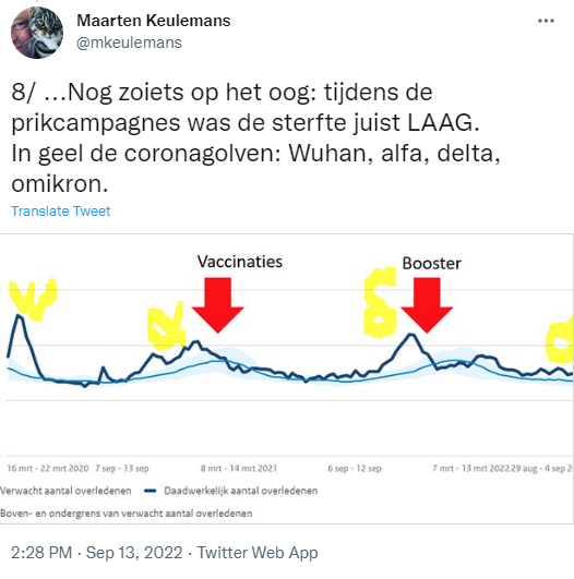
A very wild drawing that you mainly have to fill in with your own imagination.
I don't speak Twitterian but I rephrase it, also with a neater sketch.

Na het op gang komen van de Dubbelprikken (Voorjaar/zomer 2021, ongeveer tijdens de alfagolf) was er vanaf april aanhoudende meersterfte. In mei was duidelijk dat we in een oversterftesituatie zaten. Dus om nou te zeggen dat de sterfte "LAAG" was....

De Boostercampagne begon op het moment dat de Delta-sterfte net op zijn piek was, mede dankzij Omikron (einde 2021). Flinke sterfte dus tijdens de boostercampagne. Beetje flauw misschien want die bult viel duidelijk vóór de campagne. Maar "Tijdens de prikcampagnes was de sterfte juist LAAG" is wel erg onzuiver. Zeker als we kijken naar de herhaalprik.
The Repeat injection campaign is not shown in @mkeulemans' Twitter sketch. This information is therefore 'omitted'. That campaign is remarkably synchronized with a mortality spike. Stating that mortality was low during the vaccination campaigns omits this correlation.
With his immunological gaze, Theo Schetters has zoomed in on the repeat injection. Critical questions about this graph are absolutely conceivable and they need to be answered (maybe I'll make an attempt myself). But in fact, this should have been done a long time ago by the bodies set up for this purpose. That is exactly the point that Theo wants to illustrate with this graph, although this specific correlation may also be explained by available data.


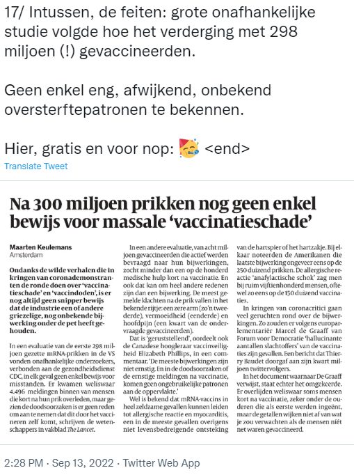
Jetzt bowls those Camels because Maarten performs the excess mortality report here. That report states that the cause of death of thousands of people unknown is.
He then draws the conclusion that it must be due to the vaccines (note the placement of the quotation marks) - and if he does not mean it that way, he puts that conclusion in our mouths, at least also Schetters. While we repeatedly and explicitly urge further research.
Tweet 10 or 11 is missing. Forgivable, Twitter is a dragon if you want to tell a story with a head and a tail. You quickly lose count if you don't pay attention.

Op dit rapport heeft geen onafhankelijke controle plaatsgevonden, de bronnen zijn dus niet vergeleken met conclusies, interpretaties of visualisaties in het rapport. Zou Frits van Eerd ook zelf zijn boekhouding mogen presenteren als iemand daar gekke dingen in vermoedt? En zodra iemand vraagt naar een afschrift: "Nee da's privacy-gevoelig"...?
De aangekondigde Fase 3, de 'externe onderzoeksfase" werd daarom door Eline van den Broek-Altenburg van de klankbordgroep al een wassen neus genoemd tijdens de hearing en on LinkedIn.
The Sounding Board Group has actually been there a bit like excuse-tricks and -gusen and they have not hidden that - of course politely but decisively. It is therefore not surprising that the graphs and conclusions in the policy report show that the vaccinations have nothing to do with excess mortality.
In deze context wordt er een argument naar voren gebracht uit de serie "Echt de lekkerste biefstuk in de omstreken, de slager zegt het zelf."
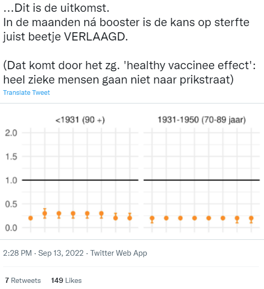
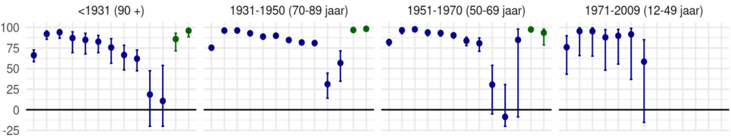
Here's it: a graph with orange dots indicates that the chance of mortality has been reduced by the booster. The balls in these age categories are indeed all below 1. Then the question is: what is that 1? Reduced relative to what? That is not in the Tweet, on Twitter you can be incomplete because of the maximum length, sometimes that is good. In the report you can find what the dots refer to:
Figure S6.3.3. HR estimates of risk of death regardless of cause of death after a booster dose of COVID-19 vaccine received a second dose from the basic series at least three months ago, with 95% confidence interval to stratum of WLZ care use and year of birth.
De oranje grafiek is een opvallende verlaging (minder dan de helft!) van de toch al verlaagde sterftekans van mensen met alleen de basisserie. "...beetje verlaagd vanwege het "Healthy Vaccinee Effect", legt Maarten uit, met een mond sprekend met Jaap van Dissel later in de Tweede Kamer hearing.
Gold dat "Healthy Vaccinee Effect" dan niet voor de basisserie en waarom niet?
I have previously expressed my surprise at the fact that a drug has an unexpected influence on general mortality rates, there is no clue how or why and it concerns an unknown new technique of which you do not know what will happen in the long term with that drastic effect. Yes, there are other active drugs whose mechanism is not fully understood - but they have first been found to be safe in the long term. It is precisely these long-term data that must now be brought to light. The VE graph I'm going to talk about now suggests something other than lasting safety.
De claim was dus "Beter dan de basisserie", dat is de blauwe bolletjes-grafiek met die opvallende, deels verholen, negatieve effectiviteit (vaccinatiesterfte) erin. Die grafiek zie ik niet meer in de online versie. Weggevallen bij het drukken, vermoed ik. Of de booster vervalt zó snel tot een negatieve VE dat het gênant wordt om er nog meer maanden bij te zetten. "Laat dan maar helemaal weg".
A critic might say something about absence, omission or even 'silencing'. But that last one sounds so accusatory.
In my PDF, the graph is still:
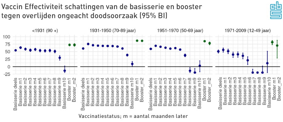
Here we see the booster balls (green) indeed higher, at up to 80% protection. That is indeed better than the basic series. Do you see this chart for the first time and be amazed at the unprecedented Negative VE (vaccine effectiveness) of the base series after six months: see Part 1, there you see how badly it really scores.
In the House of Representatives hearing, Jaap van Dissel presented a different graph. The last four red dots at 12-49 also indicate a higher mortality risk than for unvaccinated people, but much less than the blue above. In addition to the vertical reflection, has anything been corrected or 'plausibilized' for the hearing? Month 1 is also different compared to the following months. You wonder how those data can change so much.
Risk of death after 2nd dose of basic series
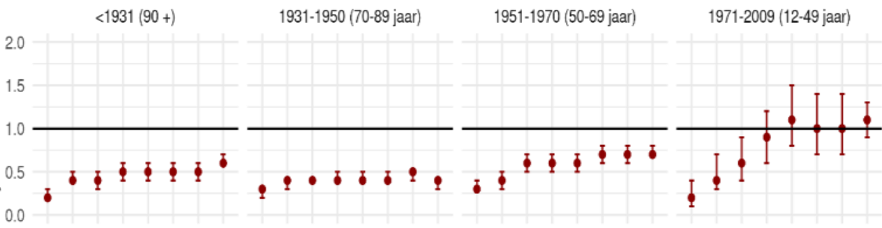
Vaccine effectiveness (VE) against COVID-19 mortality
In the graph VE against death due to Covid-19, the last dots have been omitted at 12-49. Or should I say: 'silenced'?
Reality check
If we calculate this effectiveness against death over the population 50+, then 1,832 deaths are prevented in that group among the vaccinated. If the total mortality remains the same, this under-mortality must be compensated by the vaccinated. This means that there must be 1,832 more deaths among the unvaccinated. That would be more than a doubling mean.
Jaap van Dissel even mentions 90% in the TK hearing regarding non-covid mortality, which could correspond to the orange balls that Maarten Keulemans mentions. That would even prevent 5,542 deaths! Yuchei!? The news is a bit too good to be true.
1,832 extra deaths per month, probably due to corona: that is more than half of the heaviest month in the first wave. A corona mortality of 5,542 in 1 month has never even been achieved in 2020. And that for several months in a row.
Also consider: there was no immunity in 2020, the group of unvaccinated people was 10 times as large (no one had been vaccinated, now 10% in this group) and the Wuhan variant was much more virulent. And yet the numbers would be higher now, among a group ten times smaller...? All this assuming corona mortality, because it is implausible that other causes of death have suddenly appeared en masse, exclusively among unvaccinated people.
For the details of the calculation, see the flip-out below.
The invisible effects of Positive VE against all causes of death
We now focus on the positive VE and that is really: enormous. The chance of vaccinated people dying from anything is more than half that of unvaccinated people.
Of the total group of 8.6 million people over 50, 90% have been vaccinated.
7.7 million of those over 50 therefore had an average 65% lower risk of death than those who did not receive the injection.
And that for several months. What should we imagine?
With these age groups we have 97% of all deaths. The remaining 3% are the younger groups. They enjoy significantly lower vaccine protection, better natural immunity, they carry less numerical weight and the structure from 0-49 years is too diverse, so we will leave them out for the time being. T.z.t. The older age groups should also be examined separately due to mutual differences. This calculation is purely exploratory.
On average, there are 13,500 deaths per month in that 50+ group. How many deaths will we get if next month that large vaccinated group has 65% better protection against death than unvaccinated people? A lot less, right? But mortality has not collapsed, on the contrary. (We will now ignore the excess/excess mortality, it does make the case a bit worse, but also more complicated.)
So suppose that mortality had remained the same, then this must have been because more unvaccinated people died. Just as many more as have been saved in the nine times larger vaccinated group. I turned it into an Excel that André Redert has perfected brilliantly. (Without support from the Maurice corner it would have been a lot less.).
We take the first six months after the basic series. Among the over-50s, the vaccination rate was 90%, in accordance with the RIVM.
We fill in some parameters like this. It comes down to the following: If 90% of people over fifty enjoy a Positive VE of 65%, this will save 1,832 deaths in that group (=11,700-9,867). In the explanation to the House of Representatives, Van Dissel mentions 90%, which would make it even more unlikely. We keep 65%.
We assumed that total mortality would remain the same. It does not seem to be compatible with that.
We see unvaccinated people not that way fall down in droves. Nothing has been noticed in hospitalizations, ICU occupancy (see chart by Herman), mortality rates, foreign country or anywhere else. So we should see a huge under-mortality thanks to that protection, made even greater by the excess mortality that we've had. None of that: there is excess mortality, in 2021 and in 2022 even more than in 2020.
The results of the reporting of this VE study therefore rub off on the mortality rates. Is this really the ultimate justification for keeping vaccinations out of any excess mortality research?

In the broadcast on 13 September, I literally listed point by point which options should be considered. Covid was there the first option. See timecode 10:50 on https://www.npostart.nl/ongehoord-nieuws/13-09-2022/VPWON_1339273
Dus "GEEN WOORD over covid" is een wat onzorgvuldige constatering.
(ik zeg trouwens een "Roerige tijd", ik de r valt een beetje weg 😅)
I also pointed out other options but at that time did not have the time to cover everything one by one.
To add something about those candidates:
- The heat wave has caused about 15 extra deaths per day, we know that. Nothing unexplained.
- "Door de zachte winter overleefden meer oude mensen" - OK, zou kunnen, en hoe zit het dan met de oversterfteberg die we achter de rug hebben? Waar is die bijbehorende ondersterfte gebleven?
- "Verstoorde patroon griep" - er was wel degelijk griep. Corona was altijd al een van de griepvirussen, dus dat is een wat onduidelijk statement.
- Deferred care is also a candidate (also mentioned, I believe) who could well explain the excess mortality to a certain extent. More on that in a later article.

Those abundant smileys are starting to get on my nerves honestly. Let's bite the bullet.
Tja, wat kan ik zeggen over het "wij tegen zij frame" en "Politiek bedrijven over de ruggen van argeloze burgers" zonder er een jij-bak van te maken... Ik weet het even niet.
Lying to people with nonsense stories... About aerosols for example? About face masks, lockdowns or other 'measures' for which support must be created? Or scaremongering with pitch-black nonsense scenarios? About no urge or coercion? About no benefits for vaccinated people?
There are quite a few lie incidents to focus journalistic arrows on. Which journalist or newspaper is actually on top of that?
I think I have made it clear that we have not been lying. We have expressed our concerns with integrity. You only lie if you are aware that you are not quite telling what you think is the truth. That was not the case here.
There is a difference between lying and being wrong. That distinction does not seem clear to everyone. It puts one's own morals to the test of a communications professional who is tasked with selling a dubious message. Not everyone deals with this in the same way, as can also be seen in a presentation by Marc van Ranst, which I discussed in 2020.
The tirade ends with a cherry-picking masterpiece by the acclaimed journalist and policy defender himself: the decisive proof that there is really nothing wrong with those jabs.
What is not entirely clear to me: if the damage is not 'massive', how extensive is it? Should the share of vaccines in excess mortality not be investigated? what's wrong with that? Why the unwelcomeness that everyone experiences, including the sounding board committee?
Waarom is het niet juist een argument om het wél door meerdere onafhankelijke partijen te laten onderzoeken - zodat "niet massaal" gekwantificeerd kan worden tot een misschien wel een te verwaarlozen aandeel in de oversterfte, dat van meerdere zijden vastgesteld kan worden?
It's over. This was the last part of this trilogy. See also Part 1 and Part 2. It was quite a job, and for such a stupid 'wire'. Fortunately it is a good read.
Thank you everyone for sharing!

Many thanks again.
My wife would say: "that Anton is a winner!". I agree with that.
I am still amazed that Mr Keulemans has apparently never seen a graph in which several lines have been plotted, and which therefore has two different Y axes. Surely that cannot be true!
If you are going to use such 'arguments', you make yourself very implausible.
Thank you, Anton, for your neat refutation of everything Keulemans mentions. I also learned a lot from this article.
I still do not understand why Mr Keulenmans is being given a podium.
I think he said little to nothing meaningful. Yet people follow him, and he is seen as a celebrated journalist. How is this possible? Who are those who hold him in such high esteem? I really don't understand it.
Best journalist of the Netherlands 2021. Can you check how the rest of the journalists are doing, they just take that.
I think Mr. Keulemans, given his woefully low journalistic level, is better off applying for a job at his local door-to-door newspaper. That would be a huge relief for a lot of people, de Volkskrant (perhaps the worst newspaper in the Netherlands) and especially himself.