
With Hans Verwaart and Lilian Namink.
A post on maurice.nl recently caused a lot of controversy. It was an exercise with extreme values. It's like science fiction: you have to accept the premises of the film otherwise you keep thinking "people can't time travel at all" and then you miss the crux of the film. (Maurice also wrote about it).
The article, to which I had also contributed, was briefly about the following: Herman Steigstra (Tw: @SteigstraHerman) has created a relatively simple model in which the 'pros' (the Vaccine effectiveness) and the 'cons' (Fatal side effects) of vaccination are weighed against each other in numbers of deaths. The necessary assumptions that were made were substantiated as well as possible in the article. Especially important is that we have now, thanks to some critical suggestions, come up with new cohort conversion algorithms. These have a significant influence on the chances of death and give the conjured up image a firmer foundation. More about this in the justification.
Estimating the fatal side effects is a tricky matter, for example, also because we do not know from which causes of death the excess mortality is built. A large part of the excess mortality has been attributed by CBS to corona (on what basis is unclear) and we know nothing at all about what remains of excess mortality. Assumptions therefore lie in the question to what extent the vaccines have been a factor in the still ongoing excess mortality. There can be excess mortality without Covid, there can also be Covid mortality without excess mortality.
Estimating effectiveness was done on the basis of the experiences with Omicron. The assumption is then that a coming virus wave will not follow the weakening trend of the previous variants. A more virulent variant is less likely, but cannot be ruled out. At the end, we will also briefly discuss the BA.5/6 variant.
We previously gave a 0-scenario with the assumptions that the vaccine was 100% effective and would have caused 100% of the excess mortality. They were the highest possible values, hypothetically clear but not realistic. We are therefore starting low now: in this scenario, we assume that the vaccine would have contributed 5% to excess mortality since the beginning of 2021.
These charts show probabilities based on assumptions. If the blue bar is higher than the red one, the chance that vaccination will prevent deaths in that age group is greater than the chance of death from the vaccination.
Generate these graphs yourself with your own assumptions. Download our Excel tool.
We do a few experiments:
- The first assumption is therefore that the vaccines have had a 5% share in the unexplained excess mortality.
- we then make some assumptions about the efficacy (VE) of the vaccine.
- The second assumption is that the vaccines have had a 10% share
- we also make some assumptions about the VE on that percentage
- In the following assumptions, the vaccines are believed to be responsible for 15% and 25% of the unexplained excess mortality.
- We start with 60%VE.
The red bars show the risk of death per 100,000 people, the blue bars the deaths that will be prevented thanks to the vaccine, under similar circumstances. The big question remains: what percentage of excess mortality is related to the vaccine?
Assumption: 5% share in excess mortality
VAERS' figures show that the lower limit of the vaccine share in excess mortality is around 10%. Because the objection may be that there can also be many false positives in VAERS, we choose a hypothetical 5% as the lowest level.
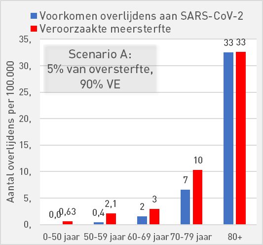
Scenario A: 5% of excess mortality, 90% vaccine effectiveness
In the Pfizer leaflet we read about a safe vaccine with an effectiveness (VE) of 90%. Those are excellent specs.

If, despite this, the vaccine has contributed 5% to excess mortality, the balance for 60+ will turn positive in the event of another Omicron-like wave: more lives saved than deaths. Unfortunately, more people under the age of 60 die from the vaccine than lives are saved in those age groups.
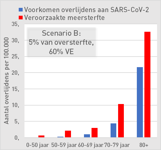
Scenario B: 5% of excess mortality, 60% vaccine effectiveness
With a VE of 60%, the over-60s will still benefit from it.

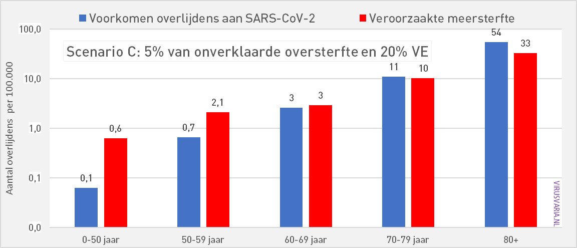
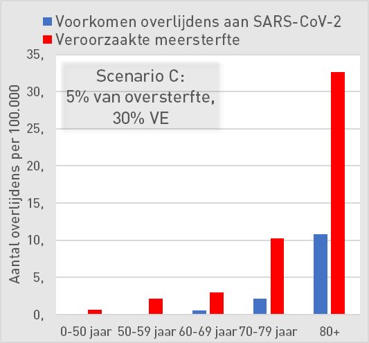
Scenario C: 5% of excess mortality, 30% vaccine effectiveness
30% VE is only effective in the 80-plus group. A VE of 30% is already high a few months after injection.
Assumption: 15% share in excess mortality
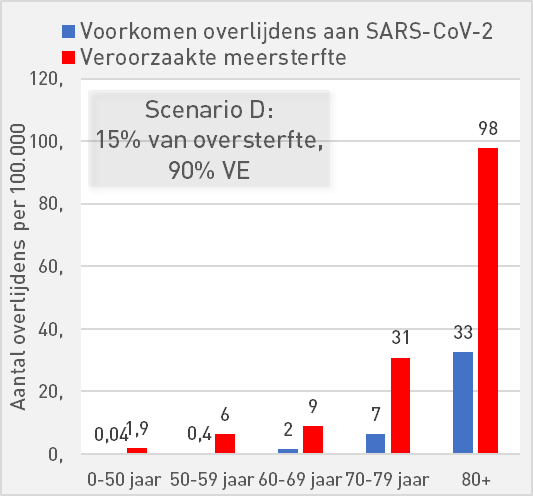
Scenario D: 15% of excess mortality, 90% vaccine effectiveness
If the vaccines have contributed a little more to excess mortality, say 15%, then even with a high protection of 90% VE, we see that a positive balance can actually only be seen at 80+.

At 0-50 years, we see that the risk of death is 10 times as high as the chance of preventing death.
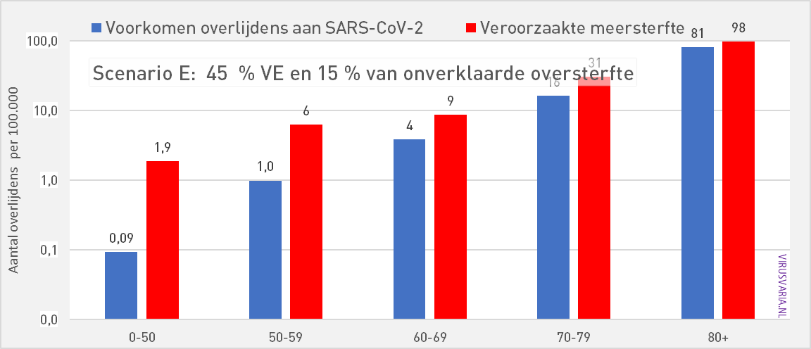
Scenario E: 15% of excess mortality, 45% vaccine effectiveness
Assuming a share of 15% of Omicron excess mortality, the tipping point for the VE is around 45%. Then all age groups are already negative in terms of effective VE against ACM. The graphs at an even lower VE add little.
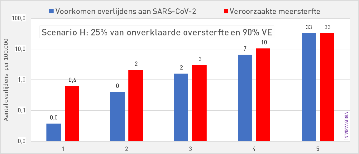
Assumption: 25% share in excess mortality
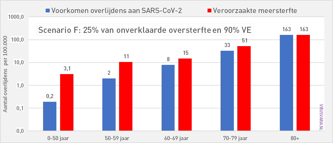
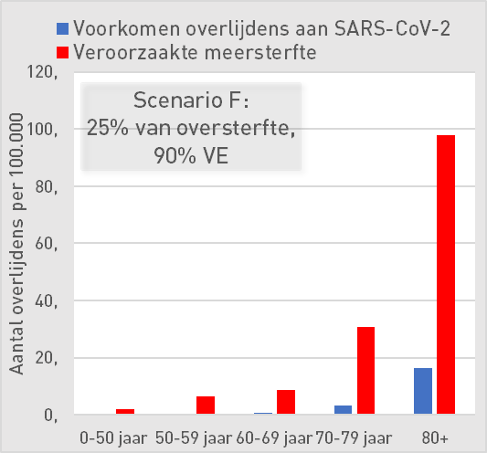
Scenario F: 25% of excess mortality, 90% vaccine effectiveness
In the event that a quarter of the reported excess mortality has to be attributed to the vaccines, even a VE of 90% net has nothing to offer in the event of a new variant with Omicron characteristics.
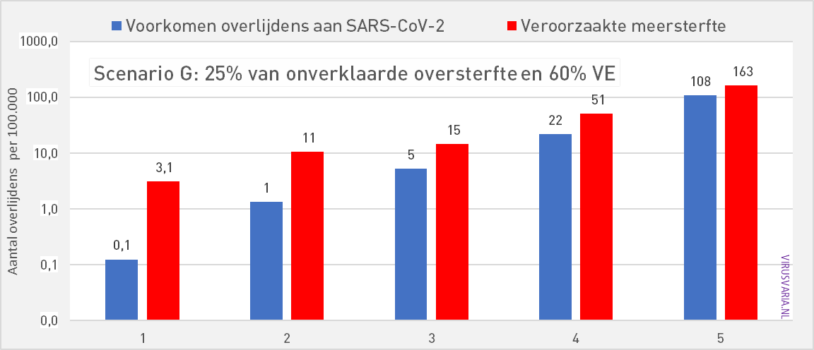
Scenario G: 25% of excess mortality, 60% vaccine effectiveness
At 60% VE, according to our model, vaccination does provide protection against the disease but in all age groups a negative VE against ACM (all cause mortality)
Watching even lower VEs makes no sense unless you like drama. Try it yourself the Excel tool. Tap and shudder.
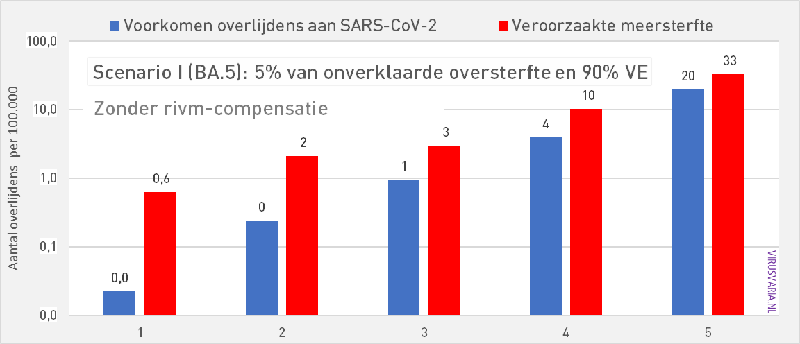
Scenario H: BA.5 virulence, 90% PU, 5% of excess mortality
All previous graphs assume a variant whose lethality is comparable to that of Omicron. If we only take the BA.5, the last Omicron variant as a reference, then the expected lethality of a subsequent BA.x is considerably lower. The effective VE also drops.
Even though only 5% of the excess mortality would have been vaccine-related, the model does not show age groups where the blue bars are convincingly longer than the red ones.
We leave it to our own imagination what happens if the excess mortality share turns out to be 50% – or even more. There are also studies that find a negative VE for non-booster people.
Above all, this series of graphs makes it clear how crucial the causality of excess mortality is. Making the anonymised data public is urgently needed so that independent parties can exclude the vaccines from the excess mortality. Excess mortality that is not only observed in the Netherlands but also in many countries and on other continents.
Generate these graphs yourself with your own assumptions. Download our Excel tool.
Accountability
In the Beta version, three buttons could be turned:
- Vaccine effectiveness: number of deaths prevented, estimated for Omicron virulence
- Excess mortality factor: The share of vaccinations in excess mortality (all mortality above the expected baseline, minus covid mortality)
- Expected virulence of the virus in relation to e.g. Wuhan/Omicron/BA.5 (we chose Omicron as a reference)
In the first article on Maurice.nl, 1. and 2. both hypothetically set at 100%. Many people responded to this: Blaming vaccines for 100% of excess mortality was even called "criminal". Fortunately, no one reacted against the equally debatable claim of 100% vaccine effectiveness! For point 3. Omicron has been taken as a reference.
Adjustments
In response to targeted criticism, we have implemented two additional assumptions that related to the past period, the basis on which further calculations are made:
- The past Vaccine effectiveness on the Omicron variants serves as a reference. It was estimated at almost zero in the Bèta but that, like any assumption, can be substantiated but is also debatable. We can now easily make calculations if we assume higher observed Omicron-AE.
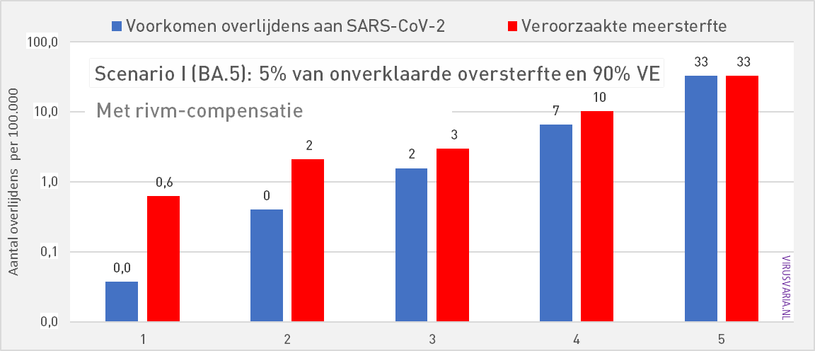
- We had assumed RIVM death figures. Several experts (thanks Hans) pointed out to us that although the figures from CBS are not plausible, it is more realistic to temporarily increase the RIVM figures by about a third. Initially, we wanted to stick to the official figures institute as much as possible, but here we allow ourselves a small correction.
Example of points 4. and 6. What difference does it make?
The differences due to these two added factors are relatively small. Given the assumptions and estimates that have to be used, we assess the decimal point figures in this case as false accuracy. It's about the big picture. To avoid the appearance that we would want to disadvantage the vaccines, we have included both points in all the scenarios below.
ad 4) There are approximately 1,500 Omicron deaths. With a VE of 50%, for example, we have to calculate with 3,000 potential Omicron deaths, half of whom have not died thanks to the vaccination. In the first model, 1,500 was calculated. Despite the fact that the VE against Omicron is very low and is decreasing very quickly, especially by vaccine standards, we still consider an average historical VE of 20%.
ad 5) There are approximately 1,500 Omicron deaths. In response to criticism of the RIVM registration, we have increased it for this article by 33% as compensation. There are then 1,995. Of course, that 33% is a calculated estimate that also leads to discussion – a discussion that also continues internally.
Presumably that percentage has to go down or RIVM turns out to be correct after all. This is less essential for the overall picture than it seems. Below in graphs 1 and 2 an example of the differences we talk about (click on the graph to zoom). The difference is most visible in the 70-79 age group. We do not attach enormous value to this degree of precision given the margins of uncertainty that we already have to calculate.

Other comments
Cohort distribution
There are certainly other improvements that can be made. The mortality rates were substantially different in the previous model due to a different synchronization method of age groups. We are now working with an improved version and on further refinement. Unfortunately, institutes report in random age classifications. That is why choices have been made in reconciling reports. Responsibly splitting from 0-65 to 0-49, 50-59, 60-69 was a challenge. Thanks to foreign studies, we have found a well-founded distribution. (link to VAERS study)
With the help of the VAERS figures (number of deaths due to vaccine per million vaccinated people), it is possible to calculate how many deaths can be expected, taking into account the NL situation in terms of number of inhabitants and vaccination coverage. But VAERS only counts what is reported, for 11 months, of which probably the first 4 without damage (December 2020 to November 2021). So 7 months of damage against NL 12 months. That has also been settled. That number is then the real minimum of vaccination damage you can expect in NL. There are 959. But in total we think we will see 10,585. Assuming that this is due to underreporting at VAERS, we make a pro rata distribution.
Optimization therefore has our attention. A further division of 0-50 years is also desirable. Of course, many more improvements and refinements are conceivable. In our opinion, the model already offers sufficient insight for an initial orientation.
Brief explanation of the estimated corona deaths
To determine the excess mortality, in our previous article we had taken the excess mortality figures published by CBS and reduced them by the Corona mortality as reported by the RIVM. We received comments on this, because the RIVM figures would be an underestimate of the actual corona mortality and the CBS figures more representative.
If we look at it over a year and we take 2020, a year in which there has been no vaccination yet, we see that the extra mortality over that year does not differ very much from the reported corona mortality of the RIVM: 11,520 and 12,682 (CBS).
Excess mortality is a period of increased mortality compared to the forecast. If extra mortality is detected in a year's time, this means that people have died who would normally live to see the turn of the year. We cannot say how many months shorter they lived. These are people who belong to the 12,682 of the CBS.
However, there is another group of people who have died from corona, while they would normally only have been able to live for an average of six months. So we do not see that number reflected in the extra mortality per year from CBS, that had already been taken into account. It is difficult to say exactly how many people this is, we also get the well-known "on or with corona" discussion. We looked at the cause of death statistics from Statistics Netherlands and looked at unlikely decreases in certain causes of death and the reports of the NICE foundation about the admissions. We estimate from this that the mortality figures of the RIVM are 33 percent too low. We have settled this.
According to Statistics Netherlands, many more people have died of corona than the excess mortality shows. To calculate net mortality, i.e. mortality from causes of death other than corona, we take total mortality and subtract it by corona deaths. Net mortality will then be almost 8000 people lower than the mortality forecast for 2020 (compare with earlier Virusvaria article from Nov, 2021). That is strange and it strongly suggests that the reduction in deaths was not due to "other causes" but "with covid" and corona was not the cause of the deaths. For this reason, the RIVM figures seem to be a more reliable source of information, especially after correction by this 33 percent.
Period
We calculate from the beginning of 2021, which means that we include several waves in the calculation. A vaccine can prove itself better the more cases of that disease occur. And vice versa: the less (serious) illness, the more difficult. If the disease does not occur, only the possible harmful effects remain.
Quantitative approach
Needless to say: this is a purely arithmetical approach based on assumptions. To what extent you can sacrifice a healthy person (perhaps involuntarily) to save several vulnerable people and how that ratio should be with a vaccine, whether a vaccine should cost the lives of healthy people at all and other ethical questions I have already asked previously raised. We compare 1-on-1 here, without quantitative value judgment or QALY calculations. That's another chapter.
Logarithmic vs linear
Graphs 1 and 2 are presented on a logarithmic scale. As a result, the differences in the groups with low mortality are also visible. Differences between small numbers appear larger than they actually are, differences between large numbers are masked. Behind graphs 2 and 3 are the same figures.
This calculation model was developed in Excel by Herman Steigstra and is co-managed by Team Maurice and Virusvaria. If you have developed something in Excel that could be useful for a better estimate of unknown quantities, we would like to hear from you.
Tables and linear views
| Scenario A: 5% of excess mortality, 90% AE | ||||||
| 0-50 | 50-59 | 60-69 | 70-79 | 80+ | ||
| Preventing deaths from SARS-CoV-2 | 0,0 | 0,4 | 2 | 7 | 33 | per 100K |
| Increased mortality | 0,63 | 2,1 | 3 | 10 | 33 | per 100K |
| Mortality risk compared to occurrence | 16,66 | 5,29 | 1,88 | 1,57 | 1,00 | |
| Scenario B: 5% of excess mortality, 60% AE | ||||||
| 0-50 | 50-59 | 60-69 | 70-79 | 80+ | ||
| Preventing deaths from SARS-CoV-2 | 0,03 | 0,3 | 1,0 | 4 | 22 | per 100K |
| Increased mortality | 0,63 | 2,1 | 3 | 10 | 33 | per 100K |
| Mortality risk compared to occurrence | 25 | 8 | 3 | 2,4 | 1,5 | |
| Scenario C: 5% of excess mortality, 30% AE | ||||||
| 0-50 | 50-59 | 60-69 | 70-79 | 80+ | ||
| Preventing deaths from SARS-CoV-2 | 0,0 | 0,1 | 1 | 2 | 11 | per 100K |
| Increased mortality | 0,6 | 2,1 | 3 | 10 | 33 | per 100K |
| Mortality risk compared to occurrence | 50,0 | 15,9 | 5,7 | 4,7 | 3,0 | |
| Scenario D: 15% of excess mortality, 90% AE | ||||||
| 0-50 | 50-59 | 60-69 | 70-79 | 80+ | ||
| Preventing deaths from SARS-CoV-2 | 0,04 | 0,4 | 2 | 7 | 33 | per 100K |
| Increased mortality | 1,9 | 6 | 9 | 31 | 98 | per 100K |
| Mortality risk compared to occurrence | 50 | 16 | 6 | 5 | 3 | |

| Scenario E: 15% of excess mortality, 45% AE | ||||||
| 0-50 | 50-59 | 60-69 | 70-79 | 80+ | ||
| Preventing deaths from SARS-CoV-2 | 0,02 | 0,2 | 1 | 3 | 16 | per 100K |
| Increased mortality | 1,9 | 6 | 9 | 31 | 98 | per 100K |
| Mortality risk compared to occurrence | 100 | 32 | 11 | 9 | 6 | |
| Scenario F: 25% of excess mortality, 90% AE | ||||||
| 0-50 | 50-59 | 60-69 | 70-79 | 80+ | ||
| Preventing deaths from SARS-CoV-2 | 0,0 | 0 | 2 | 7 | 33 | per 100K |
| Increased mortality | 3,1 | 11 | 15 | 51 | 163 | per 100K |
| Mortality risk compared to occurrence | 83 | 26 | 9 | 8 | 5 | |
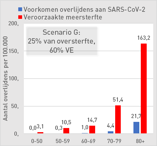
| Scenario G: 25% of excess mortality, 60% AE | ||||||
| 0-50 | 50-59 | 60-69 | 70-79 | 80+ | ||
| Preventing deaths from SARS-CoV-2 | 0,0 | 0,3 | 1,0 | 4 | 22 | per 100K |
| Increased mortality | 3,1 | 11 | 15 | 51 | 163 | per 100K |
| Mortality risk compared to occurrence | 125 | 40 | 14 | 12 | 8 | |
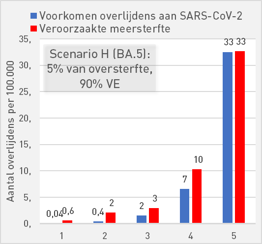
| Scenario H (BA.5): 5% of excess mortality, 90% AE | ||||||
| 0-50 | 50-59 | 60-69 | 70-79 | 80+ | ||
| Preventing deaths from SARS-CoV-2 | 0,04 | 0,4 | 2 | 7 | 33 | per 100K |
| Increased mortality | 0,6 | 2 | 3 | 10 | 33 | per 100K |
| Mortality risk compared to occurrence | 16,7 | 5,3 | 1,9 | 1,6 | 1,0 | |
Wonderful article! Thank you, Anton, for this hard work.
One question: isn't it about the 'prevented deaths' (due to corona), compared to the 'caused excess mortality' BY THE VACCINE?
Why then is there talk (scenario G) of All CAUSE MORTALITY (ACM) ? That's not what it's about, is it?
Hello Ed,
a vaccine can have a good VE against a disease but a bad VE against ACM. This means that more vaccinated people die from other causes (side effects) than patients are saved from covid death.
Have I explained that so clearly?
When we talk about ACM, I am reminded of your article of July 16: Update vax/unvax mortality in England Jan-May 2022.
A little about this article :
I think that analysis is wonderful – and that of course also applies to the previous articles that cover the period from Jan. 2021 – because it is a pure comparison by ACM of vaccinated and unvaccinated people, so only the data as they are known. (I also read the caveat at the beginning of the article)
So no fuss about what exactly is a corona death, so no question of what fraction of the excess mortality comes from the vaccine, no fuss about VE, etc. No, purely a comparison by ACM of vaccinated and unvaccinated people.
And what revealing results, if you don't know Jan. 2021 next to May 2022!
This was a sidestep for a while.
In the above article, you (and the other authors) have chosen a completely different approach.
It is now about VE, and about which fraction of the excess mortality is due to the vaccine.
Then it's not about All Cause Mortality, is it?
As you define yourself in the article of July 16 :
'In All Cause Mortality, no distinction is made between causes of death, so it concerns both Covid and non-Covid deaths'.
I understand your reaction above :
'That means that more vaccinated people die from other causes (side effects) than patients are saved from covid death'.
But dying from other causes (side effects) is something different than All Cause Mortality, isn't it?
If as many people die from side effects of the vaccine as Covid patients are saved, then ACM will remain the same.
If more people are saved from Covid death by the vaccine than die from side effects, then the ACM will decrease (and vice versa, of course).
It gets even more complicated: if you only save people from Covid who then die anyway, but from a different cause, then the ACM will simply stay up to standard and you can wonder how useful vaccinating the entire population is.
Something similar applies to the disease: if Covid is considered the cause of death in people who would otherwise have succumbed to another cause, that has no influence on ACM. Even then, vaccination makes no sense to let fewer people die.
In this way, the absence of other causes of death is also included in the basic assumptions.