
Now that corona has virtually disappeared and more and more is becoming clear about the role that the vaccines have played, it is time to take stock. How many years of life have been lost to corona? And how much protection did those vaccines actually provide? These are all questions that we are trying to answer here.
In recent years, we have published a lot about corona. In the beginning, we mainly focused on hospital admissions, reproduction numbers and later on excess mortality rates. In recent years, there has been more and more talk about the role that the vaccines have played in this. It soon became clear that the vaccine did not offer the 95% protection we had been promised, but more accurate conclusions could not be drawn from the available figures. Until February 23, when CBS... That's why. Time for a final settlement.
We have listed all the conclusions from the past few months.
1. Key points
- The adjustments to mortality expectancy (2)
- Mortality from corona itself cost 11,000 years of life (3)
- Statistics Netherlands (CBS) now reports 5 times as many deaths "due to corona" as the GGD. The GGD figures are now internationally accepted (4).
- The risk of dying from corona was 25% higher during the first 4 weeks after vaccination (5).
- No data have been published on the longer-term effects (6).
- The registration of vaccinated people in CIMS seems to be up to 25% behind. Partly because of this, calculations for the VE are much more favourable. RIVM even concludes from this that the vaccine also protects against death from other causes (6).
- The average protection of the vaccines was around 40%: from -25% in the first 4 weeks to a maximum of 60% in the summer when there is no corona. For Omicron, the vaccine seems to have worn off and even increases the risk of corona (7).
- In 2021 and 2022, the average age for excess mortality was 5 years lower than in 2020, the first corona year. That would amount to 75,000 years of life lost in both years. There is only strong evidence that vaccination was responsible for this (8).
- The mortality pattern for the 2022/23 and 2023/24 seasons has changed compared to old patterns. During the winter there is much more excess mortality than in the summer. It resembles a kind of turbo flu (8).
- Vaccination hardly seems to prevent hospitalization, we do not see an additional decrease in the first months of 2021, but we do see a tenfold increase in March 2021 for patients under the age of 80. Here, the phenomenon "with corona" seems to play a dominant role (9).
- According to the Ministry of Economic Affairs, the intelligent lockdown would result in a negative balance of 520,000 QALYs and a cost of €100 billion. It is not at all clear as yet how this has benefited us, (10).
- Recommendations and discussion (11)
Better figures should provide more reliable analyses. Until then, we'll have to make do with these findings. In that sense, it is actually a mid-term review.
We will discuss these conclusions below, but first we would like to explain some basic concepts. If we want to interpret the figures correctly, we need to know what to expect if there had been no corona.
2. Baseline
If we know how many deaths there have been for a given week and whether that was more or less than expected, then we need to know an expected value for that. If we determine that for a whole year, we call it a Baseline. Until 2020, RIVM calculated this on the basis of the average mortality over the previous 5 years. Using a clever procedure, flu waves were removed from the calculations. Furthermore, the RIVM assumed that mortality throughout the year occurs via a sine wave, which is 20% higher in winter than in summer. This extra seasonal mortality has been explained and accepted. It is also assumed that a year with higher mortality will be compensated in the following year. A reasonable assumption!
To assess whether a deviation from the baseline is meaningful, a bandwidth is also shown. That is an interval that RIVM indicates that 95% of the weekly figures will fall within if there is no flu. A possible flu wave will therefore stand out from the crowd.
From 2021 onwards, however, corona would then make a significant mark after a corona mortality of around 20,000 in 2020. CBS came to the rescue and calculated a new baseline based on mortality rates from the years 2010-2019. The trend was extended to the corona years, taking into account population growth (ageing, baby boom, etc.). Sailing on guesswork, but it's a good compromise. However, CBS replaced the flowing sine wave with the weekly average of these 10 previous years, causing bumps and potholes in the baseline. Flu waves were also included in the calculation of bandwidth, which meant that it was much broader, especially in the winter than at the time of the RIVM. But other than that, the calculation method was correct.
At the end of 2023, we conducted an extensive analysis of the accuracy of the CBS calculations based on the basic data from CBS: the population pyramid and mortality by age per year. In this way, we were able to determine a mortality probability for each age, and if you then multiply that by the numbers of inhabitants per age and per year, you can calculate the baseline fairly accurately. The findings were published in an article in ResearchGate. An example chart is this:
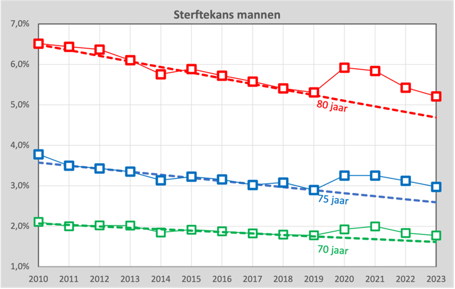
For 3 different ages, we see the actual mortality probability as blocks and the dashed line is then the trend through the years 2010-2019. It is important to note that in a decade we have apparently become slightly healthier. Before the age of 80, the mortality rate decreases from 6.5% to 5.3%. The question is, of course, how far we can extend that straight line into the future.
The assumption that this line should actually be a sloping curve or that from 2020 onwards it will suddenly show a kink and run horizontally is just as defensible as the assumption that the decline will continue for a while. What is certain is that the line will not be straight until the year 2100, because then no more 80-year-olds would die. In a few years' time, the answer to this question will become clearer.
In any case, we have been able to establish that the forecast we found for the baseline for the corona years corresponds fairly accurately with that of CBS.
As a result of the year, we adopt the method of the RIVM: a sine wave, where the value is 20% higher in winter than in summer. We base the bandwidth on the statistical uncertainty associated with these weekly figures and not on what we actually see (for statisticians: a Poisson distribution).
From 2024, RIVM will take over the task of CBS with retroactive effect to July 2022 and now a problem arises. The RIVM still calculates with the average over the past 5 years, so the excess mortality in those years is now included in the forecast. There was around 10% excess mortality every year, so the forecast was also revised upwards by 10%. And at least as strange is the increase in bandwidth. Due to the increasing fluctuations in mortality rates, it has now grown to 14% in the summer. According to the National Institute for Public Health and the Environment (RIVM), unexplained mortality in the summer is now within their bandwidth again, while this mortality, in contrast to the usual seasonal mortality, has never been explained or accepted.
In this graph we see the bandwidth according to our own model as a blue interval and the bandwidth adjusted by RIVM in green:
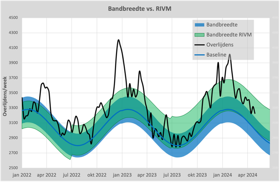
In July 2022 and July 2023, we can clearly see the incremental increases and also the ever-widening of the bandwidth, to ensure that 95% of the figures remain within it. The blue band is therefore based on our own method, which on average almost corresponds to that of CBS.
3. Excess mortality and under-mortality
If the number of deaths in a given week exceeds the bandwidth, we speak of excess mortality. The numerical deviation from the baseline is then called increased mortality. In common parlance, this excess mortality is also referred to as excess mortality, which is confusing. So when it is said that there is excess mortality, it sometimes means that there are more deaths compared to the baseline, what we call 'excess mortality'.
In the graph above, we see that the black mortality line has been outside the blue area since mid-October 2023 and there has therefore been continuous excess mortality since that time, even at the weekly level.
If the excess mortality under the baseline, there is a under-mortality. This mainly occurs after there has been a flu wave, but we also see it after the first corona wave. We have also described this effect in our ResearchGate article.
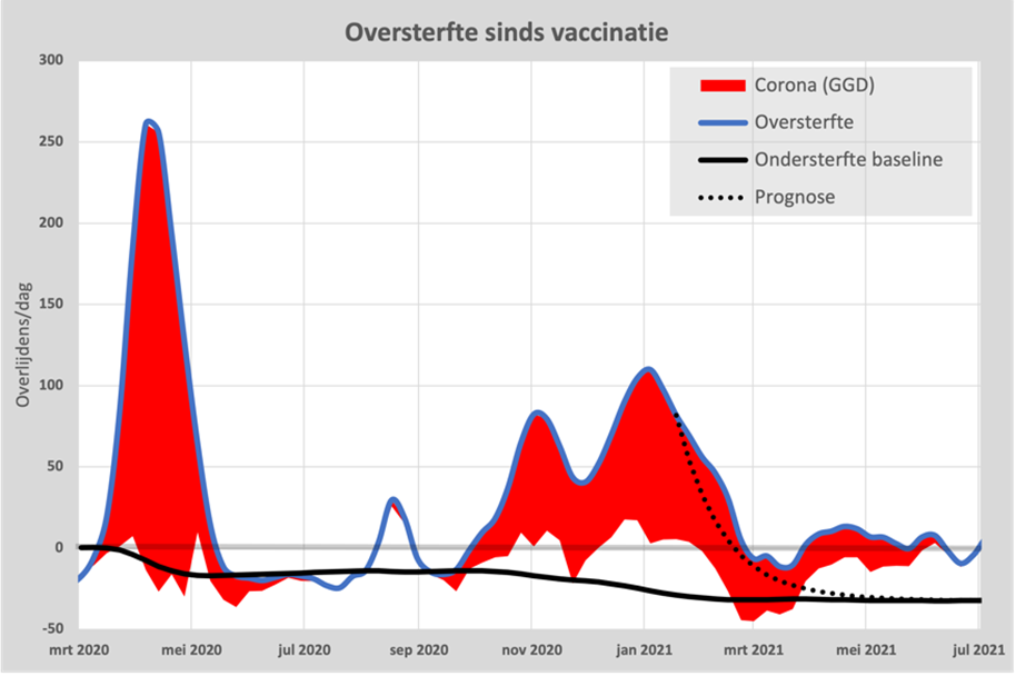
The mortality in an epidemic has a "pull effect" on the following 18 months and is therefore deducted from the 18 months thereafter. If we include this calculation in a graph, it looks like this:
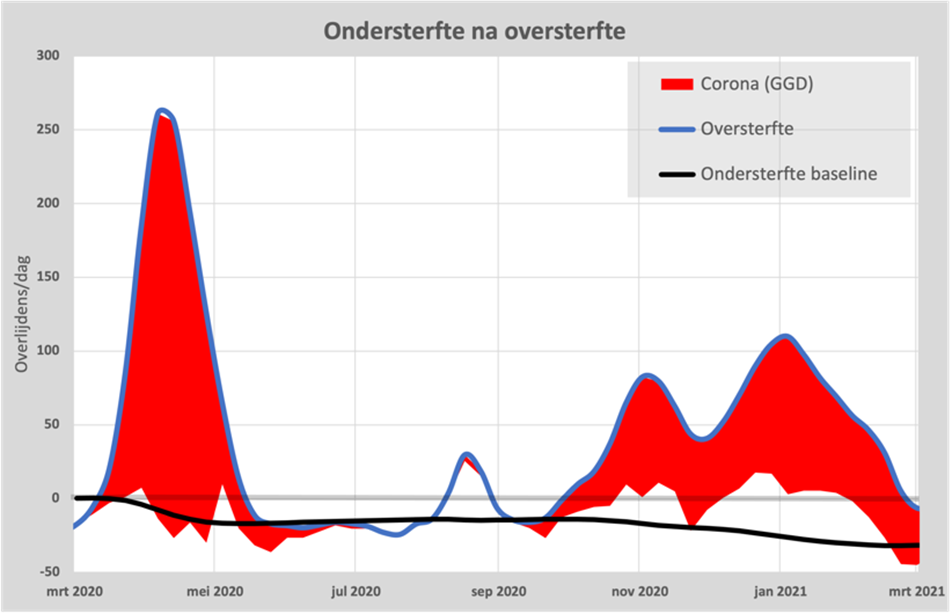
The black line is the under-mortality accumulated during the first wave and we see that this mortality indeed returns to this lower "under-mortality baseline". The excess mortality only occurs during the heat wave in August and from the second wave in September. We also see that excess mortality peaked in December 2020 and then started to decline, again towards the accumulated "under-mortality after excess mortality".
What is important to realize is that the total of 14,500 people who died of corona in 2020, according to CBS, died on average 9 months earlier. Almost all of the deceased had at least one underlying condition, which often included obesity and diabetes. So that took around 11,000 years of life. We will take that number into account in the final bill.
4. Corona according to RIVM and CBS
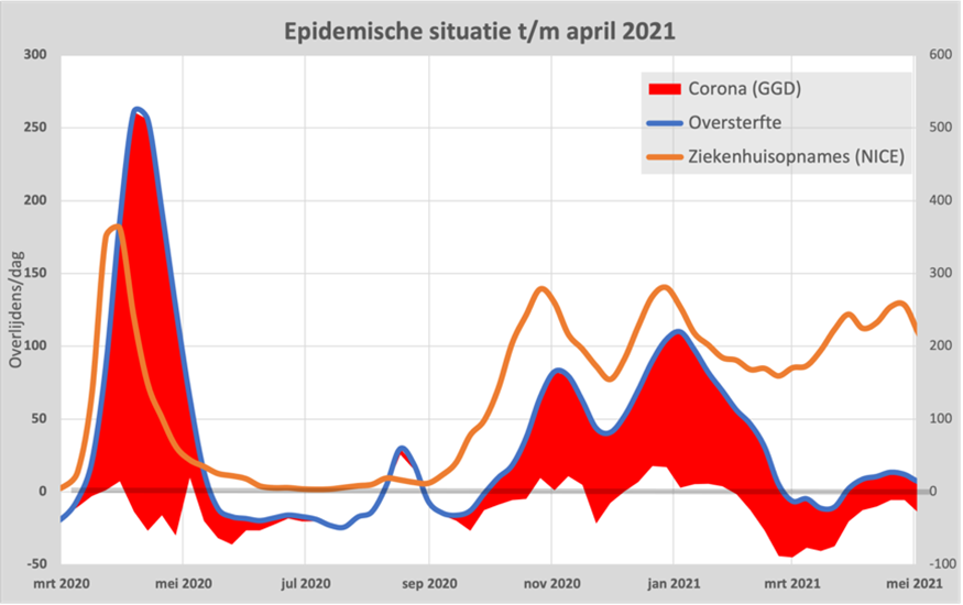
Both the National Institute for Public Health and the Environment (RIVM) and Statistics Netherlands (CBS) kept track of the number of deaths from coronavirus. The National Institute for Public Health and the Environment (RIVM) collected the figures from the Municipal Health Service (GGD) and Statistics Netherlands (CBS) analysed the data provided by the medical examiner on the death certificates. Due to the enormous workload during the first wave, the GGD had an underreport for 5 weeks and that has haunted the GGD for a long time as "the GGD has incomplete figures". These figures have been replaced by the CBS figures.
As of November 2020, the WHO a guideline in which it indicates that any death in which SARS-CoV-2 may have played a role should be counted as a COVID-19 death. And that's where it goes wrong. See this chart:
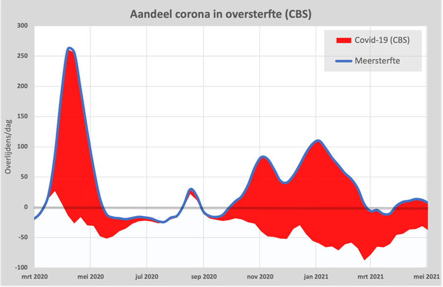
Since November 2020, we have seen the number of deaths due to covid-19 (red area) increasing compared to the excess mortality (blue line). In March 2021, there was under-mortality and even then, CBS claims that 20% of mortality was attributable to covid-19.
CBS counts 55,000 deaths from covid-19, while the GGD puts it at 22,986 on 17 March 2024. We also see the latter number on the site of OWID and even the WHO report it. Also the Health Council of the Netherlands has confirmed this. It is therefore strange that CBS, and therefore the government itself, still relies on the CBS figures. Read about this in this article: Disinformation from CBS?
Where possible, we will show the GGD figures, but we cannot avoid using the CBS figures as well.
5. February 23, 2024
A date that deserves a separate heading, because on that date CBS published the figures needed to properly calculate the role of the vaccines: Covid Vaccination Status and Mortality. This publication was published with the aim of explaining the role of the waiting period. Originally, the first 2-4 weeks after the first vaccination were considered "unvaccinated" because the protection of the vaccine was not yet at its full strength. Although the vaccine would be gone from the body after a few hours, it would take the immune system weeks to generate an adequate response. Of course, this is a strange assumption, if at the same time it was stated that the vaccine would be gone from the body after only a few hours. In the article in question, graphs were shown that were supposed to show that in the longer term, whether or not to include these 4 weeks would hardly play a role.
But (perhaps unintentionally) the tables shown in this article also contain exactly the figures we were looking for: deaths separated by vaccination status and the exact effect in the first four weeks. Hans Verwaart was the first to talk about it Published.
This resulted in the first analysis on 2 March: CBS has revealed vaccine efficacy With this graph as the first result:
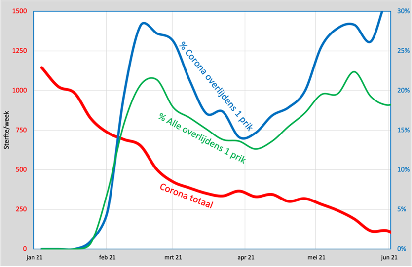
The two main lines are the green and the blue. Green is the percentage of deaths from all causes who have had exactly 1 shot. Blue is the percentage of deaths from corona with exactly 1 shot. If the vaccine did not provide any protection, the two lines would coincide. If it gave 100% protection, we wouldn't see any deaths from corona, because you would be protected. If the vaccine would give any protection, then the blue line should be below the red line and that didn't happen: it is always above it and that means that in the first 4 weeks after vaccination you can even get a ca. 25% greater chance to die from corona than the unvaccinated and that is shocking. We'll take it with us to the final bill.
It is not yet possible to determine what the situation will be after those 4 weeks due to a lack of data. There are observational studies that indicate that more vaccinations increase susceptibility to Covid.
6. Vaccination coverage
An essential factor in calculating the effectiveness of the vaccine is vaccination coverage. Mark Kaptein told us at the end of December 2020 that the newly developed vaccine would provide us with 95% protection and that a vaccination rate of 60% would be enough to contain the epidemic. Claims that later turned out to be false. Even a vaccination rate of 90% was insufficient and the vaccine did not provide any protection against spreading. The numbers in the February 23 article confirm it.
The National Institute for Public Health and the Environment (RIVM) registers the vaccinated people in their CIMS registration system. Two problems immediately arise: some of the vaccinated people did not give permission to register the data and it also seems that there was a backlog in the processing of the data.
Fortunately, we can now reconstruct these data using the CBS figures and we published the results in this article: CBS elixir of life containing this graph:
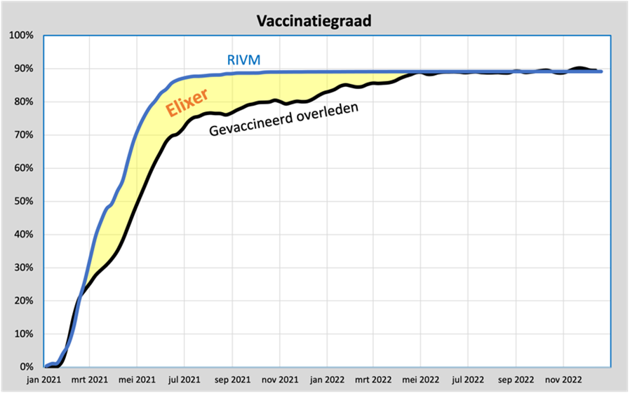
The blue line is the (age-adjusted) vaccination coverage according to the RIVM. The black line is the reconstructed vaccination coverage based on the percentage of vaccinated people in the overall mortality rates, so not just corona. We see that these are the same until the end of February, but then an ever-widening gap arises until July. The lines will meet again in May 2022.
This means that in those months, some of the deaths of vaccinated people are wrongly considered unvaccinated, because they do not appear in the CIMS system.
The difference, the yellow area, can therefore be considered an "Elixir of Life", because if you disregard this backlog and uncritically adhere to the RIVM figures, vaccinated people seem to have less chance of dying, from whatever cause. A vaccination rate of 88% was achieved.
On March 6, 2024, RIVM proudly presented this fact: vaccination reduced the risk of death by up to a factor of 3. We will include it in the final bill.
7. What is the VE now?
Because CBS published all the necessary figures needed to calculate the VE (Vaccination Effectiveness), we can now show this graph.
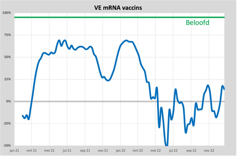
We see here the average VE for everyone who has had at least the first vaccination. Until March 2021, negative protection, which was restored in April and grows to 50%. In June (when there is virtually no more corona) the maximum of almost 70% is reached.
With the arrival of the Delta variant in November, the vaccine seems to have almost worn off with a VE of 25%. At the same time as the Delta variant, boosters were given and the VE briefly climbed back up to 70%, before dropping to around 0% with the arrival of the Omicron variant. Failing vaccines?
Vaccinated people are therefore more likely to be affected by corona than unvaccinated people. We will also take this into account in the final bill.
An overview of all conclusions from the CBS article can be found in The first 4 months of the corona vaccinations.
8. Vaccine damage
Since April 2021, we have seen that the excess mortality can no longer be explained by deaths from covid-19. The difference between excess mortality and mortality from covid-19 can be seen as a net excess mortality. Determining what causes this net excess mortality (also known as unexplained excess mortality) has been a subject of discussion for a few years now. Vaccine damage is the most frequently mentioned, but denied by at least as many. Deferred care was also mentioned a lot in the beginning, but the longer the recovery is delayed, the less unlikely it becomes. And an indirect consequence of measures and possibly therefore unhealthier living could also be possible. Recently, Minister Dijkstra also added the fall of kitchen ladders as a possible cause.
The fact remains that it is almost impossible to deduce it directly from the figures. The group of unvaccinated people has become far too small for that: around 10% are unvaccinated. Since the excess mortality is also around 10%, a difference of 1% already provides an apparent cause or the elixir effect thought by RIVM.
But aren't there any clues? There certainly are, on four occasions. The first is described in our ResearchGate publication. In it, we showed this graph:
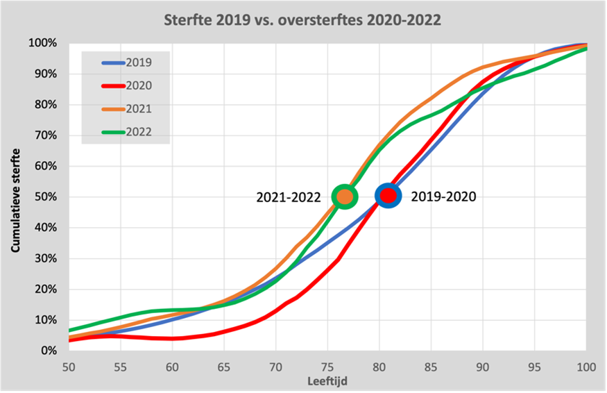
Here we see the accumulated total number of deaths in 2019 as a blue line. Half of the deaths are under the age of 82 and the other half are over 82 years old. That point is marked in the graph with a blue circle.
If we depict the excess mortality in 2020 in the same graph (which is almost entirely attributable to corona), we also see that half of them are younger than 82 years. However, far fewer residents under the age of 65 are dying: corona mainly affects the elderly over the age of 65.
If we do the same for the two years in which vaccination was carried out, 2021 and 2022, we see that the entire curve has shifted 5 years to the left (there is a significant mortality in the age around 50 years). Certainly in 2022, corona had virtually disappeared, so another cause must be found here. Whatever this cause, it has cost an average of 5 years of life per death. With an excess mortality of 15,000, that is 75,000 years of life, a lot more than the 11,000 from corona itself. We will take this into account in the final bill. A more detailed description can be found here. mail.
A second clue can be found in the 2022 booster. This graph is described in this mail and this article: Is oversterfte een keuze?
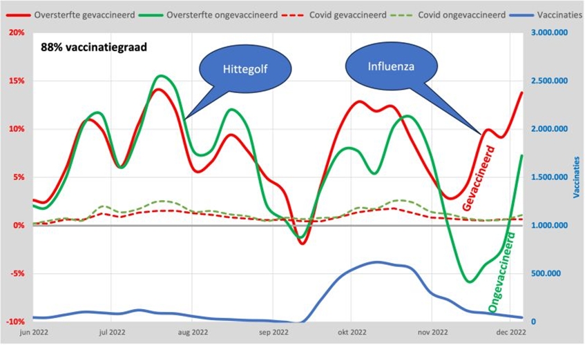
Here we see the excess mortality of vaccinated and unvaccinated people as red and green lines, respectively. Until mid-September, these are the same: vaccination did not prevent death during the heat wave. Mortality from corona (dashed line) is around 10% of this and almost negligible compared to mortality from other causes. But the moment vaccination was carried out (blue line), the two lines diverged. The flu appeared at the end of November and it claimed more victims among the vaccinated than among the unvaccinated: 10% extra deaths. The result of the vaccination?
A third indication was already there at the start of vaccination.
We showed part of this graph at the beginning of the article: under-mortality after excess mortality (the black line). After the first wave, the predicted undermortality is neatly monitored. At the end of the second wave, this trend also started (the dotted line) but turned upwards as soon as vaccination picked up steam.
The under-mortality was just not reached and so there was actually already an excess mortality of about 30 per day during an apparent period of under-mortality. Deferred care and kitchen steps seem to fall off as a possible cause. Vaccination still seems to be the leading candidate, but unfortunately these figures cannot be used as legal evidence. We'll include it in the final bill!
A final clue is the strongly changed mortality pattern. This graph shows the excess mortality in the 2023/24 season compared to the 2018 flu wave.
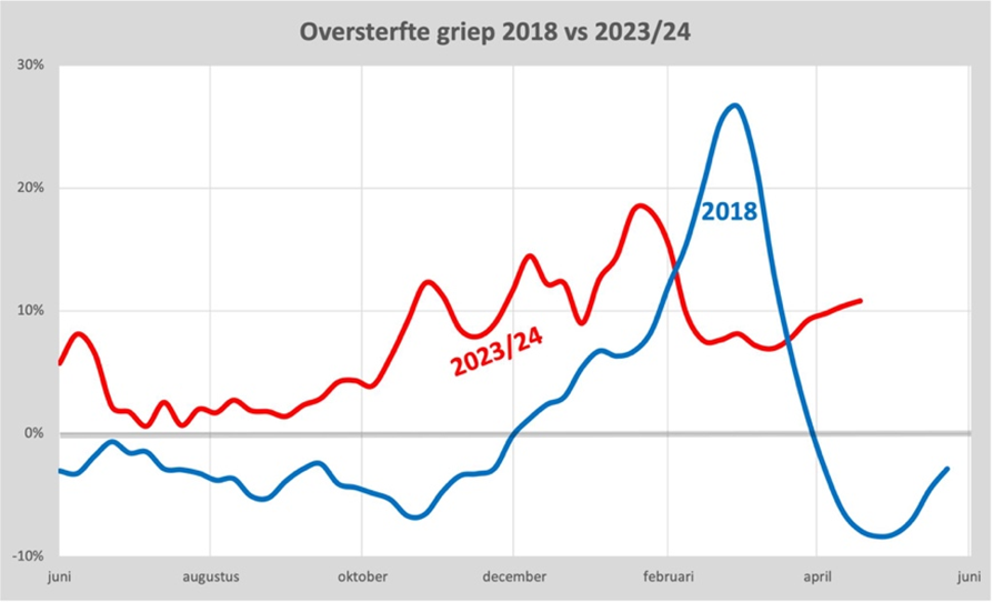
While the flu wave actually lasted no longer than about 6 weeks (incidentally, just as long as the first corona wave), the excess mortality in 2023 already started in September and is still continuing. It's like a turbo flu. Also read this mail about this. For 2022/23 we business Same pattern. It seems that the functioning of the immune system is disrupted. Food for immunologists! We'll take it with us.
9. Hospitalizations
Vaccination would also prevent (serious) illness, we were told. But in the first quarter of 2021, we saw something curious. Despite the fact that excess mortality decreased rapidly and vaccination coverage increased, we actually saw an increase in the number of hospital admissions due to corona. Immediately the finger was pointed at the unvaccinated, because it is precisely they who are now occupying the beds that were no longer available to others. Here's the graph that went with it:
We see the number of hospital admissions per day as an orange line here. Until January 2021, this was fairly similar to the number of deaths. But from February 2021 onwards, the line stagnated and from March onwards, the number of hospital admissions even rose again to almost the level at the peak of excess mortality, while there was no longer any excess mortality.
Let's break it down by age. The 80+ group was the first to be vaccinated from the end of January 2021. The excess mortality had already been halved "automatically" and we have also seen that the protection was negative for the first 4 weeks (this aside).
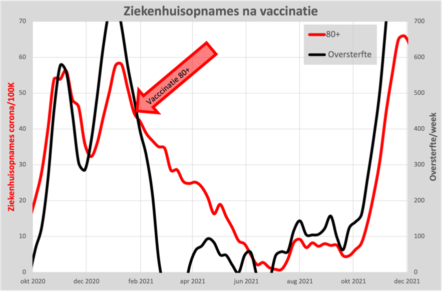
We see here that admissions for 80+ also dropped rapidly from January, even before vaccination was introduced. Vaccination is supposed to prevent hospitalization, but we are actually seeing a slowdown in the decrease in the number of admissions. Not quite the image we were hoping for. But fortunately, we don't see an increase either.
But where did that increase come from? Those must be the other ages and we can indeed see that in this graph, of the 70-79 year old group. It suddenly rises from March onwards, while excess mortality has completely disappeared.
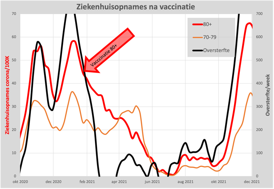
Of course, the question immediately arises: does this have to do with the vaccination that started in March? The answer seems to be "NO", because if we add the other vaccinated ages much later, we see exactly the same course. As an example, here is the number of hospital admissions of two age cohorts in relation to the number of admissions for the 80+ group:
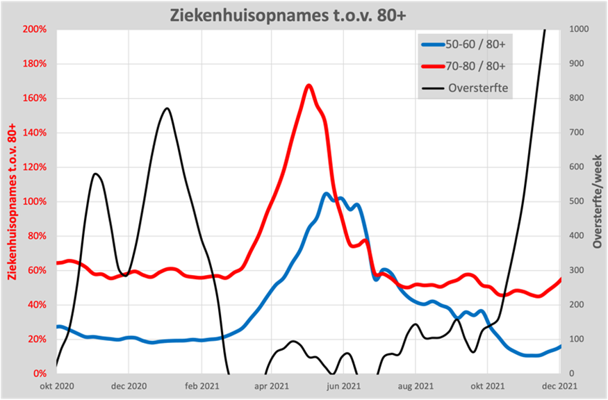
For both groups, we see the number of hospital admissions increase by 3-5 times compared to the number of admissions for 80+. It is only in the summer that it decreases again. If we compare hospital admissions in May with the number of deaths, there seem to have been 10 times as many admissions as you might expect from the number of deaths.
Read more about this in the article Did vaccination prevent hospitalizations? The factor of 10 also came from the study among a small group of general practitioners: Doctor's Omerta. In principle, any admission due to covid-19 should be subject to referral from the general practitioner. It turns out that only 10% can be explained by this, the remaining 90% was apparently registered as corona after an internal referral within the hospital itself and was therefore admitted due to another condition. We also take this into account in the final bill.
10. Intelligent lockdown
There has also been a lot of discussion about this. The Ministry of Economic Affairs calculated that these measures would cost 6 times as many years of life as they would save. Jan van der Zanden wrote a good summary about it. With the current insights into the alleged effect of the measures, even this is still a very optimistic estimate. Nevertheless, the measures have continued and have cost our economy around € 100,000,000,000 and have caused a lot of social suffering. An evaluation of cost-effectiveness can also be found in: Vaccines: protection to zero, budget standard exceeded by a factor of 20. Comes with the final bill.
11. There is room for improvement
These analyses have been carried out in particular by the first author of this article and that can of course be improved, especially with better figures. In principle, a team of thousands of experts is present at RIVM and CBS for this purpose, but nothing more has actually been heard of them than attempts to support the original assumption: the vaccine would be "Safe and effective". We are still waiting for an objective processing of the figures that could give us confidence. Also regaining trust in science, where the image lingers that we were only told a small part of the truth.
The table under point 8 (cumulative distribution curve of mortality over the years 2019-2022) shows, among other things, the following:
Relatively speaking, more elderly people died in 2020 than in 2019. The fact that you see that relatively fewer young people died in 2020 (compared to 2019) is a result of the graph that is set on a cumulative (0-100%) scale. I.e. this graph cannot say that in absolute numbers, fewer young people also died in 2020 than in 2019. This is a detail... What matters is that you see the battlefield (the one where the 2020 line is going to run steeper than the 2019 line) so clearly in this graph, i.e. that between the ages of 65 and 80 in 2020 people died much harder/faster than in 2019. This fact fits exactly within my report of the iatrogenic damage inflicted by doctors in which patients with pulmonary embolism (a disease that mainly occurs in the elderly), i.e., a serious respiratory disease in which clots get stuck in your pulmonary arteries so that you can no longer take in oxygen, and for which the treatment consists of anticoagulation, were not treated with life-saving anticoagulant therapy, but were considered (only) covid positive, after which ventilation was started and therapeutic anticoagulation was omitted. My example is about pulmonary embolism, but there are also other respiratory diseases that have a similar symptomatology as covid and that mainly occur in the elderly (e.g. pulmonary emphysema, a number of forms of cancer, pneumonia), but have a different treatment than that of covid (including dexamethasone, where doctors found out months after March 2020 that that drug miraculously prevented death in 'covid' or was it emphysema/cancer???)
My interpretation raises the question of whether corona had any influence on excess mortality in 2020 at all. Which, by the way, does not mean that corona does not exist. Flu is also a disease that is associated with increased clotability, and that doctors have looked at closely in the past (i.e. people with flu AND diagnosed pulmonary embolism because both syndromes need to be treated acutely with ventilation AND anticoagulation, and not just with ventilation).
For completeness: here is an article of mine in which you can see that infectious diseases are associated with a high (up to 35-fold-increased) risk of pulmonary embolism: https://pubmed.ncbi.nlm.nih.gov/22487204/
And here's part of my report that doctors have been negligent in diagnosing pulmonary embolism during the first wave in March-April 2020: https://maartenleeflang.blogspot.com/2024/05/uitstapje-32-over-medische-nalatigheid.html
Fantastic Willem, thank you. I'm going to read it.
Dear William, I have read your 2nd link. It's mind-boggling. After everything that every self-thinker has suspected all these 4 or 5 years and has finally seen confirmed, it turns out to have been much worse. It's embarrassing.
The first thing that comes to mind as a reflex is "why didn't people have the guts?" (to argue against something, to follow logic, to state an antithesis, whatever). I have a lot of admiration for how you described the whole process (I had already started what you published on blogspot) and that gives some insight into this "why", but I am left with the question "why did almost everyone conform, and for so long, and even now?"
Maybe it's just like looking back at what I'm doing now, but without the answers to those questions, can we "finally pry the narrative loose" and retrieve honesty, logic, and sincerity?
We are sometimes afraid of the future with AI and bots, but if people are already behaving like bots and only following procedures and/or crawling behind ...
Afterthought: an AI (fed with the right data) that reasoned medically analytically might have diagnosed a pulmonary embolism.
Very interesting.
Good overview of the current state of affairs! Of course, this is not a real final reckoning. At most, a mid-term review.
However, we must work towards a final settlement of the consequences of the pandemic for the Netherlands. Especially now that it seems more and more that the pandemic was caused by humans ('Lablek') and did not have a natural origin, it is very important to precisely name guilty parties and (if possible) deal with them harshly.
To make a real final bill, the following steps must be taken:
1. The most accurate determination possible of all the damage suffered as a result of the C19 crisis and the fight against it.
Not only excess mortality, but total mortality from C19( also substitution mortality). Ditto for illness.
2. Drawing up expectations regarding damage effects for the coming years (2024 and beyond).
To do this, you would have to look in the research literature in terms of population development, disease, mortality and expected lifespan in the coming years.
3. Update cost-benefit analysis C19 crisis (CBA)
In other words, not only updating the CBA of the 'intelligent lockdown' (see point 10 of the article), but also mapping out the costs and benefits of the policy afterwards, as well as estimating the expectations of policy in the coming years.
4. Differentiate costs/benefits to groups of responsible parties.
5. Plan for political and legal actions to lay down the claims and deal with the culprits at home and abroad, as well as compensate victims.
Under point 5 you can also include the setting up and organization of people's tribunals.
Partly in view of the enormous scale of the damage caused by the C19 crisis, this seems to me to be an ambitious action plan for a 'bottom-up' social movement.
That parliamentary inquiry is not going to work anyway...