The last loose ends of the thread of @mkeulemans on Twitter. We had stayed with a graph that, to his dismay, had two different Y axes and in which he saw a sign of severe deception. Now on with Tweet wire button 8. It still seems like a lot but we have had most of it in Part 1 and Part 2. The most interesting part of this part is in an analysis of a graph from the excess mortality report that is presented as a substantiation. The rest is actually sliced cake.
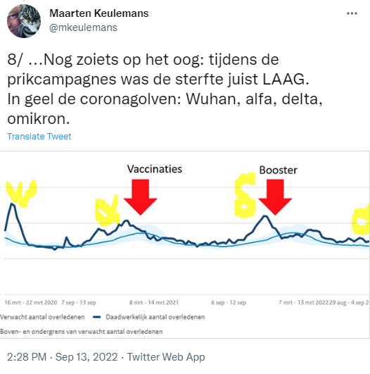
A very wild drawing that you mainly have to fill in with your own imagination.
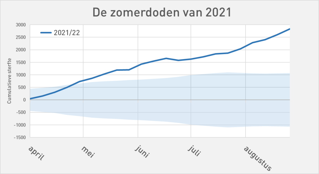
I don't speak Twitterian but I rephrase it, also with a neater sketch.

After the start of the Double (Spring/summer 2021, approximately during the alpha wave), there was continuous increase mortality from April onwards. In May it was clear that we were in an excess mortality situation. So to say that the mortality was "LOW"....
The Booster Campaign began when Delta mortality was just at its peak, thanks in part to Omikron (end of 2021). Considerable mortality during the booster campaign. A bit bland perhaps because that bump clearly fell before the campaign. But "During the prick campaigns, the mortality was low" is very impure. Especially if we look at the repeat puncture.
The Repeat prick campaign was not shown in the twitterschetsje of @mkeulemans. That information is therefore 'omitted'. It is precisely this campaign that is remarkably in sync with a mortality bump. Stating that mortality was low during the vaccination campaigns conceals that correlation.
With his immunological gaze, Theo Schetters has zoomed in on the repeat injection. Critical questions about this graph are absolutely conceivable and they need to be answered (maybe I'll make an attempt myself). But in fact, this should have been done a long time ago by the bodies set up for this purpose. That is exactly the point that Theo wants to illustrate with this graph, although this specific correlation may also be explained by available data.
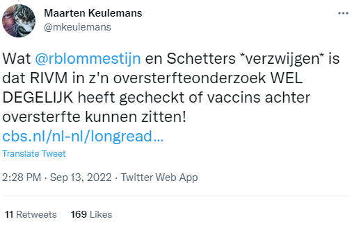
Jetzt bowls those Camels because Maarten performs the excess mortality report here. That report states that the cause of death of thousands of people unknown is.
He then draws the conclusion that it will therefore come through the vaccines (note the placement of the quotation marks) – and if he does not mean it that way, he puts that conclusion in our mouths, at least also Schetters. Yet we repeatedly and explicitly insist on further investigation.
Tweet 10 or 11 is missing. Forgivable, Twitter is a dragon if you want to tell a story with a head and a tail. You quickly lose count if you don't pay attention.
No independent audit has been made of this report, so the sources have not been compared with conclusions, interpretations or visualizations in the report. Would Frits van Eerd also be allowed to present his accounting if someone suspects crazy things in it? And as soon as someone asks for a copy: "No, that's privacy-sensitive"...?
The announced Phase 3, the 'external research phase', was therefore already called a sham by Eline van den Broek-Altenburg of the sounding board group during the hearing and on LinkedIn.
The Sounding Board Group has actually been there a bit like excuse-tricks and -gusen and they have not hidden that - of course politely but decisively. It is therefore not surprising that the graphs and conclusions in the policy report show that the vaccinations have nothing to do with excess mortality.
In this context, an argument is put forward from the series "Really the tastiest steak in the area, the butcher says it himself."
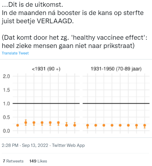
Here's it: a graph with orange dots indicates that the chance of mortality has been reduced by the booster. The balls in these age categories are indeed all below 1. Then the question is: what is that 1? Reduced relative to what? That is not in the Tweet, on Twitter you can be incomplete because of the maximum length, sometimes that is good. In the report you can find what the dots refer to:
Figure S6.3.3. HR estimates of risk of death regardless of cause of death after a booster dose of COVID-19 vaccine received a second dose from the basic series at least three months ago, with 95% confidence interval to stratum of WLZ care use and year of birth.
The orange graph is a striking reduction (less than half!) of the already reduced mortality rate of people with only the basic series. "... slightly lowered because of the "Healthy Vaccinee Effect", Maarten explains, speaking with Jaap van Dissel later in the House of Representatives hearing.
Didn't that "Healthy Vaccine Effect" apply to the basic series and why not?
I have already expressed my surprise at the fact that a drug unexpectedly affects the overall mortality rates, there is no clue how or why and it concerns an unknown new technique of which you do not know what happens in the long term with that drastic effect. Yes, there are more active agents whose mechanism is not fully understood – but they have first been found to be safe in the long term. It is precisely this long-term data that must now come to light. The VE chart I'm going to talk about now suggests something other than lasting safety.
So the claim was "Better than the basic series", which is the blue dot graph with that striking, partly concealed, negative effectiveness (vaccination mortality) in it. I don't see that graph in the online version anymore. Dropped out when printing, I suspect. Or the booster decays so quickly into a negative VE that it becomes embarrassing to add more months. "Leave it out altogether".
A critic might say something about missing, omitting or even 'concealing'. But the latter sounds so accusatory.
In my PDF, the graph is still:
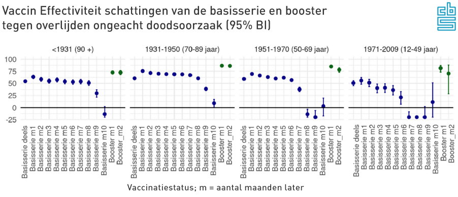
Here we see the booster balls (green) indeed higher, at up to 80% protection. That is indeed better than the basic series. Do you see this chart for the first time and be amazed at the unprecedented Negative VE (vaccine effectiveness) of the base series after six months: see Part 1, there you see how badly it really scores.
In the House of Representatives hearing Jaap van Dissel presented a different graph. The last four red balls at 12-49 also give a higher mortality risk than in the unvaccinated, but much less than the blue ones above. Apart from the vertical reflection, has anything been corrected or 'celebrated' for the purpose of the hearing? Month 1 is also different compared to the following months. You wonder how that data can change so much.
In the graph VE against death from Covid-19, the last balls are only omitted at 12-49. Or should I say: 'concealed'?
Reality check
If we calculate this effectiveness against death over the population 50+, then 1,832 deaths are prevented in that group among the vaccinated. If the total mortality remains the same, this under-mortality must be compensated by the vaccinated. This means that there must be 1,832 more deaths among the unvaccinated. That would be more than a doubling mean.
Jaap van Dissel even mentions 90% in the TK hearing regarding non-covid mortality, which could correspond to the orange balls that Maarten Keulemans mentions. That would even prevent 5,542 deaths! Yuchei!? The news is a bit too good to be true.
1,832 extra deaths per month, probably due to corona: that is more than half of the heaviest month in the first wave. A corona mortality of 5,542 in 1 month has never even been achieved in 2020. And that for several months in a row.
Also consider: there was no immunity in 2020, the group of unvaccinated people was 10 times as large (no one was vaccinated, now 10% in this group) and the Wuhan variant was much more virulent. And yet the figures would now be higher, among a group that is ten times smaller...? All this based on corona mortality because it is unlikely that other causes of death have suddenly appeared en masse, exclusively among unvaccinated people.
For the details of the calculation, see the flip-out below.
The invisible effects of Positive VE against all causes of death
We assumed that total mortality would remain the same. It does not seem to be compatible with that.
We see unvaccinated people not that way fall down in droves. Nothing has been noticed in hospitalizations, ICU occupancy (see chart by Herman), mortality rates, foreign country or anywhere else. So we should see a huge under-mortality thanks to that protection, made even greater by the excess mortality that we've had. None of that: there is excess mortality, in 2021 and in 2022 even more than in 2020.
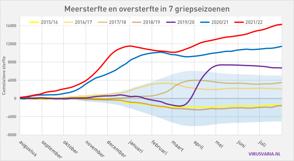
The results of the reporting of this VE study therefore rub off on the mortality rates. Is this really the ultimate justification for keeping vaccinations out of any excess mortality research?
In the broadcast on 13 September, I literally listed point by point which options should be considered. Covid was there the first option. See timecode 10:50 on https://www.npostart.nl/ongehoord-nieuws/13-09-2022/VPWON_1339273
So "NOT A WORD about covid" is a somewhat careless observation.
(by the way I say a "Turbulent time", I the r falls away 😅 a bit )
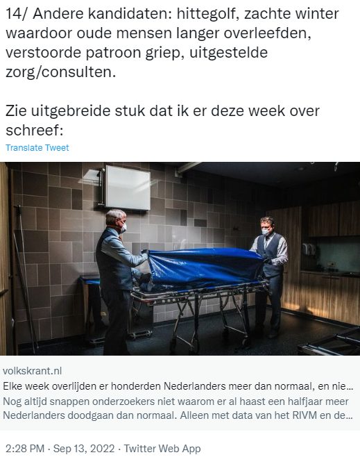
I also pointed out other options but at that time did not have the time to cover everything one by one.
To add something about those candidates:
- The heat wave has caused about 15 extra deaths per day, we know that. Nothing unexplained.
- "Because of the mild winter, more old people survived" – OK, could be, and what about the excess mortality mountain that we have had behind us? Where has that associated under-mortality gone?
- "Disturbed pattern flu" – there was indeed flu. Corona has always been one of the flu viruses, so that is a somewhat unclear statement.
- Deferred care is also a candidate (also mentioned, I believe) who could well explain the excess mortality to a certain extent. More on that in a later article.
Those abundant smileys are starting to get on my nerves honestly. Let's bite the bullet.
Well, what can I say about the "us against them frame" and "Doing politics on the backs of unsuspecting citizens" without turning it into a you-bin... I don't know.
Lying to people with nonsense stories... About aerosols, for example? About face masks, lockdowns or other 'measures' for which support must be created? Or scaremongering with inky nonsense scenarios? About no urge or compulsion? About no benefits for vaccinated people?
There are quite a few lie incidents to focus journalistic arrows on. Which journalist or newspaper is actually on top of that?
I think I have made it clear that we have not been lying. We have expressed our concerns with integrity. You only lie if you are aware that you are not quite telling what you think is the truth. That was not the case here.
There is a difference between lying and being wrong. That distinction does not seem clear to everyone. It puts one's own morals to the test of a communications professional who is tasked with selling a dubious message. Not everyone deals with this in the same way, as can also be seen in a presentation by Marc van Ranst, which I discussed in 2020.
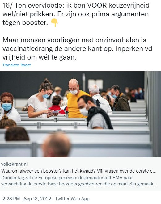
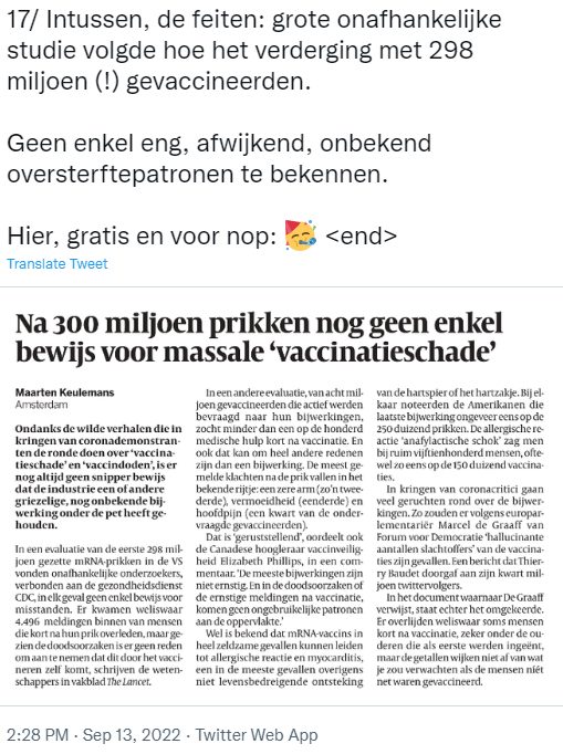
The tirade ends with a cherry-picking masterpiece by the acclaimed journalist and policy defender himself: the decisive proof that there is really nothing wrong with those jabs.
What is not entirely clear to me: if the damage is not 'massive', how big is it? May the proportion of vaccines in excess mortality not be investigated; what's against that? Why the unwillingness that everyone experiences, including the sounding board?
Why is it not an argument to have it investigated by several independent parties – so that "not massively" can be quantified to a perhaps negligible share of excess mortality, which can be determined from several sides?
It's over. This was the last part of this trilogy. See also Part 1 and Part 2. It was quite a job, and that for such a stupid 'thread'. Fortunately, it is well read.
Thank you everyone for sharing!






Many thanks again.
My wife would say: "that Anton is a winner!". I agree with that.
I am still amazed that Mr Keulemans has apparently never seen a graph in which several lines have been plotted, and which therefore has two different Y axes. Surely that cannot be true!
If you are going to use such 'arguments', you make yourself very implausible.
Thank you, Anton, for your neat refutation of everything Keulemans mentions. I also learned a lot from this article.
I still do not understand why Mr Keulenmans is being given a podium.
I think he said little to nothing meaningful. Yet people follow him, and he is seen as a celebrated journalist. How is this possible? Who are those who hold him in such high esteem? I really don't understand it.
Best journalist of the Netherlands 2021. Can you check how the rest of the journalists are doing, they just take that.
I think Mr. Keulemans, given his woefully low journalistic level, is better off applying for a job at his local door-to-door newspaper. That would be a huge relief for a lot of people, de Volkskrant (perhaps the worst newspaper in the Netherlands) and especially himself.