
That's what it's starting to look like. On Tuesday, we already published a post in which we showed that there would be a huge "elixir of life" effect according to the figures in the Nivel article. The appendix with the calculations has since been removed from their website, but fortunately we have been able to secure a copy in time, in which the last valuable clues can be found.
Also available on Herman's linkedIn account
First, a brief overview of what we showed on Tuesday, based on the CBS figures:
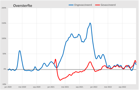
This graph shows that excess mortality among the unvaccinated would suddenly rise at the time of vaccination. These are not the figures in the Nivel report, but the figures that Statistics Netherlands (CBS) on 23 February Presented. Therefore, this graph continues until the end of 2022, while Nivel does not go beyond 12 months after the first vaccination around April 2022. That is why we can now focus on the period from May 2022, when the overdue administration was also made up.
The figures used by Nivel came from approximately 400 GP practices, which together are representative of the average of all GPs. However, Nivel did use the same CIMS database, which means that the findings should in principle be the same.
These figures suggest a fatal and at the same time impossible side effect of the Corona vaccinations: they cause significant excess mortality among those who did not get vaccinated. However, this apparent increase in excess mortality among unvaccinated people can be explained by poor administration in CIMS. We have already posted several articles about this, including this one: Wanneer ben je gevaccineerd volgens CIMS? In short: there is an increasing backlog of up to 20% in CIMS, which has been documented and confirmed by the RIVM. This backlog could lead to vaccination registrations not being processed, for example if the patient had died in the meantime – i.e. as "unvaccinated". However, this backlog was not included in this graph, because we wanted to show what the consequences would be if you did not take it into account, such as the Nivel has done. It is therefore essential to inform how many vaccinated people have NOT ended up in the CIMS.
The missing figures
To our surprise, the appendix to the Nivel report (unfortunately no longer available for download) gives us the solution. We already knew the first backlog:
Thus, 7% of the people who were vaccinated did not consent to registration in CIMS. With the booster, it would have been 5%. The latter is not what the RIVM has communicated, but it is in accordance with our own analysis, but that is beside the point. And to be fair, we had not included this in our graph, but this has been taken into account in the new graph.
In the meantime, a memo from the LHV has also surfaced (thanks Leon1969). In this memo from On 21 June 2021, the LHV speaks out about her concerns about the growing backlog of registration in CIMS, which had risen to 38.02%. Also special is that the LHV reports that not 7% do not give consent ("opt-out") but even 11.75%. The RIVM reports in this memo that they expect 9%. So even on these basic figures, the various organizations do not agree. We're only working with that 7%, but we know that it's actually around 20% should be. This is now the same graph, but with this correction:
We can clearly see the difference in May 2021. The excess mortality among unvaccinated people is "only" 75% while without correction, in the previous graph, it was still above 100%. A small correction with big consequences.
But the second clue is much more interesting:
Here's what we want to know! It seems like an unimportant remark and perhaps even an unintended compliment to healthcare, but this is what it's all about. Realize for a moment what it says here. The general practitioners have their own information systems, in which they store the vaccinations of each patient themselves. In the CIMS, they can then find the vaccinations that have been carried out at the GGD. But apparently, 2.6% of these GP patients are missing from the CIMS registrations. That doesn't seem like much, but it's actually a lot, when you realize that the vaccination rate was 89% and therefore 11% unvaccinated. Those 11% are the people who are not in CIMS!
From May 2022 we will see it
In particular, we are now looking at the moment where Nivel stopped their analysis: May 2022. At that time, almost everyone had had the first jab in 2021 and so their analysis will end in 2022. We are now going to enlarge that period from May 2022. Unfortunately, CBS has only made their required data public until the end of 2022, but that's just enough as we'll see.
It is clear from this CBS figures also shows that 11% of deaths were unvaccinated after consulting CIMS. That would mean that it no longer mattered to your chances of dying whether you were vaccinated or not. We also saw this in the first graph from May 2022: the red and blue line coincide. So realize that Nivel only looked until 12 months after the first shot, so until May 2022! The part after May 2022 where the red and blue lines almost coincide has been disregarded, on purpose?
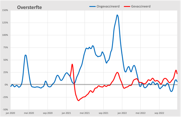
And what does this mean? First of all, we have to ask ourselves how reliable that 2.6% is. It is an investigation from the administration of the general practitioners. They had to catch up with their 63% deficit in the course of 2021. Apparently, 2.6% was left out. Perhaps there is still a part of them that has refused registration. Is that also representative of the backlog of the deceased? That is why, as a precautionary measure, we set this registration backlog at 1%. It can hardly be much less. If further research would show that it would still go towards that 2.6%, it would be easy to adjust that.
Now we also know how to correct the figures, starting from 1%. The 11% of unvaccinated deaths was therefore only 10% after correction and the vaccinated deaths therefore rise from 89% to 90%. And because of this seemingly small correction, excess mortality within the vaccinated group suddenly rises to around 10% and among the unvaccinated drops to around 0%. Normal mortality among the unvaccinated and 10% excess mortality among the vaccinated. This adjustment has already been incorporated in the last graph.
But now let's magnify this part:
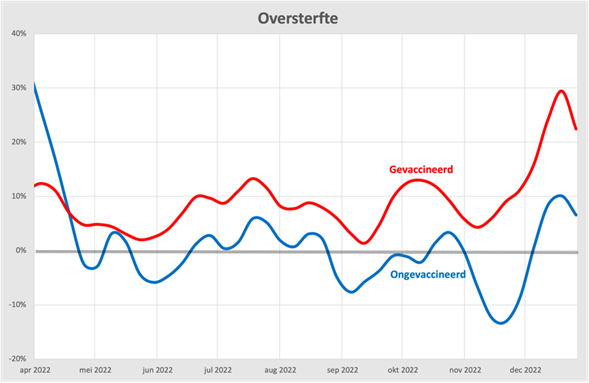
Now it is becoming abundantly clear that the excess mortality is exclusively among the vaccinated. Without this correction, the risk of death for vaccinated and unvaccinated people would have been almost the same, after correction the excess mortality among unvaccinated people disappears.
But there is something else that is now becoming visible. On the right, we see two bumps in the vaccinated. The first bump appears when vaccination was carried out in October 2022. The second bump was influenza, which hit the vaccinated much harder than the unvaccinated. The excess mortality among the vaccinated was no less than 30%, among the unvaccinated only 10%. An indication that vaccination has also done something to our immune system?
What does Nivel actually say?
We have done the math a few times and can hardly believe our eyes. This graph shows the mortality expectation according to the (now withdrawn) report by Nivel. We had to adjust the scale quite a bit to get a picture of it:
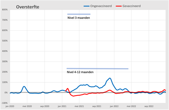
Nivel comes with ten times the excess mortality within the unvaccinated group compared to the first wave and then also during the first six months in which everyone received the first shot. This explosive excess mortality in those months would therefore be among the people who did not receive any vaccination. We understand very well that Nivel is shocked by their own findings, this really can't be true. Maurice de Hond also paid attention to this and today a similar picture emerged: The Nivel study is even stranger than I thought.
Now, after the retraction of their research (the article in question with firm conclusions is surprisingly still there) we are curious to see whether Nivel can come to the same conclusions after substantial adjustments. You could still disagree about the middle part (i.e. until May 2022), where the administration of vaccinations has played a dominant role. Was there really an elixir of life and do you really believe in it? The degree of (dis)belief also depends on confidence in the correctness of the backlog figures that the RIVM itself also provides. There can hardly be any misunderstanding about mortality from May 2022 onwards. After all, these are the official CBS figures, supplemented by the percentage of missing vaccinations in CIMS according to the Nivel report. In other words, excess mortality among the vaccinated. We can't make anything else out of it!
Still too much guesswork in the analysis. You (we, the Dutch) don't get real figures, everything has been covered up by "our" government. Consequence for the reader: no more vaccinations, even if the RIVM advises this.
Glad to see that the guesswork stems from murky numbers. I also understand that you call it 'guesswork', although I see it as 'defensible hypothesis'. 😉
It would be nice to keep the number of nonsense graphs to a minimum, Anton. No valid conclusion can be drawn from corrupted data.
Because we have known for a long time that the vaccines do not work and cause more harm than benefit, we focus on what we do know: deaths and (possibly) reasons for hospitalization.
Causes of death are unreliable because of definitional changes and wishful thinking: Before the "Corona" jab and after "prefer something else".
By the way, I don't hear anyone anymore about the diagnostic unreliability of the PCR test....
Wat mij betreft is de analyse die Wouter Aukema losliet op de CBS-cijfers supergaaf: https://x.com/waukema/status/1763244509880545591.
Deze is over sterfte tot 51 jaar: https://x.com/waukema/status/1786144788133114308
Ook die op bijwerkingen en prescriptiegedrag uit EUdraVigilance; een video:
https://rumble.com/v4st9ab-true-horrors-of-covid-vaccine-harm-data-exposed.html
It would be nice to keep the number of nonsense graphs to a minimum, Anton. No valid conclusion can be drawn from corrupted data.
Because we have known for a long time that the vaccines do not work and cause more harm than benefit, we focus on what we do know: deaths and (possibly) reasons for hospitalization.
Causes of death are unreliable because of definitional changes and wishful thinking: Before the "Corona" jab and after "prefer something else".
By the way, I don't hear anyone anymore about the diagnostic unreliability of the PCR test....
As far as I'm concerned, the analysis that Wouter Aukema unleashed on the CBS figures is super cool. And also those on
mortality up to 51 years of age.
Also those on side effects and prescribing behavior from EUdraVigilance in a video on Rumble.
Unfortunately I can't upload the links here, but I'm happy to send them to you.
But with those nonsense graphs it becomes clear that they have messed things up and are still doing it. In my environment I notice how happy people are with newspaper headlines about the death of unvaccinated people, even though they don't know anyone and there is a lot of trouble with those who have been vaccinated, so that even anniversaries are brought forward under the guise of "now they are still there". Again, it's fear and especially for himself. Meanwhile, there are people who spend every spare minute trying to get to the bottom of it. I am eternally grateful!
Interesting analysis, thanks!
The fact that from the same data you can get an approximately 100-fold increased risk of mortality in the unvaccinated (compared to vaccinated people) and a 10-fold increased risk of mortality in vaccinated people (compared to unvaccinated) is a strong indication that the data are incomplete. It's like those pictures where you can see both a young woman and an old woman or (for my favorite picture) both a rabbit and a duck (the journalistic 'canard') (otherwise Google Jastrow Rabbit duck for this picture).
The solution to the problem of ambiguous data from which you can draw two opposite conclusions is simple: collect more data. A flying rabbit is really a duck and a jumping duck is actually a rabbit!
It is therefore somewhat puzzling why there is no call from 'science' for more data in the excess mortality debate. Or maybe it's not so puzzling when you realize that the conclusion regarding excess mortality was already predetermined (it's due to unvaccinated people) at science TM. Then all you have to do is find confirmation in the data (that the excess mortality is a result of being unvaccinated) and I think that's the reason why Nivel overlooked the errors/impossibilities within the data.
Now we have to wait for the rectification by Nivel and Keulemans et al. Which might take a while... the evil (in interpreting an ambiguous picture as if it were a rabbit) has of course been done a long time ago, and happened earlier as the whole Covid saga was a period in which pictures were played with that have a double meaning.
“Van alle personen in de studie had 2,6% alleen vaccinaties in de huisartsendata,” schrijft Nivel in haar teruggetrokken rapport. In het huidige rapport ( https://nivel.nl/sites/default/files/bestanden/1004607_1.pdf ) komt die zin niet meer voor.
Virusvaria: “[De huisartsen] hebben in de loop van 2021 hun achterstand van 63% moeten inhalen. Daarbij is dus kennelijk 2,6% buiten de boot gevallen.”
Er is geen goede reden om aan te nemen dat die 2,6% iets te maken heeft een achterstand. Nivel doet dat ook niet in haar huidige rapport: “De groep ongevaccineerde mensen kon in ons onderzoek niet worden onderscheiden van de groep’ mensen die wel werd gevaccineerd, maar die geen toestemming gaven voor het opnemen van hun gegevens in het CIMS register. […] Het gaat om zo’n 7% van de door de GGD gevaccineerden in de basisserie. We noemen deze groep ‘ongeregistreerden’. We combineerden gegevens uit CIMS met vaccinatiegegevens uit de huisartsendossiers. Zo hebben we dit percentage tot 4,5% kunnen terugbrengen.”
Nivel lijkt hier aan te nemen dat het percentage van door de huisarts gevaccineerden dat geen toestemming heeft gegeven voor opname in CIMS, gelijk is aan dat voor de door de GGD gevaccineerden (7%). Aangenomen dat die 2,6% een afgeronde 2,55% is, krijgen we het percentage van 7 – 2,55 = 4,5 dat Nivel noemt.
Wellicht wéét Nivel dat het slechts om geen toestemming gaat omdat huisartsen dat toch ergens vastgelegd moeten hebben. Personen die vanwege overlijden kort na de vaccinatie door de huisarts niet geregistreerd werden in CIMS lijken echter ook bij de groep van 2,6% te horen.
Nivel: “Het aandeel van de groep ‘ongeregistreerden’ binnen de groep ‘ongevaccineerden/ongeregistreerden’ is naar schatting een kwart […].” Het percentage zichtbaar gevaccineerden van de onderzochte populatie was 84,1 en dat van de “ongevaccineerden/ongeregistreerden” 15,9. Genoemd aandeel is dan (0,045 * 0,841 / 0,955) / 0,159 = 0,249; inderdaad een kwart dus.
Het gaat hier met aan zekerheid grenzende waarschijnlijkheid om de groep mensen die overlijdt in de periode tussen vaccinatie en het moment dat de registratie “aan de beurt was”. Die komen niet in CIMS, omdat de wet dat tegenhoudt. Met nadruk wil ik daarbij zeggen, dat dit geen relatie suggereert tussen vaccinatie en overlijden. Het gaat in eerste instantie om overlijdens die om die reden als ongevaccineerd worden geteld. Aan de andere kant camoufleert dit ook vaccinatie als mogelijke doodsoorzaak. Daarover kun je dus geen conclusies trekken. Het zorgt er wel voor dat er een schijnbescherming ontstaat tegen covid-19 als doodsoorzaak.
Bedankt voor de reactie Herman. Blij dat iemand nota heeft genomen van mijn commentaar.
Herman: “Het gaat hier met aan zekerheid grenzende waarschijnlijkheid om de groep mensen die overlijdt in de periode tussen vaccinatie en het moment dat de registratie “aan de beurt was”. Die komen niet in CIMS, omdat de wet dat tegenhoudt.”
Naast degenen die niet geregistreerd zijn in CIMS omdat ze dat niet wilden, oftewel de ongeregistreerden die door de GGD geprikt zijn (4,5% van onderzoekspopulatie) en de ongeregistreerden die door de huisarts geprikt zijn (2,6%); samen 7%.
Zo werkt dat niet. Je kunt ze niet optellen. STEL dat er in de eerste maand na vaccinatie NIEMAND wordt geregistreerd door achterstand. IEDEREEN die in die maand overlijdt, wordt geregistreerd als ongevacineerd. Het vaccin lijkt dus voor 100% bescherming te geven voor overlijden aan elke oorzaak. Zelfs verkeersongelukken.
Dat is ook wat NIVEL meldt: in de 1e 3 maanden is het overlijdensrisico voor ongevaccineerden tot wel 10X zo hoog. Prof. Ronald Meester en Bram Bakker kwamen op de 1e paar dagen op meer dan 1000X zo grote overlijdenskans. Dit is een zeer sterke aanwijzing hoe dat in elkaar zit. Die 7% is slechts een afleidingsmanouvre!
Lees bv https://steig.nl/2024/11/nivel-voor-dummies/
Die 7% is de schatting van Nivel, daar had ik duidelijker over moeten zijn. Het ging mij erom dat de andere ongeregistreerden door de ggd geprikt zijn. Wat het percentage (van de onderzoekspopulatie) daarvan in werkelijkheid ook is, je kunt het optellen bij die 2,6% om daarmee het percentage ongeregistreerden te verkrijgen.
Ik snap dat de uitkomsten van het Nivel-onderzoek idioot zijn, het ging mij om de betekenis van die 2,6%. Nivel beweert dat het alleen om personen gaat die niet in CIMS wilden worden opgenomen, maar ik had in mijn oorspronkelijke reactie al geschreven dat “[p]ersonen die vanwege overlijden kort na de vaccinatie door de huisarts niet geregistreerd werden in CIMS lijken echter ook bij de groep van 2,6% te horen.”
Die 7% is ons bekend. Dat is het % van ALLE gevaccineerden dat niet in CIMS terecht is gekomen. Maar wij zijn geïnteresseerd in het % van gevaccineerden die overlijden en in CIMS zit. Dat is heel wat anders. Dat is in de eerste dagen na vaccinatie veel minder dan een procent. Dus 99,9% van de gevaccineerd overledenen is administratief ongevaccineerd. Dat % daalt in de loop van de tijd tot het werkelijke % ongevaccineerd en dat is zeg 10% plus die 7% en ook dat daalt eind 2021 naar die 10% na een inhaalslag. En als huisartsen zeggen dat slechts een paar procent wel in hun eigen administratie zit maar toch niet in CIMS, dan zijn dat dus waarschijnlijk de inmiddels overleden gevaccineerden. Maar dat zijn dus expliciet NIET de mensen die zijn overleden als gevolg van vaccinatie, maar gingen gewoon administratief vaker door dan de gevaccineerden.
“Die 7% is ons bekend. Dat is het % van ALLE gevaccineerden dat niet in CIMS terecht is gekomen.[…] Dat % daalt in de loop van de tijd tot het werkelijke % ongevaccineerd en dat is zeg 10% plus die 7% en ook dat daalt eind 2021 naar die 10% na een inhaalslag.¨
Dat zou betekenen dat de bewering van oa Nivel dat ongeveer 7% van de geprikten niet in CIMS geregistreerd wil worden onjuist is; dat dat percentage in werkelijkheid verwaarloosbaar is.
“En als huisartsen zeggen dat slechts een paar procent wel in hun eigen administratie zit maar toch niet in CIMS, dan zijn dat dus waarschijnlijk de inmiddels overleden gevaccineerden.”
Het percentage komt van Nivel en was tov de totale onderzoeksgroep. Wat je zou willen weten is wat het percentage is tov het aantal prikken gezet door huisartsen. Met “buiten de boot gevallen,” bedoelde je kennelijk overleden voor poging to registratie in CIMS ondernomen werd.
De “inhaalslag” doet me overigens ook afvragen wat er dan met die overledenen is gebeurd die niet in CIMS mochten worden opgenomen.
Maar dat zijn dus expliciet NIET de mensen die zijn overleden als gevolg van vaccinatie, maar gingen gewoon administratief vaker door dan de gevaccineerden [gingen door voor ongevaccineerden?].”
Beetje flauw om zo uitdrukkelijk een domheid te ontkrachten die ik op nergens gesuggereerd heb.
Ik ga dit lange antwoord kort beantwoorden.:
* Wie in de eerste week na vaccinatie overlijdt, wordt met 99% zekerheid geteld als ongevaccineerd
* Als je na enkele maanden na vaccinatie overlijdt, is die kans fiks gestegen, maar nog lang geen 100%
* De “inhaalslag” betreft alleen mensen die in de tussentijd NIET zijn overleden.
* Onderzoek gaat altijd over mensen die WEL zijn overleden