
Through Maurice, I received a question from a reader. She had the Lareb article and wondered if she was the only one who had noticed the excess mortality among the elderly (she mentioned 75-79 in particular). Reason to take a closer look at that. When comparing the excess mortality figures from CBS with the Covid mortality as reported on the RIVM corona dashboard, striking things indeed emerged.
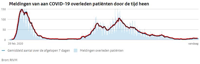
First the Covid mortality of the RIVM. The line is marked with red to make it more visible in the other graph. This is the average across all age groups.
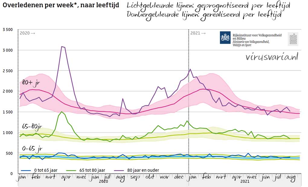
Then a graph from Statistics Netherlands: the excess mortality per age group. The light areas are margins of uncertainty. The light-coloured lines represent the expected mortality. The dark-coloured lines show the measured mortality.
From top to bottom: 80+, 65-80 years, 0-65 years.
We overlay both graphs. Where Covid mortality was (almost) 0, that zero line has been set at expected mortality. Because the red line concerns all ages, it does not quite match the highlighted ages, but enough to get an impression. Then some striking differences emerge, indicated by background colors.
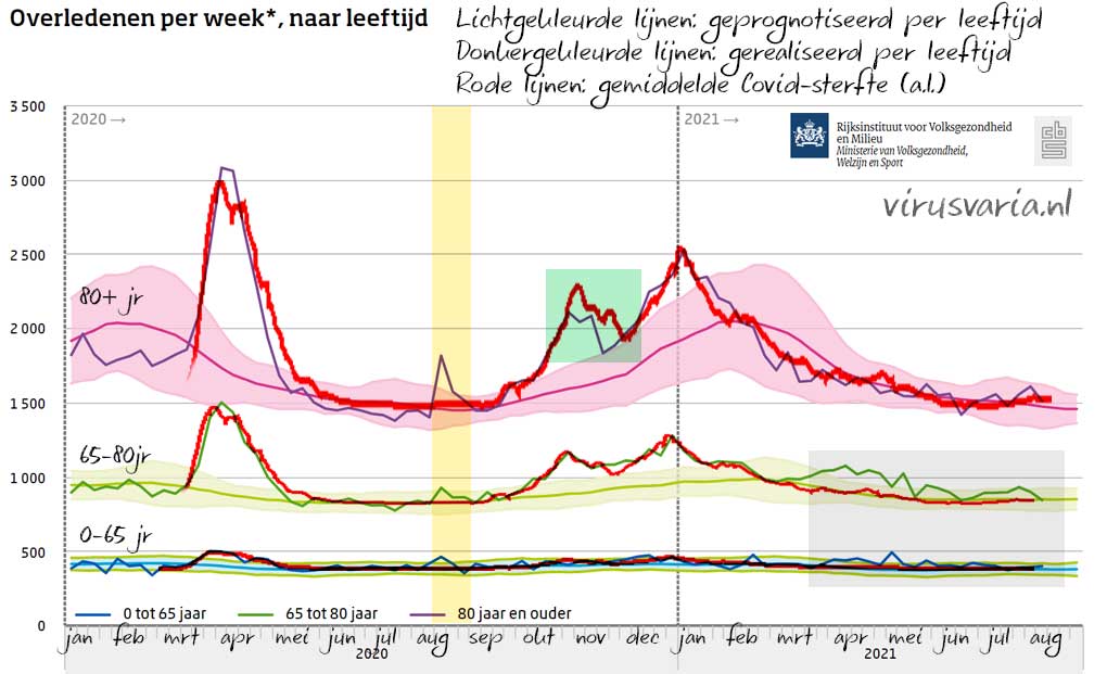
Excess mortality since March
I have indicated what it is mainly about with the gray rectangle. Especially in the age group of 65-80 years there is something striking. Excess mortality started there in March that will continue at least until August. That's not Covid because the red Covid line remains flat there – which makes sense because that group will then be largely double vaccinated. What did those people die of? It can't be the unvaccinated (due to Covid) because then the red line would have gone up with it. In the 80+ group there is less special in that period: the lines still wind around each other a bit. There has been excess mortality for several weeks now (and Covid is also rising slightly) but who knows, maybe that will drop again. If not, they would be about three months behind the 65-80 year-olds with long-term excess mortality.
If you look at the over-65s (you have to look closely), you will see the same thing: there, too, the blue excess mortality line will remain above the expected values and above Covid mortality from the end of March. It puts in there later than at 65-80. It was not Covid in this group either, and there is no flu. Where does this mortality come from?
The numbers at 0-65 are actually too small to be able to say anything about it on the basis of this graph. A numerical study is necessary to take a closer look at these groups and to count how many people have died. Does someone throw themselves up? Or could the designated authorities come up with a conclusive story?
I am very curious about what data analyses will yield and what causes of death will be mentioned. In the previous post I already gave a push.
More information
To the left of the yellow column (May-Aug) we see a period of undermortality, especially in 80+. That makes sense after such a peak and with a low prevalence of the virus.
In the yellow column itself we see the heat wave peak, which clearly affected the oldies the most. The red Covid line remains fairly flat there. You could say: proof that other causes of death are not attributed to Covid. In short: the differences are quite easy to interpret and the trends are similar.
In the green square, it is striking that covid mortality has been well above total mortality for several weeks. Now the lines are often not completely synchronous, but this is still quite substantial: throughout the month of November, significantly fewer people seem to have died than Covid patients have died. Of course, that's not possible – or is it? A registration error?
Not only in the Netherlands
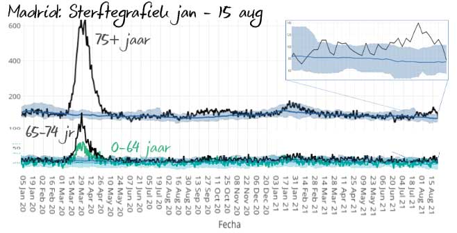
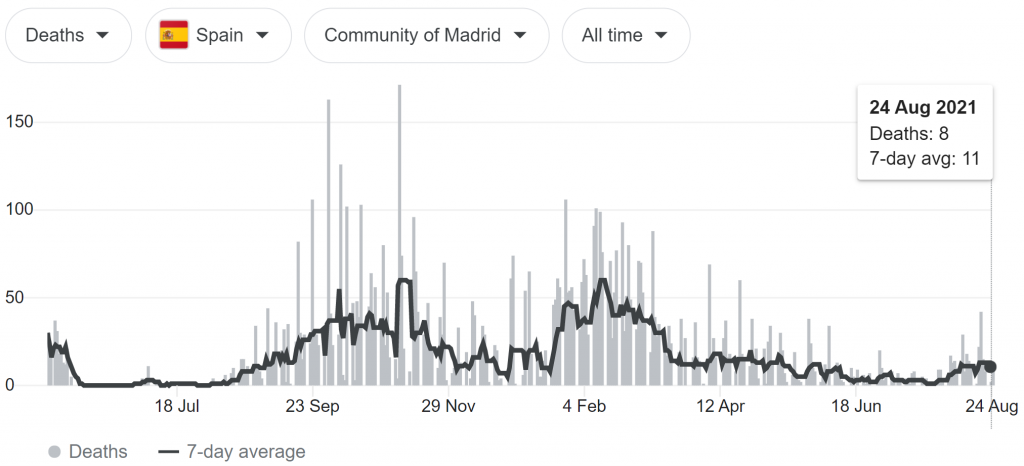
Maurice draws my attention to the fact that there are similar graphs from Spain (Madrid to be precise) that zoom in on the last few weeks among the over-75s. The 65-74 year-olds give a less intense but similar picture, in the 0-64 group it is even less.
We have also heard alarming noises from Israel before. Something seems to be going on. Now it may be that we as beer mat calculators miss the mark. But if we can explain this, why hasn't VWS, rivm or Lareb already explained how they think it is? This has been going on for weeks. Is it the deadlier Delta variant? It does not seem so deadly in other countries.
Of course, it is also suggested here and there that it could be side effects of the vaccination and a worsened response to variants or ADE, an overly severe response in vaccinated people (a study on ADE is in peer review). The issue of vaccine-trained variants (immune escape) also continues to come up, if we ask Geert VandenBossche. However, the latter two are unlikely because then the red Covid line would probably not have remained flat. Someone else suggested that this could be the result of delayed care, which was a problem especially in the Netherlands because of the substandard care capacity.
To end cautiously (pseudo)scientifically: there seems to be reason to recommend further research. Before it has been scientifically proven that there is no relationship between vaccinations and excess mortality, it may be an option to consider whether a vaccination pause would be appropriate. But that will probably not benefit the willingness to vaccinate.
Possibly related articles
Only "related" if the side effects actually turn out to be related to the excess mortality because correlation is not causation: the causal relationship must be scientifically confirmed or excluded. Thorough research should show that. As long as excess mortality is not recognized and Lareb is satisfied with the reports, such an investigation will not get off the ground. After all, that would not benefit the willingness to vaccinate and neither would the pharmaceutical companies.