At the beginning of December, a renewed/updated study by the RIVM (1) and a statistical calculation by Statistics Netherlands (CBS) (2) on the corona period and the continuous excess mortality was published. Various media responded to this, including science journalist Maarten Keulemans of de Volkskrant (3). The scaled-down care is called 'constant care infarction' by Gijs Loef, but one thing is clear: "in any case, it was not due to the vaccines".
How harsh are these claims now? At the end of the day, it's statistics, and with statistics, you can prove anything, but you can also obfuscate it, depending on how data is presented. Let's take a closer look at some of these presentation techniques.
What you should keep in mind when reading government reports on corona.
Presentation technique 1: Simply attribute beneficial phenomena to the imposed (vaccination) policy
A well-known example is the Healthy Vaccinee Effect (HVE). Already appointed by various experts, and also recognized by the RIVM. But how big is this effect, and does it have an impact?
The basic explanation is: healthier people are more likely to get vaccinated than unhealthy people. At the same time, a person with a (substantially) shorter life expectancy will be vaccinated less often. But basically it comes down to the same thing: the initial situation (health) determines the behavior of the person; But the behavior does not determine the result (health). As a result, the possible causal relationship is reversed.
To illustrate: A scratchy 75+ without underlying suffering will not want a potentially serious course of a corona infection, and will get vaccinated. A 75+ with all kinds of ailments, dependent on home help, who knows how fragile his condition is – and how short the life horizon is – will be less inclined to get a vaccination – if transport can be arranged at all. So there is a greater chance that these 75+ with ailments will not get a vaccine. In addition, we have groups of people who receive palliative care or are in hospice, and where pain relief is the only care treatment. These are also listed as unvaccinated.
The group of unvaccinated people therefore naturally contains more people with a (very) short life expectancy. And vice versa, the group of vaccinated people will contain a relatively large number of people who are healthier, with a longer life expectancy. This is called HVE for short.
This effect will be different for each age group. With the 50-min, you have relatively many people with a long life expectancy, and only a handful with a short life expectancy, and this effect will be less. This effect will also be less in people with advanced age. Life expectancy there is already quite low, and one, two or three months less, will not be so noticeable. The HVE effect will be greatest in groups with a moderate life expectancy.
Does that play a role in the studies by RIVM and CBS?
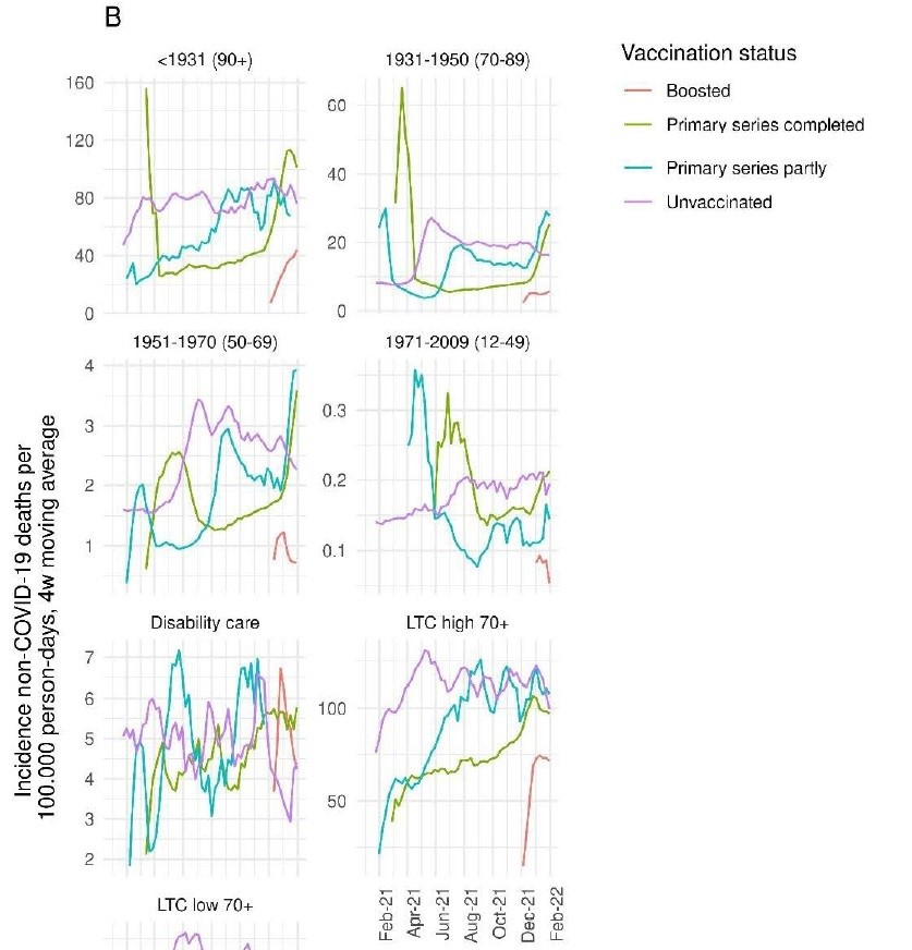
The National Institute for Public Health and the Environment (RIVM) showed a study (4) last year and there was an interesting graph in the supplementary. (5) Graph S3 showed the difference in mortality between the different vaccination groups at week level. And if you zoom in a little deeper on those groups, you'll see that the purple line (Non-covid mortality of unvaccinated per 100k "persondays") increases every time once vaccination starts. In this study, this concerns all causes of death except COVID-19.
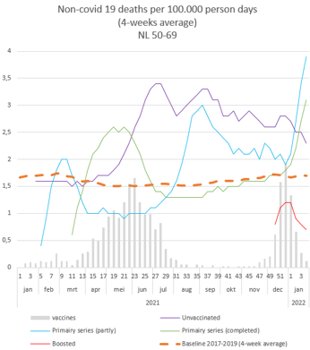
I have imitated these graphs myself and used the moment of vaccinations. As an example, I will take the 50-69 group. The group with mediocre life expectancy. Here you can clearly see mortality rising in the unvaccinated group (purple line) during vaccination and then slowly decreasing. A relatively large number of people with a shorter life expectancy do not get vaccinated.
After the vaccination period, you see that some of these people indeed die quickly, and therefore the line slowly decreases, and the effect becomes less. A clear HVE in this group. Mortality has more than doubled in a span of 4 months.
We also see a similar effect in the CBS report. When vaccination got off to a good start in the spring of 2021, mortality per 100k (per 100k) also rose rapidly among the unvaccinated, and then slowly dropped back to normal. To weaken the sawtooth somewhat, CBS, like the RIVM, should have opted for a 4-week average. But despite this, we also clearly see that HVE effect here. It should be clear that the HVE is clearly visible, and also has (great) influence.
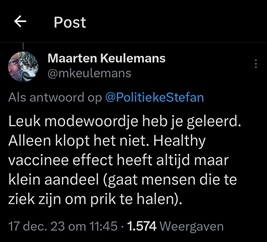
Maarten Keulemans makes us believe this on X All the time only has a small effect. Of the total population, it may only be a small percentage of people who are in hospices, etc., he reasons (probably calling Ruben van Gaalen).
But only a small number of people die every day. The effect is therefore clearly visible in the mortality graphs.
With a vaccination rate of 85%, “a few people” with a life expectancy of a few months add up to the death statistics of unvaccinated people.
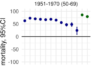
The RIVM report even shows that the Vaccine Efficiency (VE) against Non-COVID-19 mortality in the 50-69 group in the first 7 months, it is even between 60 and 70% (figure S2 in supplementary)(5).
In other words, it is a miracle vaccine, which brings down the overall mortality, (where does that excess mortality come from?) or it is a strongly different effect, which clouds the figures. And could this perhaps have something to do with HVE? And that brings me to Presentation technique 2.
Presentation technique 2: Making comparisons that turn out positively.
As explained above, clouding does not allow you to compare the groups vaccinated and unvaccinated one-on-one. Dividing a population 'randomly' doesn't work. Therefore, the more serious studies try to match the groups, by having people with the same traits appear in both groups. However, CBS and RIVM do not do this.
We now know that non-covid mortality in the unvaccinated group is sometimes twice as high compared to the vaccinated group. Why, then, do people choose to compare these groups?
Why not compare mortality with another basic data? For example, the average mortality in the years 2017-2019 (per 100 persondays). That will be much purer.
I have calculated this baseline / trend line for the various groups. As an example, the 50-69 year olds. Until the vaccination campaign picks up steam, you will see the purple line (unvaccinated) following the baseline.
After the vaccination period, the green line (basic vaccination completed) is just below the baseline. This seems logical to me, since we know that there are relatively many healthy people in this group. But what happened to the vaccinated group in the meantime? Why was mortality higher there? Is this the reason to compare vaccinated with unvaccinated? Would that give a more favorable result?
In my opinion, this is Presentation Technique 2. It is more favorable to compare both groups with each other instead of with a baseline mortality line. In other words, in this case it is a clear choice to show the most favorable effect possible in the study.
Presentation technique 3. Use meaningless charts.
CBS shows graphs that don't really say anything. Such as 3.4.1/2 most common causes of death among men and women. A top 10 is shown, and it is mentioned that this is about 50% of the causes of death. If a cause of death has a significant increase, for example, it doubles, but falls into a relatively low percentage of 1%, and therefore doubles to 2%, you will not see this in the graph.
In addition, there is also no standardization. As the population grows and ages, you can expect there to be more absolute deaths from cancer. While the techniques are getting better and mortality is decreasing in percentage terms. Calculating back to 'per 100k' is a good method. If we now look at the neoplasms (cancer cases) among men. (Causes of death can be downloaded (7) and then edited with Excel.)

If we rank the data as in the left table (standardized per 100k), then a downward trend is visible in the subgroup 2. Fewer and fewer men are dying of cancer. If we then leave the pandemic years out of the equation for a moment, and let Excel calculate an automatic regression line (trend line) from 2011-2019, you end up with the orange dotted line.
This line can be extended to 2020, 2021 and 2022. This is your expected mortality for this cause of death. And from this "expected" mortality, you can then calculate what the deviation is as opposed to the actual mortality. This is how the 2e graph
A common range was between -25 and +25 more deaths compared to expected. Then in 2022 we will see an outlier outside the usual bandwidths. With an expected mortality of just under 1000 people (per 100k), a deviation of 40 (4%) is not a very large deviation, but one to keep an eye on because four times as much as the average of the previous 10 years. When the causes of death for 2023 are released, it will hopefully give us more direction. Was it a one-time outlier off, will we see this more often in the future?
This expectation can be calculated for all groups (5-year cohort) and for all causes of death. Deviations should be considered on the basis of previous years. Sometimes even 2% deviation can indicate a statistical change.
In this way, you do show clear graphs to the readers.
Presentation technique 4. Choose relatively short periods and spread them out over the entire population.
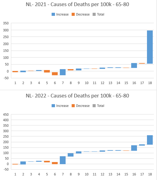
As you can see above, you can make predictions for the years 2020-2022 from the 2011-2019 trend. In an earlier analysis (6) by CBS, you can see that they show relatively short periods (2015-2022) and on that basis they 'show' that something falls 'within' the bandwidth. Like, for example, the cup cardiovascular disease. In this view it appears as if those figures fit within a certain bandwidth. But if we extend the data series slightly to 2011, and zoom in on the population 65-80, we see a different picture. A downward trend – until 2021.

Below we see a downward trend in the left graph, with the trend line 2011-2019, and in the right graph the deviations from the trend line, of roughly +10 and -10 deaths. Which is a deviation of 2.5%. But from 2020 onwards, we see the proportion rise sharply, to 70 extra deaths (per 100K) above expectations, or a deviation of 20%. This should set off alarm bells at CBS. Nothing could be further from the truth.

Quotes from the CBS reports:
"There was also a slight increase [in 2022] in the number of deaths from cardiovascular diseases (+4 percent)"
"At the time of the COVID-19 epidemic, the seasonal patterns of other (main groups) causes of death have changed and especially in 2022, mortality from respiratory diseases and non-natural causes of death (accidental falls) is higher than expected."
The sharply increased mortality (20%) among 65-80 year-olds is not mentioned. It falls away by just looking at the total population, and for a relatively short period of time.
Presentation technique 5. Covid falls under respiratory diseases but also forms its own category. Use both.
Let's take another look at the pronunciation "At the time of the COVID-19 epidemic, the seasonal patterns of other (main groups) causes of death have changed and especially in 2022 is the mortality from Diseases of the respiratory organs and non-natural causes of death (accidental falls) higher than expected.".
The disease of the respiratory organs. So what do we see there? According to Statistics Netherlands (CBS), mortality increased in 2022.
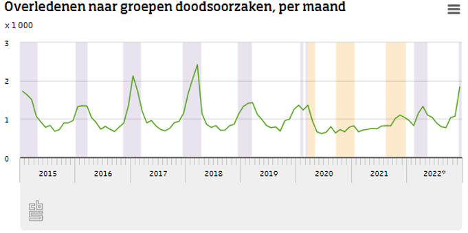
The illness of the respiratory organs seems to be strongly related to the flu seasons. "Spicy" flu seasons significantly increase mortality to the respiratory organs. Mild seasons show lower mortality.
Let's use the same method as before. We select the total population and now look at the disease of the respiratory organs. We then see more outliers by default in the non-pandemic years. Abnormal years add up to more than 10% extra mortality from respiratory diseases. If we again draw up a forecast for 2020-2022 from the trend line, we see that the year 2022 hardly any higher mortality than expected in this group. It is true that 2020 and 2021 have a much lower mortality than expected because the regular mortality peaks are probably in the subgroup 18. Corona have been booked.

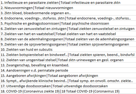
And what about the accidental fall? This is in subgroup 16 of the causes of death. In its press release (8), CBS described that ICD-10,R99 (Cardiac arrest without reporting the cause) has been shifted to the heading of the heart disease. But in the downloadable data of Statline (7), this cause is located under subgroup 16. In this subgroup, CBS attributes the excess mortality to "accidental falls", as suggested in section/graph 3.3.1.6 & 7. However, the 10% increase in accidental falls does not explain the exponential growth in corona years 2020-2023. In 2022, a deviation of 40% is seen.

In conclusion
There are even more techniques to recognize. But I'll leave it at this for now. As you can see, sometimes conscious choices have been made to make incorrect comparisons, or not to zoom in, and to keep it global.
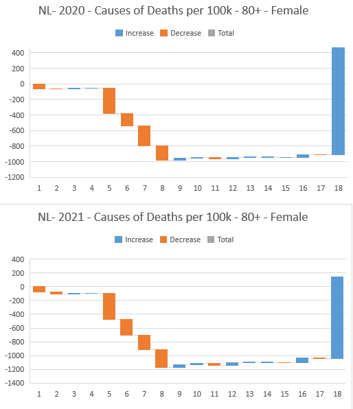
In addition, a remarkable replacement mortality can be seen among the 80+ women in the pandemic years 2020 and 2021. Here you see causes of death 5 to 8 are considerably less, and compensate for almost the entire mortality from covid-19. A similar picture can be seen among the 80+ men, but to a lesser extent.
4)https://www.medrxiv.org/content/10.1101/2022.07.21.22277831v4
7) https://opendata.cbs.nl/statline/#/CBS/nl/dataset/7052_95/table?fromstatweb






It is of course bizarre that deaths among unvaccinated people increase after a vaccination round (the purple line). I think it's relevant to know exactly when someone is considered vaccinated. I don't think it's until after 2 or 3 weeks. Is that still the case? So anyone who dies shortly after an mRNA vaccination is written off as unvaccinated. In this way, as Norman Fenton also stated, you can sell the greatest poison as a safe remedy.
Isn't that the most logical explanation for an increase in mortality among unvaccinated people immediately after a vaccination round?
This trick has been used throughout the period, and seems to me to have a huge impact on the graphs above.
It's becoming quite a complicated story, so maybe my comment is a mistake, but I wanted to mention it anyway.
I think that's still the case, indeed.
I think this piece is also mainly about how eea is misrepresented (3x word value someone? ;P) which also obscures this. But also, if I understand it correctly (because it is indeed all becoming rather complicated by now), that the significant increase in cardiovascular diseases in particular is being covered up ... And what could be the most obvious cause of this? 🤔 Because it can't be the of course... 🙄🤷🏻♂️
Correct and/or complete me if necessary.
Ok, thanks for your answers. I think it's 2 different goals that we're talking about. This article is mainly about the techniques used by the RIVM to present things differently than they are. Putting up a smokescreen.
I'm looking for a logical explanation for the excess mortality, and of course RIVM is not going to provide us with one.
Then it becomes extremely important to use the correct definitions of 'vaccinated'. That will be one of the challenges of Ronald Meester and Marc Jacobs.
You're absolutely right. If someone dies within 2 weeks of getting the poison shot, this death is counted as unvaccinated. The above article completely ignores that and that is a blunder.
RIVM divides its research into 2 parts. For Vaccination Effectiveness you only count 2 weeks after vaccination.
In the case of death after vaccination, the day the vaccine is administered counts.
CBS has not specified this, but I suspect that they use the same data, since they use the same data.
No mistakes. The effect does exist and could have been mentioned, but its share is limited and is mainly relevant when comparing "basic series partially" and "basic series complete". In any case, it is not the case that "unvaccinated" also contains everyone within two weeks of a shot. That's not how it's presented. A statistician friend of mine checked this for us. He says the following about this:
"I also checked the original RIVM report again (as promised). It is true that on the day of vaccination 1 you immediately switch to status "basic series partially"; and 2 weeks after injection 2 (or 4 weeks after a Janssen injection) switches to "basic series complete". And as mentioned, most of the VE analyses in the report focus on "basic series complete" (and then number of months since basic series complete).
So anyone who dies before "basic series complete" does not have the status "basic series complete", and that can be up to 2 weeks after injection 2. So (indeed) vaccine-induced mortality shortly after the jab is thus largely hidden. Vaccine-induced mortality shortly after jab 1 falls into the category of "basic series partially". Vaccine-induced mortality shortly after jab 2 also falls into the category of "basic series partially". This no doubt partly explains the significant gap in the reported VE between on the one hand VE of 'basic series partly' versus VE of 'basic series complete m1'. E.g. for VE against covid death, people geb between 1931-1950, 75% vs 98% reported VE. That difference between them is undoubtedly partly due to the fact that vulnerable people died there, in part probably due to either jab 1 or jab 2! So that's where those vaccine-induced deaths are.
For the rest, the 'larger' effect that influences the VE results is indeed the very large healthy vaccine effect. As a result, the ACM-VE is supposedly 50% over a long period of time. Compared to the really totally unvaccinated."
Can I assume that this response was also sent to the RIVM, CBS and Keulemans? And if so, have they already (or not adequately responded)? Let me guess... Anyway: thanks again, happy New Year's Eve & all the best for 2024 ... what that may yield in terms of statistics on this.
There has never been a reaction from the institutes to anything. They can't remove that lid from the well. Even in woo proceedings, they remain recalcitrant.
Nice analysis again, Bonne
They don't look beyond what the narrative (Safe and Effective) allows. Sometimes it even seems to be purely aimed at confirming this narrative. The will to know what's going on, to do science, is lacking.
https://photos.app.goo.gl/f1h8yxuUgJViEpk58
I think the determination of the cause of death by the medical examiner is also strongly influenced by the narrative at play (in which Covid 19 is a horrible deadly disease for everyone! and vaccination is the only remedy).
Autopsies that could give a definite answer are done less and less in the Netherlands, almost none. In Germany and Finland it still is
Remarkably enough, Covid deaths are still being reported there recently (see our world in data) in Finland (don't know if this will turn out to be vaccination damage on further histological examination).
In my opinion, a graph showing the number of ambulance trips or 112 calls for medical reasons, versus the number of injections, would also speak volumes. I felt like the fall got out of hand during the campaigns. Correct for smoothness of course:)
We always learned that about 85 percent of the adult population had been vaccinated at least once by the end of 2021. But administratively, over the whole of 2021, no more than 40 percent of the population had been vaccinated. And you have to use this figure to make a better calculation of 'effectiveness shots'.
Namely, 15 percent were never vaccinated. With Janssen that the young people received in May, June, you were only considered vaccinated after four weeks and people who received the two injections fit weeks after the second shot. Most adults in their fifties and fifties were not vaccinated until July and were therefore not 'vaccinated' until August. Elderly people who got their shot in January were no longer considered vaccinated six months later if they didn't take the next shot, which was still based on the Wuhan, by the way.
Dit lage gemiddelde inentingspercentage heeft veel meer een dempend effect op de effectiviteitscijfers dan wat in het artikel beschreven wordt. In 2022 was het inentingspercentage nog lager omdat gezonde zestigminners (uiteindelijk) niet meer werden ingeënt
Have you seen this yet?: https://rumble.com/v140n0y-pandamned-documentary.html
Definitely, although I don't remember the exact content. It was a beautiful voyage of discovery by Martijn Poels, I still remember that.
Hi Anton, I've already done that for you with WOO request:
======================
CBS 4 Scientific questions about Excess Mortality Survey December 2023
Following the research published by you on December 11, 2023, I have the following comments and questions. https://www.cbs.nl/nl-nl/longread/rapportages/2023/oversterfte-en-doodsoorzaken-in-2020-tot-en-met-2022?onepage=true
Questions
You conclude (1) that mortality from Covid-19 is positively associated with "Lower mortality"; That seems plausible.
You also conclude (2) that mortality from "Other causes" has no correlation with vaccination status. That is what my questions are about.
You have used a rather restrictive definition of “Vaccinated”. See appendix *: only 2 or 4 weeks after the full series of vaccinations instead of after at least one vaccination, which is much more logical for such a conclusion.
You announce the definition of the vaccination status in paragraph 2.5.2. indicates that you have also used a vaccination status without a waiting period of 2 resp. 4 weeks. However, this is not reflected in the research.
I would like to hear from you how this conclusion (2) can be scientifically justified if:
1. the “Vaccinated” status has been used so restrictively?
2. what the outcome is if the restrictions of 2 resp. 4 weeks is omitted?
I also have the following questions:
3. How do you explain that mortality from causes other than Covid-19 can be lower with vaccination than without vaccination, while vaccination is not indicated for this?
4. Finally, I would like to see a regression analysis, possibly. with substantiated population corrections, between the two variables
“All cause mortality” and “Vaccinated status”,
where “Vaccinated Status” is defined as “vaccinated at least once”.
A further breakdown of that regression analysis based on the above-mentioned definition you used and your definition is of course fine with me.
I request you to provide a scientifically sound answer to these questions.
WOO Request
In view of the great importance of this, I may assume that you have already carried out the research internally (overall or in draft/sketch), as stated in Question 4 above.
If you do not answer my above-mentioned question, I request you to provide me with the results of that (possibly global draft/sketchy) investigation as soon as possible.
* Status vaccinated
Vaccination status 'vaccinated' is defined as 'fully vaccinated' (i.e. two weeks after two approved vaccinations, or a positive test at least 56 days before at least one approved vaccination, or four weeks after vaccination where one vaccination counts as fully vaccinated according to the vaccination certificate, or when a booster or repeat vaccination has been administered without a known basic series) possible with boosters and repeat vaccinations. Vaccination status 'unvaccinated' is defined as no vaccination known or only one vaccination known without previously reported infection (with the exception of the vaccine where one vaccination counted as fully vaccinated).
** Additional analysis
An additional analysis has been carried out in which the definition of vaccination status does not take into account the criterion of two or four weeks. This means that people were counted as vaccinated immediately after full vaccination, without the need for a two- or four-week time difference.
Great, Jan. I'm very curious about the answer! Will you please keep me informed?
I'll be sure to let you know. However, I fear that such a "sensitive" question, just like that cost-benefit analysis at the Ministry of Economic Affairs and Climate Policy that I eventually received and contained staggering information, will also take another year......
Clever but far too complicated for 'the common man'. How are you supposed to find your way through all that reporting? The largest group hits you over the head with Keuleman's reporting, they don't look any further on e.g. this site, or on youtube to e.g. Campbell. I've read too many personal stories that are in line with my intuition to trust the vaccine. There doesn't seem to be a definitive answer from researchers. Or is that already there?
It's certainly way too complicated for 'the common man'... And I won't waste any more words about that follower.
But 'definitive', do you mean that the guilty will confess?