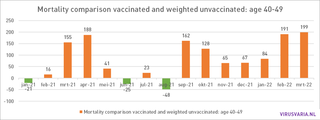
All charts in 1 post.
Explanation
More explanations and resources in a previous post.
When looking at the first graphs, also pay attention to the adjusted scale in the first three months, because the calculated mortality increased enormously there. That is why the scale has been adjusted.
Also realize that the group 18-39 is more than 2 times as large as the other groups. And remember:
Purple should be higher than yellow, then the vaccines are fine!
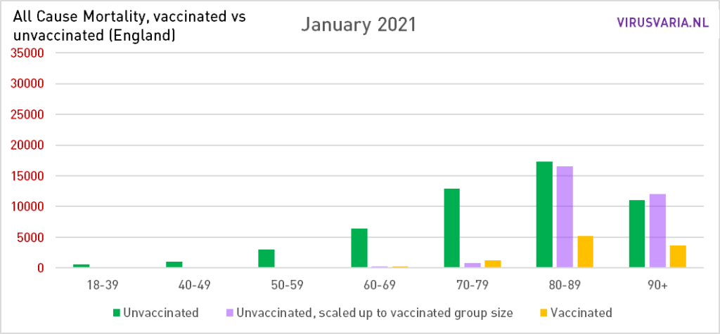
January 2021
The majority of the population is still unvaccinated, hence the high green bars. The over-80s got the jabs first – and it shows. The vaccinations were particularly effective for these groups at the time. Understandably, doctors were enthusiastic: they are used to paying attention to old vulnerable people.
(Note: The scale of the Y-axis (red numbers) changes during the first three months. As of April, the scale remains constant.)
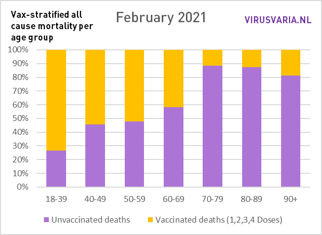
February 2021
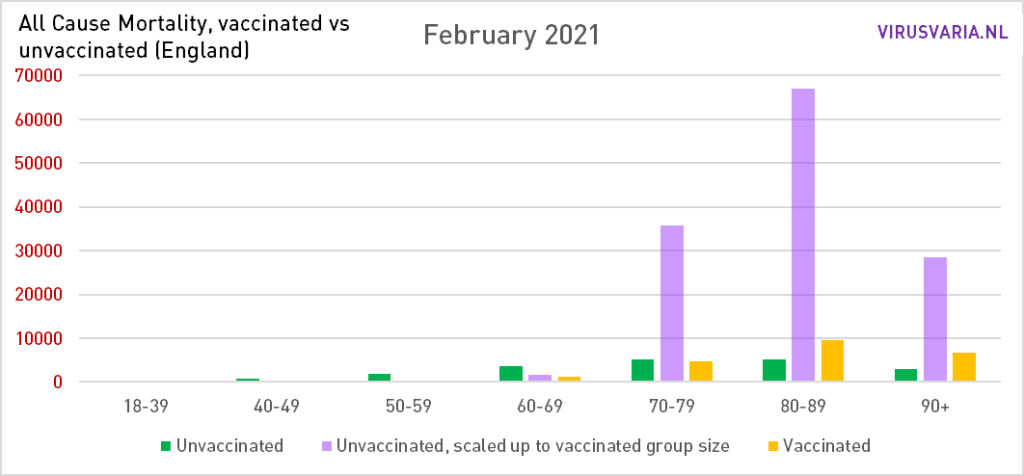
Vaccination coverage is rising. The over-70s are now also participating: there are considerably more deaths among the unvaccinated over-70s than among the vaccinated over-70s. Not in an absolute sense, because the green bars have become lower than the yellow ones, but after equalization of the group sizes. We would have liked to have seen this in all age groups. Later we zoom in on the 60-minners.
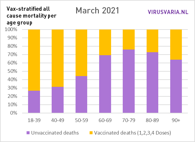
March 2021
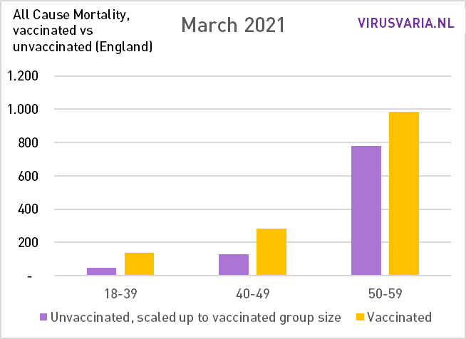
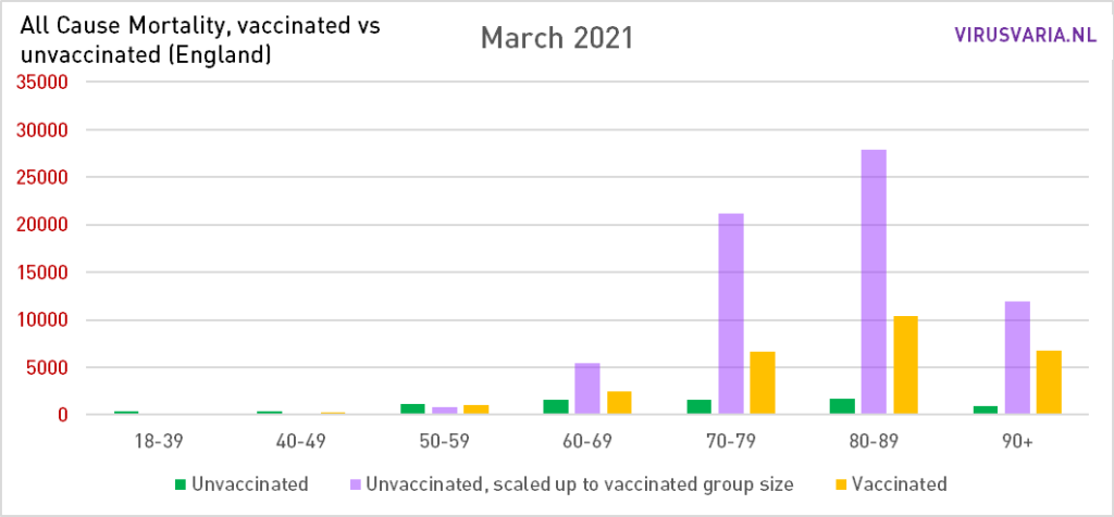
The yellow bars become higher in relation to the purple ones. But also the group 60-69 now has a clear advantage. The advantage of the vaccinations is now decreasing slightly among the over-70s (and therefore also those over 80). Tens of thousands of lives are still being spared. In the group 50-59 there is strangely enough something else going on.
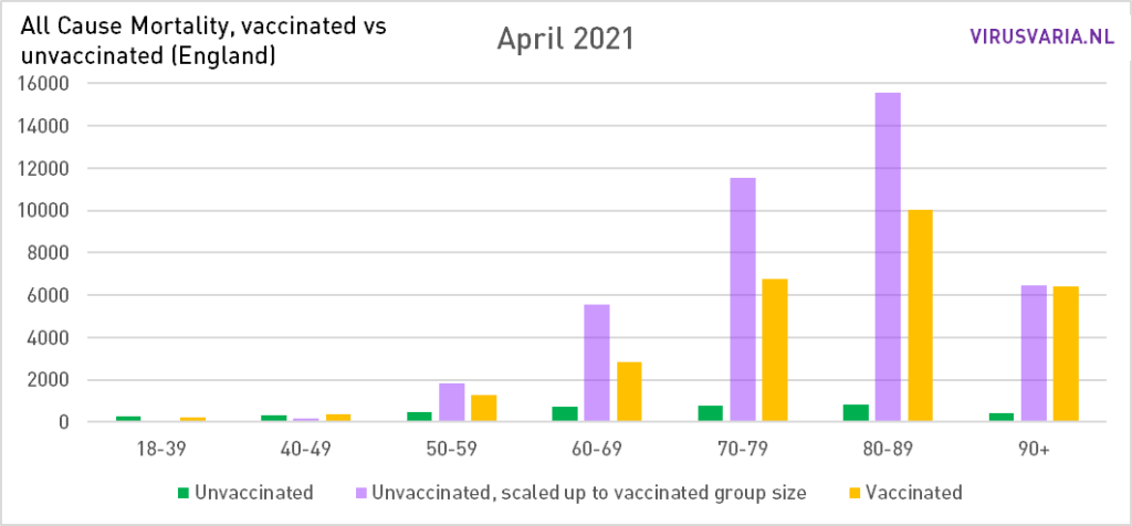
April 2021
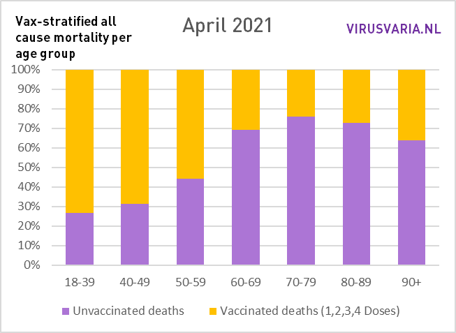
Covid mortality is falling sharply in England. The vaccinations are already largely losing their effect. Immunity increases. The difference between purple and yellow becomes smaller. Also at 50-59, an advantage of vaccination can now be seen. Among the over-90s, on the other hand, there is no longer a significant vaccination effect.
(Note: from here the scale remains the same so you can better compare the height of the columns)
May 2021
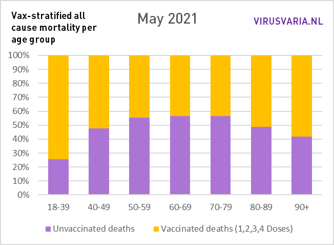
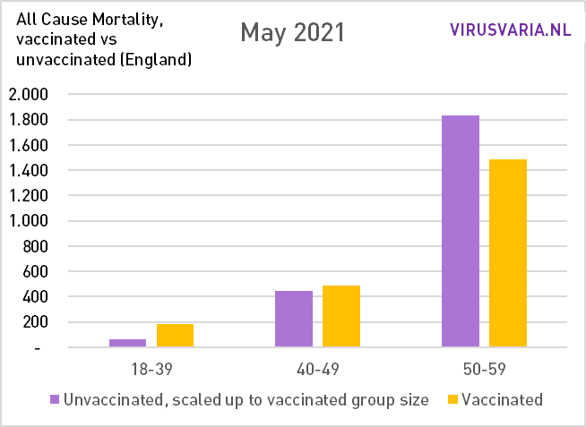
The balance is now also tipping among the over-80s: the mortality rate among vaccinated people is higher than that of unvaccinated people. Covid mortality is falling substantially, so any vaccine effectiveness may make little difference. What's left?
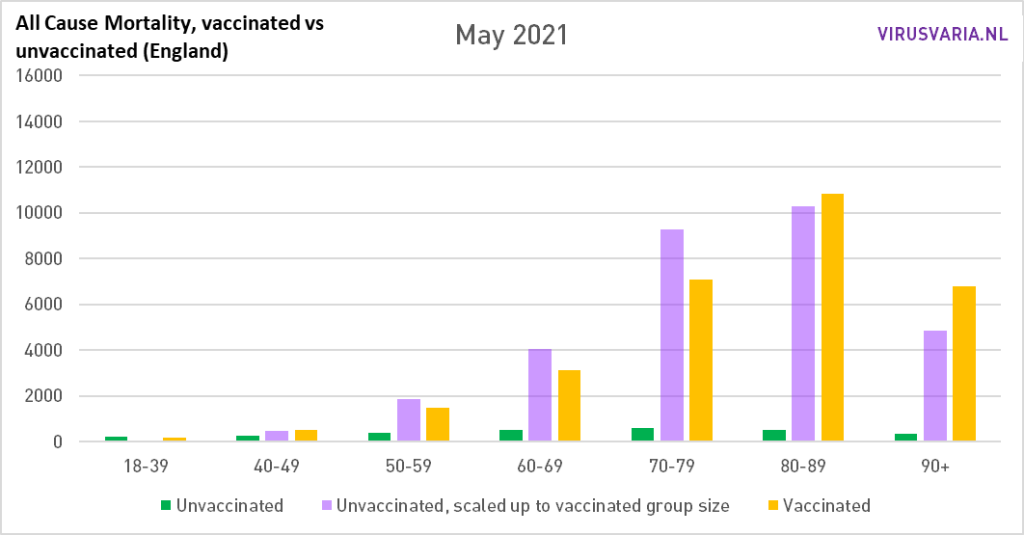
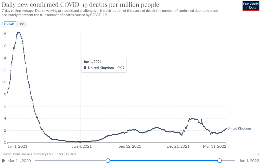
May and June were months of very low corona mortality in England. The line graph of ourworldindata also shows how high the covid mortality was in the first three months of the year. A vaccine that has even a little positive effect will make a difference there – and it did for the elderly as well.
As the year progresses, we will see how the effectiveness drops (also the booster only briefly brings relief). At the same time, immunity among the population is increasing, making it even more difficult for the vaccine to distinguish itself positively.
June 2021
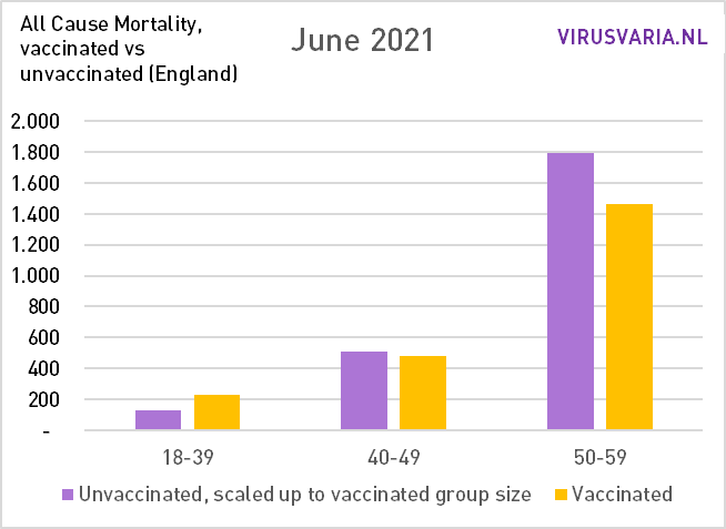
Almost no covid mortality but still difference in favor of vaccinated people, also among the over-50s. If you look at the graph of ourworldindata you would almost wonder what those unvaccinated deceased actually died of in the summer. Something that vaccinated people were less bothered by, while there was no covid... There were hardly any corona deaths. Then I involuntarily think of a "technical error". I cannot explain this otherwise. Suggestions are welcome.
The seventies are also approaching the critical limit. It now looks just like what we have seen all these months in the groups up to 50 years of age: relatively more mortality among vaccinated people, even in times of high covid mortality as seen in February and March.
This is most likely a confirmation of the fact that the first were also the first to go without protection. Look at the over-90s. And why the mortality then becomes even higher is the elephant in the room.
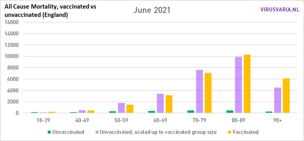
Purple must be higher than yellow, otherwise it is not good with the vaccines!
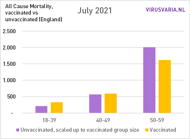
July 2021
In July, the covid mortality in England starts to rise again, that only happens again in the Netherlands in October. If anyone knows of an explanation for this, let them know in the comments. 70-79 is now also on the wrong side.

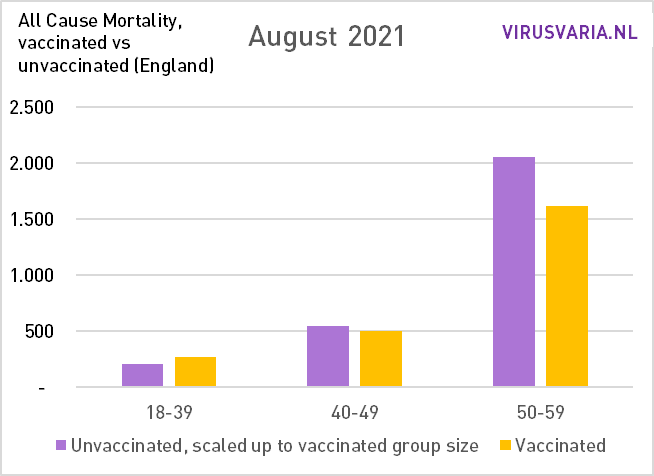
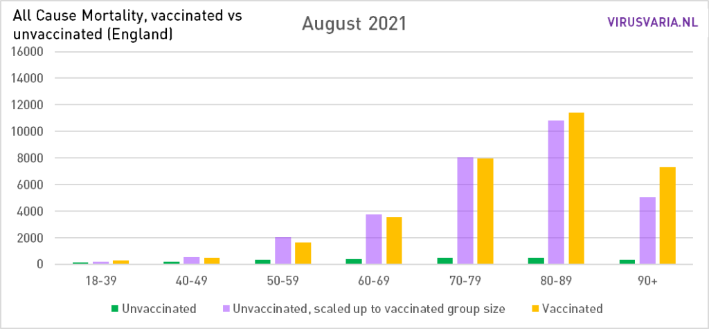
August 2021
The same image as in July, although the seventies are catching up. Such a trend break can also be an administrative issue.
September 2021
Even with the fifties, the effectiveness is now starting to fail. In the younger age groups, the yellow bar remains longer than the purple one: persistently higher mortality among vaccinated people. QALY calculations will hopefully show whether it outweighs the life gains of the over-80s and over-90s...

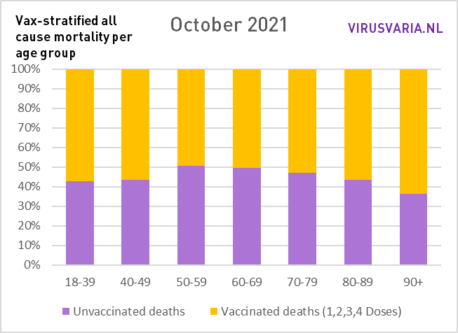
October 2021
Winter is coming. Nevertheless, covid mortality remains fairly stable in England until January. Do we still see clear benefits from the vaccinations? At 50-59 maybe a tiny bit (just checked and indeed: 1797 to 1769). Those are not differences that will make us very happy or worried. Overall, it doesn't seem like it offers any benefits in this month to have vaccine immunity in your body. If you had used drugs such as Vitaminde D and ivermectin, you could have stopped using them. You can even turn off ventilation.
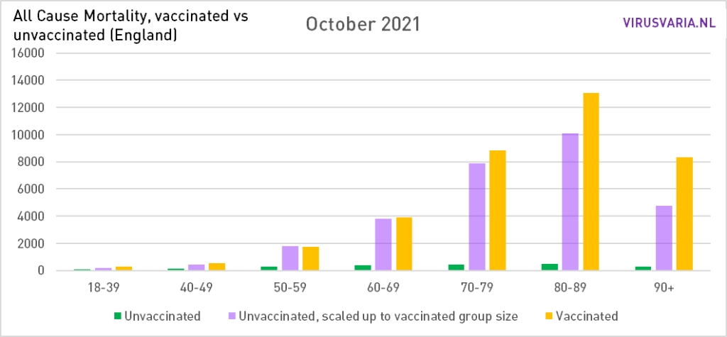
If yellow really gets higher than purple, then it's wrong with the vaccines.
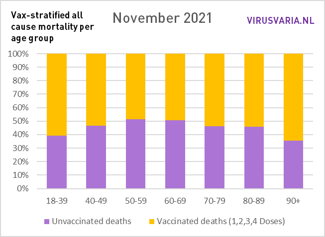
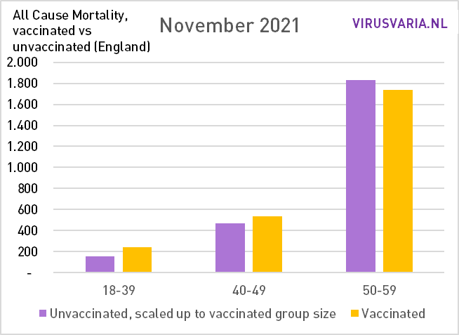
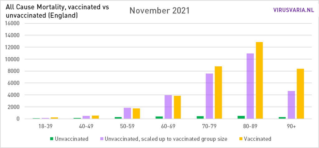
November 2021
Little difference with the month before. Covid-19 solves further in the noise thanks to Delta.
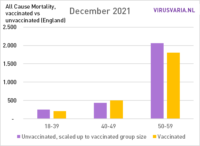
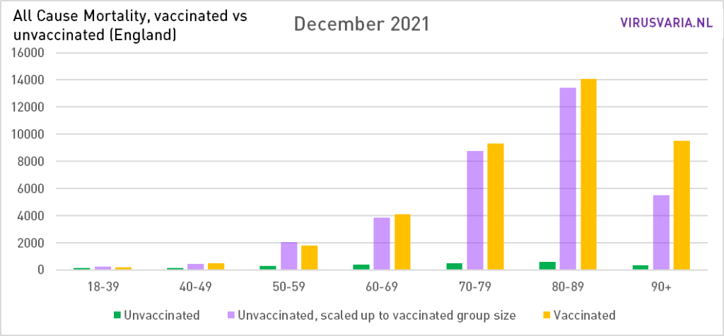
December 2021
The entry of Omikron. It is striking that the group of 50-59 is the only one still to benefit from the vaccinations.
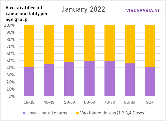
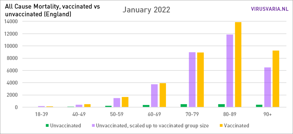
January 2022
Omikron hunts through England. It is possible that the extra mortality that this entails (such as every flu season) still keeps the bars of 50-79 somewhat in balance. Then it quickly descends via February to March...
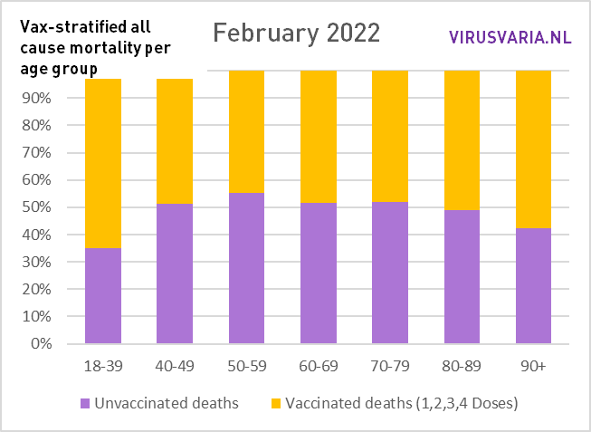
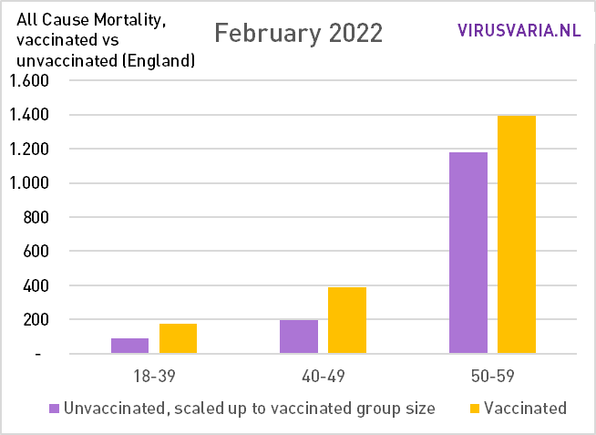
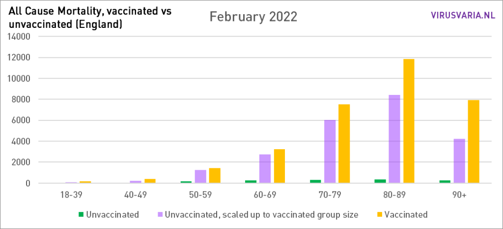
February 2022
The End Game. for the first time, mortality among vaccinated people is higher In all age groups, even at 50-59 who bravely lasted so long.
How long will this remain the case? This is more mortality than necessary. Because even in the groups under 70 it still does not look good and that is ticking, especially in terms of lost years of life. This should be visible in the excess mortality rates. Wasn't there a committee somewhere in the process of interpreting excess mortality? Send them this blog?
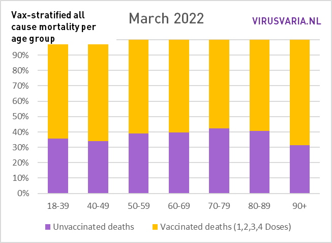
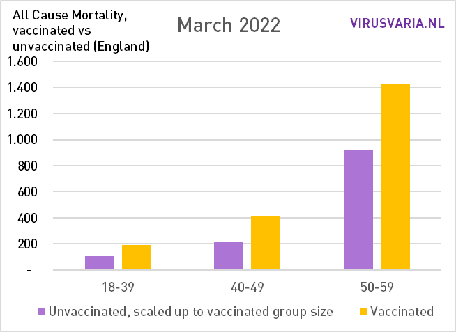
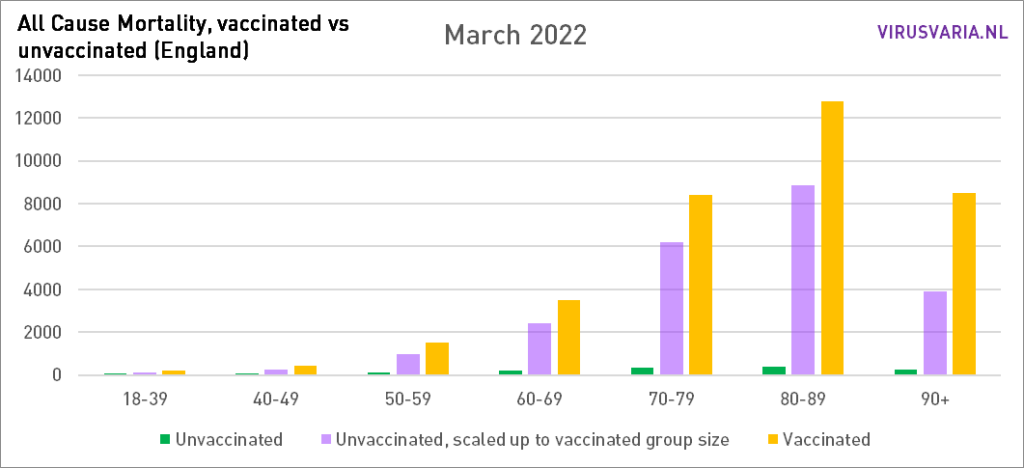
March 2022...
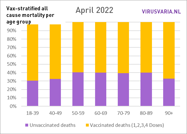
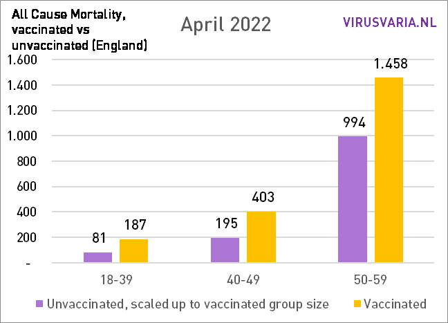
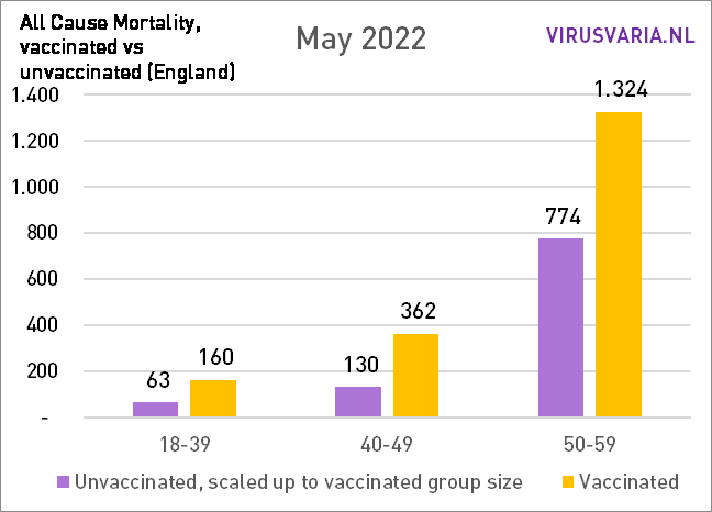
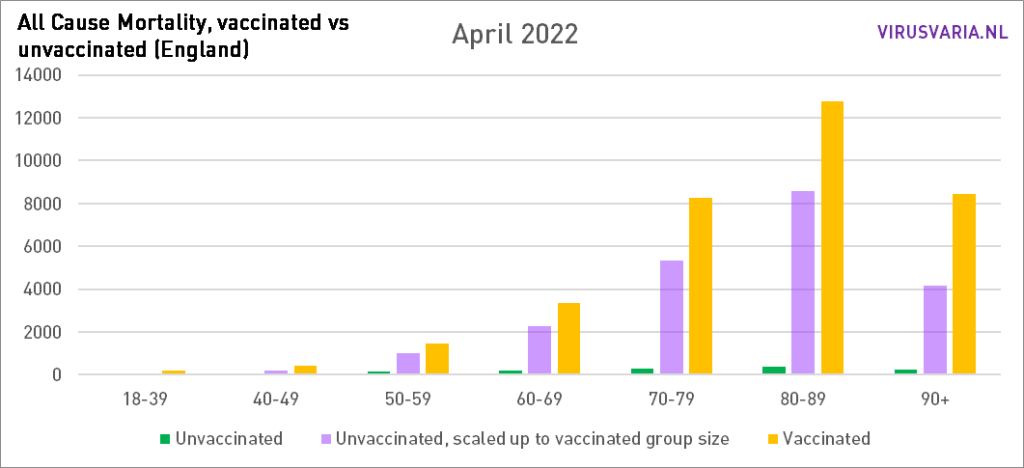
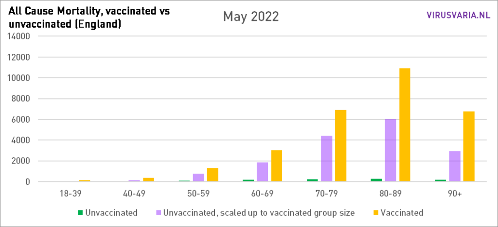
A downright dramatic picture. We'll just wait and see what April will look like. If this continues for a long time - let's hope that the trend does not continue, it has already been bad enough - a cause will have to be invented that actually kills all those people. Monkeypox? Who's to say. As long as there are things to hide, such as causes of death, we have to guess (I'm also going to unabashedly throw a throw soon. It's been enough now.)
18-59 in more detail
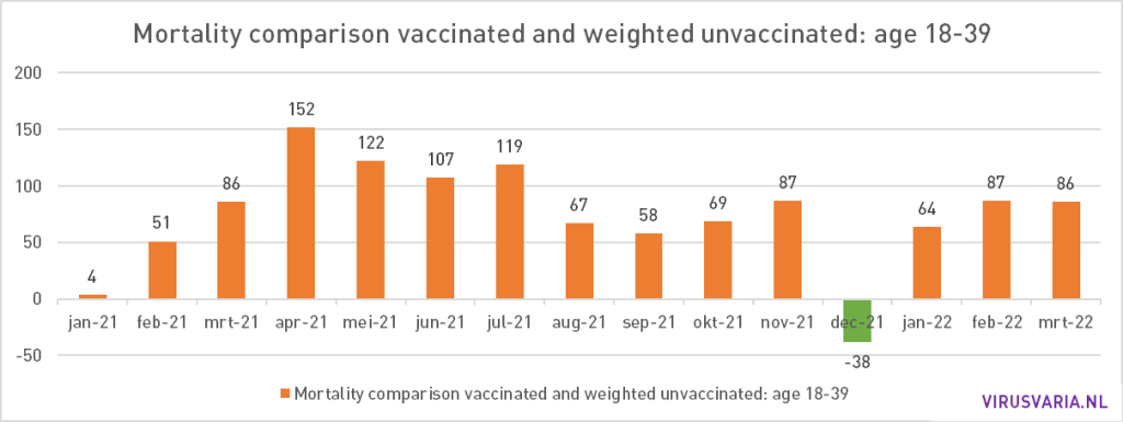
In the two youngest groups, mortality rates are traditionally very low. The group of 18-39 consists of 19 million people - but with minimal mortality chances. Every death, especially at 18+, is one too many. This is not clearly visible in the graphs above.
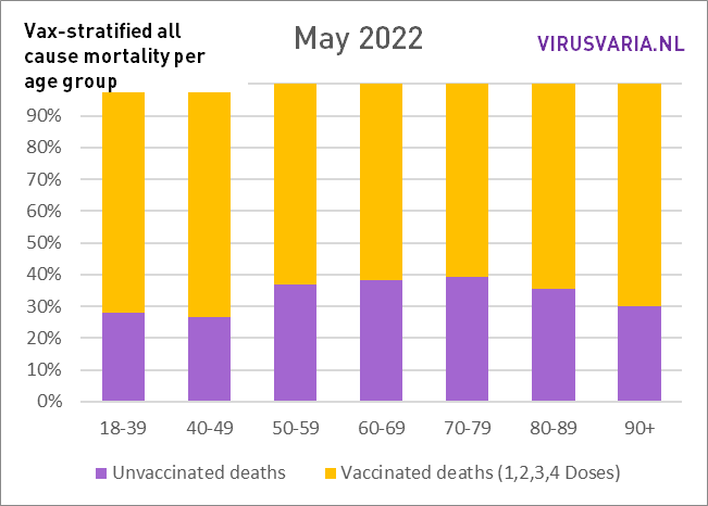
Therefore, below is the proportions with the older groups. The larger the yellow or purple part, the more deaths relative to the other vax group. Over the course of the year, the yellow bars get bigger and bigger, which means that the unvaccinated will do relatively better as time goes by. Again: all based on the figures from the Office for National Statistics, UK.

