
In the graphs below, the population data from NIMS are used. As a result, mortality rates among the unvaccinated, at least in some age groups, may be lower than they actually are.
Because England works with impure population estimates, we don't know how many unvaccinated there are. The population size used has a direct effect on reporting on unvaccinated people. The deviation also differs per age group. It is not yet clear whether and if so, how this can be adjusted; the UKSHA (UK Health Security Agency) is working on this. The ONS says about this:
"We hope that the work UKHSA is doing to improve the NIMS data (including removing duplicates), along with the work ONS is doing on population estimates and the 2021 census, will improve our understanding. It is really positive that ONS and UKHSA are working together to try to find a solution to this problem, which is so important for so many statistics. Given this uncertainty, knowing the implications of the different choices can help users interpret the presented data with caution."
More detailed justification can be found in the post "UK professor: 'Data on mortality by vaxx status are junk' “
Let's hope that the de-duplication is carried out without looking at the effects on the vaccination effects with half an eye. Organizing an independent regulator would be wise (Prof. Fenton probably wants to help) otherwise it will be just as powerless an operation as the excess mortality investigation by CBS/rivm.
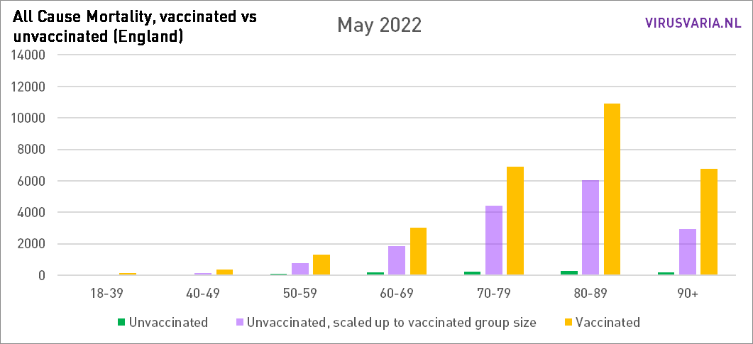
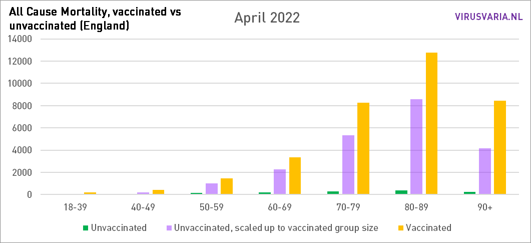
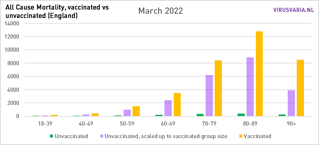
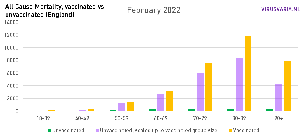
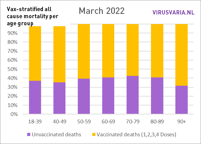
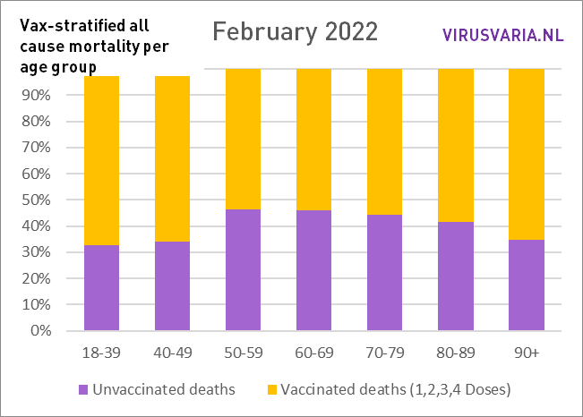
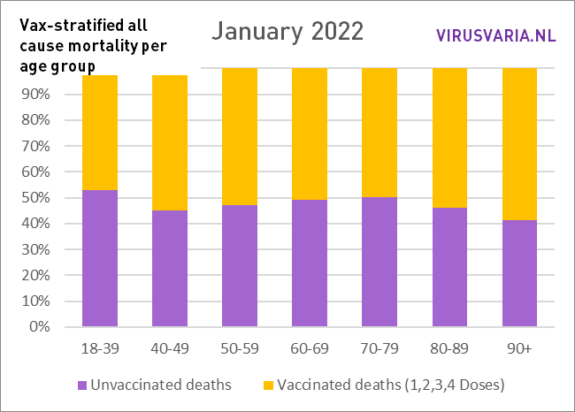
How are things going in the countries that do publish important figures? UK data is telling when graphed. They speak for themselves, feel free to scroll through. No further correction methods have been applied. That was not necessary because no age groups have been totalized, so that, for example, person-years have to be worked with. Such adaptations are necessary if generalizing statements are to be made about 'mortality'. Now that we are dealing with a disease that is particularly age-discriminatory, that makes little sense. On the contrary, it is important to keep an eye on the individual age groups.
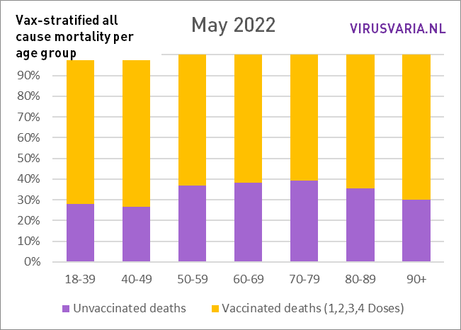
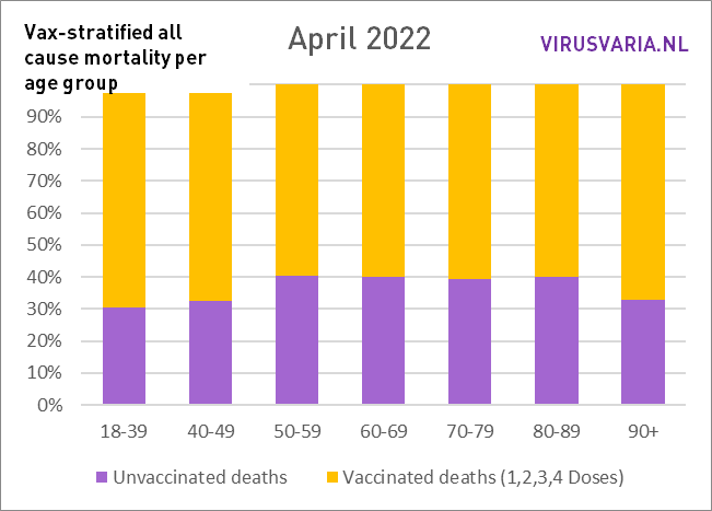
There is one methodological problem: mortality is reported in 10-year cohorts. Especially between the ages of 70 and 90, this will mean that statements can be made about, for example, 70-79, while in the oldest group 75-79 there may be three times as much mortality as in the youngest group of 70-74. The report is too coarse for that. That's a shame – but better than nothing.
To what extent do these 5-year 'subcohorts' actually differ from each other? In terms of vax percentages, there is little difference (about 2%) between the youngest 'subcohorts' and the oldest over the age of 50.
The vax percentages rise to 95% among the very elderly. It cannot be maintained that the 5% unpricked were already much healthier and therefore caused lower mortality. Rather the other way around: almost everyone without contraindication is pricked in those higher age groups.
For the younger age groups that could be different, but there is much less difference in mortality (for example between 40-44 and 45-49) so there is hardly any problem there. So it is there but it does not explain the differences shown. More about the method followed and 'confounding' all the way at the bottom this article.
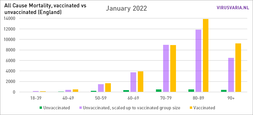
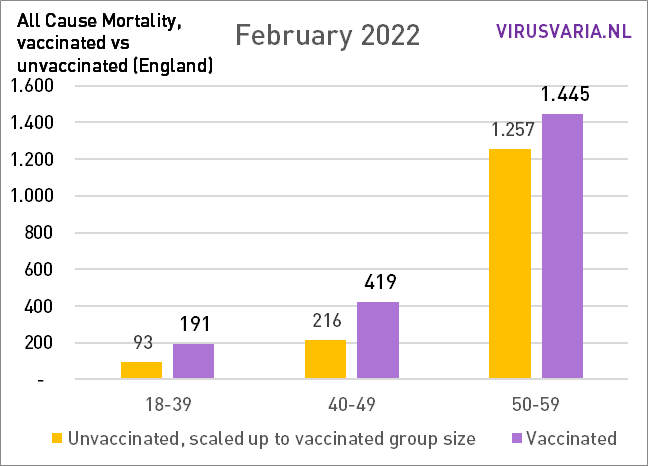
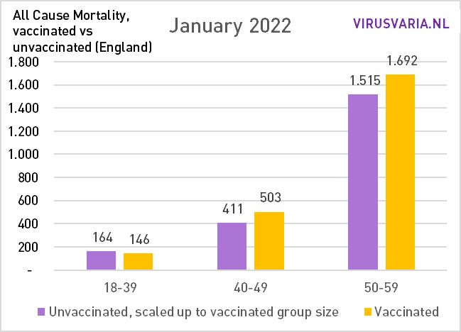
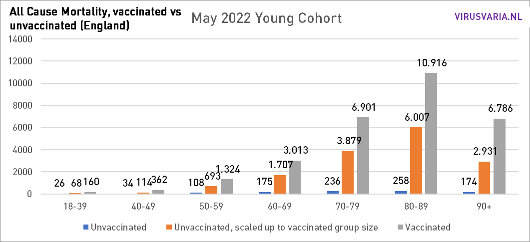
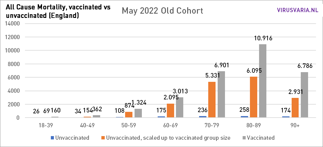
The graphs can be read as follows: the purple bar shows how many unvaccinated people would have died if the groups vaccinated and unvaccinated had been the same size. With All Cause Mortality, no distinction is made between causes of death, so it concerns both Covid and non-Covid deaths.
Zoom in on sixty-somethings
Proportionately
Graphs 2021 are here.
Method
Source data from UK government:
1) Mortality rates by vaccination status of gov.uk: download the Excel file here
2) Vaccination status (%) of gov.uk: download the XML version here (button below the bottom graph)
Source 1 shows how many deaths have been counted in groups of 10 years (except for the 18-39 group). These are broken down into unvaccinated, within 21 days after first dose, after 21 days after first dose, within 21 days after second dose, after 21 days after second dose, within 21 days after third dose, after 21 days after third dose. If you want to compare those subgroups with each other, it becomes very complicated because there is much more time between the first dose and the second dose than between the second and the third - and so more people will die for that reason alone. Just to name a few. That is why I have added up all deaths so that I know the total number of deceased vaccinated people. Follow-up studies can then go into the details - insofar as that is interesting in a massacre like this.
The above data on numbers only becomes meaningful when we know how large each subgroup is and what the vaccination percentage of that group is. This is stated exactly in Source 2. Unfortunately, it is divided very differently, into 5-year cohorts. It is easy to create 10-year cohorts from this. We lose some resolution, but doing it the other way around requires the kind of trickery that makes it less transparent and at a certain point you no longer know exactly what you are actually looking at.
Furthermore, the percentages are shown per day, while the mortality is per month. The most reliable method turned out to be to take the 15th of each month as a reference. This was especially important during the campaigns. Vaccination percentages are now virtually stable.
Then we have the vaccination status of an age group of which we know how large it is, for example 80%. That means 20% unvaccinated. So multiply your figures from this group by 4 to put it arithmetic next to the figures of the vaccinated. Another method is to convert everything to “per 100k”, but then the ratios sometimes get lost again.
So that's what was done: in each age group, the number of unvacinated people who died (green) and the number of people who died (yellow) were looked at. On the basis of the vaccination coverage, both groups have been made equal and the number of deaths has been scaled. That virtual number is represented by the purple bar.
Confounding
Within 10-year cohorts, there is also confounding. For example, it could be that between the ages of 75-79, many more people have been vaccinated than between the ages of 70-74. If more people die in that older group, it seems as if they die because of the vaccinations. Unfortunately, mortality data per 5-year cohort are lacking. However, there are the vaccination rates. Over the age of 70, the difference within a cohort is a maximum of 1.5%. The biggest difference is in the cohort 40-49: almost 5%. (40_44: 77.02% and 45_49: 81.87% vaccinated).
To see how it would vary enormously in terms of vaccination percentage, I 'ran' the entire month of May with the vaccination coverage of the "younger cohort" and with that of the "older cohort". The biggest difference can be seen in 70-79.
If the differences are influenced by confounding, I hope someone can explain to me how the differences can change so trend-wise. To see the trend you can see all graphs from the beginning of 2021 view here.
In any case, it remains disconcerting.
Thanks, Anton for another good fluffy. Question: are people who have just been vaccinated (<3 weeks?) vaccinated for the first time counted among the unvaccinated?
Hello Nanda,
They are listed in the report as 'Died within 21 days of vaccination'. I have therefore treated them as 'vaccinated'. They're just registered like that there. I don't understand the people who interpret that differently. Even when it comes to Covid/non-Covid, you should not see those people as unvaccinated.
I understand that they must also be able to be evaluated separately.
If hospitals only work with the status 'vaccinated: yes/no', they create a problem. But: With some good will, you can look up the date on which each deceased person was vaccinated in the GGD vaccination registration system. If that will is not there and you have to rely on hospital information, it is chaos.
The importance of those first three weeks: With artificial immunity, the body apparently needs three weeks to build up protection that lasts for four months. With natural infection, almost everyone has dealt with the disease after three weeks and you have robust immunity that works at least as well and lasts much longer, basically for life, if the virus does not mutate and as long as your immune system as such still works well.
It can also be a strategy like the one used in HIV treatments. If someone died quickly despite treatment with experimental drugs at the time, he would apparently have been too weak and could no longer be saved. For example, many accidents were masked, at least in The Real Anthony Fauci by Robert Kennedy Jr. I have come to take that for granted, also because the book is kept silent.
Thank you for this quick and comprehensive reply. Rightly so that you counted them as vaccinated. That this did not happen with official figures, I have always found strange. You then count, in my opinion, the people who die shortly after the jab ws. from that jab in the wrong group.
Nice work Anton!
What's interesting is, is how long the excess mortality of vaccinated person keeps coming back in these graphs, will the difference be smaller in 2022, 2023? or will it remain so big for the coming years?
In 2021 certainly in the early months, many more unvaccinated died (Feb, Mar, April), so then in the short term you could interpret that the vaccine did its job. After that, say about the same until October 2021, and after that, more vaccinated ones died.
We'll see!
Precise! Those first months have been the reason to keep stubbornly puncturing (you can also see that in that earlier post that I have now updated). Despite mutating virus and signs of side effects.
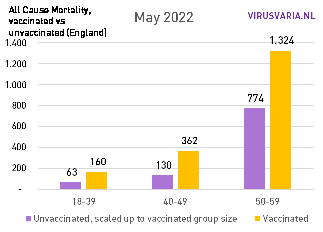
The difference between vax/unvax has increased so far. In the graphs below I have added all ages together: the total mortality.
In May, the difference decreased slightly for the first time compared to the month before, but only in an absolute sense!
The overall mortality was also lower in May (I think it fluctuates strongly...) As a result, there is no decrease in percentage terms, but there is always an increasing trend.
Perhaps it is worthwhile to dedicate an article to. Or two: one with the good news and one with the bad news 😉
I don't know if you still get notifications of a reply that I have edited. Hence this new answer. I'll throw it away in no time. Regards, Anton
Hi Anton,
Yes I get the replies! Only now we are traveling, so I'm a little less on top of it...
Thank you for this addition. I am not a medical doctor, there will definitely be factors that can partly explain this difference, but I do not understand that this vaccine is being used for Omicron, which seems to be a different disease than the previous variants. Both in terms of course and in terms of the effect of the vaccines.
Regards Martin
Hi Anton, that vaccines do not help much (anymore?) to reduce mortality seems to me a reasonable assumption. Despite the possible differences in, for example, age and original health between the two groups. But suppose vaccines are also really unhealthy, then you would also expect the mortality / persons in the young people to grow compared to pre pandemic and vaccine years. Of course, differences there too may be caused by other effects of lockdowns and the like. But this seems to me to be purer than ordinary excess mortality measurements... because there is a lot more assumption work in it with regard to, for example, population building. While the 40ers of today, for example, should be reasonably comparable to the 40ers of a few years ago
What you say about excess mortality seems to be in line with what has been observed in 2021. This article also contains something about age groups. https://zorgkrant.nl/anders/14916-in-2021-10-procent-meer-oversterfte
You sound ('assumptions') as if you have not seen or questioned the graphs. I'd love to hear what's wrong with it!
Indeed about mortality across young age groups is more worrisome. I don't see any issues in your piece. However, I believe in the experiment, because there is always a possibility of confounding/coincidence that explains this. So, for example, unhealthy people are pricked more or vaccinated take more risk after the jab. I personally do not think so. But we should have had bigger neat experiments with long (blinded) follow-up. I estimate that with 15,000 per arm and 15 deaths in control group, Pfizer had about the strength to significantly measure additional mortality of 1/1,000. So that's what we "know". But 1/3000 of extra mortality from vaccines is therefore possible. At Pfizer, 6 out of 15000 extra died (at least I quote Norman Fenton here)
Coincidence seems to me, given the overall consistency over two years, a difficult one. I looked at the confounding possibility with statisticians and data analysts. Of course, it cannot be ruled out, but possible explanations cannot explain the effect quantitatively. What confounders are we missing? And these should apply to all age groups because more or less the same thing happens everywhere... I keep myself recommended for (somewhat calculated) suggestions.
Nice analysis. Are you the first to make this analysis? With this worrying analysis, you would expect a quick reaction. Do they first wait with a response until the analysis is published per reviewed?
In almost all Western countries you see an increase in "overall excess mortality". Something is going on.
Dear Anton,
Unfortunately, there are many errors in this article. I'm surprised you say you've discussed this with data analysts and statisticians. Maybe you should just ask an epidemiologist who understands confounding, or a demographer who understands age standardization. That data is already in the table, and the ONS statisticians have already done that for you.
First, getting the vaccination status from the second source is wrong. This means that you work with sharers that are too large, because of the entire group in source 2, people must have already died in 2021. That is why the statisticians of the ONS use rates - because they know that people live, because they contribute to life days / years. This was a general problem with the NIMS database: for young people, the entire population is overestimated, because NIMS is based on the existence of a general practitioner database. These can exist twice for e.g. students and migrants who have emigrated.
Second, an age-standardized rate is a rate that corrects for age within the age cohorts. This means that the mortality in the group is recalculated if the age structure within that group had been different, according to a so-called standard population. This actually means that you do not understand the table - but it does correct for age.
If you then follow the ASMRs, you actually see a very clear pattern: the ASMR of the boosted group is (often a lot) lower than the unvaccinated group. The ASMR of people with less than 3 injections is often higher than the unvaccinated group. This contrast (much lowerboosted, higher non-boosted) indicates confounding. One is quite common in vaccine epidemiology: healthy vaccineebias. In other words: higher educated people get a booster more often and they simply have lower mortality.
The other is confounding by (contraindication). Why don't people get their next jab (1st -> 2nd, 2nd -> 3rd)? An explanation that the ONS has given for this is that people are acutely in the rag basket, or have been told that they have a terminal diagnosis. This difference was quite dramatically large at the beginning of the jab program, and after a while it weakens. But this dynamic can build on for people who later decide to get a jab: they are told a diagnosis that now puts them in a vulnerable group, and decide to get a jab.
Then still trending over time, why does the difference shrink: the unvaccinated group simply consists of a group of people who have already had corona. All cause mortality difference that is explained by corona therefore decreases, certainly in comparison with the basic series. That leaves people with vulnerable comorbidities in vaccinated people are overrepresented. It is therefore completely expected that for people with <3 injections there is a greater all cause mortality than in the unvaccinated group.
Hello Jaime,
First of all: thank you for your time! I had prepared a long answer, maybe we can look at that again.
The most important topic - and you are not the first to suggest this - is age standardization. This is necessary to be able to compare different age groups sensibly or, for example, to calculate a mortality ratio for an entire population. It can explain differences within a broad age group if you include parameters that change with age.
I do not see how that can contribute here. For example: in the 80-89 group you could say: 85-89 has a higher mortality rate than 80-84. But both subgroups have the same vaccination coverage (95.9% and 96%) so that doesn't skew at all.
So my question is what contribution age standardization can make here. In my opinion (and scientists in my circle of acquaintances): none. How does an epidemiologist see that?
Again Anton, in the source data that you have consulted yourself is the answer. ONS gives you the denominators for the raw mortality rates (just look at the relative difference between what you found and what ONS reports) and then the standardized ones. The difference between these is the effect of standardization.
The point is not that there is no difference in vaccination coverage, the point is that there is a difference in the age distribution between the vaccinated and the unvaccinated group. So you have to apply a weighting correction to the difference. Standardization is a standard method for this.
That this is important for the small differences (an RR of <1.5 is a small difference) seems obvious to me: the mortality rates in the population increase by 10% every year.
https://www.ons.gov.uk/peoplepopulationandcommunity/birthsdeathsandmarriages/lifeexpectancies/datasets/nationallifetablesenglandreferencetables
Again, my surprise. All these sizes are standard demographics. They're just delivered in the source you consulted, and they just give more expected results, why did you ignore them?
Correction: sharers.
Incidentally, indeed, when I look at the difference between the mentioned rates, it seems that they do not differ much within the age strata. That means that we are again looking at an old-fashioned problem with the sharers, and if you had followed UK twitter, this is already a more widely known problem: in NIMS there are too many people (63 million while england has +/- 55 million), and they cannot be vaccinated. If these cannot then be vaccinated, they cannot contribute to mortality. This means that using NIMS as a divisor always leads to an underestimation of mortality in the vaccinated group.
The rates of the ONS come from a data link, as described in the source: the public health data asset, which also states that the links apparently only work for 80% of the population in england over 10.
Financial times has already reported on this in 2021. https://www.ft.com/content/125fbaf8-175a-4e2e-852a-9995ca5176b2
So we do not agree on this: "... that there is a difference in the age distribution between the vaccinated and the unvaccinated group."
Both groups are (in the example) between 80 and 90 years, in the same period, from the same population. Why do you suppose that the age structure differs between those two groups? Those unvaxed could (in extremo) all be under 85, do you mean that? But you would have to see that reflected in the vax degree of the 5-year cohorts and they hardly differ from each other.
In any case, I will look further, perhaps someone can explain to me why standardization is also necessary if you treat cohorts in isolation. Changing mortality rates do not change the ratio between two groups of 80-90 years. But thanks again for your input and certainly also your substantive approach.
Of that NIMS file I only used the percentages, not the population size. Those percentages are good (I hope anyway), they are reported per day per 5y age group! I didn't take any absolutes from that.
I have already done the work for you myself: there is indeed little difference between the calculated raw rates and the standardized rates. It remains that the rates that the ONS calculates show the reverse that you show, and so there is a problem with the divisors (at least I assume that you have used the same denominators).
I don't want to ridicule you and assume that your last response was thought too quickly. Think again about whether percentages are the same if the dealer changes. You will have to look at how it is possible that the ONS rates come to a lower mortality rate for ever vaccinated people ...
Of course, percentages are a division and the denominators are just as essential as the counters. But then the vax ratio that the UK reports in Source 2 is substantially incorrect? For the older groups anyway, it seems to me, otherwise they would never be able to achieve a percentage of more than 85%.
I had also heard Fenton complain about population sizes. It's a bit of chaos though.
And let's not start by ridiculing each other, that happens enough 😉 already I assumed that NIMS and ONS were each consistent in themselves so that I could use the proportions – but of course not the numerator of one and the denominator of the other. Although that should actually be possible. I'm going to dive into it this weekend.
I want to make sure that the independent statistical authority PHE (now UKHSA) has taken the finger for reporting death rates based on NIMS denominators. And also the FT article that I posted above.
https://osr.statisticsauthority.gov.uk/communicating-data-is-more-than-just-presenting-the-numbers/
Incidentally, I do wonder whether the ONS has looked carefully at whether with their linked data file (the PHDA that I mention above) they have still nested representative sample within the English population. Still, without much notice, I would be surprised if this is a very strong skewed ratio to the real ratio vax/non vax. With NIMS this is guaranteed because the group by design is too large.
Hi Jaime, I have put a notification above the relevant articles. There will be (I hope this weekend) an article in which I indicate what is wrong with the UK figures and therefore with the graphs. As far as I can see, it is not in errors in the method followed as in the underlying data. As you yourself indicate, the ONS method also uses data from which something can be found...
Thank you for putting me on this track.
We'll see. But I do want to make it a little bit clear here that I'm a little suspicious in the back of my mind. The ONS has indicated the rates, which are simply strongly related to deaths per capita, in the table. In fact, rates are better because they take into account the fact that people die over time and shift from age groups.
These were up for grabs for you, and then you would have seen the opposite emerge for each age group than what you have found. Why have you done your own analysis and not report to your readers what is actually in the table, especially given the large discrepancy? I've asked you this question repeatedly now. You misrepresent what is in source 1, because it also states how large (more precisely: how much exposure) there is at each age level.
Hi Jaime, those differences between age groups are self-evident and that's not what those graphs are about. It doesn't matter. There is no correction for age because that is not necessary in this setup. Age standardization does not correct "within an age group", so you correct differences between age groups if you compare or merge them statistically.
I had a simple question: "how is the mortality distribution vax/onvax within each age group?" The subdivision into 5 subcategories vaccinated, which are then calculated back to mortality probabilities and person years due to periods and ages, is more cloudy than enlightening. Also, the definition of "unvaccinated" was equally uncertain. (In some tables, 1 jab = unvaccinated or within 21 days of jab = unvaccinated).
I also saw that in certain categories the number of people vaccinated was greater than the population estimated by the ONS. That was a good reason for me to look further in a different direction, with the official population numbers of the government. In my opinion, the population used was not correct.
I hope I have answered your question clearly now. You are probably rightly suspicious: I am indeed someone who has completely lost faith in institutions and governments. In the meantime, I have seen so many inaccuracies and unscientific behavior from health institutes, governments and universities that I tend not to believe what they are telling us.
I have also explained this in an article. I'll let a few people read that before I post it.
Anton, your suspicion does not absolve you of the responsibility to simply present to your readers the figures as they are by presenting people who are arguably more qualified than you. Do I now read from this that you knew about the results with ONS denominators, and therefore deliberately did not present them?
Again, ASMRs are a standard demographic measure. That you find them difficult is your problem. They are not that complicated: you choose a standard population with a certain age distribution. Then you take the number of deaths of 70'ers, and fit a correction factor that is the difference between your own population and the standard population. So if in your population 10% are 70'ers, and in the standard 8%, then you make the number of deaths for the 70′ er 80% as large. You repeat this for all other age categories, and then you have a standardized rate.
Furthermore, you just couldn't get a standardized rate from the table. The rate is simply a better size because in May 2022 you obviously do not have the same population composition as in February 2021. This difference increases as the mortality chances in the respective groups are greater: then the denominator in the group with higher mortality decreases faster. If you do not correct for this, the mortality figures seem to converge too quickly between the groups.
And yes, it is true that the ONS, which is de facto a census, has more vaccinated people in the old group than those present in the census. This simply says that censuses are indeed not precise, and all methods are ultimately *estimates*. That doesn't automatically mean that you have to use a dataset designed not to miss people (NIMS - this determines the sending out of vaccination invitations and is therefore a high threshold to remove duplicates), especially if you would see with a normal approach to the metadata that there are 63 million people in it. That is 7 to 8 million people who are unvaccinated and immortal, and therefore >10% overestimation compared to censuses. With a 'real' vaccination rate of 90%, more than half of the unvaccinated are immortal (after all: where the real denominator ratio is 90:10, you count with a denominator ratio of 90: >20).
Here you again misrepresent the table, because the ONS table also presents 'ever vaccinated'. In addition, it is simply not true that people who have been pricked are peated as unvaccinated. This is completely justified for assessing the immunological effect on corona mortality, but not for all cause mortality. And if you come up with Fenton: he can jump high and low, but his arguments are not really convincing. Healthy vaccine bias is pretty much bonton in the whole observational vaccine research. His analyses have not remotely 'debunked' this as an explanation for the difference in non covid mortality between vax and non vax. https://twitter.com/_johnbye/status/1547325894913581056
There is also simple unmeasured healthy vaccine confounding: if you are in the hospital in January 2021 for something that has nothing to do with corona, you have a higher chance of dying. At the same time, they are not going to vaccinate you in the hospital. In addition, vaccination is strongly correlated with socio-economic status. A lower non-covid mortality if you correct for age is therefore not suspicious - it is completely expected.
Explanation ONS about greater mortality of people who only got 1 jab:
https://www.ons.gov.uk/peoplepopulationandcommunity/birthsdeathsandmarriages/deaths/bulletins/deathsinvolvingcovid19byvaccinationstatusengland/deathsoccurringbetween1januaryand31october2021
Thanks for the public exchange Jaime and Anton! How I would like to see that more! Especially in areas that I am not familiar with myself. I look forward to the sequel.