We have been seeing since spring 2021 that there is excess mortality, which cannot be explained by corona alone. This excess mortality now even seems to be increasing. This is not clearly visible in the graphs on the Corona Dashboard, which is why we present an improved graph here that matches the seasonal effect that we see with flu.
A blog by Herman Steigstra, Anton Theunissen and André Redert.
Excess or excess mortality
Anton Theunissen has aarticle worth readingwritten about bandwidths, to determine if there isExcess mortality. Here is also the concept Increased mortality to make the difference between the exact number of deaths above expectations and the conclusion that is associated with it: is this number large enough to actually Excess mortalityor is it just a small coincidence?
The numerical elaboration was based on the method used by CBS and Corona Dashboard. For each week, the number of deaths is compared with the number expected for the week in question. With a blue area where, according to statistics Netherlands, there is no excess mortality and that is the end of the matter. Statistics Netherlands does not use the concept of multiple mortality and does not draw any conclusions from long-term excess mortality over many weeks as long as it falls within the bandwidth per week.
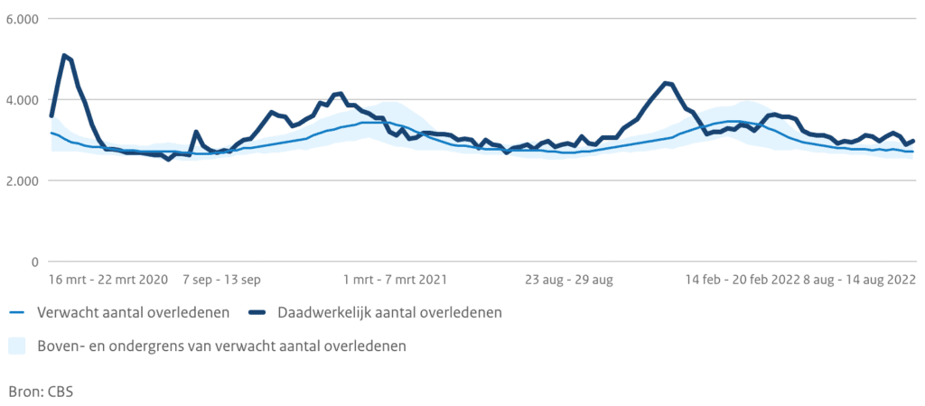
However, the aforementioned article showed that if excess mortality occurs over a longer period of time, statistically speaking, there is indeed Excess mortality. For this, the excess mortalities over the longer period were added up to totals from January to a certain point in the year, and ditto for the bandwidth. However, there was a shortcoming in the statistics: The article based itself on the CBS bandwidth, and converted it into cumulative bandwidth. Now it is often the case that a flu epidemic kills people who would otherwise have died a few months later. Statistically speaking, the total number of people who died at the end of the summer does not even vary that much per year, the deaths take place just as well, but especiallypreviously. Sooner or later, that is a strong correlation in time that not is visible in the weekly CBS bandwidth. Correlation has a lot of impact on the totalized mortality but could not be included in the article based on the CBS bandwidth.
Advanced bandwidth
Sometimes you have to take a few steps back to solve a problem: You want to know between what limits the total number of deaths could be, if you total that number from January 1 of a year. There is a simple answer to this question. If you calculate this totalized value for the previous 5 years and the same week, you get a good picture of it. From these 5 totals you can calculate a spread and that gives a good indication of the maximum deviation that you have for this years.
We have made a number of refinements to this calculation method, as CBS also does in their normal forecasts (e.g. for ageing and population growth). However, these effects are small. The impact of totalization gives a substantially better picture of excess mortality, because it includes mortality correlations over time.
Working on the basis of seasons
A second improvement is in the choice of the time axis of the graph. In many graphs we see that it starts on January 1 and ends on December 31. But is that a wise choice? We can already see in the CBS mortality graph above that mortality is lowest in the summer and that the bandwidth is also the narrowest there. That makes sense, because it is precisely in winter that most people die. To old age, but also often due to flu or pneumonia. In the summer there are rarely flu-like symptoms. It is therefore not smart to divide a flu epidemic that starts in the fall over two graphs (or two lines in the same graph). A moment in the middle of summer is a smarter choice, then the flu is always in the middle of the same line. We have chosen 1 August as the new starting point.
The new graph
In the above we have described our new approach in a hopefully still understandable way. Now let's see what that will look like in practice: This is the end result if we visualize the last 7 years in terms of totalized excess mortality and bandwidth:
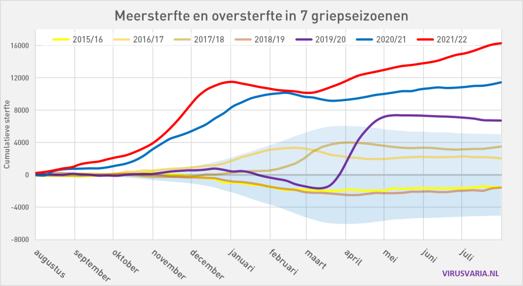
This graph was built using the data from 2015 to 1 August 2022. For the calculation of the totalized bandwidth, only the mortality figures up to and including February 2020 were used. The mortality figures afterwards contain the figures of the corona epidemic and we do not want to include them in the calculations for that bandwidth. We are now seeing a form of this bandwidth that we have not seen before. In the summer it remains narrow, but from November it becomes wider faster and faster. Until the end of March, the end of the flu season and then the bandwidth becomes narrower again.
At first you think you are dealing with an error here, certainly statisticians (including ourselves) now think they are dealing with an error in the calculation procedure, because the more figures with an uncertainty are added to the total, the greater the final uncertainty. But here we are dealing with the mortality correlations over time. The phenomenon that those who die earlier from flu can no longer die some time later. By performing the calculation method in the way described above, we also see that in the graph.
In the following we will discuss the different episodes in this graph separately.
2015-2019
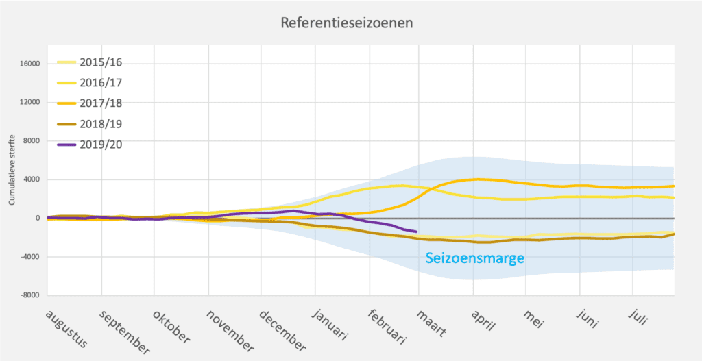
The first four years show a similar picture. They all stay within the bandwidth. We see that there have been two epidemics that have led to an increase in excess mortality, but ultimately have not caused excess mortality. There may have been a number of individual weeks of excess mortality in the winter, with a rapid increase in total mortality (top two yellow lines, January-March), but in the totalized bandwidth this hardly results in net excess mortality. At the end of each season, the total excess mortality remains well within the limits of the bandwidth.
This graph also includes the 2019/20 season, until the start of the corona epidemic. These figures are still included when calculating the bandwidth. We see that prior to the corona epidemic in 2020, there was less mortality, so that this purple line was flat until March 2020.
2019/2020
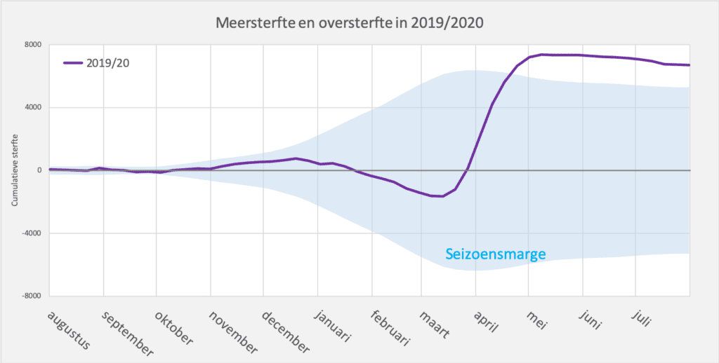
The 2019-2020 season has a completely different course. Until March 2020 a normal course, until corona came. We see a sharp increase in the increase in mortality, which leads to excess mortality in April.
Because we were dealing with a completely new virus, little to no immunity had been built up and more people died than what you can expect according to the bandwidth: excess mortality. We also see the decrease in the excess mortality from June, which we always see with a large flu wave: "under-mortality after excess mortality". Epidemiologically this is a completely normal course ("from the book"), only due to the lack of sufficient immunity a more severe course than in normal flu years.
2020/2021
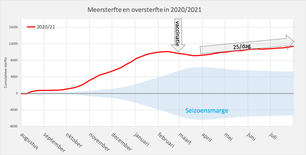
In the fall of 2020 came the second wave, actually a continuation of the first wave. The red line shows the gradient. Actually a normal course, only this wave did not come in the flu season, but already at the end of the summer. That is why the excess mortality starts immediately, on the far left of the graph! Very special, but it is easy to explain.
After February, the epidemic dies down again and the excess mortality line drops, exactly according to "the book". In March, the vaccination campaign picked up steam. In fact, you would now expect that there would be a persistent reduction in mortality, a downward trend as you also saw a year earlier (to around 10 per day). But the opposite is the case! Increased mortality will rise again in mid-March, despite the decrease in mortality from corona itself, by about 25 people per day. The big question is still whether, and if so to what extent, vaccination is responsible for this excess mortality. The trend continues in the 2021/2022 season:
2021/2022
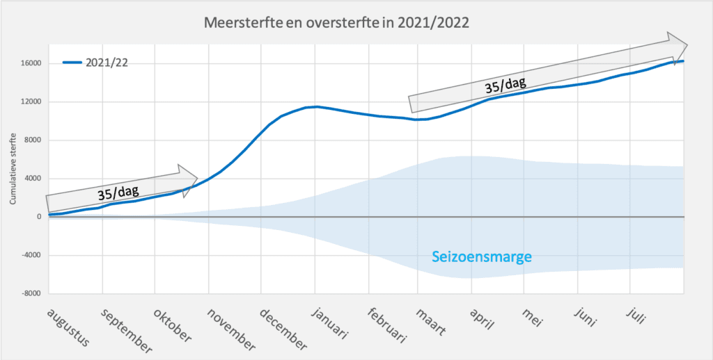
The trend of 25 deaths per day from the previous season continues and quickly rises to 35 per day. In November came the Delta variant, which made the line even steeper. A bump was the result, followed by a decrease from January to February. But then we see the same upward trend coming back from March, as we also saw from April 2021. Another 35 deaths per day extra. It is plausible that there is a continuous undercurrent of 35 daily deaths, which also continued during the Delta hump.
This mortality is unexplained because there are hardly any deaths from corona. It doesn't seem like delayed care either, because a year after the last severe peak, that should be over, or at least decrease. Especially when we normally see "under-mortality after excess mortality". In this 2021/2022 season, about 16,000 more people died than expected, more than 2 times as many as in the first corona season. Again, the question arises as to what causes this mortality.
How safe is safe?
The message is still being proclaimed that vaccines are excluded as a cause of excess mortality, because they are "Safe and effective". But what is safe? Is it excluded that 1 death per 1000 vaccinated people would be caused by the vaccination?
We found thisPfizer publication, in which more than 20,000 vaccinated people were included in a study for two months. But to show that, for example, the chance is less than 1 in 1000 of dying from the vaccination, 100,000 subjects must be taken over a year, in order to be able to determine that with 95% certainty. If we were to accept only 1 in 10,000, we would have to take 10,000,000 subjects double blind. So the question is actually up to Pfizer: what chance are we dealing with and how many subjects were there in the study that tested the safety.
In a future article we will go deeper into this and hope to find additional publications that provide clarity here.
Consideration
On an annual basis there is now an excess mortality of 16,000 and there is no indication yet that this line will bend towards under-mortality, on the contrary. There are indications that the vaccines play an important role in this, which has neither been proven nor excluded. It is limited to cases that seem to prove this. See for example Hong Kong:

A month after boostering in February-March, we see a huge spike in excess mortality in March-April. The causal link has obviously not been demonstrated, but the clues are piling up. But "vaccine damage deniers" always find a counterexample with numbers.
The government still takes the position that vaccination is "safe and effective" and does not pay any attention to publications and signals to the contrary.
The vaccine is still being touted, children are being included in the vaccination programs, and the big question is whether the vaccine will feed the excess mortality. It seems to be an experiment with thousands of human lives – not of volunteers who make a risk assessment but of citizens who fully trust the authorities. The current vaccines have been developed for a virus variant that is no longer there and there are indications that these give no or insufficient protection against the current BA.5 variant that has also virtually disappeared. It would be good if the government would share these considerations with the population instead of completely ignoring them.
You can also comment on this article at Maurice.nl, the other authors are also watching.


The pro-vaccinators cannot claim that it is safe and effective, because there is no data that shows that there is an all cause mortality benefit. It simply misses. It would be very easy to investigate, but it doesn't happen. Then I know enough.
It is indeed difficult to prove that a vaccine is the cause of a death, especially if it happens after a few months. If someone has been vaccinated and has ever gotten Covid, some of the people will blame Covid and another part will blame the vaccine. And I think medics won't judge all cases the same (one medic isn't the other)
What also strikes me is that messages and so-called studies (online questionnaires) about long covid are much more often taken over by the mainscreen media and that no critical comments are made. I wonder how many times the link has really been demonstrated between lung covid and Corona.
Still, I'm not entirely convinced that delayed care can't play a significant role. Many medical preventive actions have not been carried out during the Covid peak and how land will it take before it becomes fatal. When do problems really arise if you do nothing with a small spot or lump?
It would be interesting to know the vaccination status of all people who have died.
It is difficult to prove a causal relationship, but a correlation would be perfectly possible. For example: what is the probability per vaccine status (0-5) that you have died. And then broken down by age cohort and also directed for underlying suffering.
The data that the all cause mortality is lower among vaccinated people should be perfectly substantiated with a safe and effective vaccine. It's not that hard.
That data is not there, has never been published and that tells me enough.
the mail from Virusvaria invariably disappears in my gmail spambox. despite including your e-mail address in my contacts. This course of events may cost a lot of reach and this valuable information will be missed...