Shortlink t.ly/WpWu7
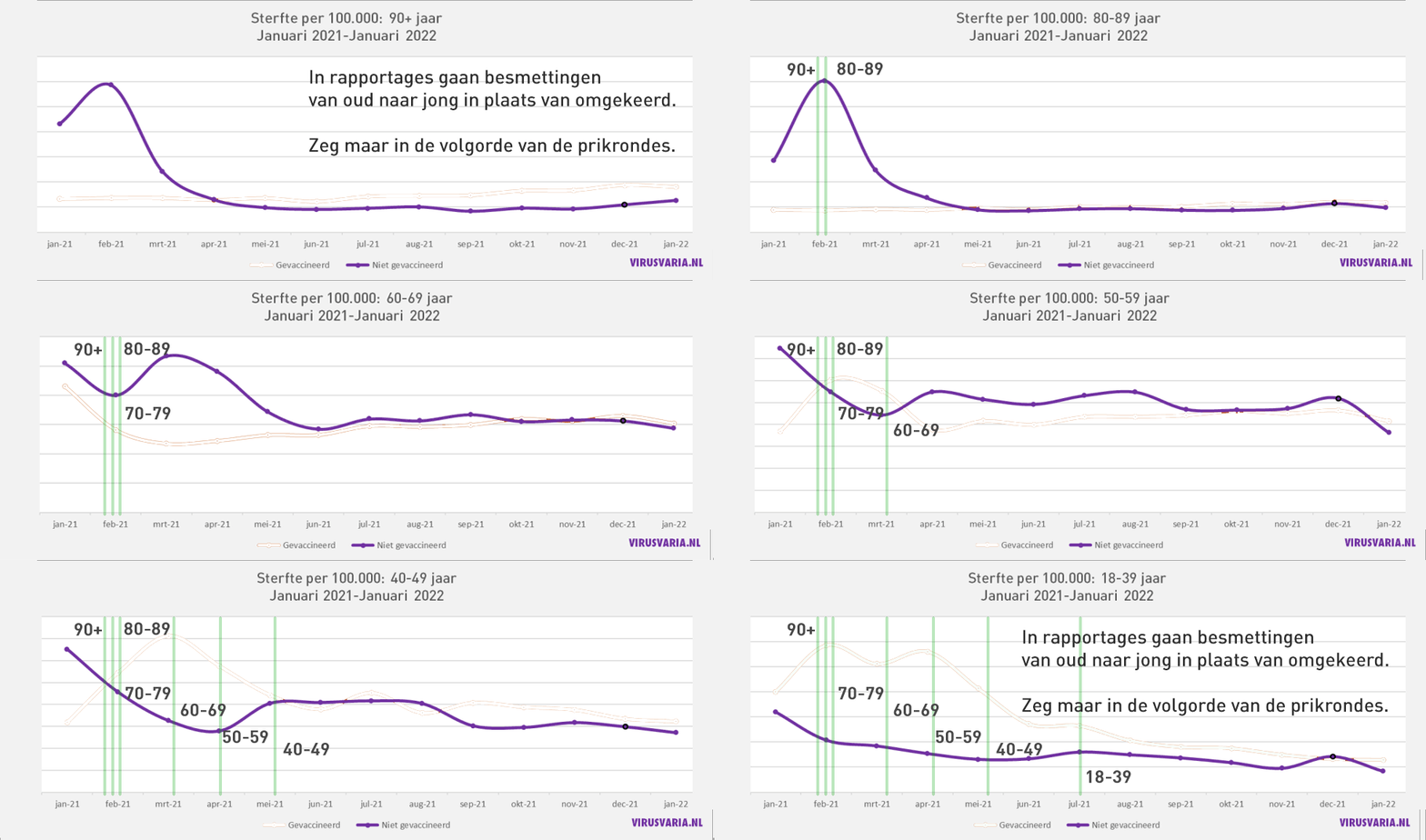
A different view of the figures as they were discussed in May. It seems that those graphs were not so crazy, despite the objections of a statistician who wanted to correct things with person-years and with ASMR, despite the fact that the cohorts were narrow enough for this purpose. The graphs now appear to be perfectly in line with the findings of Prof. Norman Fenton. The graphs show the mortality of unvaccinated people. The bumps in the unvaccinated are attributed to the fact that unvaccinated people were extra vulnerable. Another cause is becoming more and more plausible.

A respiratory virus epidemic begins in the children and young people. They then spread it to their parents and then to their grandparents, the elderly and the vulnerable. We've heard that story many times. Then it is strange that the hump above starts in February with the elders and then moves neatly to the next younger group, and so on. The younger, the less visible the effect because younger means less vulnerable.
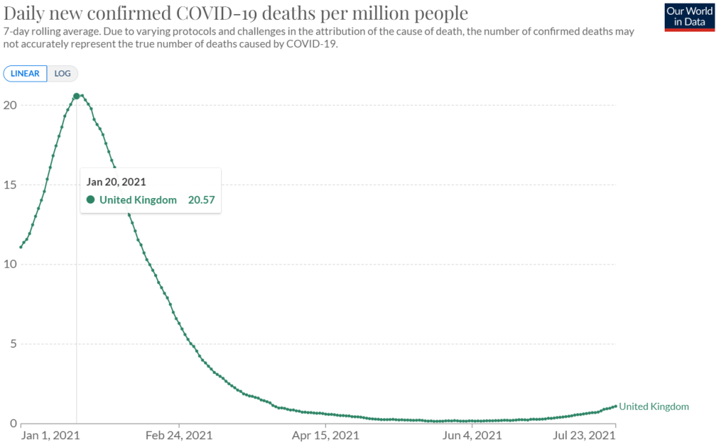
January was the peak of the second wave. This seems to be visible in the lower and lower humps. But the age order is reversed and that corresponds to the vaccination order.
Then there is something a lot of cravings: the purple line is the line of ONLY the unvaccinated.
How can unvaccinated people suddenly get a worse mortality rate than vaccinated people, right during their turn in the campaign, while not being pricked?
One explanation I didn't want to address at the time (sorry Jillis!) lies in the definition of being "vaccinated." It wasn't fair to have someone as "vaccinated" on the books if they were infected the day after the jab. After all, the immune system needs two weeks to process the jab and build up immunity. This way they could never measure whether the jab worked. were therefore only given the status "vaccinated" two weeks after the injection. That also meant that in those first weeks they were recorded as "unvaccinated" if something else happened, such as death. I refused to believe that, something like that only makes up a conspiracy fantasy. It really seems to have happened that way. This is how the "unvaccinated" line comes to the bumps.

That makes together three weeks respite.
Over the entire period, more unvaccinated people have died in this way than vaccinated people. The drug is therefore safe and effective against mortality from all causes. In fact, the more deaths within a few weeks of the jab, the safer! The (medium) long-term damage does not come out in an investigation either. This is a matter of stopping the study prematurely and then injecting the control group. After all, there is a state of emergency with a killer virus! (Still List A, so prick.)
Effective
In studies, a high effectiveness against infection can also be demonstrated in this way. Only totals are reported, not the course over the period. So you can only observe it in the actual, unresolved data. Maybe they still exist here and there.
Professor Norman Fenton explains in the video below how even an ineffective placebo can effectively come out of a study:
Whoever has a better explanation for the shifting bumps can say it!
View the original post with the UK charts.


Clear story. Thanks again.
I'm thinking ... it may be an idea, insofar as that is (still) possible and sensible, to structurally add a third category to such analyses. Namely something like semi-vaccinated o.i.d. for example? (If not already done)
This has a number of advantages imo:
1) this is purer (is that a word ? ; P)
2) no one can hide behind this anymore and/or has to waste time and energy on an explanation about this every time, at least less
3) in discussions, etc., there is no longer any need for (or at least less) fuss about the status of someone who falls into that category; This also makes discussions purer and therefore (hopefully) clearer (is actually a consequence of 1 & 2, or at least should be)
"add it yourself"? Unfortunately, we don't have that data.
Thanks for this article!
That dubiously wrong definition of the status "unvaccinated" has stayed with me all this time (almost 2 years already? scare!) as a kind of PM post. Had seen the interview with Fenton, clear explanation, shocking that statisticians with these kinds of definitions do so-called science.
Statisticians are not scientists, dear LN. They are ciphers, at best.
In the sense of "no academics"? Hopefully not, no.
The worst thing is that real scientists who rely on this data do not recognize the wrong assumptions, assumptions and definitions. Or recognize it and just let it sit?
Where are the Norman Fentons in other countries? Where are the younger researchers uncovering this?
Pharmacy, I think, by allowing ducky behavior by cutting back on controlling agencies, has become very adept at applying the tricks outlined by Fenton.
Fenton's example still assumes a placebo effect, but suppose that the injection (avoided deliberate term vaccine) with repeated use has a fatal effect but is able to make Covid asymptomatic (according to Vanden Bossche's idea) and does give increased sewer value.
Injected will not be detected as infected, possibly end up in the hospital and die there, or earlier elsewhere.
In short, covid deaths but a lot of OVER mortality.
Pretty much what happened in October after the autumn injection (after 18/9) with about 1000 deceased people falling under the Long-Term Care Act (Wlz). (Nursing homes with by far the most people from Wlz then left only a limited
number of Covid deaths).
CBS head of Galen will try to write this off again as corona deaths (I think rightly dismissed by Jan Bonte as bias). He says he is still waiting for the official figures for this period.
But if the people who died in the institutions, nursing homes there have not already been classified as Covid, he will no longer get away with this easily. I'm curious (sorry, had to say this)
Many thanks for the many inspiring virus variants.
"respiratory virus epidemic starts in the children and young people"
That is both true and not true. The virus "goes around" in different quantities and with the duration of this pandemic also through different variants. Pure spread is something else than exposure to higher viral loads. In nursing homes with a static lifestyle and relatively little ventilation, you get relatively, also per hour, more virus than a playing, moving child. The same for the elderly at home where visitors come. So this peak is more like a perfect storm. If you compare the development of spread (e.g. sewer data) with it, I think you can see that more and more people are spreading the virus and people are therefore encountering it more and more often at work, school and at home. Yes, the incidents seem to go from old to young, but you may also see the development of the epidemic itself here. In the nursing homes there were also more measures and at the same time you ultimately have fewer weaker people left for a period of time. Plus more immunity! So my thesis is that the elderly are susceptible in multiple ways. Statistically speaking, they stay in places that increase the chance of higher and regular viral loads. So in the line of fire. In contrast, "micro-vaccinations" by regular lower loads would actually encourage a form of immunization. In Sweden you see such an effect and there the nursing homes were also "forgotten", that relatively heavier infections would take place there, mainly due to the airborn factor that was only better mapped later on.
Numbers don't lie, but liars are good at numbers.
When vaccinating, the disadvantages start to work immediately while it takes approximately 2 weeks before an immune response can be expected.